2. Univers 65 bold
iger
Designer: Adrian Frut
Designed in: 1956
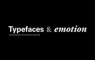
Typefaces & emotion Adobe Garamond Pro Bold Italic
Designer: Claude Garamond
Designed in: 16th century
ic s
Ital eijer 8
at m 9
dra red S 2-19
a
Qu r: F 199
ne n:
sig ned i
De sig
De
3. Swift Italic
Designer: Gerard
Unge
Designed in: 198 r
“Lettertypes zijn gezellige wezens. 5
Als je er genoeg in de juiste volgorde bij elkaar zet,
dan praten ze terug.”
Petr van Blokland
“Why design a new typeface? After all, there are so
Petr van Blokland, teacher,
many. There is a misconception that typefaces are not
ner
graphic designer and desig
of typefaces Productus & designed. They are simply here. Yet new typefaces are
’s
Proforma, designed mid 80 designed and this need is increasingly present in view
of the current technological advances.”
4. Courier New. Originally designed as typewriter face for IBM in 1955 by Howard “Bud” Kettler.
Redesigned by Adrian Frutiger for the IBM Selectric Composer series of electric typewriters.
“Maar lettertypes
zitten toch gewoon in
mijn computer?!”
“Rest nog de opmerking dat alle eigenschappen van letters
door iemand bedacht en gemaakt moeten worden. En die zal
daar meer toe geneigd zijn als daarvoor betaald wordt. Letters
zonder de L van ‘Licentie’ zijn gewoon ongezellige etters.”
Petr van Blokland
5. eigenschappen van letters
ITC AvantGarde Gothic Bold. Based on the distinctive logo designed for Avant Garde Magazine in 1967,
it was redrawn in 1970 to include lowercase characters. Designers: Herb Lubalin and Tom Carnase
1 Corps a Stam
2 Kapitaalhoogte b Schreven
3 X-hoogte c Letteroog
4 Ascenderzone d (Dwars)streep
5 accentruimte e Ronding
6 Letterlijn/basislijn f Overgang
7 letterbreedte g Eindstuk
8 Descenderzone h Bal/vlag
9 Regelafstand ÊA Kapitaalletters
10 Interlinie kpxre Onderkastletters
7. eigenschappen van letters
Braggadocio
bepalen
Designer: W.A. W
oolley
Designed in: 193
0
ner’s wife, Caecilia.
ght, named after the desig
de sfeer,
Caecilia Li
ordzij. Designed in: 1990
Designer: Peter Matthias No
mood, van de
Curlz
Designer: Steve Matteson
Designed in: 1995
rrespondence and
Book. Designed for of fice co
letter
ITC Of ficina Sans e font ITC Of ficina
n. An ideal Companion to th
business documentatio ann. Designed in: 1990
F). Designer: Erik Spiekerm
Serif (E
8. helvetica
Developed at the Haas typefoundry in Münchenstein,
Switzerland, to compete with the sans-serif typeface
Akzidenz Grotesk, it has succeeded in becoming the
most popular typeface in the world. It was originally
named “Neue Haas Grotesk”, but was renamed
Helvetica (from the Latin name for Switzerland) by
the German Stempel foundry when they produced
versions in 1961. Designers: Max Miedinger and
Eduard Hoffmann, designed in: 1956 - 1958.
letter > family
10. helvetica > quotes
Rick Poynor: Type is saying things to us all the time. Typefaces express
a mood, an atmosphere. They give words a certain coloring. Massimo
Vignelli: You can say, ‘I love you,’ in Helvetica. And you can say it
with Helvetica Extra Light if you want to be really fancy. Or you can
say it with the Extra Bold if it’s really intensive and passionate, you
know, and it might work. Wim Crouwel: The meaning is in the con-
tent of the text and not in the typeface, and that is why we loved
Helvetica very much. Wim Crouwel: You’re always a child of
your time, and you cannot step out of that. Erik Spiekermann:
It’s air, you know. It’s just there. There’s no choice. You
have to breathe, so you have to use Helvetica.
21. keuze > lettertype
Bij het kiezen kun je je laten leiden door:
onderzoek, functie, inhoud, leesbaarheid,
attentiewaarde, traditie, gewoonte, regels,
techniek, huisstijl, medium, esthetiek, sfeer,
gevoel, harmonie, trends, originaliteit of
persoonlijke voorkeuren
22. keuze > hoe?
onderzoek > onderwerp / medium / materiaal / huisstijl
functie > handleiding / omslag tijdschrift / binnenwerk roman
inhoud > hangt samen met functie: belastingformulier versus dichtbundel
leesbaarheid > staat voorop maar attentiewaarde en originaliteit kunnen voorrang
krijgen. Leesbaarheid is afhankelijk van: lettertype, lettergrootte, letterspatiëring, inter-
linie, afbrekingen, uitlijning, aantal letters per regel, aantal regels per pagina, kleur van
de letter, kleur van de achtergrond, structuur van de achtergrond.
attentiewaarde > attentiewaarde hangt af van context en omgeving
affiche / billboard / advertentie krant / advertentie magazine
traditie > gewenning en gewoonte: biedt soms houvast
23. keuze .
regels > er zijn dingen die je niet doet, bijvoorbeeld letters schuintrekken, letters te veel
afspatiëren. Regels wat typografie betreft komen uit traditie voort en gaan over maatver-
houdingen, letterkeuze, hiërarchie, interlinie, plaatsing van afbeeldingen en microtypogra-
fie (inspringingen, afbrekingen, nootcijfers, superieure cijfers, mediaevalcijfers, kleinkapi-
talen, etc.). Kennis van de regels leidt eerder tot vrijheid dan tot beperking. Als je ze niet
of niet helemaal volgt, moet je daar een gefundeerde reden voor hebben.
techniek > website / boek / grafsteen / lichtkrant / film
originaliteit > is geen doel maar (soms) een middel om attentiewaarde te verhogen
persoonlijke voorkeuren > aan jou om die te laten meewegen of niet.