ADOBE DAY: Smooth Ride on the Moble Documentation Highway
•
0 recomendaciones•1,276 vistas

"Adobe Day" presenter, John Daigle, covers many statistics on how drastically the mobile landscape has changed in the past 18 months. Smart phone and mobile devices aren't the only focal point for delivering content; home theatre systems, a variety of tables and desktop browsers also have their own design issues. Daigle's slide presentation contains dozens of useful links to references ranging from books to websites that will test or grade how well your content works with certain browsers.

Recomendados
Más contenido relacionado
Destacado
Destacado (11)
Más de Maxwell Hoffmann
Más de Maxwell Hoffmann (17)
Último
Último (20)
ADOBE DAY: Smooth Ride on the Moble Documentation Highway
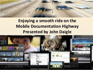
- 1. Enjoying a smooth ride on the Mobile Documentation Highway Presented by John Daigle 1
- 2. 20131993 2 Before we start – Tip of the hat to Joe Welinske of WritersUA for publishing the new “must read”: “Developing User Assistance for Mobile Apps” www.welinske.com
- 3. Shifts and Trends in the use of Mobile Devices • Organizations who are early adopters • The Mobile Device Landscape • User Assistance vs. Reference Documentation • Writing Content for a Mobile Audience 3
- 4. Shifts and Trends in the use of Mobile Devices • Designs where the Content “Flows” to fit the screen • Tools and Techniques for the tech writer • Mobile’s opportunity for Technical Communicators • Resources and links 4
- 5. The Screen Size Wars 5 iMac, iPad, iPhone iPad Mini Samsung Galaxy Series of Android Devices
- 7. 7 Example of Kindle impact: Iconlogic’s Adobe Captivate and RoboHelp Course Workbooks
- 8. Windows Surface and Windows Phone 8 “Late Bloomer” Windows is making significant new mobile inroads in a field dominated by iOS and Android
- 9. 9
- 10. Voice Activation Commands with Ford Sync and Lexus Consoles (Instead of “Click, Select or Tap” we have “Say or Speak”) 10
- 11. 11 Ultimate mobile – Google Glass
- 12. February 2013 Mobile Trends • 1 billion smartphones globally • 150 million Tablets • 1 million apps available 12
- 13. 13
- 14. 14
- 15. 15
- 16. 16
- 17. 17
- 18. Gartner Predicts by 2017, Half of Employers will Require Employees to Supply Their Own Device for Work Purposes (Instead of buying and “locking down” devices) 18
- 19. By the end of 2020: 10 billion mobile internet devices in use (up from two billion in 2011.) 19 Employers use of iPads and impact on Technical Communicators
- 20. I don’t walk around with a briefcase anymore. I just carry my iPad. • You turn it on. It’s on. • Lay flat attributes eliminates a barrier with the client • The Zagg keyboard makes data entry easier • Documents like regulations are easy to read and look up 20
- 21. Tablets and Smartphones in industry and on the Shop Floor Product Lifecycle Management Access to product knowledge anywhere, anytime Manufacturing plans, simulations and work instructions 21
- 22. Mobile Documentation: When the iPad is a Clinician’s Best Friend Mobile Medical App Market growing 25% per year over next 5 years 22
- 23. HEP iChart mobile app 23 Example of tech writers using “progressive disclosure” on a small screen
- 24. 24 Medical Students find documentation portable because the iPad Mini fits the lab coat pocket conveniently
- 25. Biggest shock is Screen Real Estate and Portrait vs Landscape orientation Touch Gestures (Tap, pinch, swipe, etc.) • User Assistance - Application Help • Quick Starts • Tutorials • Embedded Design with developer • Knowledge Bases • Policies and Procedures • Field repair instructions • Sales and Marketing resources • Training and eLearning 25 “Killing time is the killer app of mobile. When in doubt, leave it out.” - Jakob Nielsen’s Alertbox Documentation Writing for Mobile Readers
- 26. Techniques for Mobile Documentation • Flatten Navigation • Provide easy way Home, Previous, Next • Context Sensitive Topics for Mobile Apps (use APIs) • Consider whether you need a TOC at all for a Native App • Simplify Search • Use Progressive Disclosure so that user is in control of screen real estate 26
- 27. Letting Go of the Words, 2nd Edition By Janice Redish September 2012 27 Writing economically for a mobile audience
- 28. Use the following examples of “Progressive Disclosure” “Minimize the extent to which the system and the information get in the way of what the user’s really interested in.” “Herbert Simon says we have an abundance of information but we have a poverty of attention.” “David Farkas contributed to minimalism in the book, Beyond the Nurnberg Funnel which had to do with layered designs.” 28
- 29. 29
- 30. 30
- 31. 31 Southwest Airlines Web Home Page Smartphone Home Page
- 32. 32 Tech writers can use wireframing tools to better communicate with Native App developers
- 33. Responsive Web Design A site designed with RWD adapts the layout to the viewing environment by using fluid, proportion-based grids, flexible images, and CSS3 media queries, an extension of the @media rule. • Fluid grid concept calls for page element sizing to be in relative units like percentages, rather than absolute units like pixels or points. • Flexible images are also sized in relative units, so as to prevent them from displaying outside their containing element. • Media queries allow the page to use different CSS style rules based on characteristics of the device the site is being displayed on, most commonly the width of the browser. 33
- 34. But, nothing is without controversy • Responsive Design (11 Reasons Why Responsive Design Isn’t that Cool) • Viewing a responsive website on a mobile device forces the CPU and memory of it while resizing images because you are downloading a large image, uncompressing it in your phone’s memory and then resizing it to fit a small screen. • Adaptive Content • Goodbye Graceful Degradation (New to old). Hello Progressive Enhancement (lowest common demoninator and build enhancements up) • In the future responsive design will become progressive enhancement: design the mobile site first, and add stuff for desktop and tablet. 34
- 36. 36
- 37. Authoring tool developers such as Adobe are addressing adaptive issues. Adobe RoboHelp 10’s MultiScreen HTML5 Single Source Layouts can help authors generate adaptive HTML5 output that adjusts to multiple screen sizes. 37
- 38. Preview and inspect your web designs on mobile devices. With Edge Inspect, work more efficiently using synchronous browsing and remote inspection, and grab screenshots from all connected devices with a single button click. 38
- 39. • Place QR codes on equipment • Employee scans QR and goes directly to documentation Creative ways to solve problems 39
- 40. More resource links at www.showmethedemo.com john@johndaigle.com 40