Bobbie goods coloring book 81 pag_240127_163802.pdf
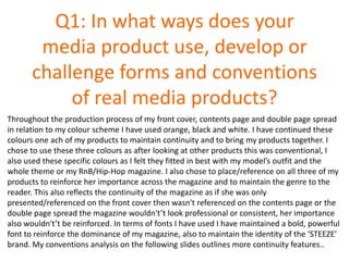
QUESTION 1
1. Q1: In what ways does your
media product use, develop or
challenge forms and conventions
of real media products?
Throughout the production process of my front cover, contents page and double page spread
in relation to my colour scheme I have used orange, black and white. I have continued these
colours one ach of my products to maintain continuity and to bring my products together. I
chose to use these three colours as after looking at other products this was conventional, I
also used these specific colours as I felt they fitted in best with my model’s outfit and the
whole theme or my RnB/Hip-Hop magazine. I also chose to place/reference on all three of my
products to reinforce her importance across the magazine and to maintain the genre to the
reader. This also reflects the continuity of the magazine as if she was only
presented/referenced on the front cover then wasn't referenced on the contents page or the
double page spread the magazine wouldn't’t look professional or consistent, her importance
also wouldn't’t be reinforced. In terms of fonts I have used I have maintained a bold, powerful
font to reinforce the dominance of my magazine, also to maintain the identity of the ‘STEEZE’
brand. My conventions analysis on the following slides outlines more continuity features..
2. I have placed the masthead right across the top
of the
Page to emphasize the importance of the brand
and make the reader well aware of the brand- as
it stands out dominantly. I have also chosen to
put the text in black as it stands out in contrast
to the white background, this again was done to
increase the importance. The font is also a very
large bold text so it stands out to the audience. I
have also chosen to put my model in front of the
text as it follows the conventions of a music
magazine.
This was my chosen main image, I chose this
as I felt is was very conventional. Firstly in
relation to mise-en-scene the costume I
chose was a prom style dress with lots of
diamanté's on the front, therefore this
connotes that she is very wealthy, and a
fierce role model. Also the fact the dress is
pink/cream and jewels shows her feminine
side, which emphasizes the fact she is very
powerful star. Her hair in this is also pinned
back in an afro due to the fact I found that
this was very conventional within the
RnB/Hip-Hop sector of music magazines.
Additionally she is making direct eye contact
to the reader which makes the reader feel
included as the magazine look more
approachable and appealing to read. I also
went for a smoky, natural looking make-up
style with slightly red lips as during my
research I found that this was very common.
In terms of positioning on the page I placed
her very largely, overlapping the masthead
at the tip as I think this emphasizes her
dominance.
In relation to my sell lines I used a lot of inspiration from Vibe and XXL magazines, in terms of font as I used
impact to make the text look dominant. I specifically used these artists to make the reader want to read on and
I also make use of effective adjectives when describing the article for example ‘Eye Candy’ make the articles
look un-missable which emphasizes STEEZE’s dominance within the market. These also draw my target
audience in as this makes them feel privileged to be reading the magazine. I placed them here as these are the
most conventional places to feature sell lines on the front cover of a magazine.
I have placed a plug here to
advertise another article within
the magazine. I decided to do it
in the style of a plug because this
is very conventional on music
magazines, especially in the style
of a circle. The reason I have
used a plug is to make this article
stand out from the rest of the
selling lines, as it appeals to the
audience as they can feel part of
the magazine. I think the plug
works with my magazine as it
separates the sell lines up.
In terms of my anchorage text I place my
main models name to the left hand side
of her, as I did not want to decrease the
Dominance of her by placing the text
over her. The font that I used is big and
bold which is also very similar to the
masthead which reflects that she is a
main part of the magazine. I purposely
used both text colours to increase her
dominance further.
Here I have used a skyline which I have placed at the top of the magazine, as it follows the conventions of
music magazines. My skyline consists or a article which will be featured in the magazine, it also relates to the
genre as RnB/Hip-hop stars like to spend a lot of money on clothes- it also relates to my model ‘30k dress’ as I
have tried to style my model in an expensive way.
3. I have used this images in terms of mise-
en-scene because the models outfit
follows all typical conventions of an RnB
dress code, this therefore reflects the
genre of my magazine and makes my
magazine look professional and reliable as
if she was wearing a really outdated outfit
no audience would be attracted to my
magazine. In terms of colours she is
wearing, they go with the colours scheme
of my magazine, as they are simple
colours, and they also demonstrate the
RnB genre.
Firstly I have shown continuity by the use
of colours as I have used the continuous
colours of orange, white and black on my
front cover, contents page and double
page spread. On here although I have used
each colour I have tried to separate them
so my page doesn't’t look to dominated by
one colour and so my contents page looks
conventional.
I have placed the contents title large at the top of the page as its very conventional to do this
and is therefore what the audience expect. I also took inspiration from Vibe magazine when
making this style of masthead.
When categorizing my features I
needed to look closely into where to
put my features, after researching into
many other brands in relation to their
contents pages I decided to make one
column with 5 main features that will
be featured in the magazine. I decided
to this as not only does this look
conventional and professional of the
magazine but it also makes the reader
feel included.
I decided to place the STEEZE logo at
the bottom of the page to maintain the
identity of the magazine and to
reinforce the importance of the brand.
I placed the website here as it gives the
reader other alternatives in terms of
STEEZE’s products. I also placed the
edition number of the magazine which
demonstrates the conventions of
existing magazines. I also added a scan
code which demonstrates other media
products given the audience a choice of
whether the want to access the
magazine on their phone/tablet.
The secondary image I used was a picture of a
group ‘odd future’ in which the magazine gives
a chance to enter a competition to see them. I
used this specific image as it shows the artist
performing on stage in concert which relates to
what the winner would be going to see. When
placing a secondary image I doubled it up and
placed an image on top of on image I did this as
its very conventional.
In terms of my features, I have used
relatively small text however with the
main selling line in the feature I have
printed the header slightly larger, in bold. I
have done This as It stands out more and
make’s people want to read the
magazine, additionally i have also placed
the page number in a different colour to
make the number easily recognisable so
the reader knows exactly where to find
different articles. In terms of conventions
this is very conventional as many other
magazines have their lay-out similar to this
one which is why i used this inspiration to
create a realistic looking contents page for
my magazine brand.
4. In relation to my main image, I chose this specific image as they are very
conventional with music magazine which I have learned from my research.
The fact my model is taking up a lot of the page increases her dominance.
In terms of mise-en-scene I have chose the same costume to show
continuity, the dress demonstrates wealth and power. Also in this image
the model has a different hairstyle indicating that superstars like to
change their hair a lot.
Here I used a drop capital as this very
conventional and its seen on nearly all
magazines which makes my magazine
look very professional.
When making a banner
across the top of the page I
decided to use the STEEZE
logo font that is presented on
the masthead of my front
cover to show continuity and
too reinforce the brad of my
magazine- establishing
importance. This also gives
the audience recognition of
my magazine, additionally
this font looks very bold and
dominant in comparison to
the rest of the text which
increases importance.
On my headline I took
inspiration from other
magazines. I tried to keep my
masthead tidy as I wanted my
magazine to be represented
in a sophisticated way. In
terms of my colour scheme I
used 2 of my main colours to
shown continuity.
Here I chose to use the
official Apple iTunes logo to
demonstrate that my model
is professional as she is big
enough to be on iTunes, the
logo is also very recognisable
with a large audience which
draws people in. Additionally
these types of logos are very
conventional and therefore
make my magazine look very
up to date and conventional.
In relation to the layout of my text I have chosen to place my text in
columns as this is a key conventional feature in regards to double page
spreads. At first on my first draft I had a different layout, but after looking
at magazines and peer feedback I realised I needed to change it to
columns. I chose specifically to have two dominant columns as this very
conventional and I thought it looked more effective, I also did the replies
in orange so the text is easy to identify. I also don’t have much text so this
was another reason I opted for two columns. In relation to the colours I
kept the same two main colours of orange and black to maintain the
reinforce the colour scheme and to present continuity.
I have placed a pull quote
to draw the reader into the
text and to give a subtle
hint of the topic in the
article. I placed this text in
a larger, bolder, font to
make it stand out to the
audience.
5. Challenging conventions with inspiration from existing products…
I really like the style of this barcode as I thought it was unique to other barcodes as
this was personalized the the actual VIBE brand. I decided to take this inspiration and
recreate my own using my own brand. I think this was successful as it make my final
front cover look a lot more conventional. However in the process of making mine I
wanted to make it individual to my own brand so I slightly changed the positioning and
added my own colour scheme, brand name and my own detail in relation to date and
price.
My Barcode: Vibe Barcode:
Date
Price
Barcode
Website
Text
Price
Barcode
Website
Text
6. This shows my features taken from my front cover in comparison to other music magazines which
are taken from the RnB genre. I chose to use the font ‘Century gothic’ as this looks very
conventional as it is used on many other magazines in relation to features. Narrow columns are
also used, which is why I have don’t my features in this format. I also placed them in the blank
spaces which is also very common and conventional when contrasting with other existing
products such as these. The features also usually have at least one/two colours within the set
colour scheme like I have used.
Challenging conventions with inspiration from existing products…
My Magazine: VIBE Magazine: XXL Magazine:
7. I created a plug to put on my front cover as I found that they were very conventional
on front covers when looking at other products. I took inspiration mainly from XXL
magazine which is within the RnB genre. When creating mine I also used 2 of my main
colours, I also used the STEEZE logo reinforce the magazine brand.
Challenging conventions with inspiration from existing products…
My Magazine: XXL Magazine:
8. Here are a list of skylines taken from other music magazines in comparison to the one
I created. These are very conventional when advertising the artists/ features featured
within the magazine. In my first drafts I had the text in red however I decided to
change it to orange to fit to my colour scheme.
Challenging conventions with inspiration from existing products…
My Magazine:
VIBE Magazine:
Flavor Magazine:
9. In terms of the masthead on my contents page I really liked the style of the Vibe contents
page, this one specifically. Whilst creating my contents page masthead I changed the font to the
font similar to the one used on my front cover to show continuity, plus it looked a lot more
conventional in relation to my RnB genre. Additionally I placed the issue number to show
continuity and also because this is a very conventional feature.
Challenging conventions with inspiration from existing products…
My Magazine: VIBE Magazine:
10. Challenging conventions with inspiration from existing products…
Feature lists are vital
when crafting a
contents page. It is
very conventional to
present them in a
column style which is
why I followed
conventions. I really
liked this style of XXL
and VIBE magazine. I
decided to include the
header ‘COVER STORY’
in which I took
influence from XXL, I
did this because it is
very conventional and
it directs the audience
to the page.
My Magazine: VIBE Magazine: XXL Magazine:
11. In terms of a footer for my contents page, after researching I found that it is very conventional to
include not only page numbers, but some form of recognition of the brand, and the date. I took
inspiration from this and used the steeze logo that I had already used previously used on my front
cover to reinforce the brand. I also added a black box at the bottom of my contents page which is
very conventional as it separate the features from the small print at the bottom of the page.
Challenging conventions with inspiration from existing products…
My Magazine:
XXL Magazine:
12. Drop caps are an essential when making a magazine look conventional which is why I used one.
They are one of the most conventional elements in relation to all magazine, not just music
magazine so I had to include one to maintain that professional look. I chose to have my drop
capital as a large, bold, orange Arial font to draw the reader into the text and to keep the theme
of bold dominate text as seen previous in my magazine.
Challenging conventions with inspiration from existing products…
My Magazine: XXL Magazine: Rolling Stones Magazine: