
Recomendados
Más contenido relacionado
Similar a Planning: contents page drafts
Similar a Planning: contents page drafts (20)
Más de amyrobb7
Más de amyrobb7 (20)
Último
Último (20)
Planning: contents page drafts
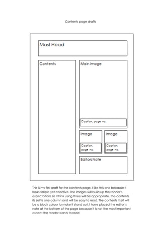
- 1. Contents page drafts <br />5048252603500<br />5143504837430This is my first draft for the contents page. I like this one because it looks simple yet effective. The images will build up the reader’s expectations so I think using three will be appropriate. The contents its self is one column and will be easy to read. The contents itself will be a block colour to make it stand out. I have placed the editor’s note at the bottom of the page because it is not the most important aspect the reader wants to read0This is my first draft for the contents page. I like this one because it looks simple yet effective. The images will build up the reader’s expectations so I think using three will be appropriate. The contents its self is one column and will be easy to read. The contents itself will be a block colour to make it stand out. I have placed the editor’s note at the bottom of the page because it is not the most important aspect the reader wants to read<br />32385056197500<br />3238507734300I like this draft because the layout is different. I placed the contents itself across the page, this is not the typical way yet I think it looks good. It will be the first thing the reader notices as it is along the top. I used fewer images on this draft so it is not so distracting. Again I have placed the editors not at the bottom as readers do not necessarily read it.I like this draft because the layout is different. I placed the contents itself across the page, this is not the typical way yet I think it looks good. It will be the first thing the reader notices as it is along the top. I used fewer images on this draft so it is not so distracting. Again I have placed the editors not at the bottom as readers do not necessarily read it.<br />6604009779000<br />