
Recommended
More Related Content
What's hot
What's hot (18)
Viewers also liked
Viewers also liked (18)
Similar to Q magazine front cover analysis
Similar to Q magazine front cover analysis (20)
More from annabellehussey
More from annabellehussey (20)
Recently uploaded
Recently uploaded (20)
Q magazine front cover analysis
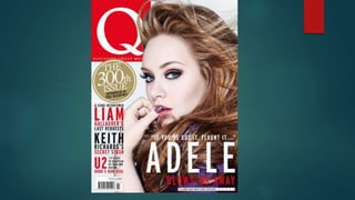
- 2. Main Image- The magazine uses the main image of the hugely successful singer/songwriter Adele to instantly grab the audiences attention. The mid shot of Adele uses direct address to create a relationship with the reader by allowing them to feel more connected to the magazine. Adele is positioned staring directly at the audience from the side, representing her as confident and outgoing as well as revealing her forthright personality. The image is also slightly provocative as she has her thumb pressed against her lips. This suggests that the magazine is directed towards the male gaze. However, the image would also appeal to women as they can look to Adele as an inspiration, feeling in awe of her talent and beauty. Her positioning could also be interpreted as a statement of power as the expression on her face is quite stern and confident and the positioning of her hand could also add a sense of challenge This would appeal to the reader, who would know about Adele and her ‘fierce’ personality. She is often seen as not caring about people’s views and her appearance. High key lighting is used to draw emphasis on her face, allowing the audience to see how immaculate she looks (make-up, skin, nail varnish and hair.). Adele’s skin tone is enhanced to look very pale, almost similar to the background colour which may signify purity which represents Adele’s clean and inspiring image to the reader. It could also relate to the 19th century idea where a pale skin tone signified beauty. The lighting also emphasises the contrast between her pale skin tone and dark eye make up. The dark purple eye make up can give connotations of power and mystery, this idea is then reinforced as she also wearing a purple top and purple nail varnish. Her hair is shown as being windswept which could also signify power and glamour which could be to convey the power behind her music. Her windswept hair also relates back to the subheading ‘Blows us away” suggesting that Adele’s talent and looks are mind-blowing.
- 3. The masthead of ‘Q’ Magazine is big and bold, taking up a lot of the page, more so than other magazine mastheads. Adele is positioned to right, where the readers eyes naturally fall, also making sure that she doesn’t cover the ‘Q’. The Q stands out as the white contrasts against the striking red box. The ‘Q’ is iconic to the magazine has a strong brand identity, that could easy be recognised by a wide audience. The colour red has connotations of power and energy whilst white is associated with purity and innocence. This could be to represent the diverseness of the magazine as it covers a wide range of artists. The use of ‘discover great music’ underneath the ‘Q’ implies that they’ll be new music that will inspire the audience. It also represents the magazine as being up to date with all the latest music. The image of Adele only slightly covers the masthead of the magazine which differentiated from other magazines like NME and Billboard who allow their artists to almost cover their masthead. This could be to show that the Q magazines ‘brand’ is as recognisable as their artists. The Plug- “The 300th issue” encourages the reader to buy the issue as it suggests that its of importance and that it will be an especially ‘special’ issue. The use of the colour gold and the circular shape connotes gold, wealth, royalty and success. This represents the magazine as being hugely successful so that the audience that buy it should feel privileged.
- 4. Cover lines- The cover lines inform and attract the audience of the other artists that will be featured within the magazine which can influence the new audiences decision as to whether they buy the magazine or not. However, generally regular readers will most likely always buy the magazine as they enjoy the genre/genres of music that the magazine focuses on. The magazine uses big names to attract the audience such as ‘Liam Gallagher, Keith Richards and U2’. These artists are all iconic and would be well known the audience. Each artist has a minor heading underneath which sounds exciting in order to attract the audience to want to know more. For example ‘Liam Gallagher’ is shown in a bold red with ‘Last requests’ in black underneath it. These two colours contrast against each other, drawing attention them and making the reader want to know more. Barcode- the bar code and price are both placed extremely small at the bottom of the page, which is a common convention music magazines. The price of the magazine is £3.99 which would be affordable for the target audience who would have the socio economic demographic grade A-C1. Headline- The headline ‘Adele’ in bold white capital letters relates to the main image by further emphasising to the reader that the main focus of this issue is Adele. The font is simplistic which could suggest the magazine focuses more on the music than the musician/ celebrity. It could also suggest that her voice alone is enough to draw attention, therefore fancy fonts are not needed.
- 5. Quote preview/ sell line- ‘if you’ve got it, flaunt it.’ This represents the confident and outgoing side of Adele which is portrayed in the main image. This would appeal to the female audience who would feel inspired by her attitude, they would want to read the magazine to find out how Adele ‘got it’. The quote relates to the main image where she is shown as flaunting what she has got. The sell lines seem to use a semantic field of exclusivity to entice the audience. For example ‘and all the best bits’ which implies an element of secrecy to the article which the audience will be able to find out by reading the magazine. Colour scheme and layout- The colour scheme is almost similar to Q’s usual house style except the gold ‘plug’ of the 300th issue. This shows it’s a special edition and an ‘un missable’ copy. It also could represent Adele as carrying power and grace, as the gold also connotes a regal theme. The number ‘300th’ is bigger than the other text, this is to emphasis the significance of the issue, persuading the audience to buy it. The layout is quite simple and not overcrowded, showing that Q Is a ‘mature’ traditional magazine that takes itself more seriously than other magazines aimed at younger audiences. Q is a mature magazine that focuses on successful artists rather than new, upcoming ones. This means the target audience are more likely to appreciate the Q’s artist choice and their consistent and professional layout.