
Recommended
More Related Content
What's hot
What's hot (20)
Viewers also liked
Similar to Flat plan
Similar to Flat plan (20)
Recently uploaded
Recently uploaded (20)
Flat plan
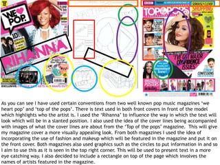
- 1. As you can see I have used certain conventions from two well known pop music magazines ‘we heart pop’ and ‘top of the pops’. There is text used in both front covers in front of the model which highlights who the artist is. I used the ‘Rihanna’ to influence the way in which the text will look which will be in a slanted position. I also used the idea of the cover lines being accompanied with images of what the cover lines are about from the ‘Top of the pops’ magazine. This will give my magazine cover a more visually appealing look. From both magazines I used the idea of incorporating the use of fashion and makeup which will be featured in the magazine and put it on the front cover. Both magazines also used graphics such as the circles to put information in and so I aim to use this as it is seen in the top right corner. This will be used to present text in a more eye catching way. I also decided to include a rectangle on top of the page which involves the names of artists featured in the magazine.
- 2. I used the idea of ‘inside the mag…’ from the ‘top of the pops’ magazine however I might change and rephrase it. I found that it gave a clear indication that it was a contents page and the readers will expect all of this inside the magazine. I decided to use the idea of using a main large imagine just as it is used in the ‘we heart pop’ magazine. This highlights the importance of this article as it could be something that featured. I then used the idea of the actual page numbers and articles names to be on the sides of the magazine just as it is shown in the ‘top of the pops’ magazine. I also really liked the idea of some of the article names being described with an image followed by text which is shown in the ‘we heart pop’ magazine and so I included this in my flat plan. I also included the masthead on the top of the magazine to show cohesion.
- 3. I decided to use a main big image of the artist on the right hand side of the artist and it will be a mid shot to show the whole body of the artist; what they’re wearing and the fact that she is playing a guitar. I then decided to put another image of the artist on the page next to it in the middle. This would be a smaller image related to the article. The text will be surrounding the image and I really liked the layout of this example as it shows clarity and it is organised well. I also decided to use a quote of the artist at the top of the page which will help engage the reader into reading the full article.