Usability Conversion Optimization for the Eye
•
274 recomendaciones•81,349 vistas

Can your web page pass the 5-second or 6-foot test? >> Are you properly leveraging color physiology to drive action? >> Are you measuring bounce rate correctly? ARE YOU SURE?? Better double check that with these powerful tricks and insights for marketing and design! Physiology can quickly trump persuasion. If your customer can't SEE it, conversion is obviously unlikely. Learn how to "optimize for the eye" with 3 quick usability tests, a color model (that converts like clockwork), and web analytics tracking code that will truly make you a HERO! >> Presented Oct 14, 2014 at Hero Conf Conversion Summit. #HeroConf >> SLIDESHARE OF THE DAY - Dec 3, 2014. Short link: http://j.mp/crofortheeye Article:

Recomendados
Más contenido relacionado
La actualidad más candente
La actualidad más candente (20)
Destacado
Destacado (20)
Similar a Usability Conversion Optimization for the Eye
Similar a Usability Conversion Optimization for the Eye (20)
Más de Angie Schottmuller
Más de Angie Schottmuller (14)
Último
Último (20)
Usability Conversion Optimization for the Eye
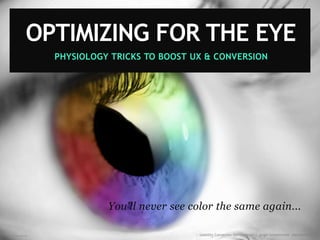
- 1. Image creditsiliconangle.com PHYSIOLOGY TRICKS TO BOOST UX & CONVERSION You'll never see color the same again... OPTIMIZING FOR THE EYE :: Usability Conversion Optimization | Angie Schottmuller @aschottmuller
- 2. :: Usability Conversion Optimization | Angie Schottmuller @aschottmuller Angie Schottmuller #HeroConf - Oct 14, 2014 Optimizing for the Eye: Mad Science & Illusion Keys to Conversion
- 3. ANGIE SCHOTTMULLER Growth Marketing Advisor @aschottmuller linkedin.com/in/angieschottmuller angie@interactiveartisan.com
- 4. #HeroConf #CRO @aschottmuller Tweet this session! :: Usability Conversion Optimization | Angie Schottmuller @aschottmuller
- 5. :: Usability Conversion Optimization | Angie Schottmuller @aschottmullerImage source: josreuser.wordpress.com
- 6. PEOPLE FORM FIRST IMPRESSIONS about other PEOPLE in 100 milliseconds That's 0.1 or 1/10th of a second. :: Usability Conversion Optimization | Angie Schottmuller @aschottmullerSource: Princeton University Research Study 2006, Reference: ConversionXL.com, Image source: reddit.com attractiveness, likeability, trustworthiness, competence, aggressiveness
- 7. PEOPLE FORM FIRST IMPRESSIONS about WEB PAGES in 17-50 milliseconds That's 1/59th - 1/20th of a second. :: Usability Conversion Optimization | Angie Schottmuller @aschottmullerReference: ConversionXL.com, Google Research 2012. Image source: cheapwebdesign.co.uk 2-6X FASTER
- 8. Image credit: michaelsamuels.com What the eye SEES and the ear HEARS, ...the mind BELIEVES. ~ Harry Houdini, Magician :: Usability Conversion Optimization | Angie Schottmuller @aschottmuller
- 9. "OPTIMIZING FOR THE EYE" TOP CHALLENGES: Time Consuming to Evaluate Suggestions Seen as Subjective Difficult to Measure Impact :: Usability Conversion Optimization | Angie Schottmuller @aschottmuller
- 10. "OPTIMIZING FOR THE EYE" GAME PLAN: Quickie Usability Tests Color Physiology & Strategy Analytics Tracking Recon :: Usability Conversion Optimization | Angie Schottmuller @aschottmuller
- 11. QUICK & EASY USABILITY TESTS :: Usability Conversion Optimization | Angie Schottmuller @aschottmuller
- 12. USABILITY HOW EASY IS IT TO USE? :: Usability Conversion Optimization | Angie Schottmuller @aschottmuller
- 13. What's wrong with this picture? A recycling bin at Austin-Bergstrom Airport.. Source: claydelk.com :: Usability Conversion Optimization | Angie Schottmuller @aschottmuller
- 14. Image credit: Bearhat Studios "BAD usability equals NO customers." ~Jakob Nielsen, 'Designing Web Usability' Author :: Usability Conversion Optimization | Angie Schottmuller @aschottmuller
- 15. Image source: HDW wallpapers IF USERS CAN'T FIND OR SEE IT... NOTHING ELSE MATTERS. (i.e. your persuasive content marketing plan is moot.) :: Usability Conversion Optimization | Angie Schottmuller @aschottmuller
- 16. 5-SECOND TEST A web page will be displayed for five seconds. See what you can remember. READY? :: Usability Conversion Optimization | Angie Schottmuller @aschottmuller SLIDESHARE USERS: Improvise by counting on your hand.
- 17. 5-SECOND USABILITY TEST Example: Byer's' LeafGuard :: Usability Conversion Optimization | Angie Schottmuller @aschottmuller
- 18. 5-SECOND TEST RESULTS WHAT DO YOU REMEMBER? Who is the company? What are they offering? Do they appear credible? (-1, 0, +1) What's the call-to-action? :: Usability Conversion Optimization | Angie Schottmuller @aschottmuller
- 19. IN 5-SECONDS A USER SHOULD KNOW... Example: midwest-dental.com WHAT ARE THEY OFFERING? WHO'S THE COMPANY? WHAT'S THE CALL-TO-ACTION? DO THEY APPEAR CREDIBLE? (-1, 0, +1) :: Usability Conversion Optimization | Angie Schottmuller @aschottmuller
- 20. ROUND 2 :: Usability Conversion Optimization | Angie Schottmuller @aschottmuller
- 21. 5-SECOND USABILITY TEST Example: midwest-dental.com :: Usability Conversion Optimization | Angie Schottmuller @aschottmuller
- 22. 5-SECOND TEST RESULTS WHAT DO YOU REMEMBER? Who is the company? What are they offering? Do they appear credible? (-1, 0, +1) What's the call-to-action? :: Usability Conversion Optimization | Angie Schottmuller @aschottmuller
- 23. IN 5-SECONDS A USER SHOULD KNOW... Example: midwest-dental.com WHAT ARE THEY OFFERING? WHO IS THE COMPANY? WHAT IS THE CALL-TO-ACTION? DO THEY APPEAR CREDIBLE? (SKETCHY / NEUTRAL / LEGIT) :: Usability Conversion Optimization | Angie Schottmuller @aschottmuller
- 24. Optimize so the user's response quickly and confidently yields the accurate desired info. :: Usability Conversion Optimization | Angie Schottmuller @aschottmuller
- 25. 6-FOOT TEST View the page on your screen standing 6-feet back. (Hold your mobile at arms length for similar effect.) READY? Image credit: immediateentourage.com ------ 6 feet ----- :: Usability Conversion Optimization | Angie Schottmuller @aschottmuller
- 26. Example: championwindow.com :: Usability Conversion Optimization | Angie Schottmuller @aschottmuller
- 27. WHAT IS THE MOST OBVIOUS ELEMENT ON THE PAGE? 6-FOOT USABILITY TEST (MOCK-UP) Example: championwindow.com WHAT ARE THEY OFFERING? WHAT IS THE PAGE ABOUT? WHO IS THE COMPANY? IS THE LOGO IDENTIFIABLE? GOAL: 1- Call-to-Action Button 2- Hero Shot Image/Video 3- Headline :: Usability Conversion Optimization | Angie Schottmuller @aschottmuller
- 28. 'USER IS DRUNK' TEST Ask an intoxicated person to perform a webpage task. Then watch and document results for deeper analysis ...and insightful entertainment! Cheers to the UX geniuses at Squareweave for the idea! Usability Test Credit to Squareweave: ▶ The User is Drunk - YouTube http://j.mp/1i2tpnV :: Usability Conversion Optimization | Angie Schottmuller @aschottmuller
- 29. "USER IS DRUNK" USABILITY TEST Example: bigcommerce.com. Usability Test Credit to Squareweave: ▶ The User is Drunk ARE ALL DISTRACTIONS REMOVED? DOES PAGE FUNCTION MAKE SENSE IF BLURRY? IS THE CTA REPEATED? ARE THERE SIMPLE, VERY SPECIFIC GUIDED DIRECTIONS? :: Usability Conversion Optimization | Angie Schottmuller @aschottmuller VIRTUAL REALITY EXPERIENCE: Squint your eyes and move your head back and forth.
- 30. COLOR PHYSIOLOGY "The Clockwork Conversion Color Model" :: Usability Conversion Optimization | Angie Schottmuller @aschottmuller
- 31. What's the Call to Action? :: Usability Conversion Optimization | Angie Schottmuller @aschottmuller
- 32. Example site: Sephora.com :: Usability Conversion Optimization | Angie Schottmuller @aschottmuller
- 33. Example site: hellobar.com :: Usability Conversion Optimization | Angie Schottmuller @aschottmuller
- 34. WHAT'S THE CALL-TO-ACTION? :: Usability Conversion Optimization | Angie Schottmuller @aschottmullerExample site: WilliamSonoma.com 3/10/14
- 35. Example site: Velti :: Usability Conversion Optimization | Angie Schottmuller @aschottmuller
- 36. The CALL TO ACTION should be the FIRST THING TO STAND OUT on any piece of marketing. :: Usability Conversion Optimization | Angie Schottmuller @aschottmuller CLICK if you AGREE ALTERNATIVE: "I like wasting time scanning a page to find my logical next step."
- 37. :: Usability Conversion Optimization | Angie Schottmuller @aschottmuller FORGET THIS STUFF FOR A FEW MINUTES
- 38. COLOR PERCEPTION Image source: dot-color.com :: Usability Conversion Optimization | Angie Schottmuller @aschottmuller PHYSICAL Existence PSYCHOLOGICAL Meaning PHYSIOLOGICAL Detection
- 39. COLOR PERCEPTION Image source: dot-color.com :: Usability Conversion Optimization | Angie Schottmuller @aschottmuller PHYSICAL Existence PSYCHOLOGICAL Meaning PHYSIOLOGICAL Detection
- 40. :: Usability Conversion Optimization | Angie Schottmuller @aschottmullerImage credit: iStockphoto/Erik Reis
- 41. Reference: wikipedia.org/wiki/Optical_illusion :: Usability Conversion Optimization | Angie Schottmuller @aschottmuller DIRECTIONS: Stare steadfast at the black "x" for 10 seconds. (Avoid blinking or side to side motion.) What colors do you see? FUCHSIA DOT COLOR ILLUSION
- 42. ANYONE SEEING SPOTS? Image credit: hdwallpapers.cat/ :: Usability Conversion Optimization | Angie Schottmuller @aschottmuller
- 43. If performed as described, a subtle halo of LIME dots should echo the MAGENTA dots on the page. :: Usability Conversion Optimization | Angie Schottmuller @aschottmuller
- 44. DOMINANT COLOR EYE EXHAUSTION = COMPLEMENTARY COLOR HALO Magenta and Lime are complementary (opposite) colors. :: Usability Conversion Optimization | Angie Schottmuller @aschottmuller
- 45. How 'bout another color? (Better see that again. Maybe it's a fluke.) :: Usability Conversion Optimization | Angie Schottmuller @aschottmuller
- 46. Reference: wikipedia.org/wiki/Optical_illusion :: Usability Conversion Optimization | Angie Schottmuller @aschottmuller DIRECTIONS: Stare steadfast at the black "x" for 10 seconds. (Avoid blinking or side to side motion.) What colors do you see? BLUE DOT COLOR ILLUSION
- 47. If performed as described, a subtle halo of ORANGE-YELLOW dots should echo the BLUE dots on the page. :: Usability Conversion Optimization | Angie Schottmuller @aschottmuller
- 48. Blue and Orange are complementary (opposite) colors. DOMINANT COLOR EYE EXHAUSTION = COMPLEMENTARY COLOR HALO :: Usability Conversion Optimization | Angie Schottmuller @aschottmuller
- 49. Image source: drtylndry.com :: Usability Conversion Optimization | Angie Schottmuller @aschottmuller "I can see your halo, halo, halo..." ~ Beyonce
- 50. Reference: wikipedia.org/wiki/Optical_illusion :: Usability Conversion Optimization | Angie Schottmuller @aschottmuller DIRECTIONS: Stare steadfast at the black "x" for 10 seconds. (Avoid blinking or side to side motion.) What happens? AQUA DOT COLOR ILLUSION
- 51. If performed as described, some of the BLUE dots should faintly DISAPPEAR. :: Usability Conversion Optimization | Angie Schottmuller @aschottmuller
- 52. Disappearing Text Isn't Magic! :: Usability Conversion Optimization | Angie Schottmuller @aschottmuller Low contrast, pure color exhausts the eye causing colors to disappear. COLOR FAIL
- 53. Image: Rainbow Bonita :: Usability Conversion Optimization | Angie Schottmuller @aschottmuller Mmmm hmmm. Those crazy ponies are dangerous!
- 54. Image source: hetras.wordpress.com HERE'S YOUR COMPLEMENTARY COLOR KEY TO CONVERSION... :: Usability Conversion Optimization | Angie Schottmuller @aschottmuller
- 55. That's COMPLEMENTARY with an "e" ...as in opposite. Although technically this is complimentary (free) as well. :: Usability Conversion Optimization | Angie Schottmuller @aschottmuller
- 56. :: Usability Conversion Optimization | Angie Schottmuller @aschottmuller HUMAN EYE RECEPTORS
- 57. Choose Your Color Wheel Wisely :: Usability Conversion Optimization | Angie Schottmuller @aschottmuller
- 58. Two Common Color Wheels Image source: brandigirlblog.com :: Usability Conversion Optimization | Angie Schottmuller @aschottmuller RGB (CMYK) R GB RYB R YB
- 59. OPTIMIZE FOR THE EYE Image source: brandigirlblog.com :: Usability Conversion Optimization | Angie Schottmuller @aschottmuller RGB (CMYK) RYB
- 60. THE HUMAN EYE JUMPS 3X A SECOND TO CAPTURE NEW VISUAL INFO. :: Usability Conversion Optimization | Angie Schottmuller @aschottmullerResearch Study by New York University, Jan 2011, Source: sciencedaily.com. Image source: clker.com.
- 61. The eye WANTS to find that complementary color. :: Usability Conversion Optimization | Angie Schottmuller @aschottmuller
- 62. The eye WANTS to find that complementary color. :: Usability Conversion Optimization | Angie Schottmuller @aschottmuller NEEDS ^
- 63. LEAD IT TO YOUR CTA. :: Usability Conversion Optimization | Angie Schottmuller @aschottmullerImage source: ingenexdigital.com/
- 64. Color Physiology THE CL O CKWO RK CO N VERSIO N CO L O R MO DEL Reference: "Clockwork Conversion Color Model" by Angie Schottmuller © 2012 :: Usability Conversion Optimization | Angie Schottmuller @aschottmuller
- 65. USE A COMPLEMENTARY COLOR CTA BUTTON CLOCKWORK CONVERSION COLOR MODEL - KEY #1 :: Usability Conversion Optimization | Angie Schottmuller @aschottmuller 12 6 9 3 4 57 8 10 11 1 2 MAIN COLOR CTA COLOR Main and CTA color hues should be about 180’ apart on an HSB color palette.
- 66. :: Usability Conversion Optimization | Angie Schottmuller @aschottmullerReference: "Clockwork Conversion Color Model" by Angie Schottmuller © 2012, Example: Eyequant.com 3/10/14. Use Complementary Color CTA Button CLOCKWORK CONVERSION COLOR MODEL - KEY #1 Opposite color for CTA COLOR WIN
- 67. :: Usability Conversion Optimization | Angie Schottmuller @aschottmullerReference: "Clockwork Conversion Color Model" by Angie Schottmuller © 2012, Example : LaunchList Pro Use Complementary Color CTA Button CLOCKWORK CONVERSION COLOR MODEL - KEY #1 Analogous CTA color COLOR FAIL
- 68. :: Usability Conversion Optimization | Angie Schottmuller @aschottmullerReference: "Clockwork Conversion Color Model" by Angie Schottmuller © 2012, Example: FreshDesk.com Use Complementary Color CTA Button CLOCKWORK CONVERSION COLOR MODEL - KEY #1 Same color for CTA COLOR FAIL
- 69. RESERVE COMPLEMENTARY COLOR ZONE FOR CTA ONLY CLOCKWORK CONVERSION COLOR MODEL - KEY #2 :: Usability Conversion Optimization | Angie Schottmuller @aschottmuller Reserve analogous hues within 45’ (HSB) of the CTA color to ensure the eye lands on the CTA. 12 6 9 3 4 57 8 10 11 1 2 CTA COLOR ZONE
- 70. :: Usability Conversion Optimization | Angie Schottmuller @aschottmullerReference: "Clockwork Conversion Color Model" by Angie Schottmuller © 2012, Example: HelloBar.com 5/1/13. Reserve Complementary Color Zone for CTA ONLY CLOCKWORK CONVERSION COLOR MODEL - KEY #2 Salmon (orange TONE) CTA color repeated on page COLOR FAIL
- 71. USE PURE COLOR FOR THE CTA BUTTON CLOCKWORK CONVERSION COLOR MODEL - KEY #3 :: Usability Conversion Optimization | Angie Schottmuller @aschottmuller PURE HUE SHADE (+ BLACK) TONE (+ GRAY) TINT (+ WHITE) PURE COLOR SOLID BUTTON PURE COLOR GRADIENT BUTTON Pure color HSB saturation and brightness values are >= 85% CTA LINK TEXT (Complementary Shade)
- 72. Reference: "Clockwork Conversion Color Model" by Angie Schottmuller © 2012, Example: Kuno Creative Use Pure Color for the CTA Button CLOCKWORK CONVERSION COLOR MODEL - KEY #3 Tan (Tint) CTA color :: Usability Conversion Optimization | Angie Schottmuller @aschottmuller COLOR FAIL
- 73. Brown (orange SHADE) CTA color :: Usability Conversion Optimization | Angie Schottmuller @aschottmullerReference: "Clockwork Conversion Color Model" by Angie Schottmuller © 2012, Example: ClubDivot.com Use Pure Color for the CTA Button CLOCKWORK CONVERSION COLOR MODEL - KEY #3 COLOR FAIL
- 74. USE SHADES, TONES & TINTS FOR NON-CTA COLORS CLOCKWORK CONVERSION COLOR MODEL - KEY #4 :: Usability Conversion Optimization | Angie Schottmuller @aschottmuller PURE SHADE (+ BLACK) TONE (+ GRAY) TINT (+ WHITE) 12 6 9 3 4 57 8 10 11 1 2 NO PURE OR CTA ZONE COLORS MAIN COLOR Neutralized color HSB saturation and brightness values are < 85%
- 75. :: Usability Conversion Optimization | Angie Schottmuller @aschottmullerReference: "Clockwork Conversion Color Model" by Angie Schottmuller © 2012, Example: Champion Window Use Shades, Tones & Tints For Non-CTA Colors CLOCKWORK CONVERSION COLOR MODEL - KEY #4 Triad of primary PURE colors... (major neutralization needed) COLOR FAIL
- 76. Let the CTA and Hero Shot stand out. All else is the stage. :: Usability Conversion Optimization | Angie Schottmuller @aschottmuller
- 77. CLOCKWORK CONVERSION COLOR TEST :: Usability Conversion Optimization | Angie Schottmuller @aschottmuller ✔ Is CTA color complementary to the main color? Are non-CTA colors neutralized as shades, tones or tints? < 85% HSB saturation and brightness levels Does the CTA button use pure color? 85%+ HSB saturation and brightness levels Is CTA color "zone” only used for the CTA? A four-point color optimization assessment for usability and call-to-action (CTA) clarity. TINT TONE SHADE PURE ✔ ✔✔
- 78. Let's see if you were paying attention... :: Usability Conversion Optimization | Angie Schottmuller @aschottmuller
- 79. WHICH RULE IS BROKEN? :: Usability Conversion Optimization | Angie Schottmuller @aschottmuller COMPLEMENTARY: ___RESERVED: PURE COLOR: OTHER COLORS NOT PURE:___ ___ ___ Reference: "Clockwork Conversion Color Model" by Angie Schottmuller © 2012. Example: H.Bloom
- 80. It works for all hues of the color wheel... :: Usability Conversion Optimization | Angie Schottmuller @aschottmuller
- 81. CLOCKWORK CONVERSION COLOR MODEL - CTA AUDIT SCORECARD COMPLEMENTARY: :: Usability Conversion Optimization | Angie Schottmuller @aschottmullerReference: "Clockwork Conversion Color Model" by Angie Schottmuller © 2012. Example: H.Bloom RESERVED: PURE COLOR: OTHER COLORS NOT PURE: A
- 82. CLOCKWORK CONVERSION COLOR MODEL - CTA AUDIT SCORECARD COMPLEMENTARY: :: Usability Conversion Optimization | Angie Schottmuller @aschottmullerReference: "Clockwork Conversion Color Model" by Angie Schottmuller © 2012. Example: ClickTale RESERVED: PURE COLOR: OTHER COLORS NOT PURE: B+
- 83. CLOCKWORK CONVERSION COLOR MODEL - CTA AUDIT SCORECARD COMPLEMENTARY: :: Usability Conversion Optimization | Angie Schottmuller @aschottmullerReference: "Clockwork Conversion Color Model" by Angie Schottmuller © 2012. Example: SalesForce RESERVED: PURE COLOR: OTHER COLORS NOT PURE: A
- 84. CLOCKWORK CONVERSION COLOR MODEL - CTA AUDIT SCORECARD COMPLEMENTARY: :: Usability Conversion Optimization | Angie Schottmuller @aschottmullerReference: "Clockwork Conversion Color Model" by Angie Schottmuller © 2012. Example: Falcon Social RESERVED: PURE COLOR: OTHER COLORS NOT PURE: A+
- 85. CLOCKWORK CONVERSION COLOR MODEL - CTA AUDIT SCORECARD COMPLEMENTARY: :: Usability Conversion Optimization | Angie Schottmuller @aschottmullerReference: "Clockwork Conversion Color Model" by Angie Schottmuller © 2012. Example: UW-Eau Claire RESERVED: PURE COLOR: OTHER COLORS NOT PURE: B+
- 86. CLOCKWORK CONVERSION COLOR TEST :: Usability Conversion Optimization | Angie Schottmuller @aschottmuller ✔ Is CTA color complementary to the main color? Are non-CTA colors neutralized as shades, tones or tints? < 85% HSB saturation and brightness levels Does the CTA button use pure color? 85%+ HSB saturation and brightness levels Is CTA color "zone” only used for the CTA? A four-point color optimization assessment for usability and call-to-action (CTA) clarity. TINT TONE SHADE PURE ✔ ✔✔
- 87. ANALYTICS TRACKING RECON FOR UX & CRO :: Usability Conversion Optimization | Angie Schottmuller @aschottmuller
- 88. Google Analytics Event Tracking: • Viewed 5+ Seconds • Viewed 15+ Seconds • Scroll Beyond Fold • Scroll to Page Bottom • Jump-To CTA Links GOT DATA? :: Usability Conversion Optimization | Angie Schottmuller @aschottmuller MUST HAVE Here's the code: http://bit.ly/gaeventtrackingforcro
- 89. MEASURE "BOUNCE" CORRECTLY :: Usability Conversion Optimization | Angie Schottmuller @aschottmuller
- 90. "BOUNCE RATE" (ORIGINAL) PRIOR TO JULY 2012 GOOGLE ANALYTICS: User enters and exits the same page. :: Usability Conversion Optimization | Angie Schottmuller @aschottmuller JULY 2012 11
- 91. "ADJUSTED BOUNCE RATE" (ABR) AS OF JULY 2012 GOOGLE ANALYTICS: User enters and exits the same page WITH NO INTERACTION. :: Usability Conversion Optimization | Angie Schottmuller @aschottmullerReference: Justin Cutroni - http://cutroni.com/blog/2012/07/27/rethinking-blog-metrics/ JULY 2012 12
- 92. A LOGGED EVENT QUALIFIES AS AN "INTERACTION". i.e. Logging an event at a 5-second view time (or whatever "first impression" time makes sense for your audience) results in Google Analytics NOT counting the visit as a bounce. :: Usability Conversion Optimization | Angie Schottmuller @aschottmuller
- 93. "Why didn't somebody tell me??" :: Usability Conversion Optimization | Angie Schottmuller @aschottmuller
- 94. :: Usability Conversion Optimization | Angie Schottmuller @aschottmuller WATCH YOUR BOUNCE RATE PLUMMET... BEFORE ABR: 70%-90% AFTER ABR: 5%-20%
- 95. Now... BOUNCE RATE matters :: Usability Conversion Optimization | Angie Schottmuller @aschottmuller
- 96. Now... BOUNCE RATE matters BIG TIME Message Match Relevance Page Load Time Intent Clarity Usability ROAS Note: Like conversion rate, bounce rate is page-specific. A roll-up aggregate metric means nothing. :: Usability Conversion Optimization | Angie Schottmuller @aschottmuller
- 97. GA EVENT TRACKING FOR CRO: :: Usability Conversion Optimization | Angie Schottmuller @aschottmuller Here's the code. Just add it to your page! INCLUDES: • Adjusted Bounce Rate • Scrolling (beyond fold, page bottom) • Dynamic Click Tracking tabs, jump-to buttons/links, file downloads, click-to-call ph# [tel:], email [mailto:] , and external domain links http://bit.ly/gaeventtrackingforcro
- 98. MAD SCIENCE WRAP-UP :: Usability Conversion Optimization | Angie Schottmuller @aschottmuller
- 99. "OPTIMIZING FOR THE EYE" RECAP: Quickie Usability Tests 5-Second, 6-Foot, "User is Drunk" Tests "Clockwork Conversion Color Model" Physiology & Strategy Quick wins and mega testing ideas (and insights) Analytics Tracking Recon Free GA code: http://bit.ly/gaeventtrackingforux :: Usability Conversion Optimization | Angie Schottmuller @aschottmuller
- 100. KEY TAKEAWAY: Your persuasive content and design psychology is futile if the user's eye can't detect it. Use the Force ...of color physiology (and magical rainbow ponies when necessary.) :: Usability Conversion Optimization | Angie Schottmuller @aschottmuller
- 101. QUESTIONS? :: Usability Conversion Optimization | Angie Schottmuller @aschottmuller
- 102. Get Your Optimization Scorecard ...or contact me for FREE consultation Angie Schottmuller | angie@interactiveartisan.com | @aschottmuller STUNNED BY COLOR PHYSIOLOGY? Put the clockwork conversion color model to work! Image source: opt-imaging.com
Notas del editor
- Image: http://siliconangle.com/blog/2013/09/11/why-the-new-iphone-5s-fingerprint-sensor-will-never-replace-passwords/eye/
- http://josreuser.wordpress.com/
- Image src: https://www.reddit.com/r/Cutouts Reference: First Impressions Matter: The Importance of Great Visual Design http://j.mp/1s7oy7S - ConversionXL, Nov 2012 Original Source: http://www.theguardian.com/science/2006/aug/23/usnews.internationalnews It takes only one tenth of a second for us to make up our minds about people. Princeton University, in the US, said. They found that people made judgements about the attractiveness, likeability, trustworthiness, competence and aggressiveness of other people after looking at their faces for 100 milliseconds.
- Image src: http://www.cheapwebdesign.co.uk/ Reference: First Impressions Matter: The Importance of Great Visual Design http://j.mp/1s7oy7S - ConversionXL, Nov 2012 Original Source: http://research.google.com/pubs/pub38315.html Source: Google Research 2012, International Journal of Human-Computer Studies, vol. 70(11)
- http://www.ict.de/en/services/usability_design.html
- http://claydelk.com/2011/10/user-unfriendly-labels-design-user-expectations/
- http://www.bearhatstudios.com/blog/design-quote-of-the-week-6/
- http://hdw.eweb4.com/out/854729.html
- http://www.immediateentourage.com/ie/wp-content/uploads/2010/12/
- https://www.youtube.com/watch?v=r2CbbBLVaPk#t=86 http://www.ayblog.com/australia-kangaroo-best-funny-drunk-pictures-collection/
- http://www.ufunk.net/en/design/psychology-of-color/ http://bluewave-pet-sitter-login.weebly.com/blog/color-psychology-marketing
- http://dot-color.com/2013/07/16/how-much-color-gamut-do-displays-really-need-part-2-how-we-perceive-color/
- http://dot-color.com/2013/07/16/how-much-color-gamut-do-displays-really-need-part-2-how-we-perceive-color/
- http://www.sciencedaily.com/releases/2011/01/110110103737.htm
- http://en.wikipedia.org/wiki/Optical_illusion
- http://hdwallpapers.cat/must_love_spots_dalmations_dogs_cute_hd-wallpaper-1136499/
- http://en.wikipedia.org/wiki/Optical_illusion
- http://www.drtylndry.com/beyonce-mrs-carter/
- http://en.wikipedia.org/wiki/Optical_illusion
- Image: http://hetras.wordpress.com/2013/02/15/is-your-future-hotel-key-already-in-your-pocket/
- http://www.brandigirlblog.com/2012/11/why-do-some-color-schemes-work-and-others-dont.html
- http://www.brandigirlblog.com/2012/11/why-do-some-color-schemes-work-and-others-dont.html
- Img: http://www.clker.com/clipart-eye-4.html Article: http://www.sciencedaily.com/releases/2011/01/110110103737.htm The study was conducted by researchers at University Paris Descartes, New York University's Department of Psychology, and Ludwig-Maximilian University in Munich
- http://ingenexdigital.com/create-tracking-url/
- http://pinterest.com/pin/114349278011328159/ Lemon landing page example with a reserved, complementary color for the call-to-action button.
- http://pinterest.com/pin/114349278011328159/ Lemon landing page example with a reserved, complementary color for the call-to-action button.
- http://pinterest.com/pin/114349278011328159/ Lemon landing page example with a reserved, complementary color for the call-to-action button.
- Only one complementary CTA color instance s/b visible on-screen at a time. (Remove or downplay others as needed.) Note: CTA color is NOT equal to site link color.
- *only one primary cTA per page. Only one complementary CTA color instance visible on-screen at a time.
- http://pinterest.com/pin/114349278011328159/ Lemon landing page example with a reserved, complementary color for the call-to-action button.
- http://pinterest.com/pin/114349278011328159/ Lemon landing page example with a reserved, complementary color for the call-to-action button.
- Jackie Chan
- http://www.linkedin.com/profile/view?id=36979992&trk=tab_pro Image credit: http://www.opt-imaging.com/