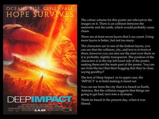
1. The colour scheme for this poster are relevant to the
images on it. There is an collision between the
meteorite and the earth, which would probably cause
chaos.
There are at least seven layers that I can count. Using
more layers is better, but not too many.
The characters are in one of the bottom layers, you
can see that the collision, city, and text is in front of
them, however you can also see the start over them so
it is probably slightly transparent. The position of the
characters is in the top left hand side of the poster,
making them not the main part of the poster. You can
see from the fact that their hugging that they’re close,
saying goodbye?
The text of Deep Impact in in upper case, the
‘IMPACT’ is in bold making it stand out.
You can see form the city that it is based on Earth,
America. But the collision suggests that things are
going to get bad, turn into a dystopia.
Think its based in the present day, when it was
filmed.
2. The colour scheme for this poster link in with the
theme, it’s very grey, and dull, and miserable.
There are at least five layers in this poster. There
aren’t as much as the previous poster, making it
more empty, this makes link is with the theme,
because everything is being destroyed, there’s
not much left.
The text ‘2012’ is the same kind of colour as the
background. This shows that it’s slightly hidden.
‘we were warned’ but we didn’t see it coming
because it was hidden, we were ignorant to the
fact that it was coming because we didn’t look for
it.
You can see form the city that it is based on
Earth, America. But the massive great trench that
the city is falling into suggests that is turning
into a dystopia, and the end of the world.
Its based in 2012.
3. The colour scheme for this poster is blue and
white this link in with the film, and that
everything in freezing .
There are at least five layers in this poster. You
can see from the poster that it is an apocalyptic
film at the statue of liberty is under ice. As the
statue of liberty represents freedom, this poster
insinuates that everything has gone wrong in the
world and people are fighting for their lives
You can see form the city that it is based on
Earth, America. But the fact that it is covered in
ice suggests that is turning into a dystopia, and
the end of the world.
4. The colour scheme for this poster is browns,
blacks, and grey’s it has quite a sombre mood to
it.
There are at least ten layers in this poster. This
makes it quite a bit more busier than the other
poster. The fact that there coming our of the
smoke indicates that they’re trying to keep out of
site, that they’re kept separate from others
The text ‘District 9’ has a sort of metallic look
about it, making it look technologically advanced
and futuristic. However this differs from the
background where it looks run down and
derelict. ‘You are not welcome here’ makes it
personal to the reader it shows that people aren’t
allowed in District 9.
Apart from the robotic aliens and space ship it
looks like present day Earth
5. The colour scheme for this poster is browns, red’s
and oranges, giving it a warmer feel than the
other posters. However form just looking at the
poster you wouldn’t think that it was a science
fiction. Probably more of a Action Film.
There are at least five layers in this poster. The
characters face takes up half of the picture. The
fact that we can’t see anything around her or
what she is aiming at creates some mystery.
Just from the poster you wouldn’t know what era
or location it is set in.
The text that says ‘The Hunger Games’ and ‘The
world will be watching’ suggests that it is a big
thing in their world/time, that it’s a very popular
game.
6. The colour scheme in this poster is blues,
grey’s and blacks. They represent a dark
element that is present in this film.
The tag line: “One man saw it coming”
this suggests that he tried to warn people
but everyone else was ignorant to the fact
that it was approaching.
The title is in a metallic grey, that links in
with the robots, and implies that it is
futuristic and they are technologically
advanced. The ‘I’ in ‘I, Robot’ is associated
with ipads, ipods, iphones etc.
You cannot tell from the poster where the
film is set. Although you can see over Will
Smith’s shoulder, the robots look like
they’re watching him. Waiting to take
over completely.
7. The colour scheme in this poster is black
and greys, which relates to the film, with
the all the high-tech alien technology.
The tag line ‘Back in Time’ gives a hint
about what the film is about.
The position of the characters show who
the main character is, and it shows that he
is in charge, however the fact that the men
stood behind them still look like they are
quite professional, it could show that they
are looking over him. The hash tag at the
bottom of the poster relates to twitter, this
gets people talking the film, and boosts
awareness.
There are only about four layers in this
poster, making it quite empty, however
because ‘Men in Black’ is such a well
known sci-fi film, it doesn’t need to be
filled with sci-fi related concepts.
Because the film is well known they don’t
have to write the name, just the MIB will
tell people what film it is.
8. The colour scheme in this poster is
browns, yellows and greys, this conveys a
desert-like theme, where everything is dry
and dying out, creating a dystopian
world. The fact that the Brooklyn bridge
behind his has been destroyed, and the
plant life is practically non-existent, and
the plants that are there seem to be dead
or dying.
The fact that Will Smith is carrying a gun
shows that earth has turned into quite a
dangerous place, it’s survival of the fittest,
and you have to fight to survive. The only
other life signs is the dog by his side,
suggesting that, he’s alone.
The tag line: ‘The last man on earth is not
alone’ makes it quite daunting, as this
suggests that there is something else out
there that isn’t human.
‘I am Legend’ has been written so the
emphasis is on the ‘legend’ this implies
that he is a prodigy, everyone else has
died out or mutated, yet he is still human,
creating the impression that he is
somewhat of a myth.
9. The colour scheme in this poster is blues
and blacks, this relates to the storyline of
the film, suggesting that there are dark
elements in it.
The tag line of “You’re mind is the scene
of the crime” this denotes the theme of
sci-fi as it has supernatural features,
logistically your mind cannot be a scene
of a crime.
The background layer of this poster play’s
tricks with your mind. As the road goes
up at a vertical angle, this relates to the
film, as it abnormal and eccentric.
The positioning of the characters shows
that they are working together as a team,
also, a few of the characters are holding
guns, this indicates that what they are
doing is dangerous, and that the film is
action packed.
As the whole poster is in blues, grey’s and
black’s, this makes the title of the film:
‘Inception’ stand out to the audience.
10. There are two lots of colour schemes in this
poster, relating to the two different genres: Sci-
fi, and Western. The blues, greys and blacks in
the top half of the poster link in with the
futuristic, technologically advanced theme of
Sci-fi. While the brown-red colour of the
bottom half of the poster links in with the
sandy, desert-like scape of the Western
themes. The iconography of westerns are
normally guns, horses etc. the wrist gun and
spaceship suggest that it has a double genre.
the woman's position and the fact that she is
handling a gun, gives the impressions that she
is ready to fight, this breaks away form the
stereotypical western female of always
needing to be saved.
The tagline “First contact. Last stand” suggests
that what they are facing dangerous
11. Conclusions:
Looking at all of the posters I have seen that most of them have some sort of
iconography that relates to this genre. For example spaceships, weapons,
destruction, supernatural happenings, dystopian worlds.
In most of the posters there are dark colour schemes, using, dark clues, blacks,
grey’s, and browns, the colours connate that there are dark elements in the film. The
only poster that has bright colours in it, is the poster for ‘The Day After Tomorrow’
For the posters that have characters in them, they are mostly standing in action
poses and mostly men.
Archetype – Heroes
Most of the posters are quite metallic and futuristic, apart from a few where they are
desolate and destroyed
In all the posters there is a light spot behind the main point in the image, illuminating
them. This draws the audiences attention to the main character or main theme in the
poster.
The posters all have a shot from the film, and you can relate it to the film.