
Recomendados
Más contenido relacionado
Destacado
Destacado (20)
Último
Último (20)
Layout analysis
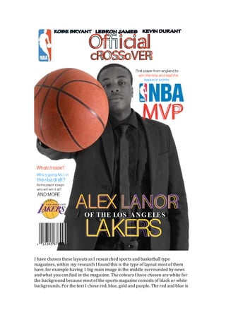
- 1. I have chosen these layouts as I researched sports and basketball type magazines, within my research I found this is the type of layout most of them have, for example having 1 big main image in the middle surrounded by news and what you can find in the magazine. The colours I have chosen are white for the background because most of the sports magazine consists of black or white backgrounds. For the text I chose red, blue, gold and purple. The red and blue is cROSSoVER Of icial First player from england to win themvp and lead the leaguein points. WhatsInside? Who isgoing No.1 in thenbadraft? Astheplayof sbegin who will win it all? AND MORE ALEX LANOR MVP KOB E B RYANT LEB RON J AMES KEVIN DURANT OF THE LOS ANGELES LAKERS
- 2. for the NBA as those are the logo colours however the gold and purple is for the team the model plays for, The Los Angeles Lakers. From the first page from the double spread you can see the background is black, which fits my black and white background theme. The text from the top of the
- 3. page is a sporty type font to fit the theme also. The large image in the middle of the page I think is important to the article, which is why I put it so large. This page consists of the article with an image and a quote at the bottom of the page, this layout is effective because most of the page is taken up by the article but I believe the layout suits the style of my magazine.