2. Catherine Heuston
Target Audience
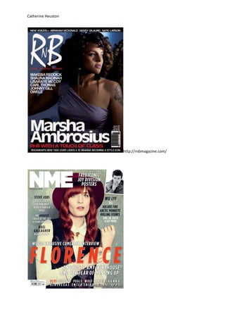
The target audience for RNB magazine are those who prefer the musical genre
of RNB including fans of the cover artist shown Marsha Ambrosius. There is no
gender specific for the magazine RNB and attracts both young girls and boys
who are interested in this particular genre, age ranging from 12-20.
In contrast to RNB magazine the target audience of NME are those who enjoy
alternative Indie style music and are largely addressed at male aggressive
audience in terms of what the music style is. The fact NMEs cover shows both
female and male images shows their target audience is also addressed at both
female and males. However it could be interpreted as indie music is a
masculine genre that they’ve addressed this by having a male on the cover as
well as a female so not to lose interest from male custom. The age range
addressed is also younger generations but it would also attract a mature
audience as well.(12-30) This can be inferred from the fact NME shows older
bands as well as current bands. In contrast RNB magazine only advertises
current music as Indie is an alternative genre its music stays current for longer.
Whereas RNB is a lot more technologically influenced and therefore is
produced on a quicker more frequent basis and the popularity of an artist
changes on a frequent basis in comparison to a band in NME magazine which
may appear on the cover a few times a year as Florence and the Machine has.
NME attract a wider age range because they reprint articles based on previous
artists that may no longer be as popular they named these specific magazines
as originals which began in 2002 widening their fan base.
House Style
In NME the title of the magazine always appears in the primary optical area,
the colour varies rarely but in the majority matches the headline. The cover
image is in the majority the only image on NME magazine covers, content is
always listed around the image and beneath the image. On a lot of the covers
they use a similar + sign to advertise what else is inside the magazine. Offers of
free posters are also normally available advertised on the cover. The price and
barcode of NME appear in either the left hand side dead corner or the terminal
area In Contrast RNB magazine has the price and barcode always in the
terminal area. More over NME keeps the information titles the same colour as
3. Catherine Heuston
the headline despite the actual colour of the title changing from red to pink to
white. In RNB magazine the covers featuring male artists in the majority
contain read titles, in contrast for female artists they stick to mild colours e.g.
yellow white, baby blue. In RNB magazine they always have an advertisement
before the contents page. RNB magazine also always has
MUSIC.LIFESTYLE.FASHION. Written underneath the title and usually advertises
how many pages are within the magazine in a bold way. In both magazines
they always have the main headline as the artist’s name written across the
image.
The Gutenberg design principle
NME complies with this theory in terms of featuring the title in the primary
optical area as RNB magazine does also. NME features the price in the dead
corner to draw attention away from the price and focus on the content of the
magazine instead.NME doesn’t actually have anything specific in the terminal
area in my chosen cover but normally they feature the price and the barcode
in this area as stated in the principle gravity naturally pulls our eyes from the
top left to the bottom right were the price is shown normally in both
magazines. In the NME cover they feature another photo in the strong fallow
area (right top) on this cover this will attract consumers as its not situated in
the weak fallow area and therefore may encourage a purchase by the
consumer. The image is featured across the axis of orientation and attracts the
consumer. The main title is also featured in this area which attracts the
consumer to the magazine. In RNB magazine they feature the main title
beginning in the weaker fallow area unusually although this makes the focus
on the image which may attract those interested in artists of RNB genre.
Image/images
In the RNB magazine the style of the costume choice on the cover connotes
the genre of RNB style clothing. It’s very dark nightclub style clothing. This will
appeal to the audience as it complies with the musical genre in terms of RNB
music being played in the majority in nightclubs as it’s more of a mainstream
dancing genre as opposed to NME style music which has more of a message
behind the music then the mainstream style. The dark lighting used in the
4. Catherine Heuston
background also connotes the setting of a nightclub and therefore complying
with the genre of RNB nightclub style music.
In contrast NME’s image uses quite old fashioned style costume for Florence.
This along with the bright red colouring complies with the indie alternative
style as she’s dressed in alternative clothing as opposed to mainstream RNB
style night club clothes, Florence wearing old fashioned casual wear.
Furthermore differentially RNB magazines cover image isn’t looking directly
into the shot whereas Florence is. However Florence appears more natural in
her expression connoting she’s the same as her fans as in natural. In contrast
the RNB image is posing although not directly looking into the camera the
posing nature of RNB artists connotes money, power etc whereas NME artists
are portrayed as more working class. Furthermore the fact NME uses 2 images
on its cover one male and one female implies the audience is both genders
equally. In contrast RNB magazines covers always portray images of one
gender or another not together. Therefore the gender of the audience of RNB
magazine varies. The NME image of the man smoking also being in black and
white connotes old fashioned style and the fact he’s smoking connotes
rebellion complying with the genre of indie and alternative music.
Masthead
Both mastheads similarly are acronyms NME (New Musical Express)(express
being an adjective adding description to the title making it more interesting)
connotes speed as if the magazine is the fastest to pick up news of musical
genre indie and alternative. RnB magazine is an acronym and written in sans
serif font therefore attracting consumers. The Masthead of RnB includes
MUSIC.LIFESTYLE.FASHION underneath the title therefore appealing to a
broader audience. Both mastheads are white making the titles clear and eye-
catching.
Lead Article/Model Credit/Cover lines
In contrast to NME Rnb’s lead article , model credit matches the colour of the
masthead which in turn makes it stand out as much as the title. NME on the
other hand has Florence’s name in bright orange lettering in a bold font
therefore making the model credit stand out and making it obvious the main
interview story is about Florence. In Contrast to NME RnB has the model credit
5. Catherine Heuston
“RnB with a touch of class” a slogan to pair with the lead article of the artist’s
name. It is written in red connoting the focus on sexual appearance focus of
the artist. NME chooses to show model credits of the article in a minimal way
and keeps this particular information in the same colour as the title therefore
maintaining that the lead article stands out. Moreover the cover lines shown
in RNB magazine are organised in a formal style below each other. In contrast
NME shows cover lines very scattered around the cover but pairs the male
image with the content of the cover lines advertising content of the magazine.
Similarly both magazines advertise new aspects of the magazine e.g. in RNB
(New voices) in NME (New Musical Express) .Moreover both advertise new
artists on the cover designed to attract the consumer who may not be
intrigued by the cover artists but in seeing another artist their a fan of
advertised in the cover lines may attract them to purchase. In contrast to RnB
NME highlights names of the bands and adjectives such as greatest in a black
font to highlight the artists and emphasis the magazines content in a positive
way. Similarly both font headlines are in a formal font. Differentially FLORENCE
is all in capitals whereas Marsha Ambrosius only has capitals for the first
letters.
In conclusion both magazines advertise their musical genre in similar and
different ways compared previously. They differ in terms of genre and
therefore style and representation of artists will be different to connote the
genre. However the layouts are very similar and the formal use of font and
acronyms is also the same as compared above. The magazine genres are aimed
at different social genres NME being category C-E and RnB similarly being
category C- E in terms of affordability . Magazines need to be different in
order to stand out to the consumer audience which is why they have some
similarities and some differences.