1. Within the text
there are two
main columns of
text which is
then split up
even future with
paragraphs
spacing, helping
to keep the
audience
interested.
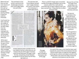
The orientation to this
article is portrait to this
double page spread as
each of the pages bleed
into each other
The interview with
Emma Watson spreads
over 7 pages however
the section of this which
I am analysing is a
double page spread.
There is a distinct margin space around the
outside of the page and between each of the
columns, which fits in well with the
minimalist look of vogue magazine that it has
been sourced from. Using sutal hits to reflect
the house style.
The text sits
horizontally on the
page with equal
spacing between the
lines, which helps to fit
in with the formal,
high end look that has
been achieved, which
also reflects the serif
font which is also very
traditional
A pull quote has
been used into
the middle of
the copy which
has been taken
from the
interview
relating to the
subject content
and also given
the illusion of a
white box
White space
doesn’t seem to
be apart of this
article even
though the space
which is there has
been managed
well to create this
boarder/ margin
round the
outskirts of the
copy
Because this isn't the
first page of the
article there is no
header to the page
and instead the
interview continues.
Even though there I
no cut out where
the text becomes
apart of the
photograph the fact
that the model is
looking directly at
the text helps to
merge to two
seamlessly together,
A drop capital has been included into the
main body of text but unlike what you see
mostly at the top of the page it has been
used into half way down the page to split
the text, and proving a break between
paragraphs of 10 lines which has this fairytale look to it.
The page
number has
been included in
the bottom left
of the page.
As a part of the copy a cross head has been used
towards the centre of the article between the two
columns which helps to merge the two together,
and brings the a theme and subject content to the
whole article. This quote also helps to draw the
attention of the audience into the article.
2. As this article use less of the conventional layout
of a magazine and has a lot more of an informal
tone to it. The use of a margin has only really
been used to define the middle of the page and
for splitting up the columns.
Again there is a portrait orientation which
bleeds the pages well together using a
darker background for pages to combine
text and image together and reflect the
look of kerrang music magazine
Reverse has also been used as a printing
technique and so instead of the
traditional black text on white paper
this technique
has been used
to fit with the
grungy
photographs
and the
alternative
look which
has been
produced
overall
The body of this
article has been
presented over a
double page
spread combining
both text and
images, however
as you can see the
images are of more
importance as a
way of grabbing
the attention of
the audience and
appeal to the
younger market
which such
magazines will look
at.
There are two
main columns for
the purpose of this
article which helps
to order the copy
into some sort of
pattern and also
makes it more
compact in
comparison to the
photographs which
are more of a
statement.
A drop capital
has also been
used to start
the article,
that helps to
draw the
reader into
the text, the
use of the
drop capital
in a red font
proves a
strong
contrast
There is also the use of
page numbers to the
bottom of the page which
helps to keep this
organised and link in with
the contents page.
A header has been used to the top of the right
page which is a quote taken from the band, using a
font that matches the main body of text yet still is
modern and stands out to the audience. The fact
that it is slightly rotated helps to fit with the
distorted look to the whole design.
A strapline has been include
below the headline just like a
newspaper. This text helps to
give the reader a taster of what
is expected and themes the
article.
3. There is also a drop capital into the beginning of the article which helps to illustrate the first point with more
impact, and the fact that the turquoise colour continues throughout makes it more striking to the eye something
very different to the persistent and white colours used traditionally which also makes it look more professional.
A pull quote has bee used
to the main article that
even though it doesn't
merge with the copy its
been incorporated within
the columns itself pulling
out apart of the article
and using the same font of
a more traditional matter
similar to a broadsheet
newspaper
The only types of blobs
and stars could be seen
as the quotation marks
that have been used to
back up the quote and
are colour coded with the
main colour themes.
The main header can be
found half way down the
page asking a rhetorical
question which hooks
the audience. The fact
they have used a bold
chunky font is common
of newspaper headlines.
A baseline/ caption has also been
And giving the piece
incorporated within the photograph to
some meaning
give it some meaning and allows the
reader to understand the point more.
The margin that has
been incorporated into
the design is used as a
way to stop the
information from
running of the page
and containing it. They
also help to split up the
different sections to
this double pages there
is more than one
feature included, and
also work well with the
formal tone that has
been suggested.
This is seen to spread
over one page to help
condense the
important information
common of a
newspaper.
As apart of the design the page number has been
placed at the top left of the page which is put in this
turquoise colour that matches the fonts colours and
areas of the photographs.
3 columns have
been used for the
main body of text
which provided the
reader with holiday
information. The
neatness of the
columns helps to
also fit with the
style of newspaper
and the text which
has been used