SlideShare a Scribd company logo
1 of 9
This was the very early stages of the magazine. The picture I had taken I felt worked perfectly as it gave me plenty of space to work in the key left hand side of a magazine. I used Stroke and Bevel and Emboss which I feel has brought out the masthead perfectly. However the most important part of the front cover is the Main Image, to make sure the masthead doesn’t take any attention away from this it has been put behind it.
I’ve decided to use this screenshot from my stages of production due to it having a couple of features I decided against using. Both the Yellow and Orange boxes have gone from the finished version as I don’t feel they represent what I want my magazine to be. The two things that have stayed the same are the ‘Free legal….’ and the warping style of the issue number.
This was one of the ideas that started off as just a little experiment but actually fitted really well and stayed as part of my music magazine. The brush takes away the light brick wall and the new wall fits in more with the text and the entirety of the front cover.
This was at a stage where the front cover was near completion, obviously a few tweaks here and there took place towards the end to improve it even further. Two of the features of the front cover I was most happy with was 1) The film strip going along the bottom with some cover lines and 2) The Black layer at the top which filled the space of a blank brick wall, a cover line was also used here. I kept to the house style of white and black text throughout, the only exception to the rule being the masthead so that it stands out from the rest.
This was the final completed front cover, as you can see only a few things have changed from the previous slide. The Artists name is now bold, bigger and clearer. It also goes over part of the main image, a bit risky some might say but I feel this would work well in getting the readers attention. The other change is putting the quote in, I feel I’ve chosen a quote that perfectly reflects what I want the interview and magazine to be about.  The final change was to decrease the opacity of the brush, the lower opacity means it takes away the plain brick wall while not taking anything away from the text.
This was my first attempt at the contents page. As you can see it’s pretty bland and there’s basically nothing going on. There’s only one image which realistically isn’t enough for a contents page and despite wanting to keep a black and white theme throughout there still needs to be slightly more colour to it.
The difference between this screenshot and the previous one is vast. Firstly, two more images have been added making it look like a more realistic contents page. Secondly some colour has been added to it, with 3 blocks of red. Lastly something that I feel is a very cool feature is an image of the front cover in the top left hand corner.  The result of these 3 features is it not only improves the look but it makes it look busier and far closer to a real life contents page than the previous effort.
The double page spread is of the 3 the one I had the least trouble with as I had pretty much completely decided the look before I had started. The image taking up one page and text the other is always something I’ve been a fan of so wanted to implement that to my music magazine. On the other side is 3 columns of text which I feel is more professional than any magazines that only use 2. At the top of the page follows a similar theme, Artist name taking up half the page and then a description on the other side going across the space.
This is the finished copy of the double page spread. The page numbers I feel are the last  thing a reader is looking for in a contents page so reduced the size of these greatly. I had always planned to use some sort of brush on the Double Page Spread but decided against using it until I had all the text in place, the snowbrush is a perfect fit with the picture that goes with the article. I also decided to decrease the opacity to around the 50% mark to make sure that it didn’t block the text in any shape or form.

More Related Content

More from Chris Smith

Cyriakmedia
CyriakmediaCyriakmedia
CyriakmediaChris Smith
 
Media project
Media projectMedia project
Media projectChris Smith
 
Media Survey Feedback
Media Survey FeedbackMedia Survey Feedback
Media Survey FeedbackChris Smith
 
Media Survey Feedback
Media Survey FeedbackMedia Survey Feedback
Media Survey FeedbackChris Smith
 
Music Magazine Survey
Music Magazine SurveyMusic Magazine Survey
Music Magazine SurveyChris Smith
 
Music Magazine Collage
Music Magazine CollageMusic Magazine Collage
Music Magazine CollageChris Smith
 
Contents Analysis
Contents AnalysisContents Analysis
Contents AnalysisChris Smith
 
Music Magazine Front Covers
Music Magazine Front CoversMusic Magazine Front Covers
Music Magazine Front CoversChris Smith
 
Music Magazine Collage
Music Magazine CollageMusic Magazine Collage
Music Magazine CollageChris Smith
 
Production Slideshow
Production SlideshowProduction Slideshow
Production SlideshowChris Smith
 

More from Chris Smith (10)

Cyriakmedia
CyriakmediaCyriakmedia
Cyriakmedia
 
Media project
Media projectMedia project
Media project
 
Media Survey Feedback
Media Survey FeedbackMedia Survey Feedback
Media Survey Feedback
 
Media Survey Feedback
Media Survey FeedbackMedia Survey Feedback
Media Survey Feedback
 
Music Magazine Survey
Music Magazine SurveyMusic Magazine Survey
Music Magazine Survey
 
Music Magazine Collage
Music Magazine CollageMusic Magazine Collage
Music Magazine Collage
 
Contents Analysis
Contents AnalysisContents Analysis
Contents Analysis
 
Music Magazine Front Covers
Music Magazine Front CoversMusic Magazine Front Covers
Music Magazine Front Covers
 
Music Magazine Collage
Music Magazine CollageMusic Magazine Collage
Music Magazine Collage
 
Production Slideshow
Production SlideshowProduction Slideshow
Production Slideshow
 

Recently uploaded

Arihant handbook biology for class 11 .pdf
Arihant handbook biology for class 11 .pdfArihant handbook biology for class 11 .pdf
Arihant handbook biology for class 11 .pdfchloefrazer622
 
1029-Danh muc Sach Giao Khoa khoi 6.pdf
1029-Danh muc Sach Giao Khoa khoi  6.pdf1029-Danh muc Sach Giao Khoa khoi  6.pdf
1029-Danh muc Sach Giao Khoa khoi 6.pdfQucHHunhnh
 
Interactive Powerpoint_How to Master effective communication
Interactive Powerpoint_How to Master effective communicationInteractive Powerpoint_How to Master effective communication
Interactive Powerpoint_How to Master effective communicationnomboosow
 
Advance Mobile Application Development class 07
Advance Mobile Application Development class 07Advance Mobile Application Development class 07
Advance Mobile Application Development class 07Dr. Mazin Mohamed alkathiri
 
microwave assisted reaction. General introduction
microwave assisted reaction. General introductionmicrowave assisted reaction. General introduction
microwave assisted reaction. General introductionMaksud Ahmed
 
Kisan Call Centre - To harness potential of ICT in Agriculture by answer farm...
Kisan Call Centre - To harness potential of ICT in Agriculture by answer farm...Kisan Call Centre - To harness potential of ICT in Agriculture by answer farm...
Kisan Call Centre - To harness potential of ICT in Agriculture by answer farm...Krashi Coaching
 
BASLIQ CURRENT LOOKBOOK LOOKBOOK(1) (1).pdf
BASLIQ CURRENT LOOKBOOK  LOOKBOOK(1) (1).pdfBASLIQ CURRENT LOOKBOOK  LOOKBOOK(1) (1).pdf
BASLIQ CURRENT LOOKBOOK LOOKBOOK(1) (1).pdfSoniaTolstoy
 
Advanced Views - Calendar View in Odoo 17
Advanced Views - Calendar View in Odoo 17Advanced Views - Calendar View in Odoo 17
Advanced Views - Calendar View in Odoo 17Celine George
 
Measures of Central Tendency: Mean, Median and Mode
Measures of Central Tendency: Mean, Median and ModeMeasures of Central Tendency: Mean, Median and Mode
Measures of Central Tendency: Mean, Median and ModeThiyagu K
 
Software Engineering Methodologies (overview)
Software Engineering Methodologies (overview)Software Engineering Methodologies (overview)
Software Engineering Methodologies (overview)eniolaolutunde
 
SOCIAL AND HISTORICAL CONTEXT - LFTVD.pptx
SOCIAL AND HISTORICAL CONTEXT - LFTVD.pptxSOCIAL AND HISTORICAL CONTEXT - LFTVD.pptx
SOCIAL AND HISTORICAL CONTEXT - LFTVD.pptxiammrhaywood
 
Russian Call Girls in Andheri Airport Mumbai WhatsApp 9167673311 💞 Full Nigh...
Russian Call Girls in Andheri Airport Mumbai WhatsApp  9167673311 💞 Full Nigh...Russian Call Girls in Andheri Airport Mumbai WhatsApp  9167673311 💞 Full Nigh...
Russian Call Girls in Andheri Airport Mumbai WhatsApp 9167673311 💞 Full Nigh...Pooja Nehwal
 
Nutritional Needs Presentation - HLTH 104
Nutritional Needs Presentation - HLTH 104Nutritional Needs Presentation - HLTH 104
Nutritional Needs Presentation - HLTH 104misteraugie
 
Paris 2024 Olympic Geographies - an activity
Paris 2024 Olympic Geographies - an activityParis 2024 Olympic Geographies - an activity
Paris 2024 Olympic Geographies - an activityGeoBlogs
 
Accessible design: Minimum effort, maximum impact
Accessible design: Minimum effort, maximum impactAccessible design: Minimum effort, maximum impact
Accessible design: Minimum effort, maximum impactdawncurless
 
Student login on Anyboli platform.helpin
Student login on Anyboli platform.helpinStudent login on Anyboli platform.helpin
Student login on Anyboli platform.helpinRaunakKeshri1
 
Beyond the EU: DORA and NIS 2 Directive's Global Impact
Beyond the EU: DORA and NIS 2 Directive's Global ImpactBeyond the EU: DORA and NIS 2 Directive's Global Impact
Beyond the EU: DORA and NIS 2 Directive's Global ImpactPECB
 
The Most Excellent Way | 1 Corinthians 13
The Most Excellent Way | 1 Corinthians 13The Most Excellent Way | 1 Corinthians 13
The Most Excellent Way | 1 Corinthians 13Steve Thomason
 

Recently uploaded (20)

Arihant handbook biology for class 11 .pdf
Arihant handbook biology for class 11 .pdfArihant handbook biology for class 11 .pdf
Arihant handbook biology for class 11 .pdf
 
1029-Danh muc Sach Giao Khoa khoi 6.pdf
1029-Danh muc Sach Giao Khoa khoi  6.pdf1029-Danh muc Sach Giao Khoa khoi  6.pdf
1029-Danh muc Sach Giao Khoa khoi 6.pdf
 
Interactive Powerpoint_How to Master effective communication
Interactive Powerpoint_How to Master effective communicationInteractive Powerpoint_How to Master effective communication
Interactive Powerpoint_How to Master effective communication
 
Advance Mobile Application Development class 07
Advance Mobile Application Development class 07Advance Mobile Application Development class 07
Advance Mobile Application Development class 07
 
microwave assisted reaction. General introduction
microwave assisted reaction. General introductionmicrowave assisted reaction. General introduction
microwave assisted reaction. General introduction
 
Kisan Call Centre - To harness potential of ICT in Agriculture by answer farm...
Kisan Call Centre - To harness potential of ICT in Agriculture by answer farm...Kisan Call Centre - To harness potential of ICT in Agriculture by answer farm...
Kisan Call Centre - To harness potential of ICT in Agriculture by answer farm...
 
Mattingly "AI & Prompt Design: The Basics of Prompt Design"
Mattingly "AI & Prompt Design: The Basics of Prompt Design"Mattingly "AI & Prompt Design: The Basics of Prompt Design"
Mattingly "AI & Prompt Design: The Basics of Prompt Design"
 
BASLIQ CURRENT LOOKBOOK LOOKBOOK(1) (1).pdf
BASLIQ CURRENT LOOKBOOK  LOOKBOOK(1) (1).pdfBASLIQ CURRENT LOOKBOOK  LOOKBOOK(1) (1).pdf
BASLIQ CURRENT LOOKBOOK LOOKBOOK(1) (1).pdf
 
Advanced Views - Calendar View in Odoo 17
Advanced Views - Calendar View in Odoo 17Advanced Views - Calendar View in Odoo 17
Advanced Views - Calendar View in Odoo 17
 
Código Creativo y Arte de Software | Unidad 1
Código Creativo y Arte de Software | Unidad 1Código Creativo y Arte de Software | Unidad 1
Código Creativo y Arte de Software | Unidad 1
 
Measures of Central Tendency: Mean, Median and Mode
Measures of Central Tendency: Mean, Median and ModeMeasures of Central Tendency: Mean, Median and Mode
Measures of Central Tendency: Mean, Median and Mode
 
Software Engineering Methodologies (overview)
Software Engineering Methodologies (overview)Software Engineering Methodologies (overview)
Software Engineering Methodologies (overview)
 
SOCIAL AND HISTORICAL CONTEXT - LFTVD.pptx
SOCIAL AND HISTORICAL CONTEXT - LFTVD.pptxSOCIAL AND HISTORICAL CONTEXT - LFTVD.pptx
SOCIAL AND HISTORICAL CONTEXT - LFTVD.pptx
 
Russian Call Girls in Andheri Airport Mumbai WhatsApp 9167673311 💞 Full Nigh...
Russian Call Girls in Andheri Airport Mumbai WhatsApp  9167673311 💞 Full Nigh...Russian Call Girls in Andheri Airport Mumbai WhatsApp  9167673311 💞 Full Nigh...
Russian Call Girls in Andheri Airport Mumbai WhatsApp 9167673311 💞 Full Nigh...
 
Nutritional Needs Presentation - HLTH 104
Nutritional Needs Presentation - HLTH 104Nutritional Needs Presentation - HLTH 104
Nutritional Needs Presentation - HLTH 104
 
Paris 2024 Olympic Geographies - an activity
Paris 2024 Olympic Geographies - an activityParis 2024 Olympic Geographies - an activity
Paris 2024 Olympic Geographies - an activity
 
Accessible design: Minimum effort, maximum impact
Accessible design: Minimum effort, maximum impactAccessible design: Minimum effort, maximum impact
Accessible design: Minimum effort, maximum impact
 
Student login on Anyboli platform.helpin
Student login on Anyboli platform.helpinStudent login on Anyboli platform.helpin
Student login on Anyboli platform.helpin
 
Beyond the EU: DORA and NIS 2 Directive's Global Impact
Beyond the EU: DORA and NIS 2 Directive's Global ImpactBeyond the EU: DORA and NIS 2 Directive's Global Impact
Beyond the EU: DORA and NIS 2 Directive's Global Impact
 
The Most Excellent Way | 1 Corinthians 13
The Most Excellent Way | 1 Corinthians 13The Most Excellent Way | 1 Corinthians 13
The Most Excellent Way | 1 Corinthians 13
 

\\Nas12\Data\C87smith\Desktop\Main Project Presentation

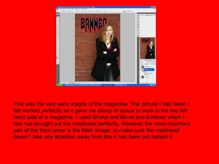
  • 1. This was the very early stages of the magazine. The picture I had taken I felt worked perfectly as it gave me plenty of space to work in the key left hand side of a magazine. I used Stroke and Bevel and Emboss which I feel has brought out the masthead perfectly. However the most important part of the front cover is the Main Image, to make sure the masthead doesn’t take any attention away from this it has been put behind it.
  • 2. I’ve decided to use this screenshot from my stages of production due to it having a couple of features I decided against using. Both the Yellow and Orange boxes have gone from the finished version as I don’t feel they represent what I want my magazine to be. The two things that have stayed the same are the ‘Free legal….’ and the warping style of the issue number.
  • 3. This was one of the ideas that started off as just a little experiment but actually fitted really well and stayed as part of my music magazine. The brush takes away the light brick wall and the new wall fits in more with the text and the entirety of the front cover.
  • 4. This was at a stage where the front cover was near completion, obviously a few tweaks here and there took place towards the end to improve it even further. Two of the features of the front cover I was most happy with was 1) The film strip going along the bottom with some cover lines and 2) The Black layer at the top which filled the space of a blank brick wall, a cover line was also used here. I kept to the house style of white and black text throughout, the only exception to the rule being the masthead so that it stands out from the rest.
  • 5. This was the final completed front cover, as you can see only a few things have changed from the previous slide. The Artists name is now bold, bigger and clearer. It also goes over part of the main image, a bit risky some might say but I feel this would work well in getting the readers attention. The other change is putting the quote in, I feel I’ve chosen a quote that perfectly reflects what I want the interview and magazine to be about. The final change was to decrease the opacity of the brush, the lower opacity means it takes away the plain brick wall while not taking anything away from the text.
  • 6. This was my first attempt at the contents page. As you can see it’s pretty bland and there’s basically nothing going on. There’s only one image which realistically isn’t enough for a contents page and despite wanting to keep a black and white theme throughout there still needs to be slightly more colour to it.
  • 7. The difference between this screenshot and the previous one is vast. Firstly, two more images have been added making it look like a more realistic contents page. Secondly some colour has been added to it, with 3 blocks of red. Lastly something that I feel is a very cool feature is an image of the front cover in the top left hand corner. The result of these 3 features is it not only improves the look but it makes it look busier and far closer to a real life contents page than the previous effort.
  • 8. The double page spread is of the 3 the one I had the least trouble with as I had pretty much completely decided the look before I had started. The image taking up one page and text the other is always something I’ve been a fan of so wanted to implement that to my music magazine. On the other side is 3 columns of text which I feel is more professional than any magazines that only use 2. At the top of the page follows a similar theme, Artist name taking up half the page and then a description on the other side going across the space.
  • 9. This is the finished copy of the double page spread. The page numbers I feel are the last thing a reader is looking for in a contents page so reduced the size of these greatly. I had always planned to use some sort of brush on the Double Page Spread but decided against using it until I had all the text in place, the snowbrush is a perfect fit with the picture that goes with the article. I also decided to decrease the opacity to around the 50% mark to make sure that it didn’t block the text in any shape or form.