
Recomendados
Más contenido relacionado
La actualidad más candente
La actualidad más candente (20)
Destacado
Destacado (20)
Similar a Ann Darling Color Presentation Subtractive and Additive Colors
Similar a Ann Darling Color Presentation Subtractive and Additive Colors (20)
Más de darlinga
Más de darlinga (16)
Último
Último (20)
Ann Darling Color Presentation Subtractive and Additive Colors
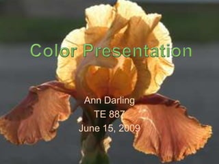
- 1. Ann Darling TE 887 June 15, 2009 Color Presentation
- 2. Color Mechanics Subtractive Colors in RYB format Color #1-96 And Additive Colors in RGB format 0-255
- 3. Primary Color Includes Red, Yellow & Blue May also include tints & shades Is a triadic color scheme
- 4. Secondary Color RYB Subtractive: Opaque Pigments
- 5. Tertiary Color In Subtractive Color, Tertiary colors are the combination of One Primary color+ one Secondary Color Subtractive Opaque Pigments
- 6. Tertiary Color Tertiary colors are named with the Primary color first Followed by the Secondary Color Subtractive Opaque Pigments
- 8. Achromatic color Strong Design Statement Means Without Color Saves $ on Printing Costs Good Legibility for Most Fonts Least Restrictive for Visual Disabilities
- 9. Achromatic Color Properties Black is associated with: Dignity Power Mystery Style Elegance White conveys: Perfection Cleanliness Innocence Simplicity Truth Gray indicates: Balance Security Classicism Intelligence Maturity
- 10. Monochromatic Color Made by mixing one color + white, black, or the opposite color on the color wheel
- 11. Monochromatic Color Properties Unifies Elements Minimizes Conflict Simplifies Color Choice Easy to “tune” to images with a dominant color Can be used to indicate a hierarchy of ideas or important facts
- 12. Neutral color A hue that has black or its compliment added
- 13. Neutral Color Properties Sophisticated Blend with any other colors well May appear bland unless enhanced with textures Natural and Earthy Can be warm and welcoming
- 14. Complimentary Color Colors that are located directly Opposite from each other on the Color wheel Complimentary Colors are Dynamic Mixing 2 compliments will create a Neutral color
- 15. Split Compliment Colors organized by choosing one color and two colors on either side of the first color’s Compliment or Opposite
- 16. Analogous Color Colors organized by choosing any 3 colors, tints and shades located next to each other on the color wheel
- 17. Clashing Color Clashing colors are colors that are 2/3 of a split- complimentary color scheme ( one color + one split)
- 19. Color Palette Generator Palette generated from photograph by COPASO at ColourLovers http://www.colourlovers.com/palette/855777/yellow_Iris
- 20. Color Palette Generator Palette generated from photograph by COPASO at ColourLovers http://www.colourlovers.com/palette/857025/Cinnamon_clash
- 21. More Palettes Choose allow macros and activex control if the next slide does not load Or follow the link below http://www.colourlovers.com/lover/darlingaw