
Recommended
More Related Content
What's hot
What's hot (20)
Similar to Magazine advertisements
Similar to Magazine advertisements (20)
Magazine advertisements
- 2. KEY ELEMENTS TO SELLING MAGAZINES • BLACK, BOLD TITLES • ITALIC SUBTITLES • RED FONTS TO INDICATE THAT IT IS THE BAND’S FIRST ALBUM • BLACK AND WHITE BACKGROUND • LEAD SINGER IN A POSITION OF DOMINANCE
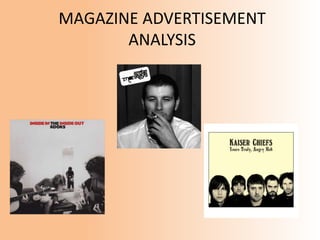
- 3. The Kaiser Chiefs- Yours, Truly Angry Mob ‘Yours Truly, Angry Mob’ is the second album by English rock band Kaiser Chiefs. It was released on 26 February 2007. Yours Truly, Angry Mob is lyrically darker and more socially aware than its predecessor ‘Employment’, with tracks dealing with street crime, violence, fame, and also the inaccuracy of tabloid stories. The album was preceded by the band’s leading single “Ruby” on 19 February 2007. It became the band’s first (and to date, only) number one album in the British album charts. The album also reached #1 in the United Kingdom.
- 4. THE KAISER CHIEFSThe title is highlighted in black, bold fonts which is usually a negative connotation. Black denotes strength and authority, and this perhaps suggests the mood the group was currently experiencing, as their single “Ruby” which is also included in the album, peaked at number 1 in the UK charts- it was the band’s first ever no.1 single For their CD cover, the band decided to go for ‘mopped’ up haircut, with all, apart from one group member, with serious faces. This possibly suggests a macho approach , especially as they are heavily featured with black clothes. This is in particularly true of the lead singer. Another reason why they may come across as serious-mined people is because the album covers topical issues such as street crime, violence and the inaccuracy of tabloid stories, and the lyrics are much darker compared to their previous album, ‘Employment’. The lighter background which contrasts to the black bold title as well as the group members who are presented in black suggest the band also have purity. This is the name of the of the Kaiser Chief’s album. It is written in italic to separate the album name from the name of the actual band
- 5. The Kooks- Inside In Inside Out Inside In/Inside Out is the debut album by English indie rock band the Kooks. It was released on 23 January 2006 on Virgin Records. It contain their most noted song to date, “Naïve”, which is the best-selling single of their careers, and also the UK’s nineteenth best-selling single of 2006. The album reached number two in the British Album Charts and has sold over 2,000,000 copies worldwide since its release.
- 6. THE KOOKS In relation to the title of the album, the band elected to highlight the key words in a red colour. As we already know, red is a colour that signals danger and attention. Therefore, as this was the band’s debut album, they may have wanted to include the title of their album in red to alert people who are unaware of the Kooks, to buy their product. Their hit single “Naïve”, only further illustrated their cause for the public to purchase their album. Judging by the still image of the band members, the Kooks come across as band who take pleasure in playing music in their spare time, particular with guitars. All their heads are down whilst they are playing, which adds to the thought that they are full focused, unworried by the events of the outer surroundings The white colour in the background adds simplicity to the album cover The character occupying the mirror, is the lead singer. He is isolated from the rest of the group meaning it is easier to identify his role in the band. His black attire implies power, authority and elegance, three key attributes of a lead singer, when posing for a magazine, album cover etc. It also suggests anonymity, and certainly in this album cover, he has no identity.
- 7. Arctic Monkeys- Whatever people say I am, That’s what I’m not ‘Whatever People Say I Am, That’s what I’m not’ is the debut album by English band Arctic Monkeys. Coincidentally, it was released on 23 January 2006- the same date as the Kooks. The album became the UK’s fastest selling debut album, shifting over 360,000 copies in its first week.
- 8. ARCTIC MONKEYS The cigarette that occupies the grasp of the lead singers two fingers on his left hand acts as a symbol to all young people in the UK. The album was considered by some to be a concept music album concerning the lives of young North England clubbers, and so the cigarette suggests a ‘cool’ side to the band’s nature. The ‘fag’ may also warn their fans (who are young), that their album also heavily features lyrics that is associated to the human behaviour is nightclubs. Alex Turner’s (the lead singer) eyes denotes someone who is ‘drowsy’, ‘on-the-edge’, but a term most commonly used to describe his eye motions, is ‘high’. This obviously implies that is under the influence of illegal drugs (Class A and B), such as heroin, marijuana, and cocaine. This may even prompt more sales to their target audience, because their fans believe this is something they can relate to, as they have, in numerous times, found themselves in a similar predicament as Turner. This is one method in which they have sold their product. It is unique that the name of the band is not positioned in the middle of the album cover, especially it being their debut album. This is because the Arctic Monkeys have deliberately made their lead singer their most primary interest. It could be said that another method used to sell their album is the fact that Turner’s hair is quite short which could imply teenage rebelliousness- something similar to that of the ‘Teddy boys’