2. Posters
Film postersdesignedanddistributedforhorrorfilmsfollowmanydifferentcommon conventionsin orderto meet the likesthedesiresof thetarget audience.One of themain conventions
usedin many film posters(i.e. the eye,seedof chucky etc.) isan extreme closeupof the eye.The reasonbehindthisisto attract the targetaudienceassuch imagesproduceaneerieand
unnaturallookthereforetemptingto them to watch thefilm itselfand findout more aboutthestoryhiddenbehindthe pictureof an eye.Croppingof theeye, making it fill theframe creates
an impact aswell asexpressingtheemotionsof fear anddisgust,thismakes it relatableto the viewer andcreatesand enigmadue to thefat that nothingelsecan be seenontheposterother
thanemotionsand othermanipulationswhichhave beenapplied.Manyfilm postersfollowthe ruleof thirdswhendesigningtheirfilm postersbyplacingthe main image onthecentreof the
page, with nothingsurroundingit, inorderto preventthe target audiencedivertingtheirattentionto somethingelsethat’s notas important.Editingandtheuseof colourcan enhancethe
effectof theoverallimage for example, in the posterof the ‘Candyman’ , in which the irisisdeepred, a silhouetteofa figure can be noticedthisis usedto portraythe fact thatthe eyeis
seeingsomethingbut don’tknowwho or why.Thissuggeststhatthe eyeisnot looking at somethingnicebut in-fact somethingdangerousasthecoloursred andblack conveyevil, hate,
blood,murder andmany more. From analysingthe postersIwas ableto seethat in postersthat featurean eyeasa main image tendto have somethingcoming out from it i.e. the beefrom
‘candyman’, fingersin ‘Theeye’etc. thisis to make the targetaudienceview theimage Ina differentway, dueto the disturbingandunnaturalnatureof thefilm which createsa temptationto
watch the film.
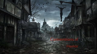
3. Setting
Many horror films, especially those that involve killing and possession are
usually filmed in an isolated location such as an old big house, with a
traditional look in the middle of no-where, abandoned forest, lakes etc. These
are often the places that have the potential to be haunted and creepy. So
therefore to give of the idea that the film is shot in such a location, film
posters nowadays use a medium longshot or a low angle to capture the
setting and place it as the main image, either with the protagonist in the
foreground e.g. ‘Insidious’ or the building just on its own e.g. ‘The last house
on the left’. The use of dark shadowy effects or the pale blue colour in some
occasions has the ability to grab the attention if the target audience as it
creates a horror effect and builds suspense in their minds. Not all horror film
posters feature the setting on their design, this is commonly seen in films that
fall under the psychological and supernatural genre, like ‘The Conjuring’ and
‘Insidious’. On the film posters, the dark foggy background around the
building e.g. the house, is used to not only make the audience feel trapped
but it is manipulated in order to produce a strange and unnatural
atmosphere. Poster in which a house is used as part of their design creates an
enigma as we are unsure whether it is the house or the people living inside it
that’s causing the disequilibrium.
4. Lighting & Colour
Another effective convention used in the design of horror film posters is the idea of a dark figure standing there, either
holding a weapon or alone. This pose is effective when coming to create an enigma and is mostly used in order to depict the
villain. Usually in horror film posters the lighting tends to be dark and black lit in order to bring out bring out a true horror
effect and highlight certain parts of the silhouette in unnatural ways to make the poster seem more eerie. When the identity
of the villain is concealed and there is only a hint at what the character is wearing, doing and what they look like creates an
enigma around its character and therefore allowing this poster to become a teaser and making the audience want to watch
the film. This convention is commonly used in the posters of slasher horrors, as the killer usually tends to be the key to the
plot holding a lethal weapon. Whereas horrors such as psychological, and supernatural may not even include serial killer or
brutal weapon. There is always a hand raised to the main images used on the posters of film, especially slashers, as they
follow the convention of featuring the antagonist holding a weapon in their hand (e.g. Texas chainsaw) which gives of the
idea to the target audience the films going to be full of violence and danger. Additionally, low key lighting and red text paired
with a dark silhouette is also another convention that is commonly used in the design of the poster to carry on the
mysterious atmosphere that this convention creates.
Within horror posters, the text and background usually consist of a wide range of dark colours, but however, black and red
are the 2 main colours that are commonly seen on such posters as the contrast of both colours are symbolic to blood and can
be used to encourage an eerie look to the page. Another convention that is popular with in the creation of horror posters is
smoke, either in the background or surrounding the page, in order to form a mysterious atmosphere and signify the idea of
death and decay. Alongside this, such an effect portrays the idea of something being hidden away from the target audience
tempting them to watch the film in order to find out what it is. A unique yet a conventional effect that has been used on
some posters is making it seem like its viewed through a CCTV lens which creates a ‘fly on the wall’ atmosphere and as if
you’re looking into something you’re not supposed to. This can also put the audience in a position where they can engage
more in the film.
5. Title and Layout
On majority of the posters, the main image is the centre of attention that has the power to attract
the target audience. This main image is usually the main character or killer positioned in the centre of
the page using the idea of rule of thirds. The reason why the main image is particularly in the centre
is because its somewhere were the audience focuses first before they move slowly onto the title,
release date and taglines which is placed at the bottom. Film titles are usually written in simple yet
bold fonts with the help of dark colours such as Red and Black to connote evil, murder and death, as
well as being able to stand out on the page and act effectively when it comes to grabbing the
viewers’ attention. In many cases the type of font used can help determine the genre of the film. The
idea of distorted text are very popular in the horror genre, where key words from the poster are
written in a larger size compared the rest of the text on the same page. This is done to give the
audience an insight into the film and a brief understanding on the theme of the film. For example on
the film poster for ‘A nightmare on Elm Street’ the word ‘Nightmare’ is the largest font on the page
followed by ‘Elm Street’ being the second largest, this change in size of the font suggests its
importance and allows the audience to understand where the setting is most likely to be and what to
look out for throughout the film. Key aspects of the poster also include a catch tagline that links with
the theme of the film and creates a strong brand identity. The purpose of the tagline is not only to
frighten the audience but also to make them anxious about what it really means and what it’s got to
do with the film. Such institutional information including the release date and credits are
predominantly placed at the bottom of the page, which is conventional to the horror genre as it is
done so that the audiences’ focus doesn’t get diverted away from the main image and title.