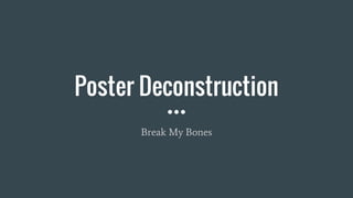
2. Break My Bones
The plot of the film follows a 10 year old girl, who
confronts her own capacity for evil when her
mother forces her to seek the mentorship of a
disturbed old man. I appreciate that the plot is
darker than what I am planning for my own film,
however it is the style of the poster of which I find
interesting, especially to link into the theme of
having two realities.
3. Double exposure
This poster uses a double exposure effect where a
coloured background image is revealed in the low
key areas on the foreground image. The
connotations of this are that the character in the
room has had a strong influence over the main
character, and is on the main character’s mind;
perhaps because of fear or love. Structurally, this
would have been achieved with the main face
being in a studio, and the secondary character
being on a set. I know I can achieve this effect as I
completed this style for a Photography course, so
I know this is realistic inspiration.
4. Colour
The stand out colours in this poster are blue and
white. The white is very prominent, and provides a
modern and clean background for the face, however
it has strong connotations of purity towards the
protagonist, as we know she is a 10 year old girl
who will encounter evil. White could also link to a
haunted atmosphere, as the stereotypical ghost is
considered white. The colour blue seeps in from the
mid-ground, in a misty paint style, which entices
the audience about how something dark and cold
will be confronted. Personally, I like the idea of
using two prominent colours to demonstrate
alternate moods or plots.
5. Lighting
The right side of the image is overexposed, which
blends her face into the white background, and
makes the image bleached out. This again
exaggerates the ghosting effect, but also creates a
blinding dream like effect, that demonstrates to the
viewer the psychological drama within the film. The
left side of her face has low key lighting in order to
blend in with the dark scene that has been double
exposed. The darkness could also connote the evil
within the film, linking to a horror aspect that is
hinted in the synopsis, which ultimately targets a
wider audience.
6. Typography
The font size is very sporadic, which in
combination with the random letter thickness and
colour, creates a distorted title, that appears to be
falling apart. The disjoined effect could perhaps
link to a gothic plot, with a story that isn’t
straightforward and simple, reaching out to a
niche audience that prefer a dark and twisted film.
Additionally, the top line of text is a different font
style to the bottom line could demonstrate the
confusion of the protagonist, which links the
audience to the character emotions before they
have seen the film