
Recomendados
Más contenido relacionado
La actualidad más candente
La actualidad más candente (19)
Destacado
Destacado (13)
Similar a Social action and community media presentation
Similar a Social action and community media presentation (20)
Más de hndoja
Más de hndoja (20)
Último
Último (20)
Social action and community media presentation
- 1. Social action and community media task 3 Lusi Ndoja
- 2. Homeless advert 1 Techniques: This is a homeless charity from SASH, it‟s a located in York, North Yorkshire and east ridings. This charity is targeted at young adults ages, 16-24. as you can see by the image, the charity SASH use sympathetic photographs, this is so that the volunteers that help support the charity are not put off by stereotypical images of homeless people. This will make them have a change of heart. The homeless people on the image look cold , the image makes you feel sad and makes you want to help and volunteers. The have used real images as this will also persuade people to help as it is not fake. The colours that SASH have used is green and white to promote their charity. Originally SASH was in red but they had to change this because people would miss understand the meaning and also it makes it look more aggressive as the colour red represents violence and anger. The green is the opposite to this its more relaxing natural and inviting which makes people approach to the charity even more. Also the slogan they have used for the charity “preventing youth homelessness together” this makes the charity more friendly and the fact that they have used together it shows that you aren't alone and that you can get the help and support you need. The charity has a simple logo, the fact that it has the picture of a home makes you automatically know what the charity is. As they have used write bold text its clear to read and also grabs the readers attention as its eye catching.
- 3. Homeless advert 2 Techniques: This is another homeless charity that is based in the UK. Shelter is more national and there target market is aimed at people with families that are suffering with homelessness. In this advert you can see they have used very dark colours such as red and black, they have used really strong powerful colours to represent their charity. The red means danger and violence but also the colour red has another meaning which represents love and passion. As this campaign is targeted at families Shelter have used a loving colour making it more appropriate. The text has various of stages. Firstly the name of the charity is in bold so instantly you see what its called. The header underneath the name says No room at the inn?” its giving the audience a question, for them to stop and think about what the campaign is advertising, giving it a hook. And the information about what you can do and how to help is in small font, this has been done purely because if the advert has hooked you and you are interested then the information is there to read even further. The image in the right hand corn will be the first thing the audience sees as its placed in the background. They have used a child to make the advert more sympathetic as its stating that children will be the most effected by being homeless. As the child is sad it makes the audience more persuaded and it‟s a good technique to get the audience to feel more guilty and will make them donate and help as they will give a child a home. The fact that the image is the biggest thing on the page its purely because someone who isn‟t interested in reading the text, the image is there to balance the two out and the reader will have some sort of awareness on what the campaign is trying to raise.
- 4. Homeless advert 3 Techniques: Rock trust is a homeless charity that is targeted at young people specifically. This charity doesn‟t have images just the name of the charity and the slogan. This is similar to the SASH charity as they have both the same target market. With this charity they have a house style to make the charity look more professional. Again with this charity they have used green, as it‟s a more relaxing and a natural colour making the meaning of the charity more welcoming and calm. The black is the main part of the charity logo, this grabs the readers attention as you are drawn to the bold text. The slogan they have used for this charity is “because every young person has potential” the fact that its used the word „every‟ it involves every young person making it more welcoming and its giving having faith in the young people because the fact that they are homeless it doesn‟t mean they cant get help or get support to help change their life around. The slogan should inspire the young people and the supporters should have faith in them too.
- 5. TASK 2: RESEARCHING EXSITING ARTEFACTS
- 6. Artefact 1 This is a homeless campaign raising awareness for homelessness in a different way. As you can see in this picture the advert is advertised on a bin lid. I like the way they have presented this because something as common like this can make the audience really think about their actions. The way the women has stopped and looked at the campaign has really made her think and stop. by throwing away left over food are the small things that people take for granted. A homeless person does not have this privilege and would have to go threw the bins for food. The place where they have located the add is also very effective, as if this was on a billboard most people would walk past and ignore what has been advertised. The fact that they have placed it in a local rubbish waste bin people have no way of avoiding this, it make the audience guilty which i think is a good way of raising awareness. when producing a homeless campaign you have to think of the ethical issues it has by trying not to make it offensive as it a very delicate subject and its real life. The fact that this ad is used in a place where homeless people will have to go and find food to feed themselves is something real and its the reality, its given the audience something true, s some campaigns you see on telly is more exaggerated and people can interpret it in many different ways.
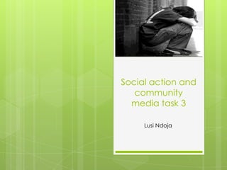
- 7. Artefact 2 This is another artefact but this however is more candid. Its a real life image of a homeless man with his pet. By looking at this picture it makes you feel lots of different things. the man is resting his head on his hand he looks sad and this makes the audience feel more sympathetic towards him. by showing people real life images is also a good way of persuading the audience as they like facts rather than something staged. Also having a pet also means that they have to look after it and have another responsibility, but also it shows that they only have each other and will affect people who do have pets how they would feel if they were in a similar situation. This could be an ethical issues as some people will find it cruel that they would use animals as a way of making them feel more sorry for the homeless person, and also the UK is known to be a great animal lover.
- 8. Artefact 3 Finally I have chosen this artefact because when reading the cardboard it says "before you turn away put yourself in my place" its asking a really good question making the audience think more? People everyday think homeless people are what people stereotype them such as, smelly, nasty people who pretend to be homeless, but this ad states a very good fact, as many people will walk away and not read what the message is trying to say and will ignore it. another way they have made this ad and have advertised it that its aimed at anyone, as the face has been cut out, this means that the person who is homeless can be anyone and anyone can be homeless in any point in their life. This is a good way to make people more aware as people will easily jump to conclusion about homeless people.
- 9. Task 4: Raising awareness
- 10. Survey responses