
Recomendados
Más contenido relacionado
La actualidad más candente
La actualidad más candente (19)
Destacado
Destacado (12)
Más de jackhorne
Último
Último (20)
Differences
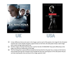
- 1. ① A clear difference that can be seen is the images used on each of the posters, the image for the UK poster contains the 3 main people and gives a good review on the front, the USA poster shows a dark image with a bold red logo capturing the eye ② Another image is the font that they have used for the title ‘EX MACHINA’ they work differently on the pages and stand out differently on the page ③ The final thing that is clearly different would be the fact that the UK poster has a review on the front to show people that top film reviewers have thought the film was amazing but on the USA poster they do not have anything like that and they let the image speak for itself
- 2. ① Both posters have used very different images to capture the different peoples eye, UK has used a side image of the two main characters whilst the USA has used a blurred kind of smoky effect image. ② Another thing that is noticeably different Is the placement of text on the page and the colour font they have used, they have used different coloured font but kept the font in the same sort of style ③ Finally the UK poster has the date that it is released very clearly where as on the USA poster it cannot be seen
- 3. ① These two poster have both taken a very different approach with the UK taking the vintage look and the USA taking a more 21st century approach ② On the UK one the image speaks for its self with the starwars logo place slightly to the right at the bottom of the page and then the USA one where the title is placed in the middle quite big so it stands out ③ Another thing that is different is the font used for the texts, the UK has gone for a simple black set back starwars logo look where as the USA has gone for the classic starwars logo