Publicidad
Publicidad

Más contenido relacionado

Publicidad

Más de Jesse Desjardins - @jessedee(20)

Publicidad

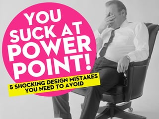
You Suck At PowerPoint!

  1. Suck at Power Point! You 5 shocking design Mistakes you need to avoid
  2. Approximately350PowerPointpresentations aregiveneverysecondaroundtheworld... #$%^& &#$*! @#$% !@#&^ !@#$% *$@# @#&^$
  3. andapproximately 99%suck.
  4. andapproximately 99%suck. Butit’snot PowerPoint whichsucks.
  5. It’sthespeaker (you)whoneeds touseitproperly.
  6. Yourslides areanaid andnot acrutch.
  7. Unfortunately iftheysuck, sodoyou.
  8. Let’slearngoodpresentationdesign fromotherpeople’smistakeswith...
  9. SHOCKING DESIGN MISTAKES YOU NEED TO AVOID 5
  10. TOO MUCH INFO 1 MISTAKE
  11. Don’tvomiteverypieceof informationonyourslides.
  12. Ifyou’regoingtoputwordforwordwhat you’rearegoingtosay,handovertheslides andtakeaseatinstead. BLAH BLAH BLAH BLAH BLAH BLAH BLAH BLAH BLAH BLAH BLAH BLAH BLAH BLAH BLAH BLAH BLAH BLAH BLAH BLAH BLAH BLAH BLAH BLAH BLAH BLAH BLAH BLAH BLAH BLAH BLAH BLAH BLAH BLAH BLAH
  13. If your audience is reading what you’re saying, then what’s the point of you being there? YOU’RE NOT GIVING A DOCUMENT, YOU’RE GIVING A PRESENTATION.
  14. Agoodtrickisto keepone mainpoint perslide. Thishelpsyouwith timingandprevents youraudiencefrom skippingahead. POINT ONE POINT TWO POINT THREE POINT FOUR POINT FIVE POINT SIX
  15. Keepit relevant. Effectivecommunication isknowingwhattocutout, sobeamercilesseditor. Lessslides meansmore timefor interaction. POINT ONE X POINT THREE X X POINT SIX
  16. iiwejfwjoiwijfop pfoqp020r97234 u823492492asdsk weoifweiojwioe qjepoqiepour93 49i1294238573498 2pqieqjfowiehjp whfpiwjef[weif[w Don’toverdoit withsenselessdata.
  17. Dothehardwork foryouraudienceand turnthatdatainto somethingwhichis meaningful.
  18. NOT ENOUGH VISUALS 2 MISTAKE
  19. Deliverabiggerpunch withstrongvisuals.
  20. Thereareendless sourcesofvisualsyou canusetobringyour presentationtolife.
  21. Ifyou’regoingtousestandardMicrosoft clipartthere’snohopeforyou,sorry. *withconditions Agoodplacetostartis: iStockPhoto.com: Royaltyfree ($$$) Compfight.com: CreativeCommons (free-ish*)
  22. Youdon’thavetousecheesystockphotos.
  23. Youdon’thavetousecheesystockphotos. Seriously,isitthatmuchfuntoworkinacallcenter?
  24. Youdon’thavetousecheesystockphotos. Whichevervisualsyouusejustrememberto... Seriously,isitthatmuchfuntoworkinacallcenter?
  25. Designforthisguy.
  26. Designforthisguy. Ifit’sunreadable,don’tuseit.
  27. CRAP QUALITY 3 MISTAKE
  28. Don’tboreyour audiencewith childishvisuals. Investtimein learninggreat design.
  29. Therearetwoshortcutstogreatdesign
  30. Buyit: Gooddesigncostsmoney. Investinprofessional imagesandtypeface. Alittle$$$cangiveyou significantadvantage.
  31. EverythingIsARemix.infoisagreatplace tostarttolearnhowtostealgreatdesign Stealit: Youcanreverseengineer almostanygooddesign. Takeapartyourfavorite presentations,infographics, websitesandfigureouthow it’sdoneandremixitinto somethingnew.
  32. aquicktipontypeface: DON’TUSE $!*#&FONTS!
  33. Tahoma Microsoft Sans Serif Arial Verdana Courier New Times New Roman Trebuchet MS Lucida Console Comic Sans MS... are$!*#&fonts
  34. Google‘beautifulfonts’ andyou’llfindplentyofhandpickedfonts bysomeofthebestdesigners.
  35. Here’san exampleofafree fontthatlooks, um,delicious.
  36. While95%ofyourcolleaguesusePowerPoint, itdoesn’tneedtobeyouronlyoption. For22yearsPowerPointhasbeenthestandard fordeliveringpresentation. Butnotanymore. Experimentwithdifferentpresentationstools andseewhichoneproducesthebestresults
  37. visual vomit 4 MISTAKE
  38. Whitespaceisagoodthing.
  39. Bemindfulof spacingand alignment.
  40. POINT 1 Alwayskeep everything niceandtidy.
  41. Having a consistent use of colors, images & alignment gives a cohesive look to your presentation. It also helps to separate your presentation into recognizable sections.
  42. Useacollectionofvisualassets thatbelongtogether...
  43. ColorLovers.comisagreat sourceofcolorschemes and always stick to a color scheme.
  44. And the most shocking design mistake...
  45. LACK OF PREP 5 MISTAKE
  46. Most presentations suck because not enough time went into making them. Period. Youneedtocrafttheperfectstory, createbeautifullookingslidestosupportit andthenrehearse,rehearse,rehearse. ...andnotthenightbefore.
  47. Anoutstanding1hourpresentationcan take30hoursormoreofpreptime.
  48. Ya,exactly.
  49. It’sallaboutbeingorganized andplanningahead. Haveasystemforcollectingyourideas to reworkthemintoamasterpiece.
  50. 86% oftopexecutivessaythat communicatingwithclarity directlyimpactstheir careerandincome. Source: www.distinction-services.com
  51. Source: www.distinction-services.com Yetonly25% Spendmorethan2hours on‘high-stakes’presentations
  52. Design,don’tjustslap somethingtogether. Ifyourpresentationsucks, don’tblamePowerPoint.
  53. Let’srecap... MISTAKES TO AVOID:
  54. TOO MUCH INFO NOT ENOUGH VISUALS HORRIBLE QUALITY VISUAL VOMIT LACK OF PREP Let’srecap... MISTAKES TO AVOID:
  55. Anicelydesignedpresentation isnotthemostimportantpart. But wait!
  56. Yesthebestspeakersgripanaudience bytellingastoryandshowingsome slidestosupportthat,but...
  57. theboldestamong themdoawaywith slidesentirelyand gonaked. Yesthebestspeakersgripanaudience bytellingastoryandshowingsome slidestosupportthat,but...
  58. Beforeyoubecomeamasterpresentation designeryoumustbeagreatstorytellerfirst. Oneofthebestresourcesto helpyouwiththisisResonate byNancyDuarte.
  59. (yousignhere) I promise to never design a presentation that sucks ever again.
  60. Now go on tiger, we need you to not suck.
  61. Pleasesharethispresentation. Togetherlet’sridtheworld ofPowerPointthatsucks. JesseDesjardins twitter.com/jessedee slideshare.net/jessedee Thank You. Download this presentation ->

Notas del editor

  1. \n
  2. \n
  3. \n
  4. \n
  5. \n
  6. \n
  7. \n
  8. \n
  9. \n
  10. \n
  11. \n
  12. \n
  13. \n
  14. \n
  15. \n
  16. \n
  17. \n
  18. \n
  19. \n
  20. \n
  21. \n
  22. \n
  23. \n
  24. \n
  25. \n
  26. http://www.flickr.com/photos/herzogbr/3264820893/sizes/o/in/photostream/\n
  27. http://www.flickr.com/photos/herzogbr/3264820893/sizes/o/in/photostream/\n
  28. http://www.flickr.com/photos/herzogbr/3264820893/sizes/o/in/photostream/\n
  29. \n
  30. \n
  31. \n
  32. \n
  33. \n
  34. \n
  35. \n
  36. \n
  37. \n
  38. \n
  39. \n
  40. \n
  41. \n
  42. \n
  43. \n
  44. \n
  45. \n
  46. \n
  47. \n
  48. \n
  49. \n
  50. \n
  51. \n
  52. \n
  53. \n
  54. \n
  55. \n
  56. \n
  57. \n
  58. \n
  59. \n
  60. \n
  61. \n
  62. \n
  63. \n
  64. \n
  65. \n
  66. \n
Publicidad