
Recommended
More Related Content
What's hot
What's hot (20)
Viewers also liked
Similar to How to Make a Bar Graph
Similar to How to Make a Bar Graph (14)
More from jmulkey
Recently uploaded
Recently uploaded (20)
How to Make a Bar Graph
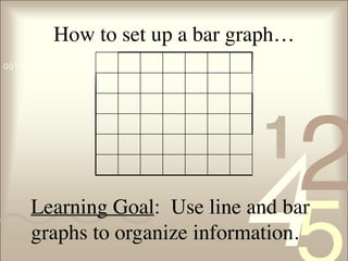
- 1. 421 0011 0010 1010 1101 0001 0100 1011 How to set up a bar graph… Learning Goal: Use line and bar graphs to organize information.
- 2. 421 0011 0010 1010 1101 0001 0100 1011 TAILS T - Title Teachers’s Favorite Singer
- 3. 421 0011 0010 1010 1101 0001 0100 1011 TAILS T - Title Teachers’s Favorite Singer Y Axis = Dependent Variable X Axis = Independent Variable A - Axis
- 4. 421 0011 0010 1010 1101 0001 0100 1011 TAILS T - Title A – Axis S – Scale Teachers’s Favorite Singer Decide on an appropriate scale for each axis. Choose a scale that lets you make the graph as large as possible for your paper and data
- 5. 421 0011 0010 1010 1101 0001 0100 1011 How to determine scale • Scale is determined by your highest & lowest number. • In this case your scale would be from 2 – 22. Favorite Singer Number of Teachers Bon Jovi 22 Metallica 15 Pitbull 11 Miley Cyrus 5 Taylor Swift 2
- 6. 421 0011 0010 1010 1101 0001 0100 1011 How to determine scale • The interval is decided by your scale. • In this case your scale would be from 2 – 22 and you want the scale to fit the graph. • The best interval would be to go by 5’s. Favorite Singer Number of Teachers Bon Jovi 22 Metallica 15 Pitbull 11 Miley Cyrus 5 Taylor Swift 2
- 7. 421 0011 0010 1010 1101 0001 0100 1011 TAILS T – Title A – Axis I – Interval S – Scale Teachers’s Favorite Singer The amount of space between one number and the next or one type of data and the next on the graph. The interval is just as important as the scale Choose an interval that lets you make the graph as large as possible for your paper and data
- 8. 421 0011 0010 1010 1101 0001 0100 1011 TAILS T – Title A – Axis I – Interval S – Scale Teachers’s Favorite Singer 0 5 10 15 20 25
- 9. 421 0011 0010 1010 1101 0001 0100 1011 TAILS T – Title A – Axis I – Interval L – Labels S – Scale Teachers’s Favorite Singer 0 5 10 15 20 25 BonJovi Metallica Pitbull MileyCyrus TaylorSwift LABEL your bars or data points Singers NumberofTeachers Label your X &Y Axes.
- 10. 421 0011 0010 1010 1101 0001 0100 1011 When to use… • Bar graphs – Used to show data that are not continuous. – Allows us to compare data like amounts or frequency or categories – Allow us to make generalizations about the data – Help us see differences in data • Line Graphs – For continuous data – useful for showing trends over time
- 11. 421 0011 0010 1010 1101 0001 0100 1011 Estimated Population Let’s Practice … Line Graphs Year World Populations (millions) 1650 500 1700 600 1750 700 1800 900 1850 1300 1900 1700 1950 2500 200 7000 Year 1650 1700 1750 1800 1850 1900 1950 2000
- 12. 421 0011 0010 1010 1101 0001 0100 1011 Learning Goal: Use line and bar graphs to organize information. Time to Self-Assess 5 – Mastered it! 4 – Own it! 3 – Getting there! 2 – Confused! 1 – No clue!