
Recomendados
Más contenido relacionado
La actualidad más candente
La actualidad más candente (19)
Similar a Poster
Similar a Poster (20)
Último
Último (20)
Poster
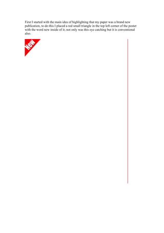
- 1. First I started with the main idea of highlighting that my paper was a brand new publication, to do this I placed a red small triangle in the top left corner of the poster with the word new inside of it; not only was this eye catching but it is conventional also.
- 2. Here now I placed the papers logo into the poster, at first I though that making the logo the largest thing on the page was a good idea however as I progressed I saw otherwise. After placing a screen shot of my front page in the poster I realized that having the
- 3. logo this size made the paper look out of proportion. I made a note to adjust this however I carried on before I did so.
- 4. Now I started to implement some text into the poster, I used the tagline, “ Get the latest in a bite” I hoped that this tag would connote the idea that the paper was a summarized account of events in the local area.
- 5. Here we have the final image, as you can see I have readjusted the size of the masthead bring the page and the logo into proportion. I placed a grey stroke around the paper to make it stand out in the image. Besides this as a part of my marketing I created some bite marks in the bottom right of the page, hope fully my readers would be able to associate these marks with my paper