SlideShare una empresa de Scribd logo
1 de 8
Heuristic Analysis
   Site                           Natural Therapy Pages
   Url                            http://www.naturaltherapypages.com.au/
   Date                           10/23/10

  Objectives

              Goal                                Task                           Screen
  Evaluate the usability status                                         Homepage. 1 click
                                    •First tier navigation.
of the landing page for Natural                                       connections.
Therapy Pages.                      •Search


  Measures

   The heuristics will be rated based on a 1 to 5 scale, being 5 the highest degree of conformity and
1 the least. If the heuristic is not applicable it will be left blank.

  Heuristics

  The heuristics chosen for this test are based on checklists from Daniel Torres Burriel and Yusef
Hassan Montero and based on the heuristics from Nielsen and Tognazzini.

  Test

  General Heuristics                                                                      Points
  Are the site objectives concrete and well defined?                                           5
  Do content and services offered correlate with such objectives?                              5
  Is the URL correct, clear and easy to remember? The internal URLs as well? Are               5
they static?
  Does it show clearly and precisely the content and services offered?                         3
  Is the general site structure user oriented?                                                 2
  Does the general look & feel correlate with the objectives, content and services?            5
  Is the general design coherent?                                                              3
  Is the general design recognisable?                                                          5
  Is the site updated periodically? Does it indicate when?                                     1


  Identity and Information                                                                Points
  Is the company/site identity clearly showed across all the pages?                            5
  Is the logo meaningful, identifiable and visible enough?                                     4
Is the slogan correctly portraying the site's objectives, content and services?          3
  Is any there any link about the company, webmaster or the website?                       1
  Is it possible to contact the company/site?                                              5
  Is there information about user data privacy and content copyright?                      5
  Do articles, reports or news show information about the author, sources, creation        1
and update dates... ?


  Language and Writing                                                                Points
  Does the site use the same language register as its users?                               5
  Is the language clear and concise?                                                       4
  Is the language familiar and friendly?                                                   4
  1 paragraph = 1 idea?                                                                    4


  Labels                                                                              Points
  Are labels meaningful?                                                                   2
  Are they standard?                                                                       4
  Is the organisational system unique and well defined?                                    2
  Are page titles correct? Have they been planned?                                         4


  Structure and Navigation                                                            Points
  Is the navigation and organisation structure the most suitable one?                      4
  Is the navigation placed in a prominent place within the site?                           2
  If the structure is hierarchy based, is there a balance between depth and width?         3
  If the structure is hypertextual are the nodes communicated?                             -
  Are links easily recognisable? Is their state correctly portrayed?                       3
  Is the number of elements and subelements in the navigation menus controlled?            2
  Is the system behaviour predictable before clicking a link?                              2
  Are there links leading no where?                                                        5
  Are there orphan pages?                                                                  5
  Are there redundant links?                                                               1
  Are image links recognisable as such? Do they have a title attribute?                    3
  Are there navigation elements informing the user of his situation and how to             2
reverse the navigation?


  Page Layout                                                                         Points
  Are higher hierarchy zones used for the most relevant content?                           2
Is there information overload?                                                           3
  Is the interface clean and without visual noise?                                         3
  Are there white zones between elements?                                                  3
  Is visual space correctly used?                                                          2
  Is visual hierarchy correctly used to express ownership and relationships between        2
elements?
  Is the page height controlled?                                                           5


  Search                                                                              Points
  Is it easily accessible?                                                                 5
  Is it easily recognisable?                                                               2
  Does it have an advanced search?                                                         1
  Are results easily understandable by the user?                                           4
  Is the search box big enough?                                                            3
  Does the no result page provide help and alternatives?                                   5


  Multimedia                                                                          Points
  Are images well cropped? Are they understandable? Do they have the right                 5
resolution?
  Are visual metaphors recognisable and understandable?                                    5
  Do images and animations add value?                                                      3
  Is the use of cyclic animations avoided?                                                 1


  Help                                                                                Points
  Is the help really needed?                                                               -
  Is the Help link placed in a visible area?                                               -
  Is there contextual help for complex tasks?                                              -
  Are FAQs well chosen? And the Answers?                                                   -


  Accessibility                                                                       Points
  Does the font size allow a correct reading?                                              3
  Do the formatting, font type, alignment and line height allow a correct reading?         3
  Is there a high contrast between the background and the font colors?                     5
  Do images have an alt attribute?                                                         1
  Is the site compatible with different browsers? And different screen resolutions?        5
  Can the user use the site without additional software or plugins?                        5
Is the weight of the page controlled?                                                       5
  Are there printer friendly versions of the page?                                            5


  Control and Feedback                                                                   Points
  Is the user in control of the interface?                                                    3
  Is the user constantly informed of whats happening?                                         4
  Are errors clearly and calmly shown, providing a way to solve the issue?                    5
  Has the user freedom to act?                                                                5
  Is the response time controlled?                                                            5


Results

  Heuristics                       Rating     Notes
  General                            3.7
  Identity and Information           3.4
  Language and Writing               4.25
  Labels                              3
  Structure and Navigation           2.9
  Page Layout                        2.8
  Search                             3.3
  Multimedia                         3.4
  Help                                -
  Accessibility                      3.6
  Control and Feedback               4.3


Considerations

Header

•The header holds the best searching tool in the site. This search box has a very powerful feature,
predictive search, and searches across different categories providing the most direct, complete and
reassuring search results. Instead of having a prominent role in the page structure is casted away in
the management zone of the page.
By placement its hierarchy is the higher as it belongs to the header. By size, position, surroundings
and by differentiating it from the other search options its role is diminished and confused.
•The element order and placement should follow a certain order within the general page layout.
The navigation bar begins halfway the content width and ends without reaching the natural header
width. The user feels uneasy.
•The login and contact links styling and placement award them with the same important, status and
purpose. This is not the case. A login link is usually expected to be seen with a register counterpart.
The contact belongs with the company related information (about us, etc..). In any case their place
should't be alongside the main navigation.
•The slogan or motto doesn't describe the page purpose or doesn't give an accurate description of its
contents.
•Cyclic animations should only be restricted as much as possible and only be included if their value
compensates the attention and visual strain put on the user. The scrolling text under the header is
small, difficult to read, there is no option to turn it off, appears all across the site and only is of use
to a very small percentage of the visitors (who have a bigger and more effective Call To Action
millimetres away).

Main Navigation

•The Main Navigation should be used to provide the user with information of the organisation and
structure of the site. It is here where the user will first come to look for what he wants and it is here
where he will first fall back when he gets lost or confused.
It must display in a clear and organised way all the conceptual sections of the page as well as
some of the utilities provided to interact with it.
In this Main Navigation all that is displayed is several paths to a search engine which is already
displayed by default. It holds little to no information about what the user can find in the page and
how to get there. Moreover, by directing the user towards the search utility (that should be an
option, not the only mean of navigation) he is given the message that his chance of actually finding
something relies within his more or less accurate ability to pick up search words.
•The first item of the navigation points to the same page. There is almost no exceptions for this to
be allowed (logo or header with link when present in the homepage).
•All search options lead to a different page that shares layout and functions with the Homepage,
confusing the user. The product search breaks this ¨convention¨ by introducing a completely new
array of options in the side navigation, creating more confusion.
•All the search sub sections lead to the same page when the Name Search tab is clicked. There is no
way to know if the name search belongs to the section it came from or is a common page. This is
misleading an confusing. Besides, the layout changes again adding to the general distraction.
•The practitioner search box seems to be present by default everywhere in the page. This creates
confusion when selecting Learn as the user could expect another search page after the 4 first, but
this is not the case. More on search boxes later.
Side Navigation

•The side navigation breaks away with the conventions previously created. This weakens the user
trusts as he needs to relearn what he knows about the site. In addition the color scheme used and
the placement make it very easy to confuse the first links with a popular and widely used
advertisement system.


•The first 5 items not only repeat the same function and links of the Main Navigation but they also
change the labels associated to them. This is highly confusing.
•The Forums/Blogs link is misleading. While it leads to a forum that is not integrated within the
layout of the page the Blogs are nowhere to be seen. After further inspection they appear as a
subforum of the main forum structure and in a different form to the one associated with the ¨blog¨
term.
•The differences between Discussion and Forum/Blogs are not clear. Why isn't the latter part of the
former? Is the presentation as two different category items justified? What is their difference with
the Articles section, later presented in the navigation, whose content shows similarities with
Discussion. The user gets confused, doesn't know which section to trust or follow. In addition the
disorganisation adds up to the general feeling of uneasiness.
•The next three links are utility links not related to the previous or next items. They don't even
share a relationship between them. However they are kept next to the most important links of the
side navigation (color scheme wise) and are bolded or supported by an image. This draws the user
attention from more important items. There are no user or business goals that justify placing a
browser management feature, a social media sharing option and a Call To Action for clients in that
position. In addition, the Facebook sharing option is not the best one and not very likely to be used,
and there have already been two more obvious advertising calls for clients. This apparently random
display of navigation items hurts badly the site image as the user trust is diminished.
•The navigation convention is broken again by recovering the color scheme previously used. In
probably the most serious issue within this section, the color cue invites the user to click the
section headers to disclose the second tier navigation. This click reveals such navigation, but only
after leaving the main page and taking the user to a subsection. This takes the control out of the
user's hand leaving him with confusion and mistrust.
•The resources section is however already expanded and it doesn't provide the option to toggle it,
breaking the convention again.
•The next 3 sub items are preceded by the the words Natural Health. What do they mean? Do they
make reference to the site contents or to a particular institution, medical term or brand? In the first
option why do those words appear here for the first time and they don't come with every other item?
In the second case, where is the explanation for its use and reason to appear there.
•Again, what's the difference between the Articles and the Discussion section? Can they be unified?
What justifies them been in such different places within the page hierarchy?


Main Content Area

•The find a practitioner search box appears apparently in a random way across the site.
•One of the most user attention gathering positions is filled by a 600x106 image with no clear
purpose. Its message, ¨Start your journey¨ is redundant since the user is already at the Homepage.


•The rest of the content are is filled by a series of product advertisements not related to the user
purpose, context of use or motivation.
•The only truly useful portion of content and information available is squeezed among the
aforementioned items and the right side ad.
•The actual content of the page is static and virtually non existing, since is way below the visual
range of the user. It features several paragraphs not related to each other. Doesn't provide a solid
first impression of the page purpose, philosophy, products, categories and utilities for the user.
The user's first thoughts of the page get diluted among a flooding series of advertisements and
confusing navigation.

Search

•There are five different types of search boxes with two of them almost always present. The most
powerful and useful one is overshadowed by the others.
•There is no Advanced Search option provided.
•The visual metaphor used to contain the search (tabs) is broken when the Name Search option is
selected and doesn't allow the user to return to the other option.

Summary

   The main issues affecting the site are a chaotic non-reliable navigation system and a confusing
search system split among different pages and categories. This is the result of a page built around
and driven by features and utilities rather than user centered.
   The side effect of this approach is a poor treatment of the content, casting aside or disregarding
valuable and updated material such as the articles, discussion or blogs, that could constitute a key
part of the branding image, an engaging experience for the user and the roots for a user community
around the page theme.


Solutions, approach and strategy

  To be discussed.

Más contenido relacionado

Similar a Natural Theraphy Heuristic analysis

'No Whitewash' - Experiences of running international qualitative forums - Bu...
'No Whitewash' - Experiences of running international qualitative forums - Bu...'No Whitewash' - Experiences of running international qualitative forums - Bu...
'No Whitewash' - Experiences of running international qualitative forums - Bu...Merlien Institute
 
InternetInvestigatorNotebook
InternetInvestigatorNotebookInternetInvestigatorNotebook
InternetInvestigatorNotebookeward511
 
Wright de ann-more than words
Wright de ann-more than wordsWright de ann-more than words
Wright de ann-more than wordsDeAnn Wright
 
SEO Content Creation 101 By LinchpinSEO for Small Business in Chicago
SEO Content Creation 101 By LinchpinSEO for Small Business in ChicagoSEO Content Creation 101 By LinchpinSEO for Small Business in Chicago
SEO Content Creation 101 By LinchpinSEO for Small Business in ChicagoLinchpin SEO
 
Information Architecture Heuristics
Information Architecture HeuristicsInformation Architecture Heuristics
Information Architecture HeuristicsAbby Covert
 
Farmer, MacLean & Corns (1) - How can reading lists be effective information ...
Farmer, MacLean & Corns (1) - How can reading lists be effective information ...Farmer, MacLean & Corns (1) - How can reading lists be effective information ...
Farmer, MacLean & Corns (1) - How can reading lists be effective information ...IL Group (CILIP Information Literacy Group)
 
Website Architecture Presentation from Web Strategy Workshops
Website Architecture Presentation from Web Strategy WorkshopsWebsite Architecture Presentation from Web Strategy Workshops
Website Architecture Presentation from Web Strategy WorkshopsCharles Edmunds
 
Web Application Visual Design for Non-Designers
Web Application Visual Design for Non-DesignersWeb Application Visual Design for Non-Designers
Web Application Visual Design for Non-DesignersTania Schlatter
 
Developing a digital literacy framework in your school
Developing a digital literacy framework in your schoolDeveloping a digital literacy framework in your school
Developing a digital literacy framework in your schoolEduwebinar
 
MGSLG Adult Learning & Knowledge Management
MGSLG   Adult Learning & Knowledge ManagementMGSLG   Adult Learning & Knowledge Management
MGSLG Adult Learning & Knowledge ManagementEducation Moving Up Cc.
 
Team Management
Team ManagementTeam Management
Team ManagementJoão Lima
 
Digital literacy criteria
Digital literacy criteriaDigital literacy criteria
Digital literacy criteriaToby Beck
 
Understanding Information Architecture
Understanding Information ArchitectureUnderstanding Information Architecture
Understanding Information ArchitectureAbby Covert
 
Integral Managerial Leadership
Integral Managerial LeadershipIntegral Managerial Leadership
Integral Managerial LeadershipMeg Salter
 
What Is Social Learning Sandeep Rathod4 Wud2011
What Is Social Learning Sandeep Rathod4 Wud2011What Is Social Learning Sandeep Rathod4 Wud2011
What Is Social Learning Sandeep Rathod4 Wud2011UExS
 
Evaluating Sources of Information
Evaluating Sources of InformationEvaluating Sources of Information
Evaluating Sources of Informationstanhopekris
 
Webinar: "Let's Get Mobile: Changing Your Concept of Mobile Content Design an...
Webinar: "Let's Get Mobile: Changing Your Concept of Mobile Content Design an...Webinar: "Let's Get Mobile: Changing Your Concept of Mobile Content Design an...
Webinar: "Let's Get Mobile: Changing Your Concept of Mobile Content Design an...Xyleme
 
Interview questions
Interview questionsInterview questions
Interview questionspublishift
 

Similar a Natural Theraphy Heuristic analysis (20)

'No Whitewash' - Experiences of running international qualitative forums - Bu...
'No Whitewash' - Experiences of running international qualitative forums - Bu...'No Whitewash' - Experiences of running international qualitative forums - Bu...
'No Whitewash' - Experiences of running international qualitative forums - Bu...
 
InternetInvestigatorNotebook
InternetInvestigatorNotebookInternetInvestigatorNotebook
InternetInvestigatorNotebook
 
Wright de ann-more than words
Wright de ann-more than wordsWright de ann-more than words
Wright de ann-more than words
 
SEO Content Creation 101 By LinchpinSEO for Small Business in Chicago
SEO Content Creation 101 By LinchpinSEO for Small Business in ChicagoSEO Content Creation 101 By LinchpinSEO for Small Business in Chicago
SEO Content Creation 101 By LinchpinSEO for Small Business in Chicago
 
Information Architecture Heuristics
Information Architecture HeuristicsInformation Architecture Heuristics
Information Architecture Heuristics
 
Farmer, MacLean & Corns (1) - How can reading lists be effective information ...
Farmer, MacLean & Corns (1) - How can reading lists be effective information ...Farmer, MacLean & Corns (1) - How can reading lists be effective information ...
Farmer, MacLean & Corns (1) - How can reading lists be effective information ...
 
Website Architecture Presentation from Web Strategy Workshops
Website Architecture Presentation from Web Strategy WorkshopsWebsite Architecture Presentation from Web Strategy Workshops
Website Architecture Presentation from Web Strategy Workshops
 
Web Application Visual Design for Non-Designers
Web Application Visual Design for Non-DesignersWeb Application Visual Design for Non-Designers
Web Application Visual Design for Non-Designers
 
Developing a digital literacy framework in your school
Developing a digital literacy framework in your schoolDeveloping a digital literacy framework in your school
Developing a digital literacy framework in your school
 
MGSLG Adult Learning & Knowledge Management
MGSLG   Adult Learning & Knowledge ManagementMGSLG   Adult Learning & Knowledge Management
MGSLG Adult Learning & Knowledge Management
 
Team Management
Team ManagementTeam Management
Team Management
 
Digital literacy criteria
Digital literacy criteriaDigital literacy criteria
Digital literacy criteria
 
Understanding Information Architecture
Understanding Information ArchitectureUnderstanding Information Architecture
Understanding Information Architecture
 
Integral Managerial Leadership
Integral Managerial LeadershipIntegral Managerial Leadership
Integral Managerial Leadership
 
Johnsen Elearning To Eleading
Johnsen Elearning To EleadingJohnsen Elearning To Eleading
Johnsen Elearning To Eleading
 
PCMA Social Media UR Doing it Wrong
PCMA Social Media UR Doing it WrongPCMA Social Media UR Doing it Wrong
PCMA Social Media UR Doing it Wrong
 
What Is Social Learning Sandeep Rathod4 Wud2011
What Is Social Learning Sandeep Rathod4 Wud2011What Is Social Learning Sandeep Rathod4 Wud2011
What Is Social Learning Sandeep Rathod4 Wud2011
 
Evaluating Sources of Information
Evaluating Sources of InformationEvaluating Sources of Information
Evaluating Sources of Information
 
Webinar: "Let's Get Mobile: Changing Your Concept of Mobile Content Design an...
Webinar: "Let's Get Mobile: Changing Your Concept of Mobile Content Design an...Webinar: "Let's Get Mobile: Changing Your Concept of Mobile Content Design an...
Webinar: "Let's Get Mobile: Changing Your Concept of Mobile Content Design an...
 
Interview questions
Interview questionsInterview questions
Interview questions
 

Más de Pablo Gil

Amped2010 presentation
Amped2010 presentationAmped2010 presentation
Amped2010 presentationPablo Gil
 
Advisor Finder User Testing debrief v0.4
Advisor Finder User Testing debrief v0.4Advisor Finder User Testing debrief v0.4
Advisor Finder User Testing debrief v0.4Pablo Gil
 
Advisor Finder tasklist v0.2
Advisor Finder tasklist v0.2Advisor Finder tasklist v0.2
Advisor Finder tasklist v0.2Pablo Gil
 
Expert Review Advisor Finder
Expert Review Advisor FinderExpert Review Advisor Finder
Expert Review Advisor FinderPablo Gil
 
DOL-Personasv1.1
DOL-Personasv1.1DOL-Personasv1.1
DOL-Personasv1.1Pablo Gil
 
Natural Theraphy Wireframe
Natural Theraphy WireframeNatural Theraphy Wireframe
Natural Theraphy WireframePablo Gil
 

Más de Pablo Gil (6)

Amped2010 presentation
Amped2010 presentationAmped2010 presentation
Amped2010 presentation
 
Advisor Finder User Testing debrief v0.4
Advisor Finder User Testing debrief v0.4Advisor Finder User Testing debrief v0.4
Advisor Finder User Testing debrief v0.4
 
Advisor Finder tasklist v0.2
Advisor Finder tasklist v0.2Advisor Finder tasklist v0.2
Advisor Finder tasklist v0.2
 
Expert Review Advisor Finder
Expert Review Advisor FinderExpert Review Advisor Finder
Expert Review Advisor Finder
 
DOL-Personasv1.1
DOL-Personasv1.1DOL-Personasv1.1
DOL-Personasv1.1
 
Natural Theraphy Wireframe
Natural Theraphy WireframeNatural Theraphy Wireframe
Natural Theraphy Wireframe
 

Último

2024新版美国旧金山州立大学毕业证成绩单pdf电子版制作修改#毕业文凭制作#回国入职#diploma#degree
2024新版美国旧金山州立大学毕业证成绩单pdf电子版制作修改#毕业文凭制作#回国入职#diploma#degree2024新版美国旧金山州立大学毕业证成绩单pdf电子版制作修改#毕业文凭制作#回国入职#diploma#degree
2024新版美国旧金山州立大学毕业证成绩单pdf电子版制作修改#毕业文凭制作#回国入职#diploma#degreeyuu sss
 
Untitled presedddddddddddddddddntation (1).pptx
Untitled presedddddddddddddddddntation (1).pptxUntitled presedddddddddddddddddntation (1).pptx
Untitled presedddddddddddddddddntation (1).pptxmapanig881
 
昆士兰大学毕业证(UQ毕业证)#文凭成绩单#真实留信学历认证永久存档
昆士兰大学毕业证(UQ毕业证)#文凭成绩单#真实留信学历认证永久存档昆士兰大学毕业证(UQ毕业证)#文凭成绩单#真实留信学历认证永久存档
昆士兰大学毕业证(UQ毕业证)#文凭成绩单#真实留信学历认证永久存档208367051
 
办理卡尔顿大学毕业证成绩单|购买加拿大文凭证书
办理卡尔顿大学毕业证成绩单|购买加拿大文凭证书办理卡尔顿大学毕业证成绩单|购买加拿大文凭证书
办理卡尔顿大学毕业证成绩单|购买加拿大文凭证书zdzoqco
 
(办理学位证)约克圣约翰大学毕业证,KCL成绩单原版一比一
(办理学位证)约克圣约翰大学毕业证,KCL成绩单原版一比一(办理学位证)约克圣约翰大学毕业证,KCL成绩单原版一比一
(办理学位证)约克圣约翰大学毕业证,KCL成绩单原版一比一D SSS
 
韩国SKKU学位证,成均馆大学毕业证书1:1制作
韩国SKKU学位证,成均馆大学毕业证书1:1制作韩国SKKU学位证,成均馆大学毕业证书1:1制作
韩国SKKU学位证,成均馆大学毕业证书1:1制作7tz4rjpd
 
Passbook project document_april_21__.pdf
Passbook project document_april_21__.pdfPassbook project document_april_21__.pdf
Passbook project document_april_21__.pdfvaibhavkanaujia
 
办理学位证(SFU证书)西蒙菲莎大学毕业证成绩单原版一比一
办理学位证(SFU证书)西蒙菲莎大学毕业证成绩单原版一比一办理学位证(SFU证书)西蒙菲莎大学毕业证成绩单原版一比一
办理学位证(SFU证书)西蒙菲莎大学毕业证成绩单原版一比一F dds
 
Dubai Calls Girl Tapes O525547819 Real Tapes Escort Services Dubai
Dubai Calls Girl Tapes O525547819 Real Tapes Escort Services DubaiDubai Calls Girl Tapes O525547819 Real Tapes Escort Services Dubai
Dubai Calls Girl Tapes O525547819 Real Tapes Escort Services Dubaikojalkojal131
 
General Knowledge Quiz Game C++ CODE.pptx
General Knowledge Quiz Game C++ CODE.pptxGeneral Knowledge Quiz Game C++ CODE.pptx
General Knowledge Quiz Game C++ CODE.pptxmarckustrevion
 
Top 10 Modern Web Design Trends for 2025
Top 10 Modern Web Design Trends for 2025Top 10 Modern Web Design Trends for 2025
Top 10 Modern Web Design Trends for 2025Rndexperts
 
Unveiling the Future: Columbus, Ohio Condominiums Through the Lens of 3D Arch...
Unveiling the Future: Columbus, Ohio Condominiums Through the Lens of 3D Arch...Unveiling the Future: Columbus, Ohio Condominiums Through the Lens of 3D Arch...
Unveiling the Future: Columbus, Ohio Condominiums Through the Lens of 3D Arch...Yantram Animation Studio Corporation
 
毕业文凭制作#回国入职#diploma#degree澳洲弗林德斯大学毕业证成绩单pdf电子版制作修改#毕业文凭制作#回国入职#diploma#degree
毕业文凭制作#回国入职#diploma#degree澳洲弗林德斯大学毕业证成绩单pdf电子版制作修改#毕业文凭制作#回国入职#diploma#degree 毕业文凭制作#回国入职#diploma#degree澳洲弗林德斯大学毕业证成绩单pdf电子版制作修改#毕业文凭制作#回国入职#diploma#degree
毕业文凭制作#回国入职#diploma#degree澳洲弗林德斯大学毕业证成绩单pdf电子版制作修改#毕业文凭制作#回国入职#diploma#degree ttt fff
 
'CASE STUDY OF INDIRA PARYAVARAN BHAVAN DELHI ,
'CASE STUDY OF INDIRA PARYAVARAN BHAVAN DELHI ,'CASE STUDY OF INDIRA PARYAVARAN BHAVAN DELHI ,
'CASE STUDY OF INDIRA PARYAVARAN BHAVAN DELHI ,Aginakm1
 
8377877756 Full Enjoy @24/7 Call Girls in Nirman Vihar Delhi NCR
8377877756 Full Enjoy @24/7 Call Girls in Nirman Vihar Delhi NCR8377877756 Full Enjoy @24/7 Call Girls in Nirman Vihar Delhi NCR
8377877756 Full Enjoy @24/7 Call Girls in Nirman Vihar Delhi NCRdollysharma2066
 
Pharmaceutical Packaging for the elderly.pdf
Pharmaceutical Packaging for the elderly.pdfPharmaceutical Packaging for the elderly.pdf
Pharmaceutical Packaging for the elderly.pdfAayushChavan5
 
办理学位证(SFU证书)西蒙弗雷泽大学毕业证成绩单原版一比一
办理学位证(SFU证书)西蒙弗雷泽大学毕业证成绩单原版一比一办理学位证(SFU证书)西蒙弗雷泽大学毕业证成绩单原版一比一
办理学位证(SFU证书)西蒙弗雷泽大学毕业证成绩单原版一比一F dds
 
Iconic Global Solution - web design, Digital Marketing services
Iconic Global Solution - web design, Digital Marketing servicesIconic Global Solution - web design, Digital Marketing services
Iconic Global Solution - web design, Digital Marketing servicesIconic global solution
 
办理学位证(UCSD证书)美国加利福尼亚大学圣迭戈分校毕业证成绩单原版一比一
办理学位证(UCSD证书)美国加利福尼亚大学圣迭戈分校毕业证成绩单原版一比一办理学位证(UCSD证书)美国加利福尼亚大学圣迭戈分校毕业证成绩单原版一比一
办理学位证(UCSD证书)美国加利福尼亚大学圣迭戈分校毕业证成绩单原版一比一A SSS
 
Top 10 Modern Web Design Trends for 2025
Top 10 Modern Web Design Trends for 2025Top 10 Modern Web Design Trends for 2025
Top 10 Modern Web Design Trends for 2025Rndexperts
 

Último (20)

2024新版美国旧金山州立大学毕业证成绩单pdf电子版制作修改#毕业文凭制作#回国入职#diploma#degree
2024新版美国旧金山州立大学毕业证成绩单pdf电子版制作修改#毕业文凭制作#回国入职#diploma#degree2024新版美国旧金山州立大学毕业证成绩单pdf电子版制作修改#毕业文凭制作#回国入职#diploma#degree
2024新版美国旧金山州立大学毕业证成绩单pdf电子版制作修改#毕业文凭制作#回国入职#diploma#degree
 
Untitled presedddddddddddddddddntation (1).pptx
Untitled presedddddddddddddddddntation (1).pptxUntitled presedddddddddddddddddntation (1).pptx
Untitled presedddddddddddddddddntation (1).pptx
 
昆士兰大学毕业证(UQ毕业证)#文凭成绩单#真实留信学历认证永久存档
昆士兰大学毕业证(UQ毕业证)#文凭成绩单#真实留信学历认证永久存档昆士兰大学毕业证(UQ毕业证)#文凭成绩单#真实留信学历认证永久存档
昆士兰大学毕业证(UQ毕业证)#文凭成绩单#真实留信学历认证永久存档
 
办理卡尔顿大学毕业证成绩单|购买加拿大文凭证书
办理卡尔顿大学毕业证成绩单|购买加拿大文凭证书办理卡尔顿大学毕业证成绩单|购买加拿大文凭证书
办理卡尔顿大学毕业证成绩单|购买加拿大文凭证书
 
(办理学位证)约克圣约翰大学毕业证,KCL成绩单原版一比一
(办理学位证)约克圣约翰大学毕业证,KCL成绩单原版一比一(办理学位证)约克圣约翰大学毕业证,KCL成绩单原版一比一
(办理学位证)约克圣约翰大学毕业证,KCL成绩单原版一比一
 
韩国SKKU学位证,成均馆大学毕业证书1:1制作
韩国SKKU学位证,成均馆大学毕业证书1:1制作韩国SKKU学位证,成均馆大学毕业证书1:1制作
韩国SKKU学位证,成均馆大学毕业证书1:1制作
 
Passbook project document_april_21__.pdf
Passbook project document_april_21__.pdfPassbook project document_april_21__.pdf
Passbook project document_april_21__.pdf
 
办理学位证(SFU证书)西蒙菲莎大学毕业证成绩单原版一比一
办理学位证(SFU证书)西蒙菲莎大学毕业证成绩单原版一比一办理学位证(SFU证书)西蒙菲莎大学毕业证成绩单原版一比一
办理学位证(SFU证书)西蒙菲莎大学毕业证成绩单原版一比一
 
Dubai Calls Girl Tapes O525547819 Real Tapes Escort Services Dubai
Dubai Calls Girl Tapes O525547819 Real Tapes Escort Services DubaiDubai Calls Girl Tapes O525547819 Real Tapes Escort Services Dubai
Dubai Calls Girl Tapes O525547819 Real Tapes Escort Services Dubai
 
General Knowledge Quiz Game C++ CODE.pptx
General Knowledge Quiz Game C++ CODE.pptxGeneral Knowledge Quiz Game C++ CODE.pptx
General Knowledge Quiz Game C++ CODE.pptx
 
Top 10 Modern Web Design Trends for 2025
Top 10 Modern Web Design Trends for 2025Top 10 Modern Web Design Trends for 2025
Top 10 Modern Web Design Trends for 2025
 
Unveiling the Future: Columbus, Ohio Condominiums Through the Lens of 3D Arch...
Unveiling the Future: Columbus, Ohio Condominiums Through the Lens of 3D Arch...Unveiling the Future: Columbus, Ohio Condominiums Through the Lens of 3D Arch...
Unveiling the Future: Columbus, Ohio Condominiums Through the Lens of 3D Arch...
 
毕业文凭制作#回国入职#diploma#degree澳洲弗林德斯大学毕业证成绩单pdf电子版制作修改#毕业文凭制作#回国入职#diploma#degree
毕业文凭制作#回国入职#diploma#degree澳洲弗林德斯大学毕业证成绩单pdf电子版制作修改#毕业文凭制作#回国入职#diploma#degree 毕业文凭制作#回国入职#diploma#degree澳洲弗林德斯大学毕业证成绩单pdf电子版制作修改#毕业文凭制作#回国入职#diploma#degree
毕业文凭制作#回国入职#diploma#degree澳洲弗林德斯大学毕业证成绩单pdf电子版制作修改#毕业文凭制作#回国入职#diploma#degree
 
'CASE STUDY OF INDIRA PARYAVARAN BHAVAN DELHI ,
'CASE STUDY OF INDIRA PARYAVARAN BHAVAN DELHI ,'CASE STUDY OF INDIRA PARYAVARAN BHAVAN DELHI ,
'CASE STUDY OF INDIRA PARYAVARAN BHAVAN DELHI ,
 
8377877756 Full Enjoy @24/7 Call Girls in Nirman Vihar Delhi NCR
8377877756 Full Enjoy @24/7 Call Girls in Nirman Vihar Delhi NCR8377877756 Full Enjoy @24/7 Call Girls in Nirman Vihar Delhi NCR
8377877756 Full Enjoy @24/7 Call Girls in Nirman Vihar Delhi NCR
 
Pharmaceutical Packaging for the elderly.pdf
Pharmaceutical Packaging for the elderly.pdfPharmaceutical Packaging for the elderly.pdf
Pharmaceutical Packaging for the elderly.pdf
 
办理学位证(SFU证书)西蒙弗雷泽大学毕业证成绩单原版一比一
办理学位证(SFU证书)西蒙弗雷泽大学毕业证成绩单原版一比一办理学位证(SFU证书)西蒙弗雷泽大学毕业证成绩单原版一比一
办理学位证(SFU证书)西蒙弗雷泽大学毕业证成绩单原版一比一
 
Iconic Global Solution - web design, Digital Marketing services
Iconic Global Solution - web design, Digital Marketing servicesIconic Global Solution - web design, Digital Marketing services
Iconic Global Solution - web design, Digital Marketing services
 
办理学位证(UCSD证书)美国加利福尼亚大学圣迭戈分校毕业证成绩单原版一比一
办理学位证(UCSD证书)美国加利福尼亚大学圣迭戈分校毕业证成绩单原版一比一办理学位证(UCSD证书)美国加利福尼亚大学圣迭戈分校毕业证成绩单原版一比一
办理学位证(UCSD证书)美国加利福尼亚大学圣迭戈分校毕业证成绩单原版一比一
 
Top 10 Modern Web Design Trends for 2025
Top 10 Modern Web Design Trends for 2025Top 10 Modern Web Design Trends for 2025
Top 10 Modern Web Design Trends for 2025
 

Natural Theraphy Heuristic analysis

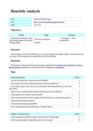
  • 1. Heuristic Analysis Site Natural Therapy Pages Url http://www.naturaltherapypages.com.au/ Date 10/23/10 Objectives Goal Task Screen Evaluate the usability status Homepage. 1 click •First tier navigation. of the landing page for Natural connections. Therapy Pages. •Search Measures The heuristics will be rated based on a 1 to 5 scale, being 5 the highest degree of conformity and 1 the least. If the heuristic is not applicable it will be left blank. Heuristics The heuristics chosen for this test are based on checklists from Daniel Torres Burriel and Yusef Hassan Montero and based on the heuristics from Nielsen and Tognazzini. Test General Heuristics Points Are the site objectives concrete and well defined? 5 Do content and services offered correlate with such objectives? 5 Is the URL correct, clear and easy to remember? The internal URLs as well? Are 5 they static? Does it show clearly and precisely the content and services offered? 3 Is the general site structure user oriented? 2 Does the general look & feel correlate with the objectives, content and services? 5 Is the general design coherent? 3 Is the general design recognisable? 5 Is the site updated periodically? Does it indicate when? 1 Identity and Information Points Is the company/site identity clearly showed across all the pages? 5 Is the logo meaningful, identifiable and visible enough? 4
  • 2. Is the slogan correctly portraying the site's objectives, content and services? 3 Is any there any link about the company, webmaster or the website? 1 Is it possible to contact the company/site? 5 Is there information about user data privacy and content copyright? 5 Do articles, reports or news show information about the author, sources, creation 1 and update dates... ? Language and Writing Points Does the site use the same language register as its users? 5 Is the language clear and concise? 4 Is the language familiar and friendly? 4 1 paragraph = 1 idea? 4 Labels Points Are labels meaningful? 2 Are they standard? 4 Is the organisational system unique and well defined? 2 Are page titles correct? Have they been planned? 4 Structure and Navigation Points Is the navigation and organisation structure the most suitable one? 4 Is the navigation placed in a prominent place within the site? 2 If the structure is hierarchy based, is there a balance between depth and width? 3 If the structure is hypertextual are the nodes communicated? - Are links easily recognisable? Is their state correctly portrayed? 3 Is the number of elements and subelements in the navigation menus controlled? 2 Is the system behaviour predictable before clicking a link? 2 Are there links leading no where? 5 Are there orphan pages? 5 Are there redundant links? 1 Are image links recognisable as such? Do they have a title attribute? 3 Are there navigation elements informing the user of his situation and how to 2 reverse the navigation? Page Layout Points Are higher hierarchy zones used for the most relevant content? 2
  • 3. Is there information overload? 3 Is the interface clean and without visual noise? 3 Are there white zones between elements? 3 Is visual space correctly used? 2 Is visual hierarchy correctly used to express ownership and relationships between 2 elements? Is the page height controlled? 5 Search Points Is it easily accessible? 5 Is it easily recognisable? 2 Does it have an advanced search? 1 Are results easily understandable by the user? 4 Is the search box big enough? 3 Does the no result page provide help and alternatives? 5 Multimedia Points Are images well cropped? Are they understandable? Do they have the right 5 resolution? Are visual metaphors recognisable and understandable? 5 Do images and animations add value? 3 Is the use of cyclic animations avoided? 1 Help Points Is the help really needed? - Is the Help link placed in a visible area? - Is there contextual help for complex tasks? - Are FAQs well chosen? And the Answers? - Accessibility Points Does the font size allow a correct reading? 3 Do the formatting, font type, alignment and line height allow a correct reading? 3 Is there a high contrast between the background and the font colors? 5 Do images have an alt attribute? 1 Is the site compatible with different browsers? And different screen resolutions? 5 Can the user use the site without additional software or plugins? 5
  • 4. Is the weight of the page controlled? 5 Are there printer friendly versions of the page? 5 Control and Feedback Points Is the user in control of the interface? 3 Is the user constantly informed of whats happening? 4 Are errors clearly and calmly shown, providing a way to solve the issue? 5 Has the user freedom to act? 5 Is the response time controlled? 5 Results Heuristics Rating Notes General 3.7 Identity and Information 3.4 Language and Writing 4.25 Labels 3 Structure and Navigation 2.9 Page Layout 2.8 Search 3.3 Multimedia 3.4 Help - Accessibility 3.6 Control and Feedback 4.3 Considerations Header •The header holds the best searching tool in the site. This search box has a very powerful feature, predictive search, and searches across different categories providing the most direct, complete and reassuring search results. Instead of having a prominent role in the page structure is casted away in the management zone of the page. By placement its hierarchy is the higher as it belongs to the header. By size, position, surroundings and by differentiating it from the other search options its role is diminished and confused. •The element order and placement should follow a certain order within the general page layout. The navigation bar begins halfway the content width and ends without reaching the natural header width. The user feels uneasy.
  • 5. •The login and contact links styling and placement award them with the same important, status and purpose. This is not the case. A login link is usually expected to be seen with a register counterpart. The contact belongs with the company related information (about us, etc..). In any case their place should't be alongside the main navigation. •The slogan or motto doesn't describe the page purpose or doesn't give an accurate description of its contents. •Cyclic animations should only be restricted as much as possible and only be included if their value compensates the attention and visual strain put on the user. The scrolling text under the header is small, difficult to read, there is no option to turn it off, appears all across the site and only is of use to a very small percentage of the visitors (who have a bigger and more effective Call To Action millimetres away). Main Navigation •The Main Navigation should be used to provide the user with information of the organisation and structure of the site. It is here where the user will first come to look for what he wants and it is here where he will first fall back when he gets lost or confused. It must display in a clear and organised way all the conceptual sections of the page as well as some of the utilities provided to interact with it. In this Main Navigation all that is displayed is several paths to a search engine which is already displayed by default. It holds little to no information about what the user can find in the page and how to get there. Moreover, by directing the user towards the search utility (that should be an option, not the only mean of navigation) he is given the message that his chance of actually finding something relies within his more or less accurate ability to pick up search words. •The first item of the navigation points to the same page. There is almost no exceptions for this to be allowed (logo or header with link when present in the homepage). •All search options lead to a different page that shares layout and functions with the Homepage, confusing the user. The product search breaks this ¨convention¨ by introducing a completely new array of options in the side navigation, creating more confusion. •All the search sub sections lead to the same page when the Name Search tab is clicked. There is no way to know if the name search belongs to the section it came from or is a common page. This is misleading an confusing. Besides, the layout changes again adding to the general distraction. •The practitioner search box seems to be present by default everywhere in the page. This creates confusion when selecting Learn as the user could expect another search page after the 4 first, but this is not the case. More on search boxes later.
  • 6. Side Navigation •The side navigation breaks away with the conventions previously created. This weakens the user trusts as he needs to relearn what he knows about the site. In addition the color scheme used and the placement make it very easy to confuse the first links with a popular and widely used advertisement system. •The first 5 items not only repeat the same function and links of the Main Navigation but they also change the labels associated to them. This is highly confusing. •The Forums/Blogs link is misleading. While it leads to a forum that is not integrated within the layout of the page the Blogs are nowhere to be seen. After further inspection they appear as a subforum of the main forum structure and in a different form to the one associated with the ¨blog¨ term. •The differences between Discussion and Forum/Blogs are not clear. Why isn't the latter part of the former? Is the presentation as two different category items justified? What is their difference with the Articles section, later presented in the navigation, whose content shows similarities with Discussion. The user gets confused, doesn't know which section to trust or follow. In addition the disorganisation adds up to the general feeling of uneasiness. •The next three links are utility links not related to the previous or next items. They don't even share a relationship between them. However they are kept next to the most important links of the side navigation (color scheme wise) and are bolded or supported by an image. This draws the user attention from more important items. There are no user or business goals that justify placing a browser management feature, a social media sharing option and a Call To Action for clients in that position. In addition, the Facebook sharing option is not the best one and not very likely to be used, and there have already been two more obvious advertising calls for clients. This apparently random display of navigation items hurts badly the site image as the user trust is diminished. •The navigation convention is broken again by recovering the color scheme previously used. In probably the most serious issue within this section, the color cue invites the user to click the section headers to disclose the second tier navigation. This click reveals such navigation, but only after leaving the main page and taking the user to a subsection. This takes the control out of the user's hand leaving him with confusion and mistrust. •The resources section is however already expanded and it doesn't provide the option to toggle it, breaking the convention again. •The next 3 sub items are preceded by the the words Natural Health. What do they mean? Do they make reference to the site contents or to a particular institution, medical term or brand? In the first
  • 7. option why do those words appear here for the first time and they don't come with every other item? In the second case, where is the explanation for its use and reason to appear there. •Again, what's the difference between the Articles and the Discussion section? Can they be unified? What justifies them been in such different places within the page hierarchy? Main Content Area •The find a practitioner search box appears apparently in a random way across the site. •One of the most user attention gathering positions is filled by a 600x106 image with no clear purpose. Its message, ¨Start your journey¨ is redundant since the user is already at the Homepage. •The rest of the content are is filled by a series of product advertisements not related to the user purpose, context of use or motivation. •The only truly useful portion of content and information available is squeezed among the aforementioned items and the right side ad.
  • 8. •The actual content of the page is static and virtually non existing, since is way below the visual range of the user. It features several paragraphs not related to each other. Doesn't provide a solid first impression of the page purpose, philosophy, products, categories and utilities for the user. The user's first thoughts of the page get diluted among a flooding series of advertisements and confusing navigation. Search •There are five different types of search boxes with two of them almost always present. The most powerful and useful one is overshadowed by the others. •There is no Advanced Search option provided. •The visual metaphor used to contain the search (tabs) is broken when the Name Search option is selected and doesn't allow the user to return to the other option. Summary The main issues affecting the site are a chaotic non-reliable navigation system and a confusing search system split among different pages and categories. This is the result of a page built around and driven by features and utilities rather than user centered. The side effect of this approach is a poor treatment of the content, casting aside or disregarding valuable and updated material such as the articles, discussion or blogs, that could constitute a key part of the branding image, an engaging experience for the user and the roots for a user community around the page theme. Solutions, approach and strategy To be discussed.