
Recomendados
Más contenido relacionado
La actualidad más candente
La actualidad más candente (20)
Destacado
Destacado (18)
Similar a Spring Breakers Title Sequence Analysis
Similar a Spring Breakers Title Sequence Analysis (20)
Más de laulmills
Último
Último (12)
Spring Breakers Title Sequence Analysis
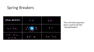
- 1. Spring Breakers This is the title sequences that is used for the film ‘’Spring Breakers’’.
- 2. The first title that is shown during the title sequence, is the films actual title. From the first sequence it is apparent that the film is going to be vibrant and energetic. This is shown due to the specific colours that are being used, e.g. ‘pink, purple, blue and orange’. The font style is electric and dangerous, breaking the rules. This gives the audience the persona of the film being suited for a younger audience such as teenagers 15+. The tone from the first sequence is set to be light hearted and fun, this is portrayed from the colours and font style used. The text function is to inform audiences of the title for the film, addressing to 15+ target audiences. In terms of age, gender and ethnicity. The title is not aimed at a particular gender, it does not use stereotypical colours e.g. pink and blue. There is no set gender. However, the age could be deciphered through the title due to the flashing motion picture being used and the vibrant colours etc. Finally, there is not ethnical background specification throughout the title sequence. In the second title sequences, the same tone is portrayed as the first time around, this is once again due to the font and colours being used. However, the contrast of colours between the first and second title sequence is apparent. Going from un stereo typical colours, to the typical pink and blue gender specified colours. The use of pink within the text can be looked at, as trying to aim to a more female specified audience. The black background contrasts further with the font colour, making it stand out to the audience watching, catching their attention. Spring Breakers Title Sequence
- 3. Further on in the title sequence, consistency is kept regards to the style of writing and colour of writing, leading yet again to the belief that the film may be more inclined to a feminine audience. However, the use of the firework type of style for the font with the first letter of every name gives it more of a vibrant and fun aspect relation more to a teenage or younger audience.