
Recomendados
Más contenido relacionado
La actualidad más candente
La actualidad más candente (20)
Similar a Cabin in the woods analysis
Similar a Cabin in the woods analysis (20)
Más de lucyl0u
Último
Último (20)
Cabin in the woods analysis
- 1. Why did I choose this poster? I decided to concentrate on this film as I found the concept to be quite unique and modern. I believe that this is echoed throughout the film posters as well. When first coming across this poster I found that it made an impact on me and I was instantly captivated by the design and unique selling point (the cabin). I also found that it left me to be confused and wanting to investigate more into the story line of the film and actually sit down and watch it there and then. From my first reaction I could see that this was a film I wanted to included in my own work and be able to evaluate the film in more depth and explain the intentions of each poster so it would help me in creating my own horror film trailer. Cabin in the woods film poster analysis
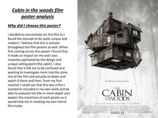
- 2. Release date Background image Main image Cast and crew Masthead Anchor text/ tag line Website
- 3. Anchor text The short piece of text just below the image is referred to as the anchor, often put into the poster so that the audience takes on board the piece of text and creates there own interpretation of the film based on what they see and what they read. The anchor text is always linked to the main image in some way. The denotations of this anchor text “you think you know the story” is that it refers to the audience as this uses direct address by addressing the audience by “you”. The connotations of the anchor text is that at the beginning the audience will guess the direction in which the film is going and will be able to guess what is going to happen but will be deluded by the film and tricked into believing something which isn't what happens. This anchor text is in San Serif front which is the most common type of font. This font connotes to the viewer that This films is a horror, mystery which is shown throughout the posters. The age rating for this film is a certificate 15 which informs the viewer that this film is not for young children. It is important for the audience to know the age rating but for some reason it is not shown on this film poster. Masthead The masthead on this poster is the name of the film which is typical for any film poster, the font used is Serif style which is a very common old style which often fits under the gothic fiction which connotes to the viewer that this is a horror film which is linked back to gothic fiction.
- 4. Main body text The main block of text at the bottom of this film poster includes, website address, cast and crew( including director) and release date. These are all important points which the viewer should know, displaying them at the bottom of the page connotes across to the audience that they are not as important as the main image and title. However the release date is slightly bigger then the website and cast, which connotes that the viewer should pay more attention to release date over the other pieces of writing. The cast and crew and the website and in normal San Serif font , this connotes that the film company want the writing to be read easy as the writing is smaller, they want it to be clear to understand. However the release date is in Serif font which is the same as the masthead, connoting that the masthead and release date are linked and are the same. Images The main image relates to the plot and theme of the film, this is connoted though the cabin levitating in the air. The cabin seems to be moving like a Rubik’s cube which connotes that this story can be confusing to some viewers and that this story is puzzle which will only be solved with time and patience. The cabin is often used too represent the feeling of being lost and alone in the wild. Along with the background image this affect has been made successful. The background image is slightly faded when compared to the main image. This connotes that the cabin is more important. The background image consists of 4 trees placed with two on each side and a space in the middle which connotes that there is a path down the woods. Which once put with the front image, it connotes that the cabin is in the woods and the audience will go into the woods along this path in order to get to this cabin.
- 5. Colour Scheme The colour scheme for this film poster is quite different when compared to normal film posters. In most posters they follow the 3 colour palette rule for example red, blue and white however for this poster they do not follow this rule but instead they use greyscale in the background image. Using greyscale brings out the highlights and shadows in the photos used. The colour black typically connotes death and a powerful evil. White connotes purity and innocence. Combining these two colours connotes across to the audience that the purity and goodness is having to battle against the dark, evilness. Which is stereotypical of a horror film. However in the main image there is a slight hint of brown. Brown connotes a very down to earth feeling which fits in with the whole feeling of being isolated in the woods. Register Register basically refers to the style of language used along side with the vocabulary. Apart from the anchor text there isn’t much writing on this which doesn’t enable me to understand which social class it is aimed at. This connotes that this film is aimed at various social classes. (from upper to lower class) What I will take away from this poster. After analysing this poster I have concluded that I will used Serif font and also use the colours black and white in my own trailer as I found them to be very powerful in this poster and I hope to have the same affect in my own work. Unlike this poster I will be including the age rating as I find it to be an important aspect to have.