
Recommended
More Related Content
What's hot
What's hot (17)
Viewers also liked
Similar to RnB Magazine Challenges Music Industry Formats
Similar to RnB Magazine Challenges Music Industry Formats (20)
Recently uploaded
Recently uploaded (20)
RnB Magazine Challenges Music Industry Formats
- 1. EVALUATION Neelam Dubb
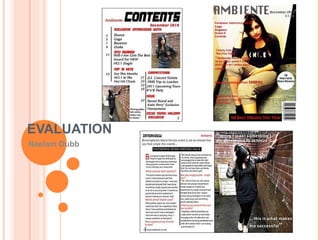
- 2. IN WHAT WAY DOES YOUR MEDIA PRODUCT USE, DEVELOP OR CHALLENGE FORMS AND CONVENTIONS OF REAL MEDIA PRODUCTS? My magazine challenges the forms and conventions of a real media product as firstly I have used the appropriate forms of a magazine. Such as I have used the correct conventions like straplines “Exclusive interviews with…”, a pug “50 new facts about Rhianna”, masthead “Ambiente”, image and other forms and conventions. Masthead Data and price Straplines Pug Barcode Cover image Kicker These forms and conventions bring my magazine together and make it look realistic. Also the layout of the media product is appealing as it is very similar to a real magazine, not just the layout but the information that has been provided in the magazine relates to a real media product.
- 3. IN WHAT WAY DOES YOUR MEDIA PRODUCT USE, DEVELOP OR CHALLENGE FORMS AND CONVENTIONS OF REAL MEDIA PRODUCTS? A real media product that my magazine relates to would be “Vibe”, this is because it uses the same target audience, layout, colours and music genre of RnB. An example of this would be the masthead of both the magazines, “Vibe” and “Ambiente” are similar as they both suggest music. The connotations of “Vibe” would be the effect of the music, the beat and sound. It also stands out as the name is memorable and makes RnB music famous.
- 4. IN WHAT WAY DOES YOUR MEDIA PRODUCT USE, DEVELOP OR CHALLENGE FORMS AND CONVENTIONS OF REAL MEDIA PRODUCTS? This would be the same for “Ambiente”, which is how you say Music in Spanish. It is also a catchy phrases and suggests rhythm which relates and associates to the idea of music. The colours that “Vibe” magazine have and “Ambiente” are a like red, black and white
- 5. IN WHAT WAY DOES YOUR MEDIA PRODUCT USE, DEVELOP OR CHALLENGE FORMS AND CONVENTIONS OF REAL MEDIA PRODUCTS? The costume is very professional and business like, this shows the talent and respect that artists have. The background lighting is quite bright which allows the outline of the straplines, masthead and the main image stand out. The props used are the hat and glass this adds to the costume and suggests that he is hiding something and has different emotions and feelings. The body language shows that he has a high status, is confident, and has a strong belief in what he does.
- 6. IN WHAT WAY DOES YOUR MEDIA PRODUCT USE, DEVELOP OR CHALLENGE FORMS AND CONVENTIONS OF REAL MEDIA PRODUCTS? The artist is not wearing much make up as it is mainly natural, this suggests that “what you see is what you get”. This is also a stereotype of young artists and implies that they are not afraid of trying anything new. The language used is understandable for the audience of young people as it includes artist names such as T.I. As the image is at eye level it is easy for the audience to make eye contact.
- 7. HOW DOES YOUR MEDIA PRODUCT REPRESENT PARTICULAR SOCIAL GROUP? My media product represents a particular social group of teenagers and young adults aged between 16 to 24, both males and females. This is partly because of the image I have used, of a young, new artist, who is successfully making her way into the music industry. This shows the audience and represents her as a role model as, they can see for themselves that such a young person can achieve what they want from life. New, young artist who can be seen as a role model for the younger generation interested in the music industry.
- 8. HOW DOES YOUR MEDIA PRODUCT REPRESENT PARTICULAR SOCIAL GROUP? It also represents teenagers and young adults as in society today the music industry is very popular within these age groups. As technology develops with phones, ipods and games consoles the music industry is becoming wider and well liked, as music can be listened to on these types of technology. New, young artist.
- 9. HOW DOES YOUR MEDIA PRODUCT REPRESENT PARTICULAR SOCIAL GROUP? My media product also represents this particular social group due to the layout of my magazine. This is because the layout of the contents page and double page spread is clear and understandable for these age groups. Also the information in the interview asks questions that the audience would want to know answerers for such as, which artists inspire them and what there plans are for the next few months, as the audience like to know what artists are doing. The layout is simple and easy to follow which also makes the magazine look realistic.
- 10. HOW DOES YOUR MEDIA PRODUCT REPRESENT PARTICULAR SOCIAL GROUP? My media product also represents this particular social group due to the genre of the magazine which is RnB, this is important to the audience. The masthead Ambiente also represents this social group as it is classy and up beat and suggest the correct target audience for teenagers and young adults.
- 11. WHAT KIND OF MEDIA INSTITUTION MIGHT DISTRIBUTE YOUR PRODUCT AND WHY? The media institution that might distribute my media product would be the publisher of “Vibe” who is Quincy Jones. This is because both the magazines are very similar. They have the same target audience of teenagers and young adults aged between 16 to 24. The mastheads “Vibe” and “Ambiente” both have the same connotations of RnB music, beat and sound and are quite unforgettable.
- 12. WHAT KIND OF MEDIA INSTITUTION MIGHT DISTRIBUTE YOUR PRODUCT AND WHY? Both magazines use similar colours red, black, white and grey, however they have been used for different parts of the magazine. “Vibe” uses red for the masthead and for most the straplines and grey for the background on the other hand, “Ambiente” uses grey for the masthead, red for the straplines and white for the background of the pug. These colours relate to the target audience and the magazine genre, this shows that the cover is well fan based. This allows the magazine to look different to each other to a certain extent as well as similar.
- 13. WHAT KIND OF MEDIA INSTITUTION MIGHT DISTRIBUTE YOUR PRODUCT AND WHY? The layout of the media products are similar the masthead at the top at the head of the models image, straplines however, my media products straplines are all on one side this is so the magazine cover looks different to other magazines and looks unique. The actual text on the straplines are alike as they mention RnB musician such as “Vibe” mentions Jay-Z and “Ambiente” mentions Gaga and Drake. Overall “Vibe” and “Ambiente” are very similar magazines therefore the institutions that might distribute my media product should be Quincy Jones the publisher of “Vibe”.
- 15. WHO WOULD BE THE AUDIENCE FOR YOUR MEDIA PRODUCT? This would attract the audiences attention as it does not have lots of small writing in large paragraphs, therefore I chose to separate them into small sections and hence I have used two colours. This makes the magazine look legitimate. The information presented in the magazine is also a tool that represents the target audience as it provides information that they would want to know like the latest music and artists.
- 16. WHO WOULD BE THE AUDIENCE FOR YOUR MEDIA PRODUCT? The target audience for this magazine would be teenagers and young adults that like to known what the last music is and make sure they are aware of what artists are around and what they are doing. This is what is available in this magazine therefore would be appropriate for the target audience. The target audience for this magazine would also be people that are concerned about there career and want to be successful and happy like artists. Recent and updated information that the audience would want to know Tickets and tours attract more attention for the audience The numbers are by the information that the audience would want to know The language used in the magazine tells us the type of artist, shows, interviews, performances, that take place for the people are interested in RnB music.
- 19. WHAT HAVE YOU LEARNT ABOUT TECHNOLOGIES FROM THE PROCESS OF CONSTRUCTING THIS PRODUCT? In terms of technology through the process of constructing my magazine I have learnt different ways of taking images. Such as the image needs to be clear, have enough head room and taking images in different angles gives the image a effect, this makes the image look realistic. I have also learnt when making a magazine the layout needs to be correct in order to make it look credible. It needs to consist of the main features of a magazine for example the masthead, straplines, pug and the other features. In terms of processing the magazine itself I have leant how to use Photoshop Images are clear, have enough head room and have been taken form different angels. Has a clear layout that makes it look realistic and contains the correct features that a magazine should.
- 20. WHAT HAVE YOU LEARNT ABOUT TECHNOLOGIES FROM THE PROCESS OF CONSTRUCTING THIS PRODUCT? I have expanded my skills and knowledge on how to use the various tools and features on the software. Such as the filter tools which allows you to change and add colour to a image, I have also learnt how the layers work and function when producing a item on the magazine. Using the filter tool the image has been made to look brighter.
- 21. WHAT HAVE YOU LEARNT ABOUT TECHNOLOGIES FROM THE PROCESS OF CONSTRUCTING THIS PRODUCT? Overall I have gained knowledge of how to produce and design a magazine using the accurate technology devices and using them to the best of there ability. Also making sure that the product looks eye catching and practical. My image on the front cover has been brightened slightly so the straplines, pug and other conventions standout on the front cover hence why the text is red and the title grey. Here you can see that the a layer has been used for the text to go on top of the image to give a effect.