Not Just Another Pretty (Inter)Face - UX Webinar
•Download as PPTX, PDF•
1 like•585 views

PointClear Solutions' user experience webinar based on the white paper "Not Just Another Pretty Interface" Presented by: Lee Farabaugh (Chief Experience Officer) Raelynn O'Leary (User Experience Expert) Visit www.pointclearsolutions.com/resources to download the free white paper.

Recommended
Recommended
More Related Content
Recently uploaded
Recently uploaded (20)
Featured
Featured (20)
Not Just Another Pretty (Inter)Face - UX Webinar
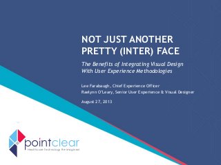
- 1. NOT JUST ANOTHER PRETTY (INTER) FACE The Benefits of Integrating Visual Design With User Experience Methodologies Lee Farabaugh, Chief Experience Officer Raelynn O’Leary, Senior User Experience & Visual Designer August 27, 2013 Healthcare Technology Re-imagined
- 2. © PointClear Solutions 2013. All Rights Reserved. POINTCLEAR SOLUTIONS • Healthcare software development firm that builds transformative technologies • Strong healthcare clinical informatics capability • Exceptional User Experience (UX) expertise – User-centered design – Increased user adoption 2
- 3. © PointClear Solutions 2013. All Rights Reserved. 3 Lee Farabaugh, MS-HCI MSHI Chief Experience Officer Raelynn O’Leary, MS Des. Sr. User Exp & Visual Designer
- 4. © PointClear Solutions 2013. All Rights Reserved. RE-SKIN THIS APPLICATION? 4
- 5. © PointClear Solutions 2013. All Rights Reserved. 5 Visual design ≠ User Experience design
- 6. © PointClear Solutions 2013. All Rights Reserved. 6 + Visual design Interaction design User research User Experience design
- 7. 7
- 8. 8
- 9. 9
- 10. 10
- 11. 11
- 12. © PointClear Solutions 2013. All Rights Reserved. Great interfaces • Look good • Perform well • Fulfill a real need 12
- 13. © PointClear Solutions 2013. All Rights Reserved. Aesthetics alone do not ensure a good product. 13
- 14. © PointClear Solutions 2013. All Rights Reserved. VISUAL DESIGN CAN • Increase usability • Engage users and build their trust 14
- 15. © PointClear Solutions 2013. All Rights Reserved. VISUAL DESIGN CAN INCREASE USABILITY • Hierarchy • Legibility • Learnability • Feedback 15
- 16. © PointClear Solutions 2013. All Rights Reserved. • Hierarchy • Legibility • Learnability • Feedback 16 VISUAL DESIGN CAN INCREASE USABILITY Communicating to the user where he is, where he can go next and where it’s important to look
- 17. 17
- 18. © PointClear Solutions 2013. All Rights Reserved. • Hierarchy • Legibility • Learnability • Feedback 18 VISUAL DESIGN CAN INCREASE USABILITY Making the system’s data easy for the user to read and digest
- 19. 19
- 20. © PointClear Solutions 2013. All Rights Reserved. • Hierarchy • Legibility • Learnability • Feedback 20 VISUAL DESIGN CAN INCREASE USABILITY Helping the user know what to expect
- 21. 21
- 22. © PointClear Solutions 2013. All Rights Reserved. • Hierarchy • Legibility • Learnability • Feedback 22 VISUAL DESIGN CAN INCREASE USABILITY Providing visible, understandable and actionable feedback about the system and the data
- 23. 23
- 24. © PointClear Solutions 2013. All Rights Reserved. • Brand • Engagement 24 VISUAL DESIGN CAN ENGAGE USERS AND BUILD THEIR TRUST
- 25. © PointClear Solutions 2013. All Rights Reserved. • Brand • Engagement 25 VISUAL DESIGN CAN ENGAGE USERS AND BUILD THEIR TRUST Users trust products built by brands that they trust
- 26. 26
- 27. © PointClear Solutions 2013. All Rights Reserved. VISUAL DESIGN CAN ENGAGE USERS AND BUILD THEIR TRUST • Brand • Engagement 27 An application that “feels” beautiful can draw a user in and accentuate how simple it is to use
- 28. © PointClear Solutions 2013. All Rights Reserved. KEY COMPONENTS OF DESIGN METHODOLOGY 28 RESEARCH INTERACTION DESIGN VISUAL DESIGN User research and design planning Persona development Iterative wireframing, prototyping Iterative visual design Interaction & visual design testing
- 29. © PointClear Solutions 2013. All Rights Reserved. • Understand the brand from the outset • Don’t create high fidelity comps too soon • Start visual design activities early • Test the visual design 29 VISUAL DESIGN IN THE UX PROCESS
- 30. © PointClear Solutions 2013. All Rights Reserved. • Understand the brand from the outset • Don’t create high fidelity comps too soon • Start visual design activities early • Test the visual design 30 VISUAL DESIGN IN THE UX PROCESS
- 31. © PointClear Solutions 2013. All Rights Reserved. • Understand the brand from the outset • Don’t create high fidelity comps too soon • Start visual design activities early • Test the visual design 31 VISUAL DESIGN IN THE UX PROCESS
- 32. © PointClear Solutions 2013. All Rights Reserved. • Understand the brand from the outset • Don’t create high fidelity comps too soon • Start visual design activities early • Test the visual design 32 VISUAL DESIGN IN THE UX PROCESS
- 33. © PointClear Solutions 2013. All Rights Reserved. • Understand the brand from the outset • Don’t create high fidelity comps too soon • Start visual design activities early • Test the visual design 33 VISUAL DESIGN IN THE UX PROCESS
- 34. © PointClear Solutions 2013. All Rights Reserved. TESTING VISUAL DESIGN USABILITY • Are users looking where we want/need them to? • Is the content legible? • Are the colors conveying intended meaning? • Is the meaning behind iconography clear? • Do symbols and graphics fit the domain and user mental models? 34
- 35. 35
- 36. © PointClear Solutions 2013. All Rights Reserved. TESTING VISUAL DESIGN ENGAGEMENT • Is it eliciting the right emotions? • Does it feel appropriate to the software’s context? 36
- 37. © PointClear Solutions 2013. All Rights Reserved. CONCLUSION • Great interfaces solve real problems, function efficiently and effectively, and are appealing and engaging • Visual design is so much more than pretty pictures • The user experience design process is most effective when all components work together in an iterative fashion to inform each other White paper available at: PointClearSolutions.com/Resources 37
- 38. © PointClear Solutions 2013. All Rights Reserved. 38 Questions & Answers
- 39. © PointClear Solutions 2013. All Rights Reserved. UPCOMING WORKSHOPS • The Essentials of User Experience – Introduction to User Experience – Design Best Practices – Iterative Design Exercise – How to Better Understand Your User • Upcoming Dates – Nashville – Sept 24 – Birmingham - Dec 10 More Info/ Sign-up at: PointClearSolutions.com/NewsAndEvents 39 Healthcare T echnology Re-imagined
Editor's Notes
- We get a lot of requests from potential clients to improve UI through visual design alone. It's difficult, if not impossible, for us to update visual styling without also considering user experience - is the system solving a problem that's important for users, and is it doing so in an intuitive manner? Updating visual styling only buys so much, if the user experience foundation is flawed or has deficiencies.
- In fact, visual design differs from user experience design in that it is actually a component of an overall user experience design.
- It should be considered along with user research and interaction design to craft a user experience that is useful, usable, and appealing.When a design is based on just one facet, it's going to fall down in the other areas. Let's look at some examples.
- Sagrada Familia is a Roman Catholic church in Barcelona Spain. The Catalan architect Antoni Gaudi is responsible for its architecture and engineering style. However, the church is still under construction, over 100 years after Gaudi began working on it, and it tentatively scheduled for completion on the centennial of Gaudi’s death, in 2026.This complex and complicated design serves as tourist site, it still can’t function as a church because it’s still not complete, due to the complexity of its design and the expense of its construction. While it’s beautiful, at least in some estimations, it’s not very useful in terms of its original intention.
- The Audi.com vehicle configurator embodies many of the classic hallmarks of good visual design: consistent use of fonts in various weights and sizes to draw attention, and plenty of white space. But as a car buyer, how can I tell the difference between the $40,000 model and the $49,000 model? There’s no information to sell me on the features of the more expensive model, so I’m left to wonder, or I have to navigate to a different area of the web site to find out the standard features for each model.
- Once I choose a model, I’m presented with a visual image of the vehicle, but nothing else. There are a couple of buttons that fall off the edge of my screen to the right, and some hotspots on the car, presumably to tell or show me more about it, but it’s not clear what I should do next. If I scroll down, I’m shown the exterior colors, interior colors, features, and standard specifications, but I would never know that from this view. Beautiful, yes. Easy to use? No.
- Here’s an example that’s perhaps more whimsical than beautiful, but I think we can all agree it has limited utility. For your next camping trip, consider the bear sleeping bag. Or maybe not. For one, it seems like it might be hard to breathe with the jaws closed. And what if your tent-mate wakes up in the middle of the night, disoriented, and sees a bear sleeping next to him? Your life could be in danger!
- Finally, we’ve all seen those catalog photos of rooms that look beautiful but would be impossible to live in. These plants are certainly a conversation piece hanging upside down, and they provide loads of visual interest. But how would you water them? And how does the dirt stay in?
- These examples show us that it’s not enough to just consider how a product looks. It also has to serve a real need and function well for the person using it.
- Aesthetics alone do not ensure a good product.
- - So as we’ve said that aesthetics alone don’t make a good product, at the same time visual design is not JUST about aesthetics- The decisions that we make about layout, color, iconography, etc. can make a system easier to use.- And, the way that it looks and feels can engage and communicate with an audience and build their trust.
- So, taking usability first - there is much in the way of what visual design can do to increase the usability of an application.
- - No matter how much we try and simplify, we’re often working with data-heavy systems are complex and full of layers of information.- Once we’ve determined the application’s hierarchy, how we treat it visually can affect whether the user knows where he is and how to navigate to where he wants to go next.- We also need to consider how we use color, layout and graphics todraw the user’s eye to the important or pertinent information he needs to look at on any screen.
- - For instance, this is a free small business accounting app that looks very nice. It’s easily apparent how the app is organized and what’s being shown on this screen based on this primary nav down the left side of the page.The secondary nav. Is clearly that – secondary. See how it’s contained within the grey primary content area and delineated by tabs. And then, in terms of where the interface draws my eye, once I’m oriented I’m drawn to the fact that I’ve got items that are overdue.The main action on the page – “create an invoice” - is clear and apparent.
- - Another aspect of usability is legibility.To make an application legible we need to select an appropriate typeface that is easily read on screen.We need to use it at the appropriate size, and with an appropriate line length, and present the content in an effective layout that utilizes enough white space so that a user can read and digest the information.
- - For instance, take a look at this relatively complex table of transactions.The horizontal stripes make it easy to read a row all the way across.The type is the appropriate size for legibility and the information is not too crowded.The formatting of each column makes it such that you can scan and pull out information without even having to look at the table headers.
- Next, learnability. We can use visual design cues to help users learn what to expect from an application. So If we develop a hierarchy of elements and a consistent set of styles or treatments, and then apply those consistently throughout the interface, a user will come to learn how the information is organized and theirAnd if they learn the system this ensures that their expectations for how the application will react to their inputs will always be met
- - For example, Notice the consistent treatment text styles – for titles, body copy, text in fields, etc. – between these two screens. When I’m entering data into the screen at left, the row is highlighted and I see a series of white fields.When I put a table row into edit mode in the larger table at right, it looks, and also behaves, in the same way, which is what I would expect.
- And finally, the way we visually address the feedback that a system gives a user can affect whether it’s visible, understood or actionable.We can use iconography, color and other visual cues to give the user instruction on how to use a system… and also to give them actionable steps to take when it’s not reacting as expected. We can also clue them in on characteristics of the data.For instance, we often use color encoding to let the user know when a data threshold has been metOr we include icons to indicate when a data element is of very high priority.
- Notice here how the color and all caps type treatment alerts me to new features in the system. The blue shaded area behind the “I” icon consistently, in both screens, provides me with instruction for how to use the system. On the bottom screen, the customer field is clearly delineated as required by the red asterisk and, when an error occurs – “no matches found” – the state is communicated to me clearly and visibly so that I have the opportunity to go back and re-structure my query.
- Not only can visual design can help make an application easier to use, but it can also make it easier for users to trust.
- - We all know that building a brand is important in establishing customer trust- It can enable someone to walk into a room, see an application up in a browser window or on the screen, recognize it and feel confident about using it because they trust your organization or your brand.
- - We’ve all probably used applications that look like they have no connection at all to the company that developed them.Visual design is a tool for propagating the brand through the application.It can ensure that the feeling an audience gets when looking at your marketing site is maintained as they use your application day to day. - Here’s an example of one of our client apps where we’ve worked hard to maintain the brand look and feel from the marketing site as the user logs in or registers and then moves into working with the application itself.
- -And finally, engagement.We’ve all experienced an interface that’s ugly.It can be intimidating and maybe even a barrier to using an application at all.On the other hand, an application that “feels” beautiful can draw you in and accentuate how simple it is to use. Take this application UI that we looked at before and contrast it with an interface that we’ve designed recently for one of our clients.Both are complex with lots of data entry and possible actions. You can see how a user might be intimidated by one of these and happy to use the other.
- We’ve seen how visual design can do so much more than just make an interface look good. Good visual design overlaps, involves, and borrows from the larger user experience methodology, and it intrinsically integrated in this methodology, when it’s given its due. Most people know that User Experience methodology invovlesresearch, and this is true, in terms of interviews and observational studies with actual users to understand how they currently solve the problems at hand. But research is important throughout the project, in terms of testing the usability, effectiveness, and learnability of interaction designs and visual elements of the interface. The personas that are created as a result of initial research activities help the design team understand the breadth of the various audience types they need to test their designs with.Wireframes and prototypespurposely lack visual design elements so that focus can be placed on page layout, placement and proximity of text and controls, and interaction between screens and screen states. They can be tested with actual users who can provide valuable insight regarding the design’s strengths and weaknesses. They are then tweaked and refined based on that feedback. This iterative approach ensures that designs are optimized to meet the precise needs of the target audience. Visual design elements are what we typically think of as page comps, but they can also include button treatments, navigation styling, content styling, font choice, and visualizations like charts and graphs. These design treatments are iterated and tested in the same manner as wireframes and prototypes.
- We’ve showed you an integrated methodology, however traditionally visual design hasn’t always been included.But we know that when it is, outcomes are better.So we’d like to talk about some ways to ensure that visual design is fully integrated into the UX process
- - First, we can work on understanding the brand from the outset of a projectThis involves more than just getting a hold of the brand guidelines.Really understanding the brand voice and including marketing stakeholders from a project’s conception allows us to iterate on the look and feel throughout the design processSo that at the end product really communicates and reflects the brand.
- We also need to be sure to spend adequate time exploring user workflows and refining features and interactions prior to designing high fidelity screen comps. While visual and interaction design should be closely intertwined and iterative as Lee mentioned, it’s a lot less time consuming and expensive to modify sketches and wireframes than it is to make changes to high fidelity comps. Also, sometimes showing users designs that look too “finished” discourages creative suggestions around how they can evolve.
- And this may sound contrary to the previous statement, but even as early as the strategy and requirements-gathering phase, there are visual design activities that can be started that will increase the ability to refine the visual design over time. Sketching icons and screen layouts and exploring visual treatments for imagery and infographics are all things that can and should be started well before the first high fidelity comp is created.
- Just like we evaluate whether users understand how the system works and complete their tasks, we should be evaluating the visual design.
- So, what kind of visual feedback can we get from users? We can evaluate how the visual design is contributing to the usability of the application.
- Take this example where we gathered user feedback around an information visualization that was the centerpiece of a system that we designed.We came up with a range of visualizations and then took these to users to see which ones were reflective of the types of visualizations that they were used to working with. We evaluated which, if any, were more intuitive than those that they already use today. We evaluated the color – whether red and green to indicate metrics of high or low performance were too “harsh” and whether alternative color encoding, like orange and blue, was too abstract.We tested whether large numeric values increased or decreased the visualization’s effectiveness. This early and iterative way of working with the visual design allowed us to build the visual design system of the entire interface around concepts that were vetted with users.
- - So we can test how visual design is contributing to a system’s usabilityand we can also evaluate whether the visual design is helping the user feel emotions that are reflective of the brand and that are appropriate to the context in which the software lives.For example, a hospital website should make a prospective patient feel confident and positive about their decision to go with that hospital systemAn application built for nurses should make a nurse feel organized and less overwhelmed as she navigates her daily tasks and provides careSo, to recap, we’re familiar with the process of evaluating a design with real people and iterating on it based on user feedback.And as we’ve illustrated, this evaluation should take into consideration not only how it works, but also how it looks and how the visual design affects its usability and user engagement.