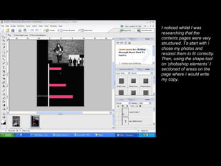
1. I noticed whilst I was researching that the contents pages were very structured. To start with I chose my photos and resized them to fit correctly. Then, using the shape tool on ‘photoshop elements’ I sectioned of areas on the page where I would write my copy.
2. Here, I have added a smaller version of the masthead in the corner which again reiterates the name of the magazine. I have included page numbers on the pictures and have made them big so they stand out and I have also added the headings in for the contents . I noticed that a few magazines said ‘this week’ instead of the traditional ‘contents’.
3. Something I noticed throughout my research was that most contents pages included a section giving information on subscriptions. In the bottom left hand corner I have included a subscription box and above that I have included a note from the editor, which is common in a lot of music magazines.
4. Using the text tool on ‘photoshop elements’ I added in the copy for the contents page making it a suitable text which you could read and would stand out. I made it white so that it stood out well against the black background as they contrast.
5. I have added captions onto my photos which give an indication as to what the photo is representing. I have also copied the front cover and pasted it 3 times on to the page as this would be something each individual issue would have.