
Recomendados
Más contenido relacionado
La actualidad más candente
La actualidad más candente (20)
Similar a Cd cover
Similar a Cd cover (20)
Más de rovenahoxha1993
Último
Último (20)
Cd cover
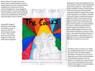
- 1. Name of band: I thought to have the band’s name in bold and black so that it Background: I want the background to be looks simple but so that it would be easily very colourful so that it’s eye catching and readable and it stands out from the draws in the audience. I want colourful colourful background. I also thought of beams of different colours shooting away having the font in a brush stroke effect as from band and I want these beams to it ties in with the band’s name and it goes incorporate different images which relate well with the whole theme of the front to the song titles on the album. I decided cover and album name. (Canvas) to have the beams in particular because I wanted to make it seem like the artists ideas are shooting out of the band. The different colours also reinforce the pop I placed the image of genre and it appeals to a young audience. the band in the middle In order to make the band stand out I of the album cover so want a bright coloured beam such as that the audience’s yellow shooting down on them so that attention goes straight the audiences attention can focus on the to them. The simple band. I also want the band to either be in pose and frame of the black and white or sepia effect as this is image also makes the different from the colourful background band easy to recognise. therefore it stands out a lot more. The album name is Canvas as an album can metaphorically be seen as a canvas on which artists are able to express themselves. The album name is not as important as the band’s name therefore I have decided to place it near the bottom in a smaller font, I want the font to be curly and twisted so that it looks creative and magical. This would appeal to my young target audience.
- 2. I thought of having a I want the back of the album cover to follow a typical puzzle effect over the CD back cover structure. I wanted to continue with the image because it looks use bright colours and black and white theme, so that playful and youthful similar ideas of the front cover are portrayed to the therefore it will appeal back. to our targeted audience. I wanted to use a bright colour for the background so that The font of the song the black and white titles and the image of the band institutional would stand out. I want information has to be the photo to be a simple so that it would medium close up so be easy for audiences that the band is easily to read recognised. I would place the institutional information near the bottom because this is not crucial information for the audiences however it still needs to be shown because of copyright laws.
- 3. As the inlay can only be viewed if the audience buy the CD I decided to make it very simple. I choose to have a photo of a drum set as I believe this connotes the pop/ rock genre of the band. As and instrument the drums are favoured by young people therefore they would appreciate the image. Them simplicity and dullness of the inlay sleeve contracts with the front and back cover of the album. The difference would would keep the audience interested in the album art work.