
Recomendados
Más contenido relacionado
Destacado
Destacado (20)
Similar a Fast Food Doc Ad - 40 Characters
Similar a Fast Food Doc Ad - 40 Characters (20)
Más de ruff123
Último
Último (20)
Fast Food Doc Ad - 40 Characters
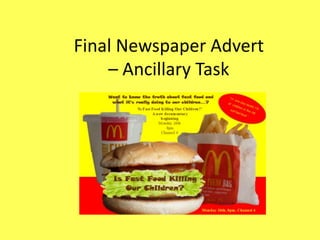
- 1. Final Newspaper Advert – Ancillary Task
- 2. Fonts I chose this font for the title of our documentary as I thought it looked quite child-like so represented our title of ‘Is Fast Food Killing Our Children’, well, as we are focusing on looking at children in our documentary. I chose the colour brown for the text as its suppose to represent the inside of the burger as I embedded the text in to the image, to create a more interesting and unique title. ‘In one day nearly 1/3 of I chose quite a plain font for this fact in the box as I wanted it children in the UK eat fast to be clear and bold, as its showing a hard and serious fact. I food’ chose the colour yellow for the text on a red background as this was the colour scheme I was using throughout – representing fast food restaurants. Also these colours make the text eye-catching. ‘Is Fast Food Killing Our Children?’ I used a plain font for the title of the documentary and when A new documentary it is showing on TV as I wanted it to be clear and simple so beginning the audience can get the information they need from it. I Monday 26th chose the colour brown so it tied in with colour of the main 8pm title on the advert, so there wasn't too many colours going on which would confuse the viewer. Channel 4
- 3. Images On my newspaper advert I used 3 images, all clearly relevant to the subject of our documentary. I took 3 photos of fast food, including a drink, burger and chips, then using mainly Microsoft Paint and Windows Photo Viewer I edited them, by cutting around them and cropping them. For the burger image I cropped the burger in half then placed images of lettuce inside, to create the filling, I then embedded in the text. I then placed them on the advert and put them in a composition that made them look like they were sitting on a table, which I thought looked really effective.
- 4. Comparison to real media The similarities between my newspaper advert and this real media is that: • They both have a colour scheme, although I have used quite garish and warm colours and the real media has used cool colours. • They both combine text and images. • They have a similar composition as they both look like the food is sitting on a table. • Both adverts clearly show the subject/theme. The differences between my newspaper advert and this real media is that: • The real media has a bigger title. • The colours on my newspaper advert are a lot more vibrant and eye catching. • My advert has more text as it is giving information on a documentary.
- 5. IT and Technologies Used I used Google to research other I used a ‘Canon’ I used Microsoft newspaper camera to Paint to edit the adverts for photograph the images which I inspiration, to used on my help with my fast food images newspaper which I used on I used Microsoft newspaper Publisher to create the advert. This I use Windows advert. I also got the newspaper software newspaper advert as it Photo Viewer to the images of advert. has lots of different allowed me to view and edit lettuce which I features which are crop and draw the images I embedded in the good for creating around the fast took. image of the posters, like unique food images to burger. fonts, different make them background settings suitable for my and new shapes and advert. designs.