SlideShare una empresa de Scribd logo
1 de 34
Positioning Elements Prepared by: Sanjay Raval |  http:// www.usableweb.in /
Box Model Recap Every element on the page is considered to be a rectangular box made up of the element’s content, padding, border, and margin ,[object Object],[object Object],[object Object],[object Object],[object Object],[object Object]
Box Model Recap In CSS,  width and height refer to the width and height of the content area .  Adding padding, borders, and margins will not affect the size of the content area but will increase the  overall size of an element’s box.  If you wanted a box 100-pixel wide with a 10-pixel margin and a 5-pixel padding on each sides,  you would need to set the width of the content to be 70 pixels. #myBox { margin:10px; padding:5px; width:70px; }
Box Model Recap Padding, borders, and margins can be applied to all sides of an element or individual sides. Margins can also be given a negative value.
Block and inline elements HTML elements are either block or inline elements.   A  block-level box , such as a div, a paragraph, or a heading, begins rendering on a new line. An  inline-level box , such as a <span> or an <em>, begins rendering wherever you place it within the  document and does not force any line breaks.
Block and inline elements Using CSS property, display, you can make an inline element display like a block-level element or vice-versa.  Example: Say you want tabs, which is a list (of links) and so should be marked up as a <ul> <ul id=&quot;maintabs&quot;> <li><a href=&quot;#&quot;>PersonalFinance</a></li> <li><a href=&quot;#&quot;>BillPay</a></li> <li><a href=&quot;#&quot;>FundsTransfer</a></li> <li><a href=&quot;#&quot;>FinancialCalendar</a></li> <li><a href=&quot;#&quot;>Customer Care</a></li> <li> </ul> Here's how it looks as a normal list
Block and inline elements #maintabs li { display:inline; list-style-type:none; float:left; background-color:#dce2c7; border:1px solid #c5d199; padding:5px 10px; margin-left:2px; } Here's how it looks with the CSS styles applied Here's the CSS code Using CSS property display:inline, you can display a block element <li> as an inline element and can show  the list items <li> as tabs.
Floating A floated box can either be shifted to the left or the right until its outer edge touches the edge of its containing box, or another floated box.  Because floated boxes aren’t in the normal flow of the document, block boxes in the regular flow of the document behave as if the floated box wasn’t there. As shown in below figure, when you float Box 1 to the right, it’s taken out of the flow of the document and moved to the right until its right edge touches the right edge of the containing block.
Floating If you float all three boxes to the left, Box 1 is shifted left until it touches its containing box, and the other two boxes are shifted left until they touch the preceding floated box. If the containing block is too narrow for all of the floated elements to fit horizontally, the remaining floats will drop down until there is sufficient space.
Floating If the floated elements have different heights, it is possible for floats to get “stuck” on other floats when they drop down.
Clearing the floats Lets say you have a grid of floated objects.   Then let’s say you want to create a break in that grid in order to start a new row.
Clearing the floats There are times when you don’t want certain content to be next to floated elements.   To accomplish this, you can use clear.   The clear has four options:  &quot;clear: left&quot;, &quot;clear: right&quot;, &quot;clear: both&quot; or &quot;clear: none&quot;.   clear: left  The element is moved below the bottom outer edge of any left-floating boxes that resulted from  elements earlier in the source document.
Clearing the floats clear: right  The element is moved below the bottom outer edge of any right-floating boxes that resulted from  elements earlier in the source document.   clear: both  The element is moved below all floating boxes of earlier elements in the source document.
Line boxes and clearing Line boxes (text boxes) next to a floated box are shortened to make room for the floated box, and flow around the float.  In fact, floats were created to allow text to flow around images
Line boxes and clearing To stop line boxes flowing around the outside of a floated box, you need to apply a clear to that box.  The clear property can be left, right, both, or none, and indicates which side of the box should not be next to a floated box. To accomplish this, enough space is added above the cleared element’s top margin to  push the element’s top border edge vertically down, past the float
The Position Property There are four values for the position property:  static, absolute, fixed, and relative.  Static is the default. Unless specified, all boxes start life being positioned in the normal flow (static position) let’s take a quick look at each using a simple example with four paragraphs.
The Position Property Static Positioning With the four paragraphs each displayed with  the default position property value, static , they stack one  above the other, as normal document flow dictates.
The Position Property Relative Positioning Let’s set the third paragraph to the relative position.  You can then move this paragraph with respect to its default position using the properties top, left, bottom, and right. p#specialpara {position:relative; top:30px; left:20px;}
The Position Property Relative Positioning Now the top of your paragraph is moved down by 30 pixels and right by 20 pixels.  Here although the element moves relative to its original position, nothing else changes.
The Position Property Absolute Positioning This type of positioning takes an element entirely out of the flow of the document.  Let’s modify the code you used for relative positioning by changing relative to absolute. p#specialpara {position:absolute; top:30px; left:20px;}
The Position Property Absolute Positioning You can see that the space previously occupied by the element is gone.  The absolutely-positioned element has become entirely independent of the surrounding elements in the markup, and  it is now positioned with respect to the top-level element, body. Because the absolutely positioned element’s positioning context is body, the element moves when the page is scrolled to retain its relationship to the body element, which also moves when the page scrolls.
The Position Property Fixed Positioning Fixed positioning is similar to absolute positioning, except that the element’s positioning context is  the viewport  (the browser window or the screen of a handheld device, for example). So the element does not move when the page is scrolled.  Note:  However, position:fixed does not work in IE6, although it does work in IE 7.
The Position Property
The Position Property Positioning Context contextual positioning  means that when you move an element using the properties top, left, right, or bottom, you are moving that element with respect to another element. That other element is known as its  positioning context. As you saw in “Absolute Positioning” earlier, the positioning context of an absolutely positioned element is body—that is, unless you change it. body is the containing element of all other elements in your markup, but you can use any ancestor  element as a positioning context of another element by changing the ancestor’s position value to relative.
The Position Property Positioning Context Let’s look at this markup <body> <div id=&quot;outer&quot;>The outer div <div id=&quot;inner&quot;>This is some text...</div> </div> </body> and this CSS div#outer_div {width:250px; margin:50px 40px; border-top:3px solid red;} div#inner_div {top:10px; left:20px; background:#AAA;}
The Position Property Positioning Context But why isn’t the inner div 10 pixels down from the top of the outer one and 20 pixels to the left, as specified?  The answer is that the inner div has the default positioning of static.  This means it is in the regular document flow, and because the outer div has no content, the inner div starts in the same place.  Only when you set an element to one of the other three positioning options—relative, absolute, or fixed—do the top, left, right, and bottom properties actually do anything.
The Position Property Positioning Context Let’s see this in action by setting the inner div’s position property to absolute. div#outer_div {width:250px; margin:50px 40px; border-top:3px solid red;} div#inner_div {position:absolute; top:10px; left:20px; background:#AAA;} Because there is no other relatively positioned element for it to reference, it positions itself by default with respect to the body element.
The Position Property Positioning Context If you then set the position property of the outer div to relative, the positioning context of the absolutely positioned inner div is now the outer div If you now set the left and top position properties of the outer div to anything other than zero, the inner div would move to maintain its positioning relationship to the outer div—its positioning context. Get it?
Overflow Property There may be a case when an element's content might be larger than the amount of space allocated to it.  CSS provides a property called  overflow  which tells the browser what to do if the box's contents is larger than the box itself .  Example: Here's the HTML code <body> <div class=“myBox&quot;> This is some text... </div> This is some text...  </body>
Overflow Property Here's the CSS code .myBox { float: left; width:150px; height:150px; background-color:#ccc; border: 1px solid #999; margin-right:5px; padding:5px; } Here's how it looks:
Overflow Property Overflow has 4 values namely visible, auto, hidden, and scroll .myBox { overflow:visible; } Overflow: visible Visible is the default value. No scrollbars will be added, and your content will just flow.   Lets add some more text to the myBox div container and see how the text flows.
Overflow Property .myBox { overflow:auto; } Overflow: auto You should use this value when you want to let the browser decide what’s right. Scroll down? Scroll right? No scrolling at all? The browser makes this decision.  This value usually is the best choice.  Here's how it looks:
Overflow Property .myBox { overflow:hidden; } Overflow: hidden This value will not add any scrollbars or will not display more text then needed.  When the content crosses the ‘height’ given to the container, it simply don’t display that content.   Here's how it looks:
Overflow Property .myBox { overflow:scroll; } Overflow: scroll An overflow of scroll means that the browser should place scrollbars on the element whether or not the  contents of the element have overflowed.   Ensure there is always enough content in this box, because otherwise there are ugly scrollbars for nothing!  Here's how it looks: Note:  Theoretically, with the overflow property, the need for frames is greatly reduced. Unfortunately, some old browsers do not fully support the overflow property.

Más contenido relacionado

Destacado (16)

Css positioning
Css positioningCss positioning
Css positioning
 
Shaping Up With CSS
Shaping Up With CSSShaping Up With CSS
Shaping Up With CSS
 
Anatomy Of A Domain Name and URL
Anatomy Of A Domain Name and URLAnatomy Of A Domain Name and URL
Anatomy Of A Domain Name and URL
 
Understanding DIVs
Understanding DIVsUnderstanding DIVs
Understanding DIVs
 
Inline, Block and Positioning in CSS
Inline, Block and Positioning in CSSInline, Block and Positioning in CSS
Inline, Block and Positioning in CSS
 
1 07-2-css floats-and_positioning
1 07-2-css floats-and_positioning1 07-2-css floats-and_positioning
1 07-2-css floats-and_positioning
 
Floats
FloatsFloats
Floats
 
Lesson 108 23 aug13-1430-ay
Lesson 108 23 aug13-1430-ayLesson 108 23 aug13-1430-ay
Lesson 108 23 aug13-1430-ay
 
Layout
LayoutLayout
Layout
 
SVG - Scalable Vector Graphic
SVG - Scalable Vector GraphicSVG - Scalable Vector Graphic
SVG - Scalable Vector Graphic
 
5 domain name worksheet
5   domain name worksheet5   domain name worksheet
5 domain name worksheet
 
CSS font-stacks
CSS font-stacksCSS font-stacks
CSS font-stacks
 
Marketing segmentation chapter 4
Marketing segmentation   chapter 4Marketing segmentation   chapter 4
Marketing segmentation chapter 4
 
Purchase Your Domain Name
Purchase Your Domain NamePurchase Your Domain Name
Purchase Your Domain Name
 
CSS Tutorial
CSS TutorialCSS Tutorial
CSS Tutorial
 
cascading style sheet ppt
cascading style sheet pptcascading style sheet ppt
cascading style sheet ppt
 

Similar a Css Positioning Elements

Chapter 15: Floating and Positioning
Chapter 15: Floating and Positioning Chapter 15: Floating and Positioning
Chapter 15: Floating and Positioning Steve Guinan
 
GDI Seattle Intro to HTML and CSS - Class 4
GDI Seattle Intro to HTML and CSS - Class 4GDI Seattle Intro to HTML and CSS - Class 4
GDI Seattle Intro to HTML and CSS - Class 4Heather Rock
 
Web Design & Development - Session 3
Web Design & Development - Session 3Web Design & Development - Session 3
Web Design & Development - Session 3Shahrzad Peyman
 
Lecture 10 CSS part 2.pptxvvvvvvvvvvvvvv
Lecture 10 CSS part 2.pptxvvvvvvvvvvvvvvLecture 10 CSS part 2.pptxvvvvvvvvvvvvvv
Lecture 10 CSS part 2.pptxvvvvvvvvvvvvvvZahouAmel1
 
Ans.1 There are four different position values •static •relat.pdf
Ans.1 There are four different position values •static •relat.pdfAns.1 There are four different position values •static •relat.pdf
Ans.1 There are four different position values •static •relat.pdfanandf0099
 
Castro Chapter 11
Castro Chapter 11Castro Chapter 11
Castro Chapter 11Jeff Byrnes
 
CSS_Day_Three (W3schools)
CSS_Day_Three (W3schools)CSS_Day_Three (W3schools)
CSS_Day_Three (W3schools)Rafi Haidari
 
Advanced CSS.pptx
Advanced CSS.pptxAdvanced CSS.pptx
Advanced CSS.pptxDiyonaVas
 
Fundamentals of Browser Rendering Css Overview PT 2
Fundamentals of Browser Rendering Css Overview PT 2Fundamentals of Browser Rendering Css Overview PT 2
Fundamentals of Browser Rendering Css Overview PT 2Barak Drechsler
 
Cascading Style Sheets CSS
Cascading Style Sheets CSS Cascading Style Sheets CSS
Cascading Style Sheets CSS Asif Shahzad
 
CSS tutorial chapter 3
CSS tutorial chapter 3CSS tutorial chapter 3
CSS tutorial chapter 3jeweltutin
 

Similar a Css Positioning Elements (20)

Css advanced – session 4
Css advanced – session 4Css advanced – session 4
Css advanced – session 4
 
Chapter 15: Floating and Positioning
Chapter 15: Floating and Positioning Chapter 15: Floating and Positioning
Chapter 15: Floating and Positioning
 
GDI Seattle Intro to HTML and CSS - Class 4
GDI Seattle Intro to HTML and CSS - Class 4GDI Seattle Intro to HTML and CSS - Class 4
GDI Seattle Intro to HTML and CSS - Class 4
 
Displaying.pptx
Displaying.pptxDisplaying.pptx
Displaying.pptx
 
Css training
Css trainingCss training
Css training
 
Web Design & Development - Session 3
Web Design & Development - Session 3Web Design & Development - Session 3
Web Design & Development - Session 3
 
Floats
FloatsFloats
Floats
 
Web Layout
Web LayoutWeb Layout
Web Layout
 
Lecture 10 CSS part 2.pptxvvvvvvvvvvvvvv
Lecture 10 CSS part 2.pptxvvvvvvvvvvvvvvLecture 10 CSS part 2.pptxvvvvvvvvvvvvvv
Lecture 10 CSS part 2.pptxvvvvvvvvvvvvvv
 
Ans.1 There are four different position values •static •relat.pdf
Ans.1 There are four different position values •static •relat.pdfAns.1 There are four different position values •static •relat.pdf
Ans.1 There are four different position values •static •relat.pdf
 
Castro Chapter 11
Castro Chapter 11Castro Chapter 11
Castro Chapter 11
 
CSS_Dibbo
CSS_DibboCSS_Dibbo
CSS_Dibbo
 
Position
PositionPosition
Position
 
Css 101
Css 101Css 101
Css 101
 
CSS_Day_Three (W3schools)
CSS_Day_Three (W3schools)CSS_Day_Three (W3schools)
CSS_Day_Three (W3schools)
 
Advanced CSS.pptx
Advanced CSS.pptxAdvanced CSS.pptx
Advanced CSS.pptx
 
Fundamentals of Browser Rendering Css Overview PT 2
Fundamentals of Browser Rendering Css Overview PT 2Fundamentals of Browser Rendering Css Overview PT 2
Fundamentals of Browser Rendering Css Overview PT 2
 
Cascading Style Sheets CSS
Cascading Style Sheets CSS Cascading Style Sheets CSS
Cascading Style Sheets CSS
 
HTML and CSS part 3
HTML and CSS part 3HTML and CSS part 3
HTML and CSS part 3
 
CSS tutorial chapter 3
CSS tutorial chapter 3CSS tutorial chapter 3
CSS tutorial chapter 3
 

Último

Connecting the Dots for Information Discovery.pdf
Connecting the Dots for Information Discovery.pdfConnecting the Dots for Information Discovery.pdf
Connecting the Dots for Information Discovery.pdfNeo4j
 
Data governance with Unity Catalog Presentation
Data governance with Unity Catalog PresentationData governance with Unity Catalog Presentation
Data governance with Unity Catalog PresentationKnoldus Inc.
 
Scale your database traffic with Read & Write split using MySQL Router
Scale your database traffic with Read & Write split using MySQL RouterScale your database traffic with Read & Write split using MySQL Router
Scale your database traffic with Read & Write split using MySQL RouterMydbops
 
Generative AI - Gitex v1Generative AI - Gitex v1.pptx
Generative AI - Gitex v1Generative AI - Gitex v1.pptxGenerative AI - Gitex v1Generative AI - Gitex v1.pptx
Generative AI - Gitex v1Generative AI - Gitex v1.pptxfnnc6jmgwh
 
The State of Passkeys with FIDO Alliance.pptx
The State of Passkeys with FIDO Alliance.pptxThe State of Passkeys with FIDO Alliance.pptx
The State of Passkeys with FIDO Alliance.pptxLoriGlavin3
 
Passkey Providers and Enabling Portability: FIDO Paris Seminar.pptx
Passkey Providers and Enabling Portability: FIDO Paris Seminar.pptxPasskey Providers and Enabling Portability: FIDO Paris Seminar.pptx
Passkey Providers and Enabling Portability: FIDO Paris Seminar.pptxLoriGlavin3
 
A Deep Dive on Passkeys: FIDO Paris Seminar.pptx
A Deep Dive on Passkeys: FIDO Paris Seminar.pptxA Deep Dive on Passkeys: FIDO Paris Seminar.pptx
A Deep Dive on Passkeys: FIDO Paris Seminar.pptxLoriGlavin3
 
Merck Moving Beyond Passwords: FIDO Paris Seminar.pptx
Merck Moving Beyond Passwords: FIDO Paris Seminar.pptxMerck Moving Beyond Passwords: FIDO Paris Seminar.pptx
Merck Moving Beyond Passwords: FIDO Paris Seminar.pptxLoriGlavin3
 
Transcript: New from BookNet Canada for 2024: Loan Stars - Tech Forum 2024
Transcript: New from BookNet Canada for 2024: Loan Stars - Tech Forum 2024Transcript: New from BookNet Canada for 2024: Loan Stars - Tech Forum 2024
Transcript: New from BookNet Canada for 2024: Loan Stars - Tech Forum 2024BookNet Canada
 
Modern Roaming for Notes and Nomad – Cheaper Faster Better Stronger
Modern Roaming for Notes and Nomad – Cheaper Faster Better StrongerModern Roaming for Notes and Nomad – Cheaper Faster Better Stronger
Modern Roaming for Notes and Nomad – Cheaper Faster Better Strongerpanagenda
 
How AI, OpenAI, and ChatGPT impact business and software.
How AI, OpenAI, and ChatGPT impact business and software.How AI, OpenAI, and ChatGPT impact business and software.
How AI, OpenAI, and ChatGPT impact business and software.Curtis Poe
 
TeamStation AI System Report LATAM IT Salaries 2024
TeamStation AI System Report LATAM IT Salaries 2024TeamStation AI System Report LATAM IT Salaries 2024
TeamStation AI System Report LATAM IT Salaries 2024Lonnie McRorey
 
React Native vs Ionic - The Best Mobile App Framework
React Native vs Ionic - The Best Mobile App FrameworkReact Native vs Ionic - The Best Mobile App Framework
React Native vs Ionic - The Best Mobile App FrameworkPixlogix Infotech
 
Arizona Broadband Policy Past, Present, and Future Presentation 3/25/24
Arizona Broadband Policy Past, Present, and Future Presentation 3/25/24Arizona Broadband Policy Past, Present, and Future Presentation 3/25/24
Arizona Broadband Policy Past, Present, and Future Presentation 3/25/24Mark Goldstein
 
Unleashing Real-time Insights with ClickHouse_ Navigating the Landscape in 20...
Unleashing Real-time Insights with ClickHouse_ Navigating the Landscape in 20...Unleashing Real-time Insights with ClickHouse_ Navigating the Landscape in 20...
Unleashing Real-time Insights with ClickHouse_ Navigating the Landscape in 20...Alkin Tezuysal
 
The Fit for Passkeys for Employee and Consumer Sign-ins: FIDO Paris Seminar.pptx
The Fit for Passkeys for Employee and Consumer Sign-ins: FIDO Paris Seminar.pptxThe Fit for Passkeys for Employee and Consumer Sign-ins: FIDO Paris Seminar.pptx
The Fit for Passkeys for Employee and Consumer Sign-ins: FIDO Paris Seminar.pptxLoriGlavin3
 
A Framework for Development in the AI Age
A Framework for Development in the AI AgeA Framework for Development in the AI Age
A Framework for Development in the AI AgeCprime
 
Top 10 Hubspot Development Companies in 2024
Top 10 Hubspot Development Companies in 2024Top 10 Hubspot Development Companies in 2024
Top 10 Hubspot Development Companies in 2024TopCSSGallery
 
QCon London: Mastering long-running processes in modern architectures
QCon London: Mastering long-running processes in modern architecturesQCon London: Mastering long-running processes in modern architectures
QCon London: Mastering long-running processes in modern architecturesBernd Ruecker
 
New from BookNet Canada for 2024: Loan Stars - Tech Forum 2024
New from BookNet Canada for 2024: Loan Stars - Tech Forum 2024New from BookNet Canada for 2024: Loan Stars - Tech Forum 2024
New from BookNet Canada for 2024: Loan Stars - Tech Forum 2024BookNet Canada
 

Último (20)

Connecting the Dots for Information Discovery.pdf
Connecting the Dots for Information Discovery.pdfConnecting the Dots for Information Discovery.pdf
Connecting the Dots for Information Discovery.pdf
 
Data governance with Unity Catalog Presentation
Data governance with Unity Catalog PresentationData governance with Unity Catalog Presentation
Data governance with Unity Catalog Presentation
 
Scale your database traffic with Read & Write split using MySQL Router
Scale your database traffic with Read & Write split using MySQL RouterScale your database traffic with Read & Write split using MySQL Router
Scale your database traffic with Read & Write split using MySQL Router
 
Generative AI - Gitex v1Generative AI - Gitex v1.pptx
Generative AI - Gitex v1Generative AI - Gitex v1.pptxGenerative AI - Gitex v1Generative AI - Gitex v1.pptx
Generative AI - Gitex v1Generative AI - Gitex v1.pptx
 
The State of Passkeys with FIDO Alliance.pptx
The State of Passkeys with FIDO Alliance.pptxThe State of Passkeys with FIDO Alliance.pptx
The State of Passkeys with FIDO Alliance.pptx
 
Passkey Providers and Enabling Portability: FIDO Paris Seminar.pptx
Passkey Providers and Enabling Portability: FIDO Paris Seminar.pptxPasskey Providers and Enabling Portability: FIDO Paris Seminar.pptx
Passkey Providers and Enabling Portability: FIDO Paris Seminar.pptx
 
A Deep Dive on Passkeys: FIDO Paris Seminar.pptx
A Deep Dive on Passkeys: FIDO Paris Seminar.pptxA Deep Dive on Passkeys: FIDO Paris Seminar.pptx
A Deep Dive on Passkeys: FIDO Paris Seminar.pptx
 
Merck Moving Beyond Passwords: FIDO Paris Seminar.pptx
Merck Moving Beyond Passwords: FIDO Paris Seminar.pptxMerck Moving Beyond Passwords: FIDO Paris Seminar.pptx
Merck Moving Beyond Passwords: FIDO Paris Seminar.pptx
 
Transcript: New from BookNet Canada for 2024: Loan Stars - Tech Forum 2024
Transcript: New from BookNet Canada for 2024: Loan Stars - Tech Forum 2024Transcript: New from BookNet Canada for 2024: Loan Stars - Tech Forum 2024
Transcript: New from BookNet Canada for 2024: Loan Stars - Tech Forum 2024
 
Modern Roaming for Notes and Nomad – Cheaper Faster Better Stronger
Modern Roaming for Notes and Nomad – Cheaper Faster Better StrongerModern Roaming for Notes and Nomad – Cheaper Faster Better Stronger
Modern Roaming for Notes and Nomad – Cheaper Faster Better Stronger
 
How AI, OpenAI, and ChatGPT impact business and software.
How AI, OpenAI, and ChatGPT impact business and software.How AI, OpenAI, and ChatGPT impact business and software.
How AI, OpenAI, and ChatGPT impact business and software.
 
TeamStation AI System Report LATAM IT Salaries 2024
TeamStation AI System Report LATAM IT Salaries 2024TeamStation AI System Report LATAM IT Salaries 2024
TeamStation AI System Report LATAM IT Salaries 2024
 
React Native vs Ionic - The Best Mobile App Framework
React Native vs Ionic - The Best Mobile App FrameworkReact Native vs Ionic - The Best Mobile App Framework
React Native vs Ionic - The Best Mobile App Framework
 
Arizona Broadband Policy Past, Present, and Future Presentation 3/25/24
Arizona Broadband Policy Past, Present, and Future Presentation 3/25/24Arizona Broadband Policy Past, Present, and Future Presentation 3/25/24
Arizona Broadband Policy Past, Present, and Future Presentation 3/25/24
 
Unleashing Real-time Insights with ClickHouse_ Navigating the Landscape in 20...
Unleashing Real-time Insights with ClickHouse_ Navigating the Landscape in 20...Unleashing Real-time Insights with ClickHouse_ Navigating the Landscape in 20...
Unleashing Real-time Insights with ClickHouse_ Navigating the Landscape in 20...
 
The Fit for Passkeys for Employee and Consumer Sign-ins: FIDO Paris Seminar.pptx
The Fit for Passkeys for Employee and Consumer Sign-ins: FIDO Paris Seminar.pptxThe Fit for Passkeys for Employee and Consumer Sign-ins: FIDO Paris Seminar.pptx
The Fit for Passkeys for Employee and Consumer Sign-ins: FIDO Paris Seminar.pptx
 
A Framework for Development in the AI Age
A Framework for Development in the AI AgeA Framework for Development in the AI Age
A Framework for Development in the AI Age
 
Top 10 Hubspot Development Companies in 2024
Top 10 Hubspot Development Companies in 2024Top 10 Hubspot Development Companies in 2024
Top 10 Hubspot Development Companies in 2024
 
QCon London: Mastering long-running processes in modern architectures
QCon London: Mastering long-running processes in modern architecturesQCon London: Mastering long-running processes in modern architectures
QCon London: Mastering long-running processes in modern architectures
 
New from BookNet Canada for 2024: Loan Stars - Tech Forum 2024
New from BookNet Canada for 2024: Loan Stars - Tech Forum 2024New from BookNet Canada for 2024: Loan Stars - Tech Forum 2024
New from BookNet Canada for 2024: Loan Stars - Tech Forum 2024
 

Css Positioning Elements

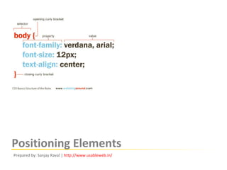
  • 1. Positioning Elements Prepared by: Sanjay Raval | http:// www.usableweb.in /
  • 2.
  • 3. Box Model Recap In CSS, width and height refer to the width and height of the content area . Adding padding, borders, and margins will not affect the size of the content area but will increase the overall size of an element’s box. If you wanted a box 100-pixel wide with a 10-pixel margin and a 5-pixel padding on each sides, you would need to set the width of the content to be 70 pixels. #myBox { margin:10px; padding:5px; width:70px; }
  • 4. Box Model Recap Padding, borders, and margins can be applied to all sides of an element or individual sides. Margins can also be given a negative value.
  • 5. Block and inline elements HTML elements are either block or inline elements. A block-level box , such as a div, a paragraph, or a heading, begins rendering on a new line. An inline-level box , such as a <span> or an <em>, begins rendering wherever you place it within the document and does not force any line breaks.
  • 6. Block and inline elements Using CSS property, display, you can make an inline element display like a block-level element or vice-versa. Example: Say you want tabs, which is a list (of links) and so should be marked up as a <ul> <ul id=&quot;maintabs&quot;> <li><a href=&quot;#&quot;>PersonalFinance</a></li> <li><a href=&quot;#&quot;>BillPay</a></li> <li><a href=&quot;#&quot;>FundsTransfer</a></li> <li><a href=&quot;#&quot;>FinancialCalendar</a></li> <li><a href=&quot;#&quot;>Customer Care</a></li> <li> </ul> Here's how it looks as a normal list
  • 7. Block and inline elements #maintabs li { display:inline; list-style-type:none; float:left; background-color:#dce2c7; border:1px solid #c5d199; padding:5px 10px; margin-left:2px; } Here's how it looks with the CSS styles applied Here's the CSS code Using CSS property display:inline, you can display a block element <li> as an inline element and can show the list items <li> as tabs.
  • 8. Floating A floated box can either be shifted to the left or the right until its outer edge touches the edge of its containing box, or another floated box. Because floated boxes aren’t in the normal flow of the document, block boxes in the regular flow of the document behave as if the floated box wasn’t there. As shown in below figure, when you float Box 1 to the right, it’s taken out of the flow of the document and moved to the right until its right edge touches the right edge of the containing block.
  • 9. Floating If you float all three boxes to the left, Box 1 is shifted left until it touches its containing box, and the other two boxes are shifted left until they touch the preceding floated box. If the containing block is too narrow for all of the floated elements to fit horizontally, the remaining floats will drop down until there is sufficient space.
  • 10. Floating If the floated elements have different heights, it is possible for floats to get “stuck” on other floats when they drop down.
  • 11. Clearing the floats Lets say you have a grid of floated objects. Then let’s say you want to create a break in that grid in order to start a new row.
  • 12. Clearing the floats There are times when you don’t want certain content to be next to floated elements. To accomplish this, you can use clear. The clear has four options: &quot;clear: left&quot;, &quot;clear: right&quot;, &quot;clear: both&quot; or &quot;clear: none&quot;. clear: left The element is moved below the bottom outer edge of any left-floating boxes that resulted from elements earlier in the source document.
  • 13. Clearing the floats clear: right The element is moved below the bottom outer edge of any right-floating boxes that resulted from elements earlier in the source document. clear: both The element is moved below all floating boxes of earlier elements in the source document.
  • 14. Line boxes and clearing Line boxes (text boxes) next to a floated box are shortened to make room for the floated box, and flow around the float. In fact, floats were created to allow text to flow around images
  • 15. Line boxes and clearing To stop line boxes flowing around the outside of a floated box, you need to apply a clear to that box. The clear property can be left, right, both, or none, and indicates which side of the box should not be next to a floated box. To accomplish this, enough space is added above the cleared element’s top margin to push the element’s top border edge vertically down, past the float
  • 16. The Position Property There are four values for the position property: static, absolute, fixed, and relative. Static is the default. Unless specified, all boxes start life being positioned in the normal flow (static position) let’s take a quick look at each using a simple example with four paragraphs.
  • 17. The Position Property Static Positioning With the four paragraphs each displayed with the default position property value, static , they stack one above the other, as normal document flow dictates.
  • 18. The Position Property Relative Positioning Let’s set the third paragraph to the relative position. You can then move this paragraph with respect to its default position using the properties top, left, bottom, and right. p#specialpara {position:relative; top:30px; left:20px;}
  • 19. The Position Property Relative Positioning Now the top of your paragraph is moved down by 30 pixels and right by 20 pixels. Here although the element moves relative to its original position, nothing else changes.
  • 20. The Position Property Absolute Positioning This type of positioning takes an element entirely out of the flow of the document. Let’s modify the code you used for relative positioning by changing relative to absolute. p#specialpara {position:absolute; top:30px; left:20px;}
  • 21. The Position Property Absolute Positioning You can see that the space previously occupied by the element is gone. The absolutely-positioned element has become entirely independent of the surrounding elements in the markup, and it is now positioned with respect to the top-level element, body. Because the absolutely positioned element’s positioning context is body, the element moves when the page is scrolled to retain its relationship to the body element, which also moves when the page scrolls.
  • 22. The Position Property Fixed Positioning Fixed positioning is similar to absolute positioning, except that the element’s positioning context is the viewport (the browser window or the screen of a handheld device, for example). So the element does not move when the page is scrolled. Note: However, position:fixed does not work in IE6, although it does work in IE 7.
  • 24. The Position Property Positioning Context contextual positioning means that when you move an element using the properties top, left, right, or bottom, you are moving that element with respect to another element. That other element is known as its positioning context. As you saw in “Absolute Positioning” earlier, the positioning context of an absolutely positioned element is body—that is, unless you change it. body is the containing element of all other elements in your markup, but you can use any ancestor element as a positioning context of another element by changing the ancestor’s position value to relative.
  • 25. The Position Property Positioning Context Let’s look at this markup <body> <div id=&quot;outer&quot;>The outer div <div id=&quot;inner&quot;>This is some text...</div> </div> </body> and this CSS div#outer_div {width:250px; margin:50px 40px; border-top:3px solid red;} div#inner_div {top:10px; left:20px; background:#AAA;}
  • 26. The Position Property Positioning Context But why isn’t the inner div 10 pixels down from the top of the outer one and 20 pixels to the left, as specified? The answer is that the inner div has the default positioning of static. This means it is in the regular document flow, and because the outer div has no content, the inner div starts in the same place. Only when you set an element to one of the other three positioning options—relative, absolute, or fixed—do the top, left, right, and bottom properties actually do anything.
  • 27. The Position Property Positioning Context Let’s see this in action by setting the inner div’s position property to absolute. div#outer_div {width:250px; margin:50px 40px; border-top:3px solid red;} div#inner_div {position:absolute; top:10px; left:20px; background:#AAA;} Because there is no other relatively positioned element for it to reference, it positions itself by default with respect to the body element.
  • 28. The Position Property Positioning Context If you then set the position property of the outer div to relative, the positioning context of the absolutely positioned inner div is now the outer div If you now set the left and top position properties of the outer div to anything other than zero, the inner div would move to maintain its positioning relationship to the outer div—its positioning context. Get it?
  • 29. Overflow Property There may be a case when an element's content might be larger than the amount of space allocated to it. CSS provides a property called overflow which tells the browser what to do if the box's contents is larger than the box itself . Example: Here's the HTML code <body> <div class=“myBox&quot;> This is some text... </div> This is some text... </body>
  • 30. Overflow Property Here's the CSS code .myBox { float: left; width:150px; height:150px; background-color:#ccc; border: 1px solid #999; margin-right:5px; padding:5px; } Here's how it looks:
  • 31. Overflow Property Overflow has 4 values namely visible, auto, hidden, and scroll .myBox { overflow:visible; } Overflow: visible Visible is the default value. No scrollbars will be added, and your content will just flow. Lets add some more text to the myBox div container and see how the text flows.
  • 32. Overflow Property .myBox { overflow:auto; } Overflow: auto You should use this value when you want to let the browser decide what’s right. Scroll down? Scroll right? No scrolling at all? The browser makes this decision. This value usually is the best choice. Here's how it looks:
  • 33. Overflow Property .myBox { overflow:hidden; } Overflow: hidden This value will not add any scrollbars or will not display more text then needed. When the content crosses the ‘height’ given to the container, it simply don’t display that content. Here's how it looks:
  • 34. Overflow Property .myBox { overflow:scroll; } Overflow: scroll An overflow of scroll means that the browser should place scrollbars on the element whether or not the contents of the element have overflowed. Ensure there is always enough content in this box, because otherwise there are ugly scrollbars for nothing! Here's how it looks: Note: Theoretically, with the overflow property, the need for frames is greatly reduced. Unfortunately, some old browsers do not fully support the overflow property.