
Recomendados
Más contenido relacionado
La actualidad más candente
La actualidad más candente (18)
Destacado
Destacado (18)
Similar a Front Cover Analysis
Similar a Front Cover Analysis (20)
Último
Último (20)
Front Cover Analysis
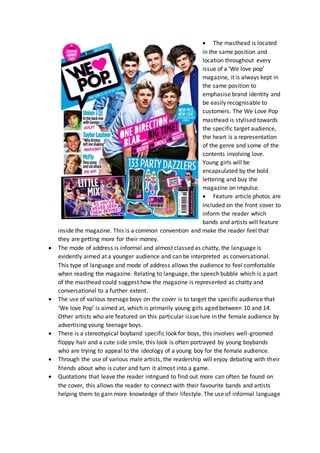
- 1. The masthead is located in the same position and location throughout every issue of a ‘We love pop’ magazine, it is always kept in the same position to emphasise brand identity and be easily recognisable to customers. The We Love Pop masthead is stylised towards the specific target audience, the heart is a representation of the genre and some of the contents involving love. Young girls will be encapsulated by the bold lettering and buy the magazine on impulse. Feature article photos are included on the front cover to inform the reader which bands and artists will feature inside the magazine. This is a common convention and make the reader feel that they are getting more for their money. The mode of address is informal and almost classed as chatty, the language is evidently aimed at a younger audience and can be interpreted as conversational. This type of language and mode of address allows the audience to feel comfortable when reading the magazine. Relating to language, the speech bubble which is a part of the masthead could suggest how the magazine is represented as chatty and conversational to a further extent. The use of various teenage boys on the cover is to target the specific audience that ‘We love Pop’ is aimed at, which is primarily young girls aged between 10 and 14. Other artists who are featured on this particular issue lure in the female audience by advertising young teenage boys. There is a stereotypical boyband specific look for boys, this involves well-groomed floppy hair and a cute side smile, this look is often portrayed by young boybands who are trying to appeal to the ideology of a young boy for the female audience. Through the use of various male artists, the readership will enjoy debating with their friends about who is cuter and turn it almost into a game. Quotations that leave the reader intrigued to find out more can often be found on the cover, this allows the reader to connect with their favourite bands and artists helping them to gain more knowledge of their lifestyle. The use of informal language
- 2. and casual mode of address for example “new pics, new chat” make the target audience feel more involved and directly being spoken to. Everybody featured on the magazine can be seen smiling, representing friendship and happiness, this indicates the genre to a further extent. Influencing young girls to be like their beloved celebrities. Facial expressions are important on pop magazines, on this particular cover the bright costumes, high key lighting and joyful facial expressions are typical of pop artists that belong in this genre and specify to the young target audience that friendship is important. The ‘bubble gum pop’ vibe which is heavily reflected on this front cover can be portrayed by a variety of conventions, the masthead which is all uppercase and bold suggests the modern pop vibe and completely emphasises brand identity. Conventionally attractive features on this issue of We Love Pop include the angled images near the bottom, images which are out of line give it an edgy modern vibe. Bold words in a brightly coloured font such as ‘Blab’ and phrases such as ‘oh no!’ give the magazine a perfect pop vibe, the colour scheme and choice of font is vital when creating a pop magazine because the chosen genre has to come across in various ways using different conventions such as colour, font, wording and image choice. Each issue of we love pop shows a different colour scheme which ultimately represents who is featured as the main image, for example One direction are males and the use of blue is stereotypically associated with males. Mise en scene on this cover is very reflective of the main image, you can also see that costume choice has been carefully selected to portray that One Direction are a British boyband, the colours blue, white and red can be seen a lot when featuring British bands and artists conveying their British background. The main sell line on the right hand side will be the first line of text read by the audience, it should be eye-catching and intriguing. “One Direction Blab” is an enticing choice of masthead and lures in many fans who love exclusive interviews. Fashion advice is important to the target audience of this magazine, they are at the age were they are trying to discover their own style, and tips from celebrities and other makeup artists etc can be helpful. The barcode and price are almost always located in the bottom right corner, in small print so that the initial price cannot be off putting. Direct address through eye contact from all the band members can make the magazine feel welcoming and personal, this is what a reader looks for when choosing a magazine, and they should be able to connect with it. The puff is a vibrant blue colour, this makes it eye catching for the reader, allowing them to view any promotional offers or special prices that the magazine is offering on that magazine issue. Also complimenting the other magazine conventions the puff alongside masthead outline is blue. The band featured indicates a magazine that works with and celebrates the success of the pop industry, a clear feminine approach has been taken to this magazine
- 3. shaped through the use of pink creating a lighter uplifting tone, blue which is the most featured colour on this cover coveys masculinity of the boy band featured. The main image encapsulates the One Direction fan base and also those who are interested in the general pop industry. One Direction are a globally popular boy band, this brings in a wider audience for the magazine and lures in new readers who may make repeat purchases after reading one copy. In terms of the layout it is fairy busy and overcrowded, this look has been achieved by collaging images together such as the images of clothing in the bottom right, combined with buzzwords and lots of colour the magazine has created an enjoyable atmosphere for the readership. Blue is typically classed as a cold colour which can be calming. The magazine have used blue to illustrate the masculinity of One Direction and also to imply confidence and intelligence of the readers. Pink is primarily a delicate colour which links to romance, femininity, fun and flowers, the connotations derived from pink on a pop magazine portray the contents including romance and fun and overall the bubble gum pop vibe often linked to pop. The bands costumes are also very basic and most importantly portraying their British roots, the basic t-shirt and jeans emphasises their friendship as the most important aspect for the readership to be drawn towards.
- 4. Lots of colour and differing fonts makes a huge difference when drawing in the reader, this magazine again is aimed at girls between the ages of 10 to 14 who love pop music and are typical young girls into popular fashion trends and songs in the charts. All the people featured on this issue of the magazine are seen to be happy and bring an elevating mood to the magazines feel, overall making the reader feel content purely from visually inspecting the magazine. We Love Pop magazine can not only be seen advertising celebrities but television too. They consider what is popular amongst young girls at the moment and add a featured article to their magazine on pop music, youtubers and television programmes. A masthead such as ‘Live Taylor’s Life’ which is featured on another issue of the magazine is encapsulating to the younger audience who aspire to be famous or have a career in the pop music industry, they want to know every aspect of various celebrities lives and desire to find out how to be in their position. Taylor’s facial expression can be classed as enthusiastic, this demonstrates the happy uplifting mood which is portrayed on the front cover. Taylor Swift can be seen singing into a hairbrush, this is stereotypical of a young girl to use a hair brush as a microphone, We Love Pop has considered this and tried to ensure that the featured artist is relatable for the audience. The conventions of We Love Pop are easily distinguishable throughout each issue, the bold angled title is easily recognisable on every issue. “Zing into spring” is a catchy modern phrase used to encapsulate the audience, young girls who love to stay updated on fashion trends will be intrigued by the new spring trends and want to purchase the magazine. The word “zing” is often associated with citrus fruits, evidently front inspecting the clothing being promoting it is all lemon and lime coloured perfectly linking to the language used. The pink love heart is fun and feminine, just like the magazine, it also is a strong indicator of brand identity and continuity, this is important for a magazine as they want their brand to be easily recognisable. Font is a very important decision on a magazine, particularly pop. It is visible that there are many varieties of fonts across the entire front cover. Bubble writing is often associated with young people as they find it easy to emulate, read and relate to. The main sell lines font has rather harsh edges which could convey Taylor’s personality.
- 5. The style tips are stated as ‘exclusive’ this will make the audience feel as if they have an advantage over girls who are not readers of the magazine. Alongside drawing in readers, sales will also be encouraged. Fashion advice can be seen on every edition of We Love Pop, it’s a typical approach for this magazine to lure in the audience as the young target audience is instantly drawn to modern fashion trends. Fun games and quizzes for the reader to participate in are often found advertised on the front cover, this type of advertisement marks the magazine as fun and age appropriate to their target audience. The colour scheme is very bright and bubbly, representing the mood which is fun and energetic, orange and pink are two colours that clash, and by using these colours for a front cover the target audience can determine a unique vibe overall giving it an edgy look. The target audience can be heavily influenced to buy the magazine based on sell lines, a catchy sell line such as “her first interview since Harry” lures in fans from the Taylor Swift and One Direction fan bases, leaving them intrigued to find out what happened between the two major celebrities. Reappearing conventions of We Love Pop include the masthead and use of more than one puff, this is to maintain brand identity making the magazine brand easily recognisable to their customers. The use of the colour red for the puff, indicates to the readers that it is important information and should attract their attention first. The word ‘Win’ on a magazine instantly draws in readers of all ages within the target audience. The fashion section helps to signal the target audience of the magazine, by using bright green clothing, the complementary colours reflect once another and emphasise the separation of clothing to other features. While analysing the actual items of clothing they are obviously aimed at a younger group of females. This is evident because of the typical young female clothing items and bright colours. The barcode and price are located in the bottom right corner to inform the reader of sell price. The price of a pop magazine is affordable for the age range as the TA are still dependant on their parents for a source of income There is a running theme throughout every issue of ‘we love pop’ where there is more than one puff, this adds shape and colour to the magazine also making it eye catching to the audience. On this particular copy of the magazine the most noticeable puff gives the reader and insight to Nicole Scherzinger’s wardrobe, young girls who are into fashion will love to view a celebrity’s wardrobe and aspire to be like her. The featured artist on this issue of We Love Pop is Taylor Swift, she is a popular and successful artist in the industry. Many young girls aspire to be famous or as influential as their favourite celebrities, so giving them an insight into celebrity’s lives can help them to dream big. The puff positioned in the upper left corner says that you can ‘win’ Harry Styles’ height in chocolate, this is appealing to the young audience as chocolate is usually a
- 6. favourite choice of food for many of them, and when food and pop stars are combined the attention of many young females is being grabbed. The shape of the masthead is a speech bubble, this represents that the magazine is a chatty and friendly magazine. Text messaging can also be linked in to this symbol as the classic sign for a text message is similar to the masthead, this makes it highly relatable to young teenagers as they use texting as their main form of communication. The main sell line circulates around Harry and Taylor’s relationship together and claims that it’s the first interview since the breakup. The use of an exclamation mark on this adds excitement and drama to the sell line, leaving a lasting impression on the readership and also keeping them interested in the contents. The use of two major pop stars and the news of a breakup encapsulates the reader, especially as the interview is exclusive to the magazine and the story being sold has never been told, allowing fans to find out how or why the relationship ended and receive exclusive details about their favourite pop stars. In the left hand third there is a strong appeal to the sell lines revolving around other artist in the industry. This fascinates the readers who may not be particularly interested in the featured article. The posters advertised on this front cover are a good way to draw in a range of fans besides Taylor Swift, seeing as the audience are young they always want new ways to decorate their bedroom, so posters are appealing to this audience. The chorus of a song is usually quoted in reference to the featured artist, pop songs have a reputation for being catchy this is why the catchiest part of the song is used suggesting that the magazine provides the best information and cuts to the chase. 101 One Direction facts in the top right hand corner puff lures in readers as the randomly selected number keeps people thinking about all the possibilities of different facts. Quotations are heavily used on the front cover of ‘We Love Pop’, they provide the reader with a small insight into the featured articles and make them feel connected as the words have come directly from the artist There are some sell lines in the right hand third of the magazine, this is not typically conventional but the cover differs each time, making it unique and giving the audience a variety. Mise en scene has been carefully selected for the photoshoot, Taylor has been made up to look feminine, fun and flirty. Red lipstick is a classic feminine approach, the background colour helps to complement it to an additional extent combined with the lighting which is clearly very high key, allowing all aspects of her makeup to show and to truly emphasise that Taylor is the main focus on the entire page.