SlideShare una empresa de Scribd logo
1 de 9
Similar product research  Billboard Front Cover Analysis 1 Masthead:  The masthead ‘Billboard’ has been written in a bold and simple font so it stands out to the reader. They have used the colour white for the masthead this is because it contrasts with dark red background therefore making it more eye catching. In some of the gaps they have filled the letter with different colours e.g. red, yellow,  blue etc - these are  quite bright and vibrant colours so when used on the magazine they stick out from the rest of the magazine. These colours also connote ‘excitement’ which reflect on to the information included in the magazine. Main image: The sell line relating to Beyonce wanting to become an independent women compliments with the main background image. In the image Beyonce is seen with her hands on her hips with her head looking upwards. This kind of body language creates a sense of power e.g. by looking up instead of directly at the camera the reader feels the model has more authority and is ‘better’ then them, overall reinforcing the independent idea. Beyonce is also wearing dark reddish clothing similar to the background colour, the colour red connotes ‘power' and ‘fire’ implying that Beyonce has quite a fiery and strong personality. Overall, this not only relates back to her independent attitude it also links well with her song ‘Run this world’ as this song talks about how women are becoming more independent – this relates to how times have changed as in the past men were seen as more superior than women however in the 21st century women are now seen as more equal to men. On the other hand it could relate to ‘love and passion’ signifying Beyonce has a lot of passion for her music. Overall the possible target audience for this magazine are probably young women as they can look up to Beyonce as they may see her as a role model or a good example of women in today's society. Sell line: The main sell line used here is: “Back to run the world Beyonce” This sell line not only relates directly to Beyonce’s song ‘Run the world’ but also links in to how Beyonce wants to be known as an independent women, this idea is reinforced with the quote “No on can define me” Other Sell lines: Other sell lines have been used around the magazine front cover and have ranged from the colours yellow and white this again is so they stand out to reader because the audience may be interested in the other artists included in the magazine rather than the main subject artist (Beyonce).   Advertisements The advertisement for the ‘Billboard music awards’ has been put in black this is so it stands out from the rest of the page as the colour black is darker than the rest of the colours used on the front page – therefore the reader draws attention to this certain advertisement .
Main Image: The black and white image of Bruno Mars gives a vintage feel to the front cover; it represents how times have changed from 50 years ago till now e.g. from black and white to colour, as 50 years go images would be in black and white – it also allows the main focus to be the ‘50 Years’. The main image picture has evidently been edited as his facial features are more emphasised e.g. his lips and eyes are more defined – this could be appeal to the female audience as he is making direct eye contact with the audience and is ‘drawing  them in’.  Masthead:  The masthead ‘Billboard’ has been written in a bold and simple font so it stands out to the reader. They have used the colour white for the masthead this is because it contrasts with dark black background and the black and white main image therefore making it more eye catching. In some of the gaps it is still clear that some of the letters have been filled with the colours red, yellow,  blue (which they use on every magazine), however this time the whole masthead isn't visible as some if it is being covered by the main image. This implies that the magazine is possibly very well known therefore, the whole masthead doesn’t need to be on show as it is recognisable to the audience. Similar product research  Billboard Front Cover Analysis 2 Sell line: The sell line ‘Bruno Mars’ is in a Serif font which links in to the vintage theme of the magazine. This could also link in to the type of genre Bruno Mars’s music is as many of his songs are love songs therefore, the font can be seen as quite a feminine font to appeal to his main audience. Underneath this it reads ‘is big business’ the word ‘big’ is in the font ‘impact’ and is in a red colour – having the word in red makes it stand out from the white background. Sell line: The main sell line presented on the magazine is ‘50 Years’ the text is in a gold colour which relates to when people celebrate the number 50 it is usually referred to the ‘golden years’ – like the masthead it also stands out from the rest of the magazine against the black background and really captures the readers eye. The text ‘50’ is also in the shape of harp which relates to the musical content of the magazine.
Similar product research  Billboard Front Cover Analysis 3 Main Image: The main image is of the music icon ‘Lady Gaga’ who is known for her extravagant style however, she is wearing dark and dull clothing which are not as exciting and eye catching. On the other hand, she has bright purple hair with part of it in a bow, and on her hand she is wearing some unusual jewellery  which slightly brings her uniqueness. The model is also in a quite seductive pose to possibly emphasise the type of clothing she usually wears reveals a lot of skin; this could directly relate to the sell line which is next to the main image which reads: “Why she doesn't wear pants”. However, this could be simply to draw the reader in.  Masthead:  The masthead ‘Billboard’ has been written in a bold and simple font and is in the colour black linking to the black and grey colour scheme. In some of the gap in the letters, they have been filled with the colours red, yellow,  blue (which they use on every magazine), however this time the whole masthead isn't visible as some if it is being covered by the main image. As a result this implies that the magazine is a well known magazine, therefore the magazine is probably easily recognised by their main consumer. Colour scheme: The use of the black, grey and white colour scheme makes the front cover look more professional and sophisticated. This is ironic as the main model image ‘Lady Gaga’ has quite an eccentric style therefore by using the dull colour scheme is in contrast. However, bits of light purple have been used around the magazine to link directly to the main image.  Sell line: The sell line ‘Lady Gaga’ is in a large bold font and is in the colour black this makes it stand out from the light grey background. It is also next to the model’s bright purple hair which makes it stand out even more for the audience. The audience also therefore know the model is ‘Lady Gaga’. Target audience: The target audience for this magazine is mainly directed at the music stars fans as it includes stories that they’d probably be interested in e.g. One sell line included is ‘How she writes pop hits’.
Similar product research  Billboard Contents Page Analysis 1 Masthead: The contents masthead has been done in a different font to the simplistic bold font usually used on ‘Billboard’s’ front pages which highlights the sense of ‘change’ this could link into the charts continuous change every week. However ‘contents’ is still easy for the audience to read and has written in a black colour which stands out from the rest of the page. Images: Four images have been used on the contents page; three at the top and the fourth at the bottom in a bigger image. The audience are firstly drawn to the three images at the top; the first one is of a man smiling at the camera welcoming the audience, the second is of a vibrantly styled person who has glasses on however, they are slightly looking at the camera this makes them more mysterious, and the final one is of pop icon ‘Katy Perry’ where she is wearing seductive clothing which could appeal to a male audience. The fourth images is the main image on the page as it is larger than the others, the people included in the picture have very neutral facial expressions which are in contrast to the more exciting images present. Billboard Chart: As the ‘Billboard’ magazines main purpose is to provide their readers with the top music that week or the top album, therefore as it is the readers main interest they have put the music chart on the left hand side as this is usually what the reader looks to first. Therefore the magazine has a wider audience as it provides multiple music interests. The top charts have also been categorised into different sections e.g. Albums, singles etc – this is so it is easier for the reader to navigate to their most interested section. The numbers for the certain pages have been put down the middle making it easier for the reader to locate the number – each number are also surrounded by a vibrant colour this makes the number stand out more and directly relates to the vibrant colours used in the Billboard masthead. Colours: Certain headings have been written in a blue colour in contrast to the white background as result making them stand out more. This is so the subject of the certain article is emphasised to the reader. The events are at the bottom of the page (last thing the reader will see) therefore they possibly may spend more time reading it which might be the purpose of the positioning.
Similar product research  VIBE Contents Page Analysis 2 Contents:  The contents itself has been split up into two sections; ‘features’ and ‘fashion’ so its easier for the reader to navigate to their interested category. The subheadings are in a larger text and are in a different font this makes it stand out two the audiences and it draws the readers eye. Also by having a range of different categories included in the magazine (not only music) allows the magazine to be targeted at a much larger audience. Next to the page numbers the articles have been put in a different colour (pale blue) this is so its easier for the reader to locate the article’s title e.g. The article linking to Ciara (the model) reads ‘Barely there’ this draws the readers eye and it directly relates to the main image as the model is wearing ‘barely’ any clothes. Masthead: Here the masthead ‘Contents’ is written in a bold font and is in white which is in contrast to the darker background – this makes it stand out more to the audience. The word ‘contents’ has also been split up in to three different sections which makes the contents page more intriguing for the audience. Behind the masthead is a transparent ‘V’ which is in the same font as the magazine’s front cover masthead – this is so the contents page is recognisable for the audience (they know the contents page belongs to ‘VIBE’.  Main image: The main image is of a young women in a very provocative pose with her legs held in the air and her skin showing – she is also directly looking at the reader with seductive look – this draws the reader in and adds interest into the magazine. However this is the only image present on the page which my signify it has a lot of importance in the magazine.  Colour scheme: The colour scheme used on the contents page is black, white, and grey – this overall makes the page look more professional and stylish – however it also links into the urban theme.
Similar product research  VIBE Contents Page Analysis 3 Masthead: The masthead ‘Contents’ is written in a san serif font and is in black which makes it stand out from the lighter background – it also makes the page look more modern and classy. The word ‘contents’ has been split up in to three different sections which makes the contents page more unique. Behind the masthead there is a pale blue ‘V’ which is in the same font as the magazine’s front cover masthead – this is so the contents page is recognisable for the audience (they know the contents page belongs to ‘VIBE’.  Main Image: The main image is of the RnB singer ‘Kanye West’ straight away this appeals to the audience as he is a recognisable artist. The model is also directly looking at the audience making it more personal to the reader – the model is also given out quite a negative stare towards the reader which may make the audience feel intimidated - this is also complimented by his somewhat slightly aggressive body language/posture . The main image is in black and white which links with the page’s colour scheme of black, grey and white. However the only colour present on the page is the red heart on the model’s chest which is being held by an arm. This could signify the common view people have on Kanye West that he is ‘heartless’ as he is known for being quite an arrogant person therefore the redness of the heart could connotate danger. On the other hand the red heart could also connotate passion which signifies his passion for music. Contents:  The contents itself has been split up into two sections; ‘features’ and ‘fashion’ making it easier for the reader to navigate to their preferred section – it also allows the magazine to be targeted at a wider audience as both male and females have something to read about e.g. Males may look up to Kanye West so will read about him, and females may be more interested in the fashion side to the magazine. The subheadings are in a larger text and are in a different font (serif) this makes it stand out two the audiences and it draws the readers eye. Before each article there are the page numbers which makes it easier for the reader to locate the page. The article linking to Kanye West reads ‘Pride in the name of love’ this directly relates to the red heart on Kanye’s chest as it links to ‘love’.
Similar product research  Q Magazine Double Page Spread Analysis 1 Main Image: The main image on the double page spread is of Amy Winehouse. The pose in which see is in is intriguing; for example in the image she has contrasting hand poses – one hand is scrunched up into a fist resting on her cheek which could signify how she is fighting against her battle of drugs and her battle with media. The other hand is in feminine pose resting under her face this is to reinforce the heading that she is still a ‘girl’ and shouldn’t be portrayed differently. Her facial expression also conveys innocence which again relates to the title where she states; “I’m not horrible” – however one of her eyes are being covered by her hair which could signify her hiding something. The tattoos on her arm are ironic as she states in the heading that she is a ‘Girl’ however the tattoos displayed on her arm could be seen as quite masculine - therefore the two contrast with each other.  Heading: The heading in the double page spread is in a San Serif font and is in a large text size – addition to this the heading has been written in black making it stand out from the white background. The reason for having the heading “I’M NOT A HORRIBLE GIRL” in such a bold font is so the subject of the double page spread is emphasised to the audience. The reader can then make the connection that the double page spread is about Amy Winehouse’s difficult life and how she is portrayed in the media. The word “GIRL” which is included in the title is slightly larger than the text above it – this is to possibly highlight to the audience Amy Winehouse’s message that no matter how difficult her life is right now she is still a human. Colour Scheme: The colour scheme of black and white could represent the contrast of innocence and negativity. On the other hand it could also link into Amy Winehouse’s song ‘Back to Black’  which is about a difficult relationship between a man and a women – the women representing Amy Winehouse. In the song Amy describes how she is ‘going back to black’ which could signify how she is going back to the negativity which could involve ‘drugs.  Text: In the main text the name ‘Amy Winehouse’ has been highlighted in black box – this draws the readers eye as this becomes a focus point for the reader. By drawing the readers eye to this specific point tells the reader that there is something important about Amy Winehouse featured in the magazine and encourages the reader to keep reading. Target Audience: The target audience for the double page spread would be fans of ‘Amy Winehouse’ who were interested about her life and the struggles she went through, as this is an article that was released after the stars death.
Similar product research  Double Page Spread Analysis 2 Heading: The heading “WILL HE WON’T HE?” is in a gold and grey colour which links into the colour scheme. It has also been positioned on the left hand side of the page as this is the first place the reader looks – having the heading as a question intrigues the reader and makes them wont to read the full page spread  to find out the reason for the heading. Main Image: The main image is of the music band ‘The Black Eyed Peas’. The third band member across is the only one wearing gold which signifies his wealth – however, it also represents his importance to the article and he possible directly links to the heading. The pose in which he stands is very confident with his legs shoulder width apart and one of his arms strongly by his side and the other against his head. The other band members are behind him who are also in quite powerful poses e.g. the female of the group is in quite a provocative clothes with quite revealing clothing . Colour Scheme: The colour scheme of gold, silver relates to the main image of the band – this could be to simply represent the wealth of the band or illustrate how high they are in the music industry. Target Audience: The target audience for this double page spread could be young adults or teenagers as many will idolise the band ‘The Black Eyed Peas’. Text: Part of the text in the article is highlighted in black this is to draw the audiences focus to this point – the reason for doing this may possibly to highlight to the audience that this is important information which could possible relate to the heading itself. Position: The picture has also been positioned on the left as this is the first place the audience will read.
Similar product research  Double Page Spread Analysis 3 Main Image: The main image is of R&B artist Solange Knowles – the model is standing with a strong posture and her hands hidden behind her back, pushing her body slightly forward, this illustrates the artists confidence with herself and the way she looks, this relates to where the heading describes the artist as ‘outspoken’. The artist is wearing bright red clothing which allows her to stand out from the page in contrast to the black and white images behind. The red clothing could connotate the artists strong passion for music this is evident again in the masthead where it states ‘Solange Knowles created one of the year’s best R&B albums’. The black and white images behind the main image are of the singer in different poses – the multiple pictures represent the singers exciting and bubbly personality – the black and white effect that has been used is to possibly illustrate that underneath this strong confident attitude she has a  lively personality. Heading: The heading on the double page spread is capitalized and is in a bold text making it stand out to the audience - the artists name in the heading is in a different colour to the rest of the heading adding more emphasise to who the double page spread is about (Solange Knowles) and their importance to the article.  Target Audience:  The target audience for the double page spread could be young women as many of them may look up to the artist ‘Solange Knowles’ as their role model/icon. The five black lines underneath the artist mimics some sort of stage which relates back to the artists passion for music and her love of being on stage. The black lines could also be used to divide up the page. The page has been divided into three sections; the pictures at the top of the page, the main image, and the main text – this links to the magazine itself, as ‘VIBE’ are known for splitting up their headings e.g. The heading ‘contents’ on the contents page, are always split up into three sections making the page more interesting. Therefore, by splitting the page up into three sections creates a continuous theme throughout the magazine.

Más contenido relacionado

La actualidad más candente

Presentation1.pptx signs and signifiers
Presentation1.pptx signs and signifiersPresentation1.pptx signs and signifiers
Presentation1.pptx signs and signifiersanniemyatt
 
Portfolio research
Portfolio researchPortfolio research
Portfolio researchFrancoisAli
 
Portfolio research
Portfolio researchPortfolio research
Portfolio researchFrancoisAli
 
Mixed Magazine cover analysis
Mixed Magazine cover analysis Mixed Magazine cover analysis
Mixed Magazine cover analysis carlaharrisss
 
Task 5 – deciding which genre and style
Task 5 – deciding which genre and styleTask 5 – deciding which genre and style
Task 5 – deciding which genre and styleAS Media Column D
 
Music Magazine Cover Analysis
Music Magazine Cover AnalysisMusic Magazine Cover Analysis
Music Magazine Cover Analysisfob163
 
Media front cover analysis
Media front cover analysisMedia front cover analysis
Media front cover analysisurvisha38
 
Film magazine cover
Film magazine cover Film magazine cover
Film magazine cover aya_wanis
 
Music Magazine Analysis
Music Magazine AnalysisMusic Magazine Analysis
Music Magazine AnalysisLauren_Clarke
 
Music and school Magazine analysis
Music and school Magazine analysisMusic and school Magazine analysis
Music and school Magazine analysishalimashalim
 
Signs And Signifiers - Music Magazines
Signs And Signifiers - Music MagazinesSigns And Signifiers - Music Magazines
Signs And Signifiers - Music MagazinesMattR298
 
My magazine research
My magazine research My magazine research
My magazine research adinewenner
 

La actualidad más candente (20)

Magazine Analysis
Magazine AnalysisMagazine Analysis
Magazine Analysis
 
Magazine Analysis
Magazine AnalysisMagazine Analysis
Magazine Analysis
 
Presentation1.pptx signs and signifiers
Presentation1.pptx signs and signifiersPresentation1.pptx signs and signifiers
Presentation1.pptx signs and signifiers
 
Magazine analysis
Magazine analysisMagazine analysis
Magazine analysis
 
Portfolio research
Portfolio researchPortfolio research
Portfolio research
 
Portfolio research
Portfolio researchPortfolio research
Portfolio research
 
Mixed Magazine cover analysis
Mixed Magazine cover analysis Mixed Magazine cover analysis
Mixed Magazine cover analysis
 
Task 5 – deciding which genre and style
Task 5 – deciding which genre and styleTask 5 – deciding which genre and style
Task 5 – deciding which genre and style
 
Music Magazine Cover Analysis
Music Magazine Cover AnalysisMusic Magazine Cover Analysis
Music Magazine Cover Analysis
 
Media front cover analysis
Media front cover analysisMedia front cover analysis
Media front cover analysis
 
A2exsw
A2exswA2exsw
A2exsw
 
Music mag analysed
Music mag analysedMusic mag analysed
Music mag analysed
 
Music mag analysed
Music mag analysedMusic mag analysed
Music mag analysed
 
Film magazine cover
Film magazine cover Film magazine cover
Film magazine cover
 
Music Magazine Analysis
Music Magazine AnalysisMusic Magazine Analysis
Music Magazine Analysis
 
Radial analysis
Radial analysisRadial analysis
Radial analysis
 
Music and school Magazine analysis
Music and school Magazine analysisMusic and school Magazine analysis
Music and school Magazine analysis
 
Signs And Signifiers - Music Magazines
Signs And Signifiers - Music MagazinesSigns And Signifiers - Music Magazines
Signs And Signifiers - Music Magazines
 
Music Magazine Analysis
Music Magazine AnalysisMusic Magazine Analysis
Music Magazine Analysis
 
My magazine research
My magazine research My magazine research
My magazine research
 

Similar a Magazine analysis

Analyising music magazines
Analyising music magazinesAnalyising music magazines
Analyising music magazinesjessasmedia4
 
Analyising music magazines
Analyising music magazinesAnalyising music magazines
Analyising music magazinesJess Stafford
 
Analyising music magazines
Analyising music magazinesAnalyising music magazines
Analyising music magazinesjessasmedia4
 
Analyising music magazines
Analyising music magazinesAnalyising music magazines
Analyising music magazinesjessasmedia4
 
Product research
Product researchProduct research
Product researchmaxdowling
 
Textual analysis covers
Textual analysis  coversTextual analysis  covers
Textual analysis covers051MARY
 
3 Magazine front cover analysing
3 Magazine front cover analysing3 Magazine front cover analysing
3 Magazine front cover analysinglaylakeegan
 
Presentation1[1]
Presentation1[1]Presentation1[1]
Presentation1[1]Domelar
 
Cover deconstruction
Cover deconstructionCover deconstruction
Cover deconstructionchlozeebo
 
Analysis of magazines
Analysis of magazinesAnalysis of magazines
Analysis of magazinesasmediag13
 
Magazine research really official [recovered]
Magazine research really official [recovered]Magazine research really official [recovered]
Magazine research really official [recovered]Karis Hays
 
Textual analysis covers
Textual analysis  coversTextual analysis  covers
Textual analysis covers051MARY
 
Magazine research really official [recovered]
Magazine research really official [recovered]Magazine research really official [recovered]
Magazine research really official [recovered]eleanorwaring1
 
Researching genre
Researching genreResearching genre
Researching genre048600
 
Analysing existing magazines
Analysing existing magazinesAnalysing existing magazines
Analysing existing magazinesamber_foster
 
Analysing existing magazines
Analysing existing magazinesAnalysing existing magazines
Analysing existing magazinesamber_foster
 
All analysis
All analysisAll analysis
All analysisljeyash
 

Similar a Magazine analysis (20)

Analyising music magazines
Analyising music magazinesAnalyising music magazines
Analyising music magazines
 
Analyising music magazines
Analyising music magazinesAnalyising music magazines
Analyising music magazines
 
Analyising music magazines
Analyising music magazinesAnalyising music magazines
Analyising music magazines
 
Analyising music magazines
Analyising music magazinesAnalyising music magazines
Analyising music magazines
 
Product research
Product researchProduct research
Product research
 
Textual analysis covers
Textual analysis  coversTextual analysis  covers
Textual analysis covers
 
3 Magazine front cover analysing
3 Magazine front cover analysing3 Magazine front cover analysing
3 Magazine front cover analysing
 
Presentation1[1]
Presentation1[1]Presentation1[1]
Presentation1[1]
 
Cover deconstruction
Cover deconstructionCover deconstruction
Cover deconstruction
 
Main task
Main taskMain task
Main task
 
Analysis of magazines
Analysis of magazinesAnalysis of magazines
Analysis of magazines
 
Magazine PP
Magazine PPMagazine PP
Magazine PP
 
Magazine research really official [recovered]
Magazine research really official [recovered]Magazine research really official [recovered]
Magazine research really official [recovered]
 
Textual analysis covers
Textual analysis  coversTextual analysis  covers
Textual analysis covers
 
Magazine research really official [recovered]
Magazine research really official [recovered]Magazine research really official [recovered]
Magazine research really official [recovered]
 
Textual Analysis
Textual AnalysisTextual Analysis
Textual Analysis
 
Researching genre
Researching genreResearching genre
Researching genre
 
Analysing existing magazines
Analysing existing magazinesAnalysing existing magazines
Analysing existing magazines
 
Analysing existing magazines
Analysing existing magazinesAnalysing existing magazines
Analysing existing magazines
 
All analysis
All analysisAll analysis
All analysis
 

Más de soniawardg322

Más de soniawardg322 (20)

Video game
Video gameVideo game
Video game
 
Theory
TheoryTheory
Theory
 
Analysis of music videos from the same genre
Analysis of music videos from the same genreAnalysis of music videos from the same genre
Analysis of music videos from the same genre
 
Props List
Props ListProps List
Props List
 
Music theory
Music theoryMusic theory
Music theory
 
Merchandising
MerchandisingMerchandising
Merchandising
 
Initial ideass
Initial ideassInitial ideass
Initial ideass
 
Mood board
Mood boardMood board
Mood board
 
Music channels
Music channelsMusic channels
Music channels
 
Comments
CommentsComments
Comments
 
Contact sheet
Contact sheetContact sheet
Contact sheet
 
Media essay - Eastenders bullying
Media essay - Eastenders bullyingMedia essay - Eastenders bullying
Media essay - Eastenders bullying
 
Media essay - Eastenders bullying
Media essay - Eastenders bullyingMedia essay - Eastenders bullying
Media essay - Eastenders bullying
 
Colour connotations
Colour connotationsColour connotations
Colour connotations
 
Greysom returns
Greysom returnsGreysom returns
Greysom returns
 
Cutting it analysis
Cutting it analysisCutting it analysis
Cutting it analysis
 
Cutting it analysis
Cutting it analysisCutting it analysis
Cutting it analysis
 
Cutting it analysis
Cutting it analysisCutting it analysis
Cutting it analysis
 
Camera shots
Camera shotsCamera shots
Camera shots
 
TV drama analysis
TV drama analysisTV drama analysis
TV drama analysis
 

Último

What's New in Teams Calling, Meetings and Devices March 2024
What's New in Teams Calling, Meetings and Devices March 2024What's New in Teams Calling, Meetings and Devices March 2024
What's New in Teams Calling, Meetings and Devices March 2024Stephanie Beckett
 
Merck Moving Beyond Passwords: FIDO Paris Seminar.pptx
Merck Moving Beyond Passwords: FIDO Paris Seminar.pptxMerck Moving Beyond Passwords: FIDO Paris Seminar.pptx
Merck Moving Beyond Passwords: FIDO Paris Seminar.pptxLoriGlavin3
 
A Deep Dive on Passkeys: FIDO Paris Seminar.pptx
A Deep Dive on Passkeys: FIDO Paris Seminar.pptxA Deep Dive on Passkeys: FIDO Paris Seminar.pptx
A Deep Dive on Passkeys: FIDO Paris Seminar.pptxLoriGlavin3
 
Unraveling Multimodality with Large Language Models.pdf
Unraveling Multimodality with Large Language Models.pdfUnraveling Multimodality with Large Language Models.pdf
Unraveling Multimodality with Large Language Models.pdfAlex Barbosa Coqueiro
 
SIP trunking in Janus @ Kamailio World 2024
SIP trunking in Janus @ Kamailio World 2024SIP trunking in Janus @ Kamailio World 2024
SIP trunking in Janus @ Kamailio World 2024Lorenzo Miniero
 
Commit 2024 - Secret Management made easy
Commit 2024 - Secret Management made easyCommit 2024 - Secret Management made easy
Commit 2024 - Secret Management made easyAlfredo García Lavilla
 
SAP Build Work Zone - Overview L2-L3.pptx
SAP Build Work Zone - Overview L2-L3.pptxSAP Build Work Zone - Overview L2-L3.pptx
SAP Build Work Zone - Overview L2-L3.pptxNavinnSomaal
 
"Debugging python applications inside k8s environment", Andrii Soldatenko
"Debugging python applications inside k8s environment", Andrii Soldatenko"Debugging python applications inside k8s environment", Andrii Soldatenko
"Debugging python applications inside k8s environment", Andrii SoldatenkoFwdays
 
Moving Beyond Passwords: FIDO Paris Seminar.pdf
Moving Beyond Passwords: FIDO Paris Seminar.pdfMoving Beyond Passwords: FIDO Paris Seminar.pdf
Moving Beyond Passwords: FIDO Paris Seminar.pdfLoriGlavin3
 
Hyperautomation and AI/ML: A Strategy for Digital Transformation Success.pdf
Hyperautomation and AI/ML: A Strategy for Digital Transformation Success.pdfHyperautomation and AI/ML: A Strategy for Digital Transformation Success.pdf
Hyperautomation and AI/ML: A Strategy for Digital Transformation Success.pdfPrecisely
 
The Role of FIDO in a Cyber Secure Netherlands: FIDO Paris Seminar.pptx
The Role of FIDO in a Cyber Secure Netherlands: FIDO Paris Seminar.pptxThe Role of FIDO in a Cyber Secure Netherlands: FIDO Paris Seminar.pptx
The Role of FIDO in a Cyber Secure Netherlands: FIDO Paris Seminar.pptxLoriGlavin3
 
DSPy a system for AI to Write Prompts and Do Fine Tuning
DSPy a system for AI to Write Prompts and Do Fine TuningDSPy a system for AI to Write Prompts and Do Fine Tuning
DSPy a system for AI to Write Prompts and Do Fine TuningLars Bell
 
Ensuring Technical Readiness For Copilot in Microsoft 365
Ensuring Technical Readiness For Copilot in Microsoft 365Ensuring Technical Readiness For Copilot in Microsoft 365
Ensuring Technical Readiness For Copilot in Microsoft 3652toLead Limited
 
Streamlining Python Development: A Guide to a Modern Project Setup
Streamlining Python Development: A Guide to a Modern Project SetupStreamlining Python Development: A Guide to a Modern Project Setup
Streamlining Python Development: A Guide to a Modern Project SetupFlorian Wilhelm
 
The State of Passkeys with FIDO Alliance.pptx
The State of Passkeys with FIDO Alliance.pptxThe State of Passkeys with FIDO Alliance.pptx
The State of Passkeys with FIDO Alliance.pptxLoriGlavin3
 
TeamStation AI System Report LATAM IT Salaries 2024
TeamStation AI System Report LATAM IT Salaries 2024TeamStation AI System Report LATAM IT Salaries 2024
TeamStation AI System Report LATAM IT Salaries 2024Lonnie McRorey
 
Nell’iperspazio con Rocket: il Framework Web di Rust!
Nell’iperspazio con Rocket: il Framework Web di Rust!Nell’iperspazio con Rocket: il Framework Web di Rust!
Nell’iperspazio con Rocket: il Framework Web di Rust!Commit University
 
The Ultimate Guide to Choosing WordPress Pros and Cons
The Ultimate Guide to Choosing WordPress Pros and ConsThe Ultimate Guide to Choosing WordPress Pros and Cons
The Ultimate Guide to Choosing WordPress Pros and ConsPixlogix Infotech
 
From Family Reminiscence to Scholarly Archive .
From Family Reminiscence to Scholarly Archive .From Family Reminiscence to Scholarly Archive .
From Family Reminiscence to Scholarly Archive .Alan Dix
 

Último (20)

What's New in Teams Calling, Meetings and Devices March 2024
What's New in Teams Calling, Meetings and Devices March 2024What's New in Teams Calling, Meetings and Devices March 2024
What's New in Teams Calling, Meetings and Devices March 2024
 
Merck Moving Beyond Passwords: FIDO Paris Seminar.pptx
Merck Moving Beyond Passwords: FIDO Paris Seminar.pptxMerck Moving Beyond Passwords: FIDO Paris Seminar.pptx
Merck Moving Beyond Passwords: FIDO Paris Seminar.pptx
 
A Deep Dive on Passkeys: FIDO Paris Seminar.pptx
A Deep Dive on Passkeys: FIDO Paris Seminar.pptxA Deep Dive on Passkeys: FIDO Paris Seminar.pptx
A Deep Dive on Passkeys: FIDO Paris Seminar.pptx
 
Unraveling Multimodality with Large Language Models.pdf
Unraveling Multimodality with Large Language Models.pdfUnraveling Multimodality with Large Language Models.pdf
Unraveling Multimodality with Large Language Models.pdf
 
SIP trunking in Janus @ Kamailio World 2024
SIP trunking in Janus @ Kamailio World 2024SIP trunking in Janus @ Kamailio World 2024
SIP trunking in Janus @ Kamailio World 2024
 
Commit 2024 - Secret Management made easy
Commit 2024 - Secret Management made easyCommit 2024 - Secret Management made easy
Commit 2024 - Secret Management made easy
 
SAP Build Work Zone - Overview L2-L3.pptx
SAP Build Work Zone - Overview L2-L3.pptxSAP Build Work Zone - Overview L2-L3.pptx
SAP Build Work Zone - Overview L2-L3.pptx
 
"Debugging python applications inside k8s environment", Andrii Soldatenko
"Debugging python applications inside k8s environment", Andrii Soldatenko"Debugging python applications inside k8s environment", Andrii Soldatenko
"Debugging python applications inside k8s environment", Andrii Soldatenko
 
Moving Beyond Passwords: FIDO Paris Seminar.pdf
Moving Beyond Passwords: FIDO Paris Seminar.pdfMoving Beyond Passwords: FIDO Paris Seminar.pdf
Moving Beyond Passwords: FIDO Paris Seminar.pdf
 
Hyperautomation and AI/ML: A Strategy for Digital Transformation Success.pdf
Hyperautomation and AI/ML: A Strategy for Digital Transformation Success.pdfHyperautomation and AI/ML: A Strategy for Digital Transformation Success.pdf
Hyperautomation and AI/ML: A Strategy for Digital Transformation Success.pdf
 
The Role of FIDO in a Cyber Secure Netherlands: FIDO Paris Seminar.pptx
The Role of FIDO in a Cyber Secure Netherlands: FIDO Paris Seminar.pptxThe Role of FIDO in a Cyber Secure Netherlands: FIDO Paris Seminar.pptx
The Role of FIDO in a Cyber Secure Netherlands: FIDO Paris Seminar.pptx
 
DSPy a system for AI to Write Prompts and Do Fine Tuning
DSPy a system for AI to Write Prompts and Do Fine TuningDSPy a system for AI to Write Prompts and Do Fine Tuning
DSPy a system for AI to Write Prompts and Do Fine Tuning
 
Ensuring Technical Readiness For Copilot in Microsoft 365
Ensuring Technical Readiness For Copilot in Microsoft 365Ensuring Technical Readiness For Copilot in Microsoft 365
Ensuring Technical Readiness For Copilot in Microsoft 365
 
Streamlining Python Development: A Guide to a Modern Project Setup
Streamlining Python Development: A Guide to a Modern Project SetupStreamlining Python Development: A Guide to a Modern Project Setup
Streamlining Python Development: A Guide to a Modern Project Setup
 
DMCC Future of Trade Web3 - Special Edition
DMCC Future of Trade Web3 - Special EditionDMCC Future of Trade Web3 - Special Edition
DMCC Future of Trade Web3 - Special Edition
 
The State of Passkeys with FIDO Alliance.pptx
The State of Passkeys with FIDO Alliance.pptxThe State of Passkeys with FIDO Alliance.pptx
The State of Passkeys with FIDO Alliance.pptx
 
TeamStation AI System Report LATAM IT Salaries 2024
TeamStation AI System Report LATAM IT Salaries 2024TeamStation AI System Report LATAM IT Salaries 2024
TeamStation AI System Report LATAM IT Salaries 2024
 
Nell’iperspazio con Rocket: il Framework Web di Rust!
Nell’iperspazio con Rocket: il Framework Web di Rust!Nell’iperspazio con Rocket: il Framework Web di Rust!
Nell’iperspazio con Rocket: il Framework Web di Rust!
 
The Ultimate Guide to Choosing WordPress Pros and Cons
The Ultimate Guide to Choosing WordPress Pros and ConsThe Ultimate Guide to Choosing WordPress Pros and Cons
The Ultimate Guide to Choosing WordPress Pros and Cons
 
From Family Reminiscence to Scholarly Archive .
From Family Reminiscence to Scholarly Archive .From Family Reminiscence to Scholarly Archive .
From Family Reminiscence to Scholarly Archive .
 

Magazine analysis

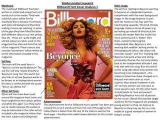
  • 1. Similar product research Billboard Front Cover Analysis 1 Masthead: The masthead ‘Billboard’ has been written in a bold and simple font so it stands out to the reader. They have used the colour white for the masthead this is because it contrasts with dark red background therefore making it more eye catching. In some of the gaps they have filled the letter with different colours e.g. red, yellow, blue etc - these are quite bright and vibrant colours so when used on the magazine they stick out from the rest of the magazine. These colours also connote ‘excitement’ which reflect on to the information included in the magazine. Main image: The sell line relating to Beyonce wanting to become an independent women compliments with the main background image. In the image Beyonce is seen with her hands on her hips with her head looking upwards. This kind of body language creates a sense of power e.g. by looking up instead of directly at the camera the reader feels the model has more authority and is ‘better’ then them, overall reinforcing the independent idea. Beyonce is also wearing dark reddish clothing similar to the background colour, the colour red connotes ‘power' and ‘fire’ implying that Beyonce has quite a fiery and strong personality. Overall, this not only relates back to her independent attitude it also links well with her song ‘Run this world’ as this song talks about how women are becoming more independent – this relates to how times have changed as in the past men were seen as more superior than women however in the 21st century women are now seen as more equal to men. On the other hand it could relate to ‘love and passion’ signifying Beyonce has a lot of passion for her music. Overall the possible target audience for this magazine are probably young women as they can look up to Beyonce as they may see her as a role model or a good example of women in today's society. Sell line: The main sell line used here is: “Back to run the world Beyonce” This sell line not only relates directly to Beyonce’s song ‘Run the world’ but also links in to how Beyonce wants to be known as an independent women, this idea is reinforced with the quote “No on can define me” Other Sell lines: Other sell lines have been used around the magazine front cover and have ranged from the colours yellow and white this again is so they stand out to reader because the audience may be interested in the other artists included in the magazine rather than the main subject artist (Beyonce). Advertisements The advertisement for the ‘Billboard music awards’ has been put in black this is so it stands out from the rest of the page as the colour black is darker than the rest of the colours used on the front page – therefore the reader draws attention to this certain advertisement .
  • 2. Main Image: The black and white image of Bruno Mars gives a vintage feel to the front cover; it represents how times have changed from 50 years ago till now e.g. from black and white to colour, as 50 years go images would be in black and white – it also allows the main focus to be the ‘50 Years’. The main image picture has evidently been edited as his facial features are more emphasised e.g. his lips and eyes are more defined – this could be appeal to the female audience as he is making direct eye contact with the audience and is ‘drawing them in’. Masthead: The masthead ‘Billboard’ has been written in a bold and simple font so it stands out to the reader. They have used the colour white for the masthead this is because it contrasts with dark black background and the black and white main image therefore making it more eye catching. In some of the gaps it is still clear that some of the letters have been filled with the colours red, yellow, blue (which they use on every magazine), however this time the whole masthead isn't visible as some if it is being covered by the main image. This implies that the magazine is possibly very well known therefore, the whole masthead doesn’t need to be on show as it is recognisable to the audience. Similar product research Billboard Front Cover Analysis 2 Sell line: The sell line ‘Bruno Mars’ is in a Serif font which links in to the vintage theme of the magazine. This could also link in to the type of genre Bruno Mars’s music is as many of his songs are love songs therefore, the font can be seen as quite a feminine font to appeal to his main audience. Underneath this it reads ‘is big business’ the word ‘big’ is in the font ‘impact’ and is in a red colour – having the word in red makes it stand out from the white background. Sell line: The main sell line presented on the magazine is ‘50 Years’ the text is in a gold colour which relates to when people celebrate the number 50 it is usually referred to the ‘golden years’ – like the masthead it also stands out from the rest of the magazine against the black background and really captures the readers eye. The text ‘50’ is also in the shape of harp which relates to the musical content of the magazine.
  • 3. Similar product research Billboard Front Cover Analysis 3 Main Image: The main image is of the music icon ‘Lady Gaga’ who is known for her extravagant style however, she is wearing dark and dull clothing which are not as exciting and eye catching. On the other hand, she has bright purple hair with part of it in a bow, and on her hand she is wearing some unusual jewellery which slightly brings her uniqueness. The model is also in a quite seductive pose to possibly emphasise the type of clothing she usually wears reveals a lot of skin; this could directly relate to the sell line which is next to the main image which reads: “Why she doesn't wear pants”. However, this could be simply to draw the reader in. Masthead: The masthead ‘Billboard’ has been written in a bold and simple font and is in the colour black linking to the black and grey colour scheme. In some of the gap in the letters, they have been filled with the colours red, yellow, blue (which they use on every magazine), however this time the whole masthead isn't visible as some if it is being covered by the main image. As a result this implies that the magazine is a well known magazine, therefore the magazine is probably easily recognised by their main consumer. Colour scheme: The use of the black, grey and white colour scheme makes the front cover look more professional and sophisticated. This is ironic as the main model image ‘Lady Gaga’ has quite an eccentric style therefore by using the dull colour scheme is in contrast. However, bits of light purple have been used around the magazine to link directly to the main image. Sell line: The sell line ‘Lady Gaga’ is in a large bold font and is in the colour black this makes it stand out from the light grey background. It is also next to the model’s bright purple hair which makes it stand out even more for the audience. The audience also therefore know the model is ‘Lady Gaga’. Target audience: The target audience for this magazine is mainly directed at the music stars fans as it includes stories that they’d probably be interested in e.g. One sell line included is ‘How she writes pop hits’.
  • 4. Similar product research Billboard Contents Page Analysis 1 Masthead: The contents masthead has been done in a different font to the simplistic bold font usually used on ‘Billboard’s’ front pages which highlights the sense of ‘change’ this could link into the charts continuous change every week. However ‘contents’ is still easy for the audience to read and has written in a black colour which stands out from the rest of the page. Images: Four images have been used on the contents page; three at the top and the fourth at the bottom in a bigger image. The audience are firstly drawn to the three images at the top; the first one is of a man smiling at the camera welcoming the audience, the second is of a vibrantly styled person who has glasses on however, they are slightly looking at the camera this makes them more mysterious, and the final one is of pop icon ‘Katy Perry’ where she is wearing seductive clothing which could appeal to a male audience. The fourth images is the main image on the page as it is larger than the others, the people included in the picture have very neutral facial expressions which are in contrast to the more exciting images present. Billboard Chart: As the ‘Billboard’ magazines main purpose is to provide their readers with the top music that week or the top album, therefore as it is the readers main interest they have put the music chart on the left hand side as this is usually what the reader looks to first. Therefore the magazine has a wider audience as it provides multiple music interests. The top charts have also been categorised into different sections e.g. Albums, singles etc – this is so it is easier for the reader to navigate to their most interested section. The numbers for the certain pages have been put down the middle making it easier for the reader to locate the number – each number are also surrounded by a vibrant colour this makes the number stand out more and directly relates to the vibrant colours used in the Billboard masthead. Colours: Certain headings have been written in a blue colour in contrast to the white background as result making them stand out more. This is so the subject of the certain article is emphasised to the reader. The events are at the bottom of the page (last thing the reader will see) therefore they possibly may spend more time reading it which might be the purpose of the positioning.
  • 5. Similar product research VIBE Contents Page Analysis 2 Contents: The contents itself has been split up into two sections; ‘features’ and ‘fashion’ so its easier for the reader to navigate to their interested category. The subheadings are in a larger text and are in a different font this makes it stand out two the audiences and it draws the readers eye. Also by having a range of different categories included in the magazine (not only music) allows the magazine to be targeted at a much larger audience. Next to the page numbers the articles have been put in a different colour (pale blue) this is so its easier for the reader to locate the article’s title e.g. The article linking to Ciara (the model) reads ‘Barely there’ this draws the readers eye and it directly relates to the main image as the model is wearing ‘barely’ any clothes. Masthead: Here the masthead ‘Contents’ is written in a bold font and is in white which is in contrast to the darker background – this makes it stand out more to the audience. The word ‘contents’ has also been split up in to three different sections which makes the contents page more intriguing for the audience. Behind the masthead is a transparent ‘V’ which is in the same font as the magazine’s front cover masthead – this is so the contents page is recognisable for the audience (they know the contents page belongs to ‘VIBE’. Main image: The main image is of a young women in a very provocative pose with her legs held in the air and her skin showing – she is also directly looking at the reader with seductive look – this draws the reader in and adds interest into the magazine. However this is the only image present on the page which my signify it has a lot of importance in the magazine. Colour scheme: The colour scheme used on the contents page is black, white, and grey – this overall makes the page look more professional and stylish – however it also links into the urban theme.
  • 6. Similar product research VIBE Contents Page Analysis 3 Masthead: The masthead ‘Contents’ is written in a san serif font and is in black which makes it stand out from the lighter background – it also makes the page look more modern and classy. The word ‘contents’ has been split up in to three different sections which makes the contents page more unique. Behind the masthead there is a pale blue ‘V’ which is in the same font as the magazine’s front cover masthead – this is so the contents page is recognisable for the audience (they know the contents page belongs to ‘VIBE’. Main Image: The main image is of the RnB singer ‘Kanye West’ straight away this appeals to the audience as he is a recognisable artist. The model is also directly looking at the audience making it more personal to the reader – the model is also given out quite a negative stare towards the reader which may make the audience feel intimidated - this is also complimented by his somewhat slightly aggressive body language/posture . The main image is in black and white which links with the page’s colour scheme of black, grey and white. However the only colour present on the page is the red heart on the model’s chest which is being held by an arm. This could signify the common view people have on Kanye West that he is ‘heartless’ as he is known for being quite an arrogant person therefore the redness of the heart could connotate danger. On the other hand the red heart could also connotate passion which signifies his passion for music. Contents: The contents itself has been split up into two sections; ‘features’ and ‘fashion’ making it easier for the reader to navigate to their preferred section – it also allows the magazine to be targeted at a wider audience as both male and females have something to read about e.g. Males may look up to Kanye West so will read about him, and females may be more interested in the fashion side to the magazine. The subheadings are in a larger text and are in a different font (serif) this makes it stand out two the audiences and it draws the readers eye. Before each article there are the page numbers which makes it easier for the reader to locate the page. The article linking to Kanye West reads ‘Pride in the name of love’ this directly relates to the red heart on Kanye’s chest as it links to ‘love’.
  • 7. Similar product research Q Magazine Double Page Spread Analysis 1 Main Image: The main image on the double page spread is of Amy Winehouse. The pose in which see is in is intriguing; for example in the image she has contrasting hand poses – one hand is scrunched up into a fist resting on her cheek which could signify how she is fighting against her battle of drugs and her battle with media. The other hand is in feminine pose resting under her face this is to reinforce the heading that she is still a ‘girl’ and shouldn’t be portrayed differently. Her facial expression also conveys innocence which again relates to the title where she states; “I’m not horrible” – however one of her eyes are being covered by her hair which could signify her hiding something. The tattoos on her arm are ironic as she states in the heading that she is a ‘Girl’ however the tattoos displayed on her arm could be seen as quite masculine - therefore the two contrast with each other. Heading: The heading in the double page spread is in a San Serif font and is in a large text size – addition to this the heading has been written in black making it stand out from the white background. The reason for having the heading “I’M NOT A HORRIBLE GIRL” in such a bold font is so the subject of the double page spread is emphasised to the audience. The reader can then make the connection that the double page spread is about Amy Winehouse’s difficult life and how she is portrayed in the media. The word “GIRL” which is included in the title is slightly larger than the text above it – this is to possibly highlight to the audience Amy Winehouse’s message that no matter how difficult her life is right now she is still a human. Colour Scheme: The colour scheme of black and white could represent the contrast of innocence and negativity. On the other hand it could also link into Amy Winehouse’s song ‘Back to Black’ which is about a difficult relationship between a man and a women – the women representing Amy Winehouse. In the song Amy describes how she is ‘going back to black’ which could signify how she is going back to the negativity which could involve ‘drugs. Text: In the main text the name ‘Amy Winehouse’ has been highlighted in black box – this draws the readers eye as this becomes a focus point for the reader. By drawing the readers eye to this specific point tells the reader that there is something important about Amy Winehouse featured in the magazine and encourages the reader to keep reading. Target Audience: The target audience for the double page spread would be fans of ‘Amy Winehouse’ who were interested about her life and the struggles she went through, as this is an article that was released after the stars death.
  • 8. Similar product research Double Page Spread Analysis 2 Heading: The heading “WILL HE WON’T HE?” is in a gold and grey colour which links into the colour scheme. It has also been positioned on the left hand side of the page as this is the first place the reader looks – having the heading as a question intrigues the reader and makes them wont to read the full page spread to find out the reason for the heading. Main Image: The main image is of the music band ‘The Black Eyed Peas’. The third band member across is the only one wearing gold which signifies his wealth – however, it also represents his importance to the article and he possible directly links to the heading. The pose in which he stands is very confident with his legs shoulder width apart and one of his arms strongly by his side and the other against his head. The other band members are behind him who are also in quite powerful poses e.g. the female of the group is in quite a provocative clothes with quite revealing clothing . Colour Scheme: The colour scheme of gold, silver relates to the main image of the band – this could be to simply represent the wealth of the band or illustrate how high they are in the music industry. Target Audience: The target audience for this double page spread could be young adults or teenagers as many will idolise the band ‘The Black Eyed Peas’. Text: Part of the text in the article is highlighted in black this is to draw the audiences focus to this point – the reason for doing this may possibly to highlight to the audience that this is important information which could possible relate to the heading itself. Position: The picture has also been positioned on the left as this is the first place the audience will read.
  • 9. Similar product research Double Page Spread Analysis 3 Main Image: The main image is of R&B artist Solange Knowles – the model is standing with a strong posture and her hands hidden behind her back, pushing her body slightly forward, this illustrates the artists confidence with herself and the way she looks, this relates to where the heading describes the artist as ‘outspoken’. The artist is wearing bright red clothing which allows her to stand out from the page in contrast to the black and white images behind. The red clothing could connotate the artists strong passion for music this is evident again in the masthead where it states ‘Solange Knowles created one of the year’s best R&B albums’. The black and white images behind the main image are of the singer in different poses – the multiple pictures represent the singers exciting and bubbly personality – the black and white effect that has been used is to possibly illustrate that underneath this strong confident attitude she has a lively personality. Heading: The heading on the double page spread is capitalized and is in a bold text making it stand out to the audience - the artists name in the heading is in a different colour to the rest of the heading adding more emphasise to who the double page spread is about (Solange Knowles) and their importance to the article. Target Audience: The target audience for the double page spread could be young women as many of them may look up to the artist ‘Solange Knowles’ as their role model/icon. The five black lines underneath the artist mimics some sort of stage which relates back to the artists passion for music and her love of being on stage. The black lines could also be used to divide up the page. The page has been divided into three sections; the pictures at the top of the page, the main image, and the main text – this links to the magazine itself, as ‘VIBE’ are known for splitting up their headings e.g. The heading ‘contents’ on the contents page, are always split up into three sections making the page more interesting. Therefore, by splitting the page up into three sections creates a continuous theme throughout the magazine.