Stop Making Sucky Presentations!
•Descargar como PPT, PDF•
127 recomendaciones•10,032 vistas

This document discusses poor presentation slide design. It notes that slides are often filled with too much unimportant text that presenters just read, lack organization and proper formatting. Specific poor design elements called out include typos, lack of alignment, repetition, unrelated stock images, and small or hard to read text and fonts. The document suggests improving slides by unifying design, having a clear purpose on each slide, using proximity, alignment and your own effective images instead of stock ones. It advises preparing well, being respectful of the audience, taking ownership of the presentation, and knowing when design rules can be broken for effectiveness.

Recomendados
Más contenido relacionado
Destacado
Destacado (20)
Más de Jeff Ebbing
Más de Jeff Ebbing (7)
Último
Último (18)
Stop Making Sucky Presentations!
- 1. Title
- 6. DOEST THIS SLIDE LOOK FAMILIAR? It’s completely full of text and the presenter is just standing there reading it with their back to you. They just keep droning on and on with infomation that they *think* may be important but aren’t exacly sure because they were either too stupid or too lazy to remove all…
- 7. THE SAGA CONTINUES… …the unimportant stuff that really didn’t matter anyway. And by now I bet you can’t remember the title of the last slide or the fact that it contained three typos. So listen to me when I say…
- 10. Unify
- 11. Ideal
- 12. Purpose
- 14. DA SLIDE SORTADA SLIDE SORTA
- 16. CRAP Design
- 20. Repetition
- 21. OVAH AND OVAHOVAH AND OVAH
- 22. Alignment
- 24. Proximity
- 25. Images
- 27. YOUR OWNYOUR OWN
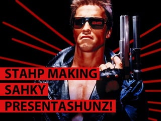
- 28. EFFECTIVE IMAGES T-800 comes from the future to keep John Connor, the future leader of the rebellion, from being killed by the T-1000. They play cat-and-mouse until Arnold is able to destroy the T-1000. He then must destroy himself to complete his mission.
- 29. BETTAHBETTAH COME WITH ME IF YOU WANT TO LIVECOME WITH ME IF YOU WANT TO LIVE
- 30. Better image treatment Full slide image, text over
- 31. Fonts
- 32. Go big with your text
- 34. Graphs & charts
- 38. PRO Presenter
- 39. Prepare
- 40. Respect
- 41. Own
- 43. Know when to break the rules
Notas del editor
- Bullets bullets Force for evil AND for good
- THREE PARTS TO A GOOD PRESO: CONTENT SLIDE DESIGN PRESENTATION 3-LEGGED STOOL
- IT all starts with content Simplify Three Unify Point Ideal Define
- If you can’t explain it simply, you don’t understand it well enough. Know your audience: newbs or uber brains? Newbs: don’t lose them! broad strokes, key points, thought provokers Ubers: don’t waste their time! get to the meat, dig deep, new info
- I would have written you a shorter letter but I didn’t have the time. – Mark Twain
- Message loses impact Audience loses focus You lose credibility
- Proven as best way people remember Happens in nature, we can ID patterns and relationships Works in design too: rule of thirds
- Stick to the message Avoid tangents, anything that weakens your point
- Graph slides v interest/ data v understanding
- WHO IS THIS GUY? What’s your #1 goal? inform? Sell? Persuade? Educate? Why are you even here? WIIFM/so what? P really should go first but that wouldn’t make sense: PSTUID
- Keep time, attention, agreement Slash garbage, expand, clarify Keep them wanting more?
- Help organize your thoughts see how the preso will play out Where you need structure, ups & downs… Good for pace
- Tell them what to do! Bottom line it for them Make your case/call to action So what? Does this train of thought have a caboose?
- Contrast Repetition Alignment Proximity
- Kuler Pantone Target audience prefs (sites, pubs)
- Colors fonts Image style
- Grids Bullets & hierarchy Rule of thirds Gestalt (CRAP?)
- Close things are related Graphics or messages
- Images are % better than text Good pix are hard to find
- Rights & royalty-free Resources – istockphoto, stock.xchng, compfight.com Your photos Drawings (NCMPR guy) Photoshop, Illustrator, free image tools
- Rights & royalty-free Resources – istockphoto, stock.xchng, compfight.com Your photos Drawings (NCMPR guy) Photoshop, Illustrator, free image tools
- Serif, sans, artistic How to use, qty
- Headline & text examples 1-2-3 Basic Nicer for emphasis Stylized for impact Typography as a term v
- Resources – fontsquirrel, myfonts, fontfont, dafont, font spring… Google “beautiful fonts” Icons- the noun project, iconmonstr, picol.org Careful: embed/transpo, resident
- Show the significance of the data. What’s your point? Infographics
- Horizontal Bar Charts. Used to compare quantities. For example, comparing sales figures among the four regions of the company.
- Vertical Bar Charts. Used to show changes in quantity over time. Best if you limit the bars to 4-8.
- Pie Charts. Used to show percentages. Limit the slices to 4-6 and contrast the most important slice either with color or by exploding the slice.
- Prepare Respect Own
- Practice (X% build preso XX% practice) Know your audience Get feedback during practices
- Know your stuff & reason you’re presenting Be courteous, gracious and professional It’s their time – make it count
- Be yourself Start strong Ditch podium/bring clicker Notes function/presenter mode Slides as visual cues Express passion
- THREE PARTS TO A GOOD PRESO: CONTENT SLIDE DESIGN PRESENTATION 3-LEGGED STOOL