Presentation on how to chat with PDF using ChatGPT code interpreter
Q1 - part 2
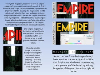
1. For my film magazine, I decided to look at Empire
magazine’s covers as they are professional. At first, I
looked at how to get the masthead exactly the same as
Empire’s. I did this by using the magic wand tool to
select each letter to then copy and paste onto my
magazine cover. Once I pasted the Empire masthead
onto my magazine, I edited the colour by clicking on
image, adjustments then on hue/saturation which
allowed me to change the colour of the Empire
masthead I imported without reducing the quality.
Like Empire magazine, I
decided to add an effect to
the masthead that would
relate to my film so I
decide to put in small
gunshot effects on random
letters.
I found a suitable
image to use as my
background image for
my magazine cover
which was a dark As you can see from the image above, I
alleyway. I used this have went for the same type of subtitle
image to reflect the that Empire use which was representing
life that the characters
were living in the
the supremacy of the brand by writing
movie trailer. ‘Magazine of the year’ in capitals right at
the top
2. I went for the conventional
Empire date and price being
placed on top of the M. In
addition, I also put a different
currency underneath ($) which
made it look quite
professional.
As you can see, these two images are exactly the same
however I cut out the background from the screenshot
I took and used the image as my main image for the
magazine and added a thin black border around the
figure.
For the title, I left the font white and used Century
Gothic Bold Italic, giving an engraved effect on the
magazine. I also added a red border to this as well, to
match the red border of the character behind the main
image and also to match the Empire masthead which is
also red. I bordered the second character in red to
show that he is a character to look out for.
The barcode is placed at the bottom left of the
magazine cover, which isn’t somewhere Empire would
place theirs. I did this because on the bottom right I
added a small image of another movie which behaves
as kicker, which is a feature Empire do use.
3. I added this small sticker-looking
image that shows the production
company of the movie: Big Screen.
I did this to advertise the
company in order to create a big
name around it and popularity.
I have added extras to the
magazines and kickers to attract
other audiences. For example
here, I have found 3 images of
Megan Fox, and put them
together to create a shuffled
effect. I also wrote that there are
‘3 Posters!’ colouring the 3 in pink
to make the number stand out.
At the top, above myself (the
main image) I put ‘Starring Urim
Restelica’. I did this because I
noticed that magazine covers tend
to put down main actor’s names
in order to gain a bigger public
response.
5. For my poster I looked at professional productions of real movies. I noticed
that the majority of professional posters used the same colour schemes and
images for their posters as this makes it clear for the audience to link the
movie, magazine and poster together.
I used these particular As you can see, I used two of the
images of the characters same images from the magazine
to show the different cover which was myself and
themes in my movie Ibrahim. I also added a third
trailer. The image of character (Huseyin) who is smiling
myself (left) represents and holding a gun. I used an
music, as I have image of him holding a gun to
headphones on. The show that my movie will contain
image of Huseyin (right) violent scenes and weapons.
represents violence and
crime as he is holding a
weapon and lastly the
image in the middle of
Ibrahim represents the
enemy as he is almost
looking back at the
image of me in a sly way.
I placed the main character’s names at the top of the poster as
this is quite a conventional thing to do. I left the font colour of
the first names in white, and highlighted the surnames in red
with a white border to make it stand out from the poster and
also match with the colour scheme. Red also symbolises anger
and danger which are two features that my trailer uses.
6. I got my slogan from the movie ‘The Good, The Bad & The Ugly’ which was
directed by Sergio Leone however I decided to change ‘Good’ into ‘Hood’
as that’s where my movie’s main location will be. I also laid out the three
words in downwards/diagonal way so that each word was in the same
order as each of the characters. I did this so that the audience would be
able to link the words with the characters and find the similarities. For
example:
‘The Bad’ is nearest to Ibrahim ‘The Ugly’ is closest to Huseyin
‘The Hood’ is nearest as he will represent an uglier
as he is portrayed as the
to me as I am the main side to the plot of the movie –
enemy. In colloquial terms he is
character, who will be violence, fighting etc. in
referred to as a ‘snake’ as this
filmed in the hood addition, he will deliberately
means a serpent-like individual
(also known as the look less attractive than other
who stops at nothing to fulfil
urban) and I will be characters; like the poster cover
their own motives, while
representing the street (unshaved, weapon).
usually under the disguise of
life.
being considerate to others.
7. I have used the rating 18 certificate as my film will contain most
of the criteria set under the rating 18 category. My trailer depicts
many features from the rating 18 certificate for example: drugs,
kissing (which gives hints of sexual scenes), violence, abhorrent
behaviour and swearing.
I created the billing block to display a
Same title so that the audience The date is the same font as sense of realism to my poster as most
are able to make a quick in the trailer, and keeps the posters include this. Inclusion in the
comparison and see the same colour scheme as the credits and the billing block is generally a
similarity; recognising the film. poster & magazine. matter of detailed contracts between the
artists and the producer. Using a
condensed typeface allows the heights of
the characters to meet contractual
constraints while still allowing enough
horizontal space to include all the
required text.
I created my own My version Original version
distribution companies. As As you can see, I changed
you can see, they are very Dolby Digital to Dobby Digitale,
similar however I have adding a highlighted E to make
made minor changes using the change obvious.
Photoshop to avoid Here I selected the text in the
copyright infringement. middle from Universal and
You can see the differences deleted it. I inserted my own text
between the original logos Urimversal which is a
and my own logos. Portmanteau (click link for
definition
9. For my poster I looked at professional productions of real movies. I noticed
that the majority of professional posters used the same colour schemes and
images for their posters as this makes it clear for the audience to link the
movie, magazine and poster together.
I used these particular As you can see, I used two of the
images of the characters same images from the magazine
to show the different cover which was myself and
themes in my movie Ibrahim. I also added a third
trailer. The image of character (Huseyin) who is smiling
myself (left) represents and holding a gun. I used an
music, as I have image of him holding a gun to
headphones on. The show that my movie will contain
image of Huseyin (right) violent scenes and weapons.
represents violence and
crime as he is holding a
weapon and lastly the
image in the middle of
Ibrahim represents the
enemy as he is almost
looking back at the
image of me in a sly way.
I placed the main character’s names at the top of the poster as
this is quite a conventional thing to do. I left the font colour of
the first names in white, and highlighted the surnames in red
with a white border to make it stand out from the poster and
also match with the colour scheme. Red also symbolises anger
and danger which are two features that my trailer uses.
10. I got my slogan from the movie ‘The Good, The Bad & The Ugly’ which was
directed by Sergio Leone however I decided to change ‘Good’ into ‘Hood’
as that’s where my movie’s main location will be. I also laid out the three
words in downwards/diagonal way so that each word was in the same
order as each of the characters. I did this so that the audience would be
able to link the words with the characters and find the similarities. For
example:
‘The Bad’ is nearest to Ibrahim ‘The Ugly’ is closest to Huseyin
‘The Hood’ is nearest as he will represent an uglier
as he is portrayed as the
to me as I am the main side to the plot of the movie –
enemy. In colloquial terms he is
character, who will be violence, fighting etc. in
referred to as a ‘snake’ as this
filmed in the hood addition, he will deliberately
means a serpent-like individual
(also known as the look less attractive than other
who stops at nothing to fulfil
urban) and I will be characters; like the poster cover
their own motives, while
representing the street (unshaved, weapon).
usually under the disguise of
life.
being considerate to others.
11. I have used the rating 18 certificate as my film will contain most
of the criteria set under the rating 18 category. My trailer depicts
many features from the rating 18 certificate for example: drugs,
kissing (which gives hints of sexual scenes), violence, abhorrent
behaviour and swearing.
I created the billing block to display a
Same title so that the audience The date is the same font as sense of realism to my poster as most
are able to make a quick in the trailer, and keeps the posters include this. Inclusion in the
comparison and see the same colour scheme as the credits and the billing block is generally a
similarity; recognising the film. poster & magazine. matter of detailed contracts between the
artists and the producer. Using a
condensed typeface allows the heights of
the characters to meet contractual
constraints while still allowing enough
horizontal space to include all the
required text.
I created my own My version Original version
distribution companies. As As you can see, I changed
you can see, they are very Dolby Digital to Dobby Digitale,
similar however I have adding a highlighted E to make
made minor changes using the change obvious.
Photoshop to avoid Here I selected the text in the
copyright infringement. middle from Universal and
You can see the differences deleted it. I inserted my own text
between the original logos Urimversal which is a
and my own logos. Portmanteau (click link for
definition