SlideShare una empresa de Scribd logo
1 de 2
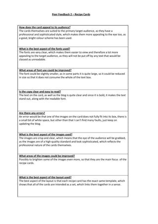
How does the card appeal to its audience?
The cards themselves are suited to the primary target audience, as they have a
professional and sophisticated style, which makes them more appealing to the eye too, as
a good, bright colour scheme has been used.
What is the best aspect of the fonts used?
The fonts are very clear, which makes them easier to view and therefore a lot more
appealing to the target audience, as they will not be put off by any text that would be
classed as unreadable.
What areas of font use could be improved?
The font could be slightly smaller, as in some parts it is quite large, so it could be reduced
in size so that it does not consume the whole of the text box.
Is the copy clear and easy to read?
The text on the card, as well as the blog is quite clear and since it is bold, it makes the text
stand out, along with the readable font.
Are there any errors?
An error would be that one of the images on the card does not fully fit into its box, there is
a small bit of white space, but other than that I can’t find many faults, just keep on
updating the blog.
What is the best aspect of the images used?
The images are crisp and clear, which means that the eye of the audience will be grabbed,
as the images are of a high quality standard and look sophisticated, which reflects the
professional nature of the cards themselves.
What areas of the images could be improved?
Possibly to brighten some of the images even more, so that they are the main focus of the
recipe cards.
What is the best aspect of the layout used?
The best aspect of the layout is that each recipe card has the exact same template, which
shows that all of the cards are intended as a set, which links them together in a sense.
Peer Feedback 2 – Recipe Cards
What areas of the layout could be improved?
The headers of the recipe cards could be enlarged as they are quite small, but otherwise, I
can’t think of anything.
Do the cards work as a set?
The cards do work together as a set as the layout is the same for all of them, as well as the
house style being identical for each of the cards, which makes them all look as a set. The
colour scheme matches to each of the cards too.
What changes could be made to improve the cards?
Possibly the font could be made smaller, but, not many changes could be included, apart
from maybe a few of the images being made brighter.
Do you feel it meets the brief? If so why/why not?
The recipe cards meet the brief, as they look professional and therefore meet the
requirements, as the ‘brief’ itself is based upon professionalism, as a consumer will not
buy a product that does not look sophisticated, especially if the audience is older.
Do the cards make the recipe appealing?
The bright colour scheme that has been used on each of the cards makes the recipes look
appealing and the audience will be drawn in by this. Also, the bright images also make the
cards look more appealing too and they will also attract the eye of the audience as they
are clear as well as professional.
Do the cards look professional? If so why/why not?
The cards look professional, as the images used look very sophisticated and of a high
quality standard. The layout also looks professional, as the same template is used for all
eight of the cards, which makes them look as a set.
Do you feel this work is better or worse than your own and why?
I do not think that the cards are better or worse than mine, as the layout which has been
used for all of the cards looks professional, as well as the imagery, which shows that all
aspects of the card have been thought through well.

Más contenido relacionado

Destacado

August 28th Staff Call
August 28th Staff CallAugust 28th Staff Call
August 28th Staff CallGSU Army ROTC
 
437825 634145356830064580(1)
437825 634145356830064580(1)437825 634145356830064580(1)
437825 634145356830064580(1)Richa Roy
 
Course syllabus EFL Methodology II
Course syllabus EFL Methodology IICourse syllabus EFL Methodology II
Course syllabus EFL Methodology IIGerardo Zavalla
 

Destacado (6)

Android in 2012
Android in 2012Android in 2012
Android in 2012
 
Pzcasestudy
PzcasestudyPzcasestudy
Pzcasestudy
 
U.S. Government fabrications4
U.S. Government fabrications4U.S. Government fabrications4
U.S. Government fabrications4
 
August 28th Staff Call
August 28th Staff CallAugust 28th Staff Call
August 28th Staff Call
 
437825 634145356830064580(1)
437825 634145356830064580(1)437825 634145356830064580(1)
437825 634145356830064580(1)
 
Course syllabus EFL Methodology II
Course syllabus EFL Methodology IICourse syllabus EFL Methodology II
Course syllabus EFL Methodology II
 

Similar a Peer Feedback 2 - Recipe Cards

Peer feedback - Worldwide theme recipe cards
Peer feedback - Worldwide theme recipe cardsPeer feedback - Worldwide theme recipe cards
Peer feedback - Worldwide theme recipe cardsveggieburgers4lyf
 
Recipe cards task 3 (analysing existing products)
Recipe cards task 3 (analysing existing products)Recipe cards task 3 (analysing existing products)
Recipe cards task 3 (analysing existing products)PJG123
 
Recipe cards task 3 (analysing existing products)
Recipe cards task 3 (analysing existing products)Recipe cards task 3 (analysing existing products)
Recipe cards task 3 (analysing existing products)PJG123
 
Recipe evaluation
Recipe evaluationRecipe evaluation
Recipe evaluationashboyne
 
Recipe evaluation
Recipe evaluationRecipe evaluation
Recipe evaluationashboyne
 
Evaluation%20pro%20forma[1]
Evaluation%20pro%20forma[1]Evaluation%20pro%20forma[1]
Evaluation%20pro%20forma[1]PJG123
 
Evaluation%20pro%20forma[1]
Evaluation%20pro%20forma[1]Evaluation%20pro%20forma[1]
Evaluation%20pro%20forma[1]PJG123
 
Tester cards evidence template
Tester cards evidence templateTester cards evidence template
Tester cards evidence templateChloeandRachel
 
Evaluation pro forma!!
Evaluation pro forma!!Evaluation pro forma!!
Evaluation pro forma!!AlanSmith96
 
Evaluation (print based media and working to brief)
Evaluation (print based media and working to brief)Evaluation (print based media and working to brief)
Evaluation (print based media and working to brief)savannahryan11
 

Similar a Peer Feedback 2 - Recipe Cards (20)

Peer feedback - Worldwide theme recipe cards
Peer feedback - Worldwide theme recipe cardsPeer feedback - Worldwide theme recipe cards
Peer feedback - Worldwide theme recipe cards
 
Peer feedback
Peer feedbackPeer feedback
Peer feedback
 
Peer feedback
Peer feedbackPeer feedback
Peer feedback
 
Feedback 1
Feedback 1Feedback 1
Feedback 1
 
Peer feedback 1
Peer feedback 1Peer feedback 1
Peer feedback 1
 
Peer feedback 1
Peer feedback 1Peer feedback 1
Peer feedback 1
 
Peer feedback 2
Peer feedback 2Peer feedback 2
Peer feedback 2
 
Peer feedback 2
Peer feedback 2Peer feedback 2
Peer feedback 2
 
Recipe cards task 3 (analysing existing products)
Recipe cards task 3 (analysing existing products)Recipe cards task 3 (analysing existing products)
Recipe cards task 3 (analysing existing products)
 
Recipe cards task 3 (analysing existing products)
Recipe cards task 3 (analysing existing products)Recipe cards task 3 (analysing existing products)
Recipe cards task 3 (analysing existing products)
 
Peer feedback1
Peer feedback1Peer feedback1
Peer feedback1
 
Recipe evaluation
Recipe evaluationRecipe evaluation
Recipe evaluation
 
Recipe evaluation
Recipe evaluationRecipe evaluation
Recipe evaluation
 
Evaluation%20pro%20forma[1]
Evaluation%20pro%20forma[1]Evaluation%20pro%20forma[1]
Evaluation%20pro%20forma[1]
 
Evaluation%20pro%20forma[1]
Evaluation%20pro%20forma[1]Evaluation%20pro%20forma[1]
Evaluation%20pro%20forma[1]
 
Tester cards evidence template
Tester cards evidence templateTester cards evidence template
Tester cards evidence template
 
Presentation1
Presentation1Presentation1
Presentation1
 
Presentation1
Presentation1Presentation1
Presentation1
 
Evaluation pro forma!!
Evaluation pro forma!!Evaluation pro forma!!
Evaluation pro forma!!
 
Evaluation (print based media and working to brief)
Evaluation (print based media and working to brief)Evaluation (print based media and working to brief)
Evaluation (print based media and working to brief)
 

Más de veggieburgers4lyf (20)

Page layout and design evaluation!!
Page layout and design evaluation!!Page layout and design evaluation!!
Page layout and design evaluation!!
 
Task 9 – flat plans, fonts development
Task 9 – flat plans, fonts developmentTask 9 – flat plans, fonts development
Task 9 – flat plans, fonts development
 
Task 8 – flat plans, fonts and development
Task 8 – flat plans, fonts and developmentTask 8 – flat plans, fonts and development
Task 8 – flat plans, fonts and development
 
Task 7 – flat plans & fonts
Task 7 – flat plans & fontsTask 7 – flat plans & fonts
Task 7 – flat plans & fonts
 
Task 6 evaluation
Task 6 evaluationTask 6 evaluation
Task 6 evaluation
 
Task 5 (evaluations)
Task 5 (evaluations)Task 5 (evaluations)
Task 5 (evaluations)
 
Task 4 evaluations
Task 4 evaluationsTask 4 evaluations
Task 4 evaluations
 
Task 3
Task 3Task 3
Task 3
 
Task 2
Task 2Task 2
Task 2
 
Task 1
Task 1Task 1
Task 1
 
Contact sheet
Contact sheetContact sheet
Contact sheet
 
On going evaluations
On going evaluationsOn going evaluations
On going evaluations
 
Planning sheet
Planning sheetPlanning sheet
Planning sheet
 
Task 4
Task 4Task 4
Task 4
 
Experiments evidence
Experiments evidenceExperiments evidence
Experiments evidence
 
Experimental photography case studies
Experimental photography   case studiesExperimental photography   case studies
Experimental photography case studies
 
Unit 42 evaluation
Unit 42 evaluationUnit 42 evaluation
Unit 42 evaluation
 
Continuing of my evaluation
Continuing of my evaluationContinuing of my evaluation
Continuing of my evaluation
 
Fonts
FontsFonts
Fonts
 
Ideas and moodboards
Ideas and moodboardsIdeas and moodboards
Ideas and moodboards
 

Peer Feedback 2 - Recipe Cards

  • 1. How does the card appeal to its audience? The cards themselves are suited to the primary target audience, as they have a professional and sophisticated style, which makes them more appealing to the eye too, as a good, bright colour scheme has been used. What is the best aspect of the fonts used? The fonts are very clear, which makes them easier to view and therefore a lot more appealing to the target audience, as they will not be put off by any text that would be classed as unreadable. What areas of font use could be improved? The font could be slightly smaller, as in some parts it is quite large, so it could be reduced in size so that it does not consume the whole of the text box. Is the copy clear and easy to read? The text on the card, as well as the blog is quite clear and since it is bold, it makes the text stand out, along with the readable font. Are there any errors? An error would be that one of the images on the card does not fully fit into its box, there is a small bit of white space, but other than that I can’t find many faults, just keep on updating the blog. What is the best aspect of the images used? The images are crisp and clear, which means that the eye of the audience will be grabbed, as the images are of a high quality standard and look sophisticated, which reflects the professional nature of the cards themselves. What areas of the images could be improved? Possibly to brighten some of the images even more, so that they are the main focus of the recipe cards. What is the best aspect of the layout used? The best aspect of the layout is that each recipe card has the exact same template, which shows that all of the cards are intended as a set, which links them together in a sense. Peer Feedback 2 – Recipe Cards
  • 2. What areas of the layout could be improved? The headers of the recipe cards could be enlarged as they are quite small, but otherwise, I can’t think of anything. Do the cards work as a set? The cards do work together as a set as the layout is the same for all of them, as well as the house style being identical for each of the cards, which makes them all look as a set. The colour scheme matches to each of the cards too. What changes could be made to improve the cards? Possibly the font could be made smaller, but, not many changes could be included, apart from maybe a few of the images being made brighter. Do you feel it meets the brief? If so why/why not? The recipe cards meet the brief, as they look professional and therefore meet the requirements, as the ‘brief’ itself is based upon professionalism, as a consumer will not buy a product that does not look sophisticated, especially if the audience is older. Do the cards make the recipe appealing? The bright colour scheme that has been used on each of the cards makes the recipes look appealing and the audience will be drawn in by this. Also, the bright images also make the cards look more appealing too and they will also attract the eye of the audience as they are clear as well as professional. Do the cards look professional? If so why/why not? The cards look professional, as the images used look very sophisticated and of a high quality standard. The layout also looks professional, as the same template is used for all eight of the cards, which makes them look as a set. Do you feel this work is better or worse than your own and why? I do not think that the cards are better or worse than mine, as the layout which has been used for all of the cards looks professional, as well as the imagery, which shows that all aspects of the card have been thought through well.