What is a Gender-Neutral Design?
•
1 like•1,448 views

The feminine / masculine stereotype is everywhere. How can you make your designs more gender-neutral? Find a balance between masculine and feminine. Here are the colors, fonts, layouts, photos, and icons you need to use to perfectly achieve a gender-neutral design. Learn more here: http://blog.visme.co/feminine-design-masculine-design/
Recommended

Recommended
More Related Content
More from Visme
More from Visme (20)
Recently uploaded
Recently uploaded (20)
What is a Gender-Neutral Design?
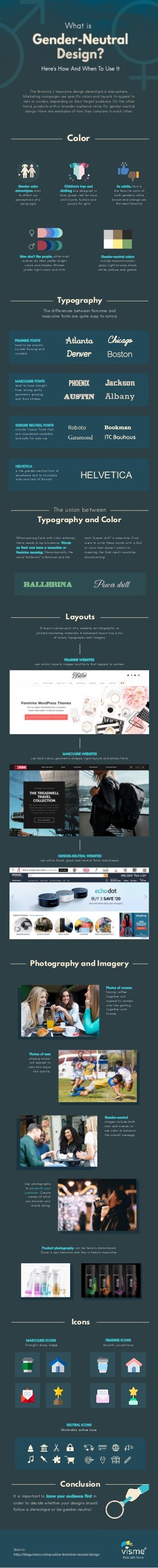
- 1. The feminine / masculine design stereotype is everywhere. Marketing campaigns use specific colors and layouts to appeal to men or women, depending on their target audience. On the other hand, products with a broader audience strive for gender-neutral design. Here are examples of how they compare to each other. Gender color stereotypes start to affect our perceptions at a young age. Children’s toys and clothing are designed in blue, green, red for boys and in pink, fuchsia and purple for girls. As adults, blue is the favorite color of both genders, while brown and orange are the least favorite. Men don’t like purple, while most women do. Men prefer bright colors and shades. Women prefer light colors and tints. Gender-neutral colors include monochromatic grays, light browns, black, white, yellows and greens. Color Typography The differences between feminine and masculine fonts are quite easy to notice. FEMININE FONTS tend to be smooth, curved, flowing and rounded. MASCULINE FONTS tend to have straight lines, strong serifs, geometric spacing and thick strokes. HELVETICA is the gender-neutral font of excellence due to its simple style and lack of flourish. The union between Atlanta Chicago Denver Boston PHOENIX Jackson Austin Albany HELVETICA When pairing fonts with color schemes, there needs to be a balance. Words on their own have a masculine or feminine meaning. Stereotypically, the word “ballerina” is feminine and the term “power drill” is masculine. If we were to write these words with a font or color that doesn’t match its meaning, the final result would be disconcerting. Ballerina Power drill Layouts A layout can be part of a website, an infographic or printed marketing materials. A balanced layout has a mix of colors, typography and imagery. FEMININE WEBSITES use colors, layouts, images and fonts that appeal to women. MASCULINE WEBSITES use dark colors, geometric shapes, rigid layouts and blocky fonts. Typography and Color Photography and Imagery Use photography to personify your customer. Create scenes of what you envision your clients doing. Photos of men playing soccer will appeal to men who enjoy the activity. GENDER-NEUTRAL WEBSITES use white, black, greys and neutral fonts and shapes. Photos of women having coffee together will appeal to women who like getting together with friends. Gender-neutral images include both men and women or use color to balance the overall message. Product photography can be heavily stereotyped. Dove is very feminine and Axe is heavily masculine. Icons MASCULINE ICONS Straight, sharp edges NEUTRAL ICONS Minimalist, outline icons Conclusion It is important to know your audience first in order to decide whether your designs should follow a stereotype or be gender-neutral. Made With Visme Source: http://blog.visme.co/masculine-feminine-neutral-design FEMININE ICONS Smooth, curved lines GENDER NEUTRAL FONTS include "classic" fonts that are considered readable and safe for web use. Roboto