Designing for young children: Child Proofing your Application
•Descargar como PPT, PDF•
3 recomendaciones•888 vistas

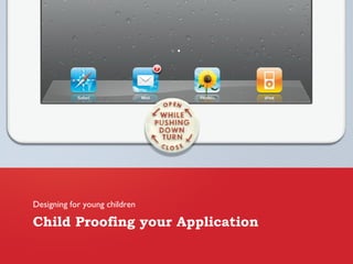
The idea is simple: design menu access for the parent only. Just like a childproof safety cap for a medicine bottle or other devices made safe for young children, we create a menu system that is childproof.

Recomendados
Más contenido relacionado
Destacado
Destacado (19)
Último
Último (20)
Designing for young children: Child Proofing your Application
- 1. Child Proofing your Application Designing for young children
- 12. Complexity
- 15. Difficulty
- 18. Ambiguity
- 21. Clear Path
- 27. Swipe
- 42. Thank you Avi Itzkovitch www.XGmedia.com @xgmedia
Notas del editor
- Kids explore an interface by touching almost aimlessly on the screen, trying to discover as much as they can. A banner ad or a Facebook "like" button may work for some applications, but when designing for kids we must realize that banners link to pages toddlers cannot return from, and pressing "like" takes them out of the app and into to a browser with the Facebook page.
- When designing for toddlers and preschoolers I recommend creating a "childproof" navigation interface to prevent children accidentally brushing or touching the menu while using the application. The idea is simple: design menu access for the parent only. Just like a childproof safety cap for a medicine bottle or other devices made safe for young children, we create a menu system that is childproof.
- For example, a childproof app might require that a menu button be tapped once to change its color, and then tapped again after a short interval to activate the menu. This short delay gives the child an opportunity to divert attention to something else on the screen. If the child presses once without any rewarding feedback, he is not likely to press again.
- Another example is a banner type graphic that you must "pull" (swipe down) in order to see a menu, or even basic linear navigation flow without a menu to allow a focus on the tasks at hand with no unwanted interruptions.
- Basic linear navigation with no menu access
- Don’t make it too hard
- Sometimes a swipe gesture is used to flip the page in interactive storybooks, but for young children trying to interact with the story, flipping the page may not be what they’re trying to do. For an inquisitive child, a swipe is sometimes a clumsy press or an attempt to move things around the screen; “next” and “back” buttons to change a page would be more effective in this case especially when combining other interactive elements on the page. Generally, I recommend avoiding any sensitive triggers when designing for young kids.
- A Present for Milo app is a good example of a confusing experience for children using the swipe for navigation. Although it's a fun book to read, tapping the interactive elements on the screen sometimes flips the page unintentionally and distract from the story.
- Kids love playing together, so applications for kids should allow multi-touch for a more enjoyable experience. For example, a drawing app should allow painting with multiple fingers to allow two kids to draw at the same time.
- Allowing multi-touch will also make the interface more forgiving when a child is holding the device. If the child is touching the corner of the screen with one finger and tapping with another, he would be frustrated when nothing happens because the application only allows for one-finger touch.
- Accelerometers and young kids don't go together. The tablet is an expensive device, so invoking accelerometer triggers as means to create interaction for kids should be avoided, as children don't have a strong grip and tend to drop things.
- Shaking the device to erase a drawing or tilting a device up to play a game could be a cause for disaster.
- Interface elements sometimes intrude on the experience for young kids, replacing large, colorful buttons and appealing intuitive controls with a generic design that children cannot relate to. Here is an example:
- Use Icons