
Recomendados
Más contenido relacionado
La actualidad más candente
La actualidad más candente (20)
Similar a Contents 3
Similar a Contents 3 (20)
Más de zoetoase
Más de zoetoase (20)
Último
Último (20)
Contents 3
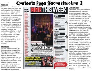
- 1. Masthead The masthead uses the same font style that is on the front cover and that is unique to NME. The font is capitalised, red and bold. Red is the dominant colour on the page therefore makes the name stand out the most therefore makes the magazine brand more recognizable for new readers. It includes the phrase “this week,” suggesting that the magazine offers new and up to date information every single week. It is also a unique phrase instead of just saying “contents.” It is positioned across the top thirds of the page and had their own black background column. This makes it different from the rest of the information on the page. The necessary information such as the date is also attached to the masthead. Contents Text The contents text is positioned down the right thirds of the page. The purpose of this text is to give the reader a brief overview of what the magazine will contain and what pages certain articles are on. The articles have been split into 5 subheadings (news ,radar ,reviews, Live!, features) with an extras paragraph at the bottom. The subheadings follow the same colour scheme as the mast head and use white capitalised font against a black background. This makes the separation of information clearly identifiable in a neat and structured way. Under each subheading, the articles name/ key appeal is in bold lettering for instance band names or albums etc. This bold lettering is accompanied by a page number which is in red. All of the numbers on the page are red which makes it easy for the audience to find what they are looking for. Underneath the bold heading is a brief summary of the article. This can be as short as one line and uses standard text as this would only be important once the reader has took interest in the heading itself. Arrows point to the specific articles that were shown on the front cover to make it easier for the audience. If it was a story on the front cover that attracted them they can go straight to this page. Band Index The band index is a list of all the bands/artists that are featured in the magazine and what page you will find them on. This is positioned down the left thirds of the magazine. As we tend to read from left to right, it can suggest that it the artists the audience find most appealing therefore sell the magazine. The artists names are also in red making them the dominant text and stand out more than the articles in the context.
- 2. Images One dominant image is positioned in the centre of the magazine directly under the masthead. This emphasises the importance of the image and because it is the only image on the page suggests the story is important enough on its own. The image itself is of a famous band known worldwide as “Kasabian” which will draw fans into buying the magazine. It uses low key lighting and a similar dark colour scheme to the magazine, pleasing those interested in indie and rock. The image is framed by text which makes it more central and key. It is supported with its own textual description. Within this description, the band name is in bold lettering that is the second biggest on the page. It also hints at romance which will intrigues the reader and immediately makes them want to find out more about the story. Below this heading is information on who what and where this photo was taken suggesting to the readers that the rest of the magazine will be jam packed with all the vital facts and information. Subscription The subscription section stands out from the rest of the magazine as it has its own black background and uses yellow text which does not appear anywhere else. “Save over £45” suggests to the reader that they are getting a bargain which makes the promotion seem more exclusive and beneficial. The long list of artists and detailed contents would have already appealed to the audience and they will have already decided if they like the magazine or not from this page alone. Also, the reader will flick back to this page constantly to be able to find certain articles which each time will tempt them into subscribing to the promotion. The subscription box is anchored with photos of other magazines suggesting the information they provide will be constant and up to date. It also has links to websites and phone numbers which makes it more accessible and easier for the young target audience to do. Composition The layout is formal and sophisticated. The presence of text is more dominant however it frames the dominant image suggesting the text is led by the image which supports it. The layering is very structured suggesting the magazine takes a serious approach to music. Colour Scheme The colour scheme across the page is black, white, yellow and red. The yellow and red parts are more dominant as they connote danger as if this information is going to be the most dramatic and important. The black and white colours contrast each other and clearly show the magazine is of rock genre.