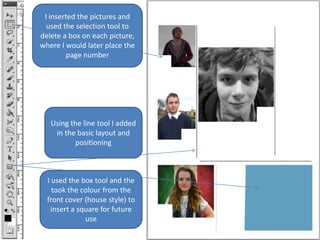
1. I inserted the pictures and
used the selection tool to
delete a box on each picture,
where I would later place the
page number
Using the line tool I added
in the basic layout and
positioning
I used the box tool and the
took the colour from the
front cover (house style) to
insert a square for future
use
2. I added the beginning of the
text to start filling in the
content. I didn’t change the
fonts just yet, because I
wanted to complete the basic
layout
The dotted line next to the
picture of the girl was made
by creating a custom drawing
tool that let me draw dotted
lines.
3. I added the new fonts and
changed the colours to fit
with the house style
established with the front
cover.
I edited the main
image to make it look
different and seem
more professional. I
added the black box
and font.
4. To make it look more
authentic, I put text down
the side. Linking to a
website and naming the
photographer.
I moved about the layout so
it looked more appealing
and well presentd.
I changed around
the picture down
here to add
variation to the
pictures that I used
5. From the original idea,
I’ve altered the
positioning of the
contents title so it looks
both more appealing and
gives room for the rest of
the magazine
I had also moved
around a lot of the
different pieces as to
create a straighter
and better looking
layout.
On some of the
photos I added filters
to create an Indie
look and make it suit
the style more.