
Recomendados
Más contenido relacionado
La actualidad más candente
La actualidad más candente (19)
Destacado
Destacado (20)
Similar a Masthead and Font Ideas
Similar a Masthead and Font Ideas (20)
Último
Último (20)
Masthead and Font Ideas
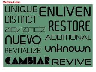
- 2. I used ‘www.dafont.com’ to find all the fonts that I used. I chose fonts that I thought best portrayed the indie rock genre I chose and will fit well my brand identity that I want to represent. Three most preferred choices: ENLIVEN- I chose this word as the meaning is to make something more interesting or appealing, improve and enhance it. This fits well with my brand as I intend to bring new content to the music magazine world that has never been seen before. Thus making my magazine the source of the best content and increase my fan base. REVIVE- This is one of my favourites as It conveys the idea of reviving the genre. The word means to recover, or restore something, which I feel ties in as some would consider the genre to be ‘dying out’, this is because of it’s niche audience base and therefore not as many artists/bands. To combat this i would like my magazine to stand out and almost advertise the genre through amazing content and coverage of upcoming concerts and festivals. I also really like the font due to it’s very sleek appearance, I feel this will appeal to my target audience of young adults and attract them to the magazine. Chosen decision: UNKNOWN- I really like the font used for this one as it is very different to any other existing magazines, meaning mine will stand out to my target audience. The word ‘unknown’ works well with my choice of genre as indie rock music is seen as an ‘underground’ or ‘less known’ style which has a fairly niche audience, I would like to change this perspective people have on the genre and would like to create a magazine that will increase it’s popularity, making the genre well known and gain larger followers.
- 3. Font Ideas
- 4. The reason I chose the name ‘UNKNOWN’ for my magazine is because it connotes the idea of the genre being understated and unheard of, which portrays its ‘indie’ reputation. However, this name will also grasp people attention do to it’s intriguing nature usually associated with it, and therefore bring light to the genre for more people. As I need my magazine to stand out on a magazine rack, I need the font to be exiting and different to it’s competators, however it also needs to conform to conventions of the genre which in turn helps to attract my target audience. Font choice: Out of the fonts I have experimented with, I have chosen to use the font ‘Rezland’, this is because it stands out as being different to any other Masthead from my competitors, yet still fits with the sleek, mature conventions of the genre. I came to this decision from asking a focus group of my target audience age for their opinions and 4 out of the 5 people chose this font. Reasons from them were “the quirky style matches the name, I like it” and “It definitely stands out to it’s competitors”.
- 5. So that I could get an understanding of what the finished product would look like, I quickly drew out this plan and added my newly chosen Masthead and font. I think this choice works very well with the layout and makes the overall appearance very modern and edgy, which fits with the conventions of the genre.