Independent Sonagachi Escorts ✔ 9332606886✔ Full Night With Room Online Booki...
Production Log for 'RANSOM' Poster
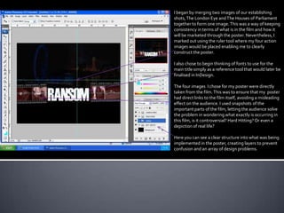
1. I began by merging two images of our establishing
shots, The London Eye and The Houses of Parliament
together to form one image. This was a way of keeping
consistency in terms of what is in the film and how it
will be marketed through the poster. Nevertheless, I
marked out using the ruler tool where my four action
images would be placed enabling me to clearly
construct the poster.
I also chose to begin thinking of fonts to use for the
main title simply as a reference tool that would later be
finalised in InDesign.
The four images I chose for my poster were directly
taken from the film. This was to ensure that my poster
had direct links to the film itself, avoiding a misleading
effect on the audience. I used snapshots of the
important parts of the film, letting the audience solve
the problem in wondering what exactly is occurring in
this film, is it controversial? Hard Hitting? Or even a
depiction of real life?
Here you can see a clear structure into what was being
implemented in the poster, creating layers to prevent
confusion and an array of design problems.
2. Now I have exported my work into
InDesign to begin adding text and
refining every minute detail in the
poster to successfully promote my
film. From this I was able to choose
very clear cut and defined fonts to
make the poster readable and visible
from varied distances.
I have also exported my institutions,
Empire Entertainment & Supernova
Pictures. I placed them in the far
corners of the poster as these will be
the last pieces of text the audience
will see and as a result will lead to
further promotion of the institutions
we integrated.
3. Now I have reached the
stage where I begin to
place text and surrounding
information on the poster.
InDesign proved to be a
very useful programme to
use as it enabled me to
pace images and text in its
rightful place effortlessly.
Moreover, I began adding
the directing text and
introductory lines in and
around the title following
the professional examples
such an Inception.
Also, note that I have
placed the main character
of the film at the very top
of the poster, signifying his
importance and stance in
the film.
4. All the actors and characters are now
being placed in line with the
protagonist ‘Olufemi Coker’ laid out
in reference to the Inception trailer I
took inspiration from.
As you can see all the actors have
different coloured boxes indicating
them being created in different
layers.
I have chosen to stick with a simple
font ‘Times New Roman’ at a ’12pt’
font to ensure its both easy to read
and effectively integrates simplicity
and creativity to produce a quality
body of work.
5. Here I have removed all rulers and all
border lines to enable you to see the
current stage I am at. As you can see the
image in the background is slightly faded.
Initially this was part of the design process
in which it would act as a feature to
enhance the professionalism of my work,
however after extensive research and a
redrafted design plan, I chose to change
the contrast and brightness of the image,
which meant removing the base layer and
importing it back into PhotoShop. As I had
created several layers to great effect, this
was not an issue and limited time was lost.
Furthermore, the institutions placed at the
very bottom of the poster are in colour,
which was initially part of my design path
but after reconsideration I changed them
to black and white to fit with the rest of the
poster. This was mainly because of the
colour text I had chosen.
6. The poster was drawing to a finish but one
or two things had caught my attention and
needed redefining and editing in
PhotoShop. As you can see, the film strip
effect placed on the images is slightly
slanted towards one side and because of
this I chose to change it rather that
overlook it.
Here I open the colour, effects and
gradient tool to make a few minute
changes to the text such as making the
colours somewhat brighter and also make
it stand out against the black background.
STRAP YOURSELVES IN THIS SUMMER IN
THEATRES,ODEON AND IMAX. The phrase Strap
Yourselves was implemented here as a direct
reference to the main turning point in the film,
where the protagonist as been captured and
strapped to a chair in a undisclosed location.
7. Minute details A website created for further
As you can see here the such as the The merged background is now a lot insight to what is to be the
institution has been Trademark sign brighter and visible for the audience. greatest urban drama / action
changed to black and white being film to be released this year.
to fit the rest of the posters implemented is
colour scheme. what allows this
The film strip effect is now straight and from this, it adds to the professionalism of
to be considered
the poster.
a profession piece
of design.