Model elevation attribute with geostatistical procedures
•
2 recomendaciones•909 vistas

Geisa Bugs. Trabalho final da disciplina de geoestatistica na UNL, 2007.

Recomendados
Más contenido relacionado
Destacado
Destacado (20)
Similar a Model elevation attribute with geostatistical procedures
Similar a Model elevation attribute with geostatistical procedures (20)
Más de gaup_geo
Más de gaup_geo (11)
Último
Último (20)
Model elevation attribute with geostatistical procedures
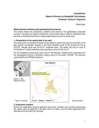
- 1. Geostatistics Master of Science on Geospatial Technologies Professor: Carlos A. Felgueiras Geisa Bugs Model elevation attribute with geostatistical procedures This article reports the procedures, problems and results of the geostatistics proposed exercise. The goal is to create a model with a free chosen data in order to understand how the data is distributed and how is it spatial dependency across the study area. 1. Presentation of the spatial data to be used The study area is composed of seven census sectors (urban area and surroundings) of the São Gabriel municipality, located in the South Brazilian state of Rio Grande do Sul at 30° 20’9’’ latitude south and 54°19’12’’ longitude west. The whole city has an area of 5.019,646 km2 and the selected study area has an area of 618,15 km2. For the modeling exercise was used a set of 189 elevation sample points originated from the cartographic service of Brazilian military army’s in the scale 1:50.000. The exercise used ArcGIS and SPRING softwares. Figure 1: São Gabriel location. Figure 2: Sample points location. 2. Exploratory analysis During the exploratory analysis graphical and visual methods and numerical techniques are used to look for patterns in the data, look for outliers, and formulate hypothesis from data about the symmetry for example. 1
- 2. • Descriptive Statistic Sample points 189 Minimum 9 Maximum 286 Mean 146,96 Standard deviation 50,739 Skewness 1,0259 Kurtosis 3,5291 st 1 Quartile 114 Median 129 rd 3 Quartile 164,5 Global variance 2560,86 Table 1: exploratory analysis. The mean and median are measures of location and show where the center of distribution lies. Values of the two approximately equal suggest a possible normal distribution of the data. In the elevation data they are not much, and that may be because an erratic value is affecting the mean value. The standard deviation describes the variability. Skewness and kurtosis are measures of shape and show information about symmetry. The three coefficients are also sensitive to erratic values, since take into account the mean value. • Histogram: a histogram plots the range of data values (x-axis) against the number of points that have those values (y-axis). Histogram Transformation: None Frequency Count : 189 Skewness : 1,0259 59 Min :9 Kurtosis : 3,5291 Max : 286 1-st Quartile : 114 Mean : 146,96 Median : 129 Std. Dev. : 50,739 3-rd Quartile : 164,5 47,2 35,4 23,6 11,8 0 0,09 0,37 0,65 0,93 1,21 1,49 1,77 2,05 2,33 2,61 2,89 -2 Data 10 Data Source: Layer: sg_topo_pontos_cotados_Clip selection Attribute: CODIGO Figure 3: histogram of the elevation points. The histogram shows that the data are almost symmetric, but there is a very low and isolate value. The more long tail in the right indicates a bigger concentration of high values in comparison with low values. 2
- 3. The sequence of figures bellow helps to see where these values are located. By visual analysis it is clear that the low values are mainly located at the north part of the study are, the values that occur more often are mainly located in the central area and the higher values are located mainly in the south part of the study area. By selecting the very low value it shows that it is one value located in between the lower and the values that occur more often. It may be considered an outlier. Figure 4: shows the location of the values that occur more often. Figure 5: shows the location of the higher values. 3
- 4. Figure 6: shows the location of the lower values. Figure 7: show the location of the lower point value. • Normal Probability Graph: helps to see how close the distribution is to a Gaussian. The graph bellow shows that the elevation data is almost close to a Gaussian behavior but not actually. The points almost follow the normal line but there is an upper dispersion to the low values, a “down belly” dispersion to the values close to the mean, and an upper dispersion to the high values. 4
- 5. Normal QQPlot Transformation: None -1 Data's Quantile 10 29,15 23,5 17,85 12,2 6,55 0,9 -2,79 -2,23 -1,67 -1,11 -0,55 0,01 0,57 1,13 1,69 2,25 2,81 Standard Normal Value Data Source: Layer: sg_topo_pontos_cotados_Clip selection Attribute: CODIGO Figure 8: the normal probability graph. 3. Experimental omnidirectional semivariogram The semivariogram allows examining the spatial autocorrelation between the measured sample points, besides of define the necessary parameters to do the estimations values for not sampled areas. The principle of spatial autocorrelation tells that pairs of locations that are close in distance should also be close in value. In the semivariogram cloud of ARCGIS each red dot represents a pair of locations. Figure 09: ArcGIS semivariogram cloud in 90° direction. In order to improve the semivariogram evaluation and actually be able to see the “curve” it was run also in SPRING. When analyzing the SPRING semivariogram results it was clear to see that the data presents trend because it was not found a stabilized behavior. In a usual behavior as the distance between the point pairs increases, the semivariogram values also increase till 5
- 6. stabilizes and reach a landing. In the elevation data the semivariograms values increased continually, not showing a defined land, indicating the presence of trend in the data. Figure 10: SPRING semivariogram 90° direction. 4. Taking off the data trend In this step it was used a program to take off the data trend and the semivariogram creation was tested again. The results now are very satisfactory. The sill value is approximately the global variance value for the sample without trend (174); the range is sensible smaller comparing to the previous results; and the nugget effect is really close to zero. The sill, range and nugget effect are the important parameters a semivariogram shows. Sill represents variability in the absence of spatial dependency; in a typical behavior of an adjusted semivariogram, the sill value is approximately like the global variance. Range represents separation between point pairs at which the sill is reached, in other words, the distance at which there is no evidence of spatial dependency. Figure 11: semivariogram and numeric result for the points without trend. 6
- 7. 5. Theoretical semivariograms Modeled semivariograms are mathematical models representing the experimental semivariograms. The goal is to find the best fit for the variogram (lowest fitting error). By comparing the spherical and gaussian models, the range, sill, and contribution are very simmilar but when looking to the akaike effect, the gaussian model suggested a little better fitting. Figure 12: spherical modeled semivariogram. Figure 13: gaussian modeled semivariogram. 7
- 8. 6. Kriging Let’s go back to ArcGIS after had the parameters set in SPRING. By observing the surface plot the data can be assumed as anisotropic as shows different behaviors for different directions; the data values along certain direction are more continuous than along others. So ArcGIS offers to calculate it automatically. The first step is to define which interpolation method will be used. In this case it was used the ordinary kriging stochastic interpolator. Stochastic interpolators use weighted averages and probability models to make predictions to the points there is no samples values. Ordinary kriging assumes that the mean is a simple constant, what means no trend on the data. So similarly to what was done to take the trend on the data before, in ArcGIS it was selected a second order polynomial trend removal. The input parameters were the ones figured out from the modeled semivariogram for the point without trend made in SPRING: number of lags: 9, nugget effect: 43, sill value: 131, model: spherical, range: 2.665. Figure 14: ordinary kriging with anisotropy. Figure 15: ordinary kriging with isotropy. 8
- 9. 7. Cross validation In the cross validation procedure one datum is removed and the rest of the data are used to predict the removed datum. The cross validation graphs bellow shows that the result is very satisfactory, almost all the points are following the line, and the root mean squared is more or less 16 and it represents only a 5% error when comparing with the range of the data. When comparing the anisotropy and isotropy the RMS is a little slower for the isotropy. Figure 16: cross validation - anisotropy. Figure 17: cross validation - isotropy. 9
- 10. Figure 18: cross validation comparison: on the left anisotropy and on the right isotropy. 8. Graph result The graph result shows the ordinary kriging map for the elevation data from the seven census areas of Sao Gabriel municipality. The kriging works with the hypotesis od minimazing the error variance and creates a smooth model that can filter some details of the original surface. The difference between isotropy and anisotropy is quite small but still it is better the anisotropy result because is considering this difference in directions. Figure 19: anisotropy. Figure 20: isotropy. 10
- 11. 9. Conclusions Different softwares offer different possibilities for data prediction using geostatistics analysis. It is realy important to know the theory a priori in order to acept or not the automatic parameters given by the softwares, and also to input the ones that fits better to the expected results. Important points to keep in mind is to observe if there is trend in the data. If there is trend is very usefull to take the trend off in order to improve the semivariogram creation and the result parameters used to input in the modeled semivariogram and in the interpolation procedure. Also important to also observe if it is a isotropic or anisotropic behavior. If there is a anisotropy is needed to combine the two information (directions) in one model. Finally, the interactive work of generation reliable variograms really request a previous knowledge of geostatistical concepts. If there is no previous knowledge is quite difficult to find good results. 10. References Isaaks, E. H. and Srivastava, R. M., 1989, An introduction to applied geostatistics, new York: Oxford University Press. ESRI training and education, 2007, Introduction to ArcGIS 9 Geostatistical Analyst. Avaiable online in: http://training.esri.com/acb2000/showdetl.cfm?DID=6&Product_ID=808 (last acessed 11 November 2007). GPS Global, 2007, Artigos geostatística. Avaiable online in: www.gpsglobal.com.br/Artigos/Geoestat.html (last acessed 11 November 2007). 11