
Recomendados
Recomendados
Más contenido relacionado
Destacado
Destacado (20)
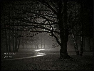
Media Evaluation 2
- 2. How effective is the combination of your main product and ancillary texts?
- 3. What references to the film have you included? What features have you continued across all 3 items? • For my three items which I have created, I have included the same black style, I have done this to make all of my products to look consistent. I have also used similar fonts, colours and images. I have done this as many successful films have done this and created a ‘brand identity’ . One successful film included ‘Silent House’ the screaming image of ‘Elizabeth Olsen’ is now Iconic for the film. Thus creating a brand icon. That’s what I have done with my items, using one iconic image, which matches the genre and also effects the audience because it scares them making them inquisitive and wanting to watch the trailer.
- 4. What messages about your film have you made? • I have hopefully portrayed my film as a terrifying psychological thriller, with a dark twist and tragic ending. I want the audience to be captivated by the images on the poster and the magazine cover which makes them want to watch the trailer. With the usage of similar fonts, colours, layouts, style and taglines to create a brand identity thus making all of my products have a professional aspect. The Silent House One Step Till No Return
- 5. Bigger versions of each poster
- 6. How are you enticing an audience to watch your trailer/film? I am enticing the audience to watch my trailer by having too good ancillary products which sell my product very well. With me using similar fonts, images and colours. The iconic image is the back of actresses head, symbolising that someone or something is behind her, watching, following, waiting. This is what I want the audience to feel when looking at the poster/ magazine and the actual trailer. I want this them to look at the trailer and think maybe something is behind them, and they think about walking home by themselves.
- 7. Have you ensured continuity across all 3 items? I have ensure continuity by using similar fonts throughout my three items, I have also used the same image on both my magazine cover and poster, I have done this as I think it’s the most appropriate and matches my genre as well as the title, the font I have used looks like its scruffy and rough and ben rushed by someone who is not normal, I chose the font purposefully to add the effect that the stalker is not ‘normal’ and is psychotic. However continuity was hard to keep and I have used three fonts across my three products, which draws away from continuity and doesn’t help with the branding of the product. I have also used a black colour scheme throughout as well to keep the scariness incorporated and making the audience want to watch this style of film and be scared whilst watching.
- 8. What could you have done better? For all of my products I believe I could of managed my time better, I think this after realising that my products could be of much better quality. The amount of images I had to work with for the usage of my poster and magazine wasn’t good enough. However another drawback was some of the editing software at my disposal with the lack of photo shop, also by having only iMovie to edit the trailer with, with better equipment It would have been easier to work with the some of the less quality footage and images, however both could have been worked around if my time management was better.