UXD - A quick overview on what you need to work with your UX team
•Descargar como PPTX, PDF•
1 recomendación•725 vistas

The UXD team came up with a presentation, covering some of the point we have in our day to day work. Information architects, designers and front-end participated to build up this doc in order to practice and be more familiar with UCD process, agile project management, UX research and so on. Have a look on the presentation and help us to build it up.

Recomendados
Más contenido relacionado
La actualidad más candente
La actualidad más candente (20)
Destacado
Destacado (13)
Similar a UXD - A quick overview on what you need to work with your UX team
Similar a UXD - A quick overview on what you need to work with your UX team (20)
Último
Último (20)
UXD - A quick overview on what you need to work with your UX team
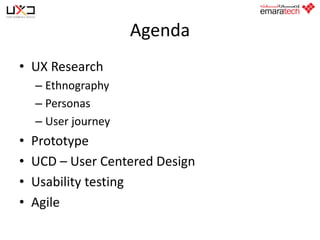
- 1. Agenda • UX Research – Ethnography – Personas – User journey • • • • Prototype UCD – User Centered Design Usability testing Agile
- 3. Ethnography • Most important and most widely used qualitative mode of inquiry into social and cultural conditions • Currently , qualitative methods including ethnography, are providing new insights into developmental and educational issues. • These methods are being used not only by "Pure Researchers"
- 4. Ethnography • deliberate attempt to generate more data then the researcher is aware of at the time of collection
- 5. Personas • Describes the ways in which certain types of people will use your website • Created for each type of user • Used to show the goals that users will be trying to achieve on your website A good persona goal is • To help you make design decisions. • To remind you that real people will be using your system. Don’t forget while creating a persona • Use short descriptive bulleted points • Base personas on real people • Use descriptive photography
- 6. Creating Personas What do you need to include in your persona • • • • Photos Persona names User quotes Key goals
- 7. Validate Personas • Quick validation you can always run your personas past the customer service team or call center staff . • they will be able to see if your personas ring true with what they experience, or just never happen. • If you're performing some usability testing to find some quick wins or online surveys to gather customer experience information, you can evaluate the results with your personas. Comparing your results will show if new findings are consistent with your personas
- 8. Benefits of Personas • allow you to speak to only a small number of people, but as the name suggests, you can gather some in-depth information • simply watching (and talking to) people trying to achieve their goals in their natural environment
- 9. Benefits of Personas • The more research you do, the more accurate and robust your personas become. This creates a trade-off between budget and quality. • To have personas, you must do research, but a six-person usability test will not be enough.
- 10. User journey • Great document to help you figure out how elements of a site will flow together and is helpful when discussing the options with the team.
- 11. User Journey objectives • steps that a user goes through to complete a task or goal • interactions and paths through a system rather than being a representation of desired user behavior • specific routes through a site rather than the logical structure of the entire site.
- 12. When to create a user journey? Product development when developing a system from scratch. Example you're working with a client to develop a new check-out process and you need to understand the best way to implement it. Analysis when testing has shown that the current user journey is broken and needs to be fixed. Example when an confusing checkout process journey can be redesigned to increase conversion.
- 13. User journey Elements typically illustrated in a user journey • • • • • • • • • • The goal or task Steps Decision points Start and end steps Grouping Flow Content Pain points External factors Measurement
- 15. How to validate the user journey You can validate and optimize the user journey at several times during the development process, first on prototypes and later on the live site. • • User testing of wireframes, designs, and live sites If you see that the process isn't meeting user expectations then you’ll need to step back and revise the user journey. A/B testing and multivariate testing (MVT) A/B and multivariate testing allow you to test the real-world performance of two or more design variables against each other to uncover which combination of variables is most effective for the completion of tasks You can test the user journey at three levels : • Element level to test that specific form fields and pieces of content are in the right place and executed in the best way. • • Group level to test the order of chunks of content on a page. Page level to test the optimal flow through the site.
- 16. Validate user journey • during the development process – first on prototypes – later on the live site • If you see that the process isn't meeting user expectations then you’ll need to step back and revise the user journey. • A/B testing allow you to test the real-world performance of two or more design variables against each other
- 17. Testing the User journey Three levels • Element level to test that specific form fields and pieces of content are in the right place and executed in the best way • Group level to test the order of chunks of content on a page • Page level to test the optimal flow through the site
- 18. Agenda PROTOTYPE
- 19. Wireframe Useful for communication between teams or client Express ideas, requirements and features in a User interface way Divided into - Low fidelity - Hight fidelity "I can't picture it, I can't understand it" Albert Einstein
- 20. Low fidelity Allows anyone to share ideas over a standard type of UI In a general view, separate components, prioritize content spots and think about flows and navigation A sitemap can be useful at this stage
- 22. High fidelity Based on a grid system http://www.thegridsystem.org/ Possible to be created on top of the design Rich in terms of UI components Focus on usability and requirement details Useful for usability testing and validating requirements Rapid prototype
- 24. Is your UI user friendly?
- 25. Tools $ Paid • Axure • Balsamic • Expression Blend • Fireworks • Solidify app !$ Free • Indigo Studio • Prototyper
- 27. User Centered Design • User-centered design (UCD) is a design methodology and process that focuses on the: • • • • Needs of end users Limitations of end users Preferences of end users Business objectives • No matter what objectives you have for your site, it must carefully balance the needs of users and the needs of your organization.
- 28. Importance of User Centered Design • Users use your product/service to accomplish tasks. If they don't find your product/service helpful, you risk them leaving. By focusing on the end user you: • Satisfy the user with a more efficient and user-friendly experience • Create service/product that supports rather than frustrates the user • Establish a more relevant and valuable service/product • Increase loyalty and return usage of service/product
- 29. The Process • To create a user-centered service/product, you must think about the needs of your users through each step of the process, including: • • • • • Planning Collecting user data Developing prototypes Writing content Conducting usability tests
- 30. User Interface Design • Great UI are the ones that are engineered to stay out of the way. • UI must not distract users, rather it should help them complete their goals. • This will result to reduced training costs and highly engaged and satisfied users.
- 31. UI Design Fundamentals Heuristic • Know your user, their tasks, problems and goals • Pay attention to patterns • Stay consistent/Reduce, reuse and recycle • Use visual hierarchy • Be forgiving, provide sign posts and cues • Provide feedback • Speak their language • Keep it simple and limit distractions/Hide complexity • Keep moving forward • Present few choices/Make lean UI • Minimize visual noise
- 32. Know your user, their tasks, problems and goals • Obsess over customers, start with your customer and work backwards. Your user goals should be your goals, learn about their skills, experience and what they need. Do not follow the competition and design trends and style, it may not match your customer goals. Add new features only if it will help your user. • There should be a purpose for your work, address actual and immediate problems users are facing. Make sure you know and understand the reason before starting any design.
- 33. Pay attention to pattern • Users spend the majority of their time on interfaces other than your own. There is no need to reinvent the wheel every time. Those interface they use may solve some of the goals you are trying to achieve, by using a familiar UI pattern your users feel at home. • They don't need to exert effort to learn and familiarize themselves on your UI.
- 34. Stay consistent • Reduce, reuse and recycle • The more user's expectation is proved right the more they feel in control of the system and acceptance and liking is high. • Users need consistency, once they learned something they expect the same behavior throughout. Language, layout and design are just a few elements that needs to be consistent. A consistent interface enable users better understanding of how things work and will increase their efficiency. • Look for ways to reuse components of the interface. This will result in less development time and more consistent user experience. When the user learns a single task, they can apply the same knowledge to the rest if implementation is consistent.
- 35. Use visual hierarchy • A good design can make order out of chaos through clear organization and manipulation of words and visuals. design interface that focus on what is important. The size color and placement each work together in creating a clear path to understanding your interface. A clear hierarchy will go great lengths in reducing complexity. • Visual hierarchy is a combination of several dimensions to aid in the processing of information, such as color, size , position, contrast, shape, proximity to like items, etc. The prioritization of information and functionality ought to mimic real world scenarios. Make most commonly used items the most accessible to the user.
- 36. Provide feedback • UI must speak to your user at all times, whether his actions are right or wrong, inform users of actions, changes in state and errors or exceptions that occur. Visual cues or simple messaging can show the user whether his or her actions have led to the expected result.
- 37. Be forgiving, provide signposts and cues • No matter how clear your design is, people will make mistakes. UI should allow or tolerate user errors. • Design ways for users to undo actions, edit mistakes without doing the whole process back to start. Use messaging and hints to show where they made the mistake so they will learn and avoid doing it in the future. • Never let the user get lost. Give the user visual and contextual cues to lead them to the right path. Make them aware where they are in the overall experience at all times.
- 38. Speak their language • All UI require a level of copywriting. Keep things conversational. Provide clear and concise labels for actions and keep messaging simple and targeted to your users. This will enable them to understand and relate better. • Make sure your language is clear and understandable. • Avoid jargon, remember that the experience is for the user and not the business. • Use language that the user will understand and don't use words or terminology that is exclusive to the business.
- 39. KISS • Keep It Simple Sir, limit distractions, and hide complexity • The best UI are always invisible. They do not contain bling or makeup, instead they contain only the necessary elements that make sense. • Whenever you add an element, always think of its purpose, does it help the overall UI, does the user need them or does it help the user achieve their goals. Limit distractions, allow people to focus on the task at hand without diverting their attention to less critical tasks. • If you can't kill a complex feature the next best thing is to hide it. A good interface must make the most common and relevant task prominent and accessible then hide secondary tasks that get in the way.
- 40. Keep moving forward • What you produce will not be perfect. You will learn and see the mistakes or things you can improve on when you release it in the market and users started using them. • Get feedback and iterate them as often as you can see a chance to correct or improve your UI.
- 41. Make a lean UI • The more choices a user is presented the harder it is for them to decide. Remove the nice to haves and focus on the necessary alternatives that will help the user finish his/her goals. • Studies have found 80% of users use only 20% of software features (Pareto Analysis). Applications that try to do everything often struggle to do anything well (like spreading yourself thin). • A successful application is a lean application that isolates a single problem and solves it brilliantly. Eliminate features that are not necessary, if it does not help the majority of users to accomplish their frequent task, then its not worth including.
- 42. Minimize visual noise • The amount of visual noise has great deal of impact in the perceived complexity of the application. Keeping the visual noise to bare minimum will make an interface seem easier to use. The two primary tools in reducing visual noise are white space and contrast. • White space is the space between elements in a composition. Never introduce a design element unless it can be solved by white space. • While white space should be used in abundance, contrast must be used as little as possible. Emphasize what is important and let the rest take the back seat.
- 43. Agenda AGILE
- 44. Agile • Value System not a process • Frameworks – Kanban – Scrum
- 45. Kanban • • • • Japanese - Toyota Just in type Lean method Focusing on the customer values
- 46. Kanban board
- 47. Scrum
- 48. Scrum in a nice way
- 49. ... in a mind blowing way
- 50. User Stories examples How to write them
- 53. Sprint planning
- 54. Sprint planning • Time to take a look on the Product Backlog • Create the Sprint Backlog • Scrum team – Product owner – Scrum master – Dev. team
- 55. Sprint Review • Present the potentially shippable increment (our product release) • Demonstrate in a meeting with the whole team • Collect feedback and hint of the plan for the coming spring – Possible impediments – Advantages