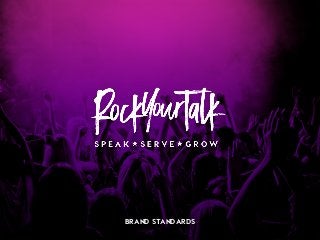
Rock Your Talk Brand Book
•
7 likes•3,228 views

Rock Your Talk is a comprehensive course by Kristin Thompson to teach you how to speak to sell. http://www.rockyourtalk.com

Recommended
Recommended
More Related Content
Viewers also liked
Viewers also liked (16)
More from Kaye Putnam
More from Kaye Putnam (20)
Recently uploaded
Recently uploaded (20)
Rock Your Talk Brand Book
- 2. contents This brand standards document explores the message, visuals, and expression of your brand. Brand Message Design & Visuals Words & Content Live Your Brand Brand Guidelines 1 2 3 4
- 3. VISUAL CONCEPT This concept was created to express the “mood” of the brand and to inspire the visual decisions. The inspiration was “Hard Rock Cafe” meets “Apple.” We were striving for a balance between rock and roll, light heartedness, and class. And while we were giving the course a visual upgrade, we wanted to maintain consistency with your existing brand.
- 5. position CORE IDEA Rock Your Talk is an online course that helps people craft their signature Talk that turns into clients. OUR GOAL Our work together included developing an updated brand style for your course, along with designing specific assets that will be used during the launch. We wanted to communicate your rock star personality with hints of humor and “relate-able-ness.” HOW YOU ARE DIFFERENT Instead of teaching ways that people can be better entrepreneurs, speakers, etc, you let them know that they are already perfect the way that they are. They just need to share their true personality and knowledge with the world. THE END RESULT After working with you, your clients and students Rock Their Talk! :) They develop a brand, system, talk, and product that grows their income and impact. BRAND GUIDELINES BRAND MESSAGE 1
- 6. personality MAVERICK & GIRL NEXT DOOR PERSONALITY ARCHETYPE Your goal is to help people rebel against the “expectations” and how they *think* they need to show up. You empower them to proudly be themselves. You instill a sense of “real-ness” into everything that you do, which makes you relatable and accessible. When they encounter your brand, your audience FEELS: empowered, understood, appreciated, confident, and excited. You are: • Direct (no B.S.) • Real • Engaging • Fun (you don’t take yourself too seriously) BRAND GUIDELINES BRAND MESSAGE + 1
- 7. point of view YOU ARE PERFECT NOW You aren’t too fat or too skinny or to old or too young. You are exactly who people need you to be. Stare your personality and knowledge now. I’m not here to improve you. I’m here to help you be exactly who you are. YOU’VE GOT TO WORK IT Magic bullets would be great, but unfortunately they are a fool’s wish. For anything to work, you’ve got to work it. Put the system into action and you’ll get the results you’re looking for. I WAS WHERE YOU ARE I’m not a guru. I’m exactly as special as you are. Your dream of making an impact and an income is completely possible. I know because I started where you are now. BRAND GUIDELINES BRAND MESSAGE 1
- 8. you are the secret weapon in your business - MANIFESTO -
- 9. unfair advantage YOUR ‘UNFAIR ADVANTAGES’ ARE: • You have a gift for showing people how special they are and helping them see and own it for themselves • You have the results to back up everything that you teach (from your own experience and from your clients) • You are genuine through your brand and being. Your authenticity shows through your consistency from your hair color, to the way you speak, to your design. You are 100% and unapologetically you! BRAND GUIDELINES BRAND MESSAGE 1
- 10. design + visuals
- 11. logo VISUAL IDENTITY The logo was designed to fit your new name and brand message. The Black Diamond font and gradient are signature pieces of the brand identity, and are reflected in the logo. Brand Guidelines 2
- 12. primary colors VISUAL IDENTITY The primary colors, purple and gold, have been a part of your brand identity for a long time. We updated them slightly (moving from yellow to gold) for this project and added several complementary colors that are shown on the next page. The colors feel very rock and roll. #78009d 20% 40% 60% 80% GOLD #2C2C2C 20% 60% 20% 60% Brand Guidelines 2 The gold effect can also be achieved with a gradient: #F4DF6C to #C09321
- 13. secondary colors VISUAL IDENTITY The secondary colors give the brand more depth and interest. We use them as accents throughout all of the designs. #3C005A #C22098 #FFFFFF Brand Guidelines 2 #000000
- 14. patterns VISUAL IDENTITY The patterns and gradients used in the brand designs add a lot of texture to the designs. The gradients feel very modern, and the paint splatters and grunge texture add the rock n’ roll edge that your brand is known for. Brand Guidelines 2
- 15. typography HEADLINES: VISBY HEAVY ABCDEFGHIJKLM NOPQRSTUVWXYZ 1234567890 !@#$%^&*() VISUAL IDENTITY Body:Helvetica Light ABCDEFGHIJKLMNOPQRSTUVWXYZ abcdefghijklmnopqrstuvwxyz 1234567890 !@#$%^&*() The fonts used in your designs mix some very interesting styles together. The accent that shows throughout the brand and logo, Black Dimond, is very rock. It adds an element of accessibility and real-ness because it’s a bit messy and grungy. Visby is nice and bold, and has some unusual letter forms. In the form of a font, its the mix of modern and humor that is found elsewhere in your brand. Brand Guidelines Accent: Black Diamond ABCDEFGHIJKLMNOPQRSTUVWXYZ abcdefghijklmnopqrstuvwxyz 1234567890 2
- 16. fonts in action HEADLINE LEVEL 1 This is a description paragraph. It explains the purpose of the page and describes the title to the left. 1. Example 2. Example 3. Example 4. Example Rock on! This is an interesting quote! HEADLINE LEVEL 2 This is a description paragraph. It explains the purpose of the page and describes the title to the left. This is a description paragraph. It explains the purpose of the page and describes the title to the left. • Example • Example • Example VISUAL IDENTITY Brand Guidelines 2
- 17. image style
- 18. image do’s VISUAL IDENTITY Brand Guidelines Images of you that are full of personality or in your element - on stage, speaking Images with the purple-pink gradient Stock images that have an element of irony or humor in them Images of microphones, technology, and other objects speakers use on the regular When choosing images for your brand, pick ones like these. 2
- 19. image don’ts Brand Guidelines Lifestyle porn that makes you seem inaccessible or too “royal” Super corporate pictures of people that have no personality Mockups or graphics that are overtly feminine Cheesy or low quality stock photos When choosing images, avoid ones like these. VISUAL IDENTITY 2
- 20. other graphics Brand Guidelines Other graphics that show up throughout your brand follow the rock n’ roll + grunge feel, with hints of quality. VISUAL IDENTITY 2
- 21. words + content
- 22. tone of voice BRAND GUIDELINES Content and communication from your brand should be extremely conversational, empowering, and direct. You say what you mean and you don’t jazz it up with lots of jargon or $10 words. YOU’LL SOUND • Friendly • High-energy • Straight talkin’ • Easy to understand • Personable (use your own slang, phrases, etc.) NOT • Formal • Generic • Sophisticated • Jargon-filled • Preachy BRAND COMMUNICATION 3
- 23. brand name BRAND GUIDELINES ROCK YOUR TALK The original name of the course was “Command Any Room.” Early in our work together, we settled on using “Rock Your Talk” as the new name. The phrase is already strongly associated with your brand. The course is your signature method, so the name change brought that in alignment. Also, on a word level, “Rock” is much more on brand than “Command.” BRAND COMMUNICATION 3
- 24. word bank • The real deal • Rockin’ • Sneak peek • Cherry on top • Damnit Janet! • Rock your…. • Combine your personality and expertise • For realz • Shimmy on… • Get a little crazy • Go-to girl BRAND GUIDELINES BRAND COMMUNICATION 3
- 25. live your brand
- 26. action steps STAY ACCESSIBLE THROUGHOUT THE LAUNCH Your “girl-next-door” is an important piece of your brand personality. Stay accessible to people throughout the launch so they can see your personal involvement. KEEP ENCOURAGING PEOPLE TO BE THEMSELVES I don’t think you could ever tell people enough that THEY ARE ENOUGH. It’s an important (and sexy) message. Keep on keeping on. CAPTURE CLIENT RESULTS Keep building the social proof for your course and for your free content. Let other people sing your praises. Share their kind words. BRAND GUIDELINES BRAND COMMUNICATION 4
- 27. brandemies IDEA ENEMIES • Impact or income without the other. They work together to build a business that serves you while you serve others. • Needing to “be more” or “be better” to see success NOT TO DO LIST • Engage in the “lifestyle porn” or “business porn” that is so prevalent in the industry. Keep sharing the real- talk and behind the scenes moments in your brand. WE ARE NOT • A “guru” or “genius” • Another complicated online marketing system BRAND GUIDELINES BRAND COMMUNICATION 4
- 28. Q U E S T I O N S ? kaye@kayeputnam.com