Website Users Give Bbc News Redesign Grief (And Anger, And Bargaining ) Media Guardian Co
•
1 recomendación•488 vistas


Recomendados
Recomendados
Más contenido relacionado
Similar a Website Users Give Bbc News Redesign Grief (And Anger, And Bargaining ) Media Guardian Co
Similar a Website Users Give Bbc News Redesign Grief (And Anger, And Bargaining ) Media Guardian Co (20)
Más de Luciana Moherdaui
Más de Luciana Moherdaui (20)
Último
Último (13)
Website Users Give Bbc News Redesign Grief (And Anger, And Bargaining ) Media Guardian Co
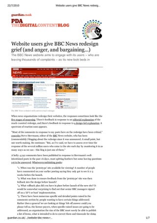
- 1. 22/7/2010 Website users give BBC News redesig… Website users give BBC News redesign grief (and anger, and bargaining...) The BBC News website aims to engage with its users – who are leaving thousands of complaints – as its new look beds in The BBC News w ebsite's still-controv ersial redesign When news organisations redesign their websites, the responses sometimes look like the five stages of mourning. There's feedback in response to an editorial explanation of the much-vaunted redesign, and there's feedback in response to a design-led explanation. A spectrum of reaction soon appears. "Most of the comments in response to my posts here on the redesign have been critical," concedes Steve Herrmann, editor of the BBC News website, who has been (commendably) blogging about the redesign since it was announced. A small point, but one worth making. He continues: "But, as I've said, we have to assess over time the response of the several million users who come to the site each day by monitoring it in as many ways as we can - this blog is just one of them." A hefty 4,242 comments have been published in response to Herrmann's well- intentioned posts in the past 16 days, most spitting feathers but some leaving questions yet to be answered. Whatwereyouthinking posits: "1. When was the 'prototype' site available for viewing? A number of people have commented on your earlier posting saying they only got to see it 2-3 weeks before the launch. "2. What was done to ensure feedback from the 'prototype' site was then fedback into the design before launch? "4. What rollback plan did you have in place before launch of the new site? It would be somewhat surprising to find out that senior BBC managers signed off on a 'sh*t or bust' implementation. "5. There have been numerous specific and detailed points raised in the comments section by people wanting to have certain things addressed. Rather then a general 'we are looking at things' fob off answer could you please tell us, the licence payers, when specific raised issues are going to be addressed, an organisation the size of the BBC must surely be able to publish a list of items, what is intended to do to correct them and timescale for doing guardian.co.uk/…/website-bbc-news-r… 1/7
- 2. 22/7/2010list of items, what is intended to do to correct users and timescale for redesig… a Website them give BBC News doing it. "6. Give the Alexa numbers are suggesting site traffic is down between 15% and 20% on the BBC news site when you take into account that news represents about 50% of bbc.co.uk total traffic would you consider the redesign a success?" While many like Whatwereyouthinking wait for a response through more diplomatic means, the strength of feeling in some parts is such that Freedom of Information Act requests are being launched. Of course, we have to remember that, on the whole, people don't react well to change: 'If it ain't broke, don't fix it' etc. The seven-day report from web metrics company Alexa mentioned above says page views for bbc.co.uk are down 10.6%, while reach, time on site and traffic rank are all down for the week – not entirely indicative of direct reaction to the BBC News Online refresh, but a nugget nonetheless. Experian Hitwise is analysing early traffic data. It also has to be said that web traffic tends to fall in July. Holding its ground, the BBC yesterday ruled out the possibility of reverting back to the previous site, saying that building on changes made is the only way forward. Meanwhile, Herrmann and co. will be battening down the hatches in preparation for the monthly summary of all complaints. And complying with requests to disclose internal discussions around the website redesign. Next Previous Blog home Ads by Google Attention All Expatriates Free Savings, Pension & Investment Report for all Expats. Request Now! www.OffshoreSavingsDesigner.com UK Expat? £60K+ Pension? Move your UK Pension funds to QROPS Speak to our Expert Advisers now. your.QropsGuide.com/Guardian/Guide Grief Counseling Degree Earn a PhD in Grief Counseling Online. Apply Today! www.breyerstate.com Comments in chronological order (Total 24 comments) Post a comment Staff Contributor nursenurse 22 Jul 2010, 1:13PM That Whatwereyouthinking can't even count. Pfff, BBC eh? Recommend? (2) Report abuse Clip | Link MTFlanders 22 Jul 2010, 1:21PM It's such a shame as the BBC has always done a great job of improving the news website in the past. I've always lived on that website more than any other, but I'm amazed how little time I've spent on it since the redesign. I like to think I'm not a 'fear change' type but the new version looks like the idiot cousin guardian.co.uk/…/website-bbc-news-r… 2/7
- 3. 22/7/2010 Website users give BBC News redesig… of CNN.com. Recommend? (9) Report abuse Clip | Link BigDaveB 22 Jul 2010, 1:43PM The refreshed site was clearly designed for touchscreen devices, that's the only way of explaining so much white space and the huge fonts on many links - the "most popular" links being a good example. I'm sure it look fabulous on an iPad, but on proper high resolution monitors it's an awful mess with far more scrolling necessary. I also can't understand the fascination with tiny paragraphs, many just a single sentence. It's as if the BBC think we're all stupid and can't concentrate on blocks of text. Overall it's a pretty shoddy job, which they're finally admitting. The first few versions of the Editors' Blog could almost have been written by Steve Jobs, such was its "we know what's best for you" tone. Recommend? (6) Report abuse Clip | Link MistressG 22 Jul 2010, 1:46PM The previous site wasn't pretty, but it was easy to navigate. The new one is the former and not the latter. Recommend? (3) Report abuse Clip | Link Wizardweb 22 Jul 2010, 2:19PM I like the new website if I'm viewing on a PC, but as I do most of my browsing on my iPhone (via WiFi, it's easier than booting up a pc, just to answer one query) I find the new site a right pain. It doesn't reformat the text-box shape when you double tap. So you have to zoom in all the time, then slide across. In that respect the old mobile site is more usable and in fact I'm unfortunately reluctant to use the site now. Maybe there's a Murdoch sabateur working for the Beeb... or maybe it's a way of making it poo, so the trust allows the App. I hope so... Recommend? (1) Report abuse Clip | Link AndyStiff 22 Jul 2010, 2:22PM I'm using it a lot less, probably about 50% less since the redesign. It's too in-your-face for my liking and for some reason the sport section remains the same. Recommend? (6) Report abuse Clip | Link guardian.co.uk/…/website-bbc-news-r… 3/7
- 4. 22/7/2010 Website users give BBC News redesig… davidabsalom 22 Jul 2010, 2:29PM It's hideous. Recommend? (4) Report abuse Clip | Link Briantist 22 Jul 2010, 2:50PM It much, much better IMHO. Works just fine and the horizontal navigation is, like that on the Gruniad, much more logical layout. Strange how the former "frontier" of the internet has become filled with such boring "small c" conservatives who moan about every little thing. Some "haters" seem to be under the untrue idea that the text is dumbed down (is isn't) and dislike red (even though it has been the BBC News colour since the start of colour TV). Recommend? (4) Report abuse Clip | Link Briantist 22 Jul 2010, 2:54PM I guess many people have not found the scroll button on their mouse yet. BigDaveB: I also can't understand the fascination with tiny paragraphs, many just a single sentence. It's as if the BBC think we're all stupid and can't concentrate on blocks of text. I just picked a random story from 2008, BBC NEWS - UK - Suicide claim over UK hostage and look, same paragraph layout. People just make shit up and then complain about it. Recommend? (1) Report abuse Clip | Link Briantist 22 Jul 2010, 2:56PM Wizardweb: Ah, didums. You should have got an Android phone. Recommend? (1) Report abuse Clip | Link Briantist 22 Jul 2010, 3:04PM Whilst I think of it, there is a really good reason why that start of any BBC News story is cut into short paragraphs. This is because this is what you see when you access the same story on BBC Digital Text (Freeview, Sky, Freesat, Virgin Media) and on the legacy Ceefax system. So, no change there. Recommend? (1) Report abuse guardian.co.uk/…/website-bbc-news-r… 4/7
- 5. 22/7/2010 Website users give BBC News redesig… Clip | Link twobenches 22 Jul 2010, 3:21PM The design-led explanation for the revamp is here. The Guardian article links to a post about the global visual BBC language employed in the re-design . Recommend? (0) Report abuse Clip | Link ScottyN1 22 Jul 2010, 3:55PM I'm not altogether convinced by the redesign but am prepared to wait and see whether I get used to it. The problem I do have with it is when I navigate to a story - any story - I get six warnings in very quick succession (on a secure corporate network) that the current web page is trying to open www.facebook.com on my intranet. Why should my browser be trying to take me to a commercial social networking site when all I want to do is read the news? Recommend? (0) Report abuse Clip | Link GotaLife 22 Jul 2010, 4:27PM The horizontal navigation and making the page "wider" is a big improvement. Also I know how to use the scroll wheel on my mouse. So in this case, change is good. Recommend? (0) Report abuse Clip | Link damagedgavster 22 Jul 2010, 4:52PM Sorry but they seem to have copied CNN's website. I don't doubt they had the best intentions and didn't do it deliberately but come on - check them out. Even worse, CNN have done it better. Recommend? (2) Report abuse Clip | Link Red246 22 Jul 2010, 4:53PM I'm almost afraid to post this comment but......... I like the new BBC News website design. I think it's much more dynamic than the old one, everything is easier to find and easier to read - much more accessible. I've notice that my 11 year old daughter spends a lot of time reading the Local news pages and has pointed out to me the local regions which are guardian.co.uk/…/website-bbc-news-r… 5/7
- 6. 22/7/2010 Website users give BBC News redesig… now visible on the map. Maybe the BBC has unintentionally (or intentionally) targeted a younger audience but for me and my daughter, I cannot see this as bad in any way at all. Recommend? (2) Report abuse Clip | Link Briantist 22 Jul 2010, 5:05PM ScottyN1: If you want to block the "Facebook Like" that appears on a billion websites from the BBC News one - click here my friend: Facebook remove cookie set Recommend? (1) Report abuse Clip | Link Briantist 22 Jul 2010, 5:09PM ScottyN1: Why should my browser be trying to take me to a commercial social networking site when all I want to do is read the news? It's called OpenGraph - see Open Graph protocol - Facebook developers and The Open Graph Protocol. I would have thought that 500,000,000 users of Facebook is something Auntie want to leverage, along with the 190,000,000 Twitterers. Recommend? (0) Report abuse Clip | Link PriscillaPrestwich 22 Jul 2010, 5:21PM Maybe they all have gigantic monitors at the BBC? The title and navigation takes up a quarter of my browser window and I'm on 1440x900 resolution. Most of us are on widescreen monitors now and text works best in fairly narrow columns. Putting the navigation at the top is the modern style but really the left side is a more obvious place for it. I agree there is way too much white space between various things at the moment. This tends to be a problem with content management systems, compared to pages that are lovingly coded by hand. But all of this can be tightened up in due course and I'm sure it will look great. The thinking behind it is solid. Recommend? (0) Report abuse Clip | Link narrowboat 22 Jul 2010, 5:22PM I also can't understand the fascination with tiny paragraphs, many just a single sentence. It's as if the BBC think we're all stupid and can't concentrate on blocks of text. It's always been like that. It's because the first four paragraphs are also used for Ceefax. Recommend? (0) Report abuse guardian.co.uk/…/website-bbc-news-r… 6/7
- 7. 22/7/2010 Website users give BBC News redesig… Clip | Link Briantist 22 Jul 2010, 5:30PM narrowboat: Yes, indeed. Compare: web - BBC News - Bankers' deals could be 'torn up' Ceefax - CEEFAX1 mobile page 104 Recommend? (0) Report abuse Clip | Link Briantist 22 Jul 2010, 5:54PM BBC News is red, 1981 - TV ARK - BBC 9 O'Clock News 1981... Recommend? (0) Report abuse Clip | Link kingmaker 22 Jul 2010, 5:56PM The whitespace in the articles and the general layout of the section pages is for one thing, and one thing only. It is to facilitate the placement of ads for the non-UK version. Recommend? (2) Report abuse Clip | Link Xoco 22 Jul 2010, 6:28PM It's the blood red, orange tan and purplish grey colour scheme that I can't tolerate. The header graphic looks like an accident in an operating theatre. However it's possible to get rid of these! Thanks to the lovely Firefox, you can remove the header graphic, carousel, geographical news box (and anything else you don't want) from the page using Adblock Plus and its Element Hiding Helper extension. Recommend? (0) Report abuse Clip | Link Post a comment In order to post a comment you need to be registered and signed in. Register | Sign in g u a r dia n .co. u k © Gu a r dia n New s a n d Media Lim it ed 2 0 1 0 guardian.co.uk/…/website-bbc-news-r… 7/7