SlideShare una empresa de Scribd logo
1 de 14
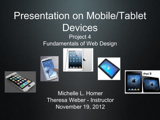
Presentation on Mobile/Tablet
           Devices
              Project 4
      Fundamentals of Web Design


           Michelle L. Homer
       Theresa Weber - Instructor
          November 19, 2012
How much mobile and tablet usage has
grown and estimated future usage


* 50% of US adults currently have mobile connection to the   web
via smartphones or tablets

* 22% of US adults own a tablet device

* 44% of US adults have smartphones
* Number of Smartphones
   2012 = 1,000,000,000

   2016 = +2,000,000,000


                           * Number of Tablets
                            2012 = +100,000,000

                           2016 = +2,500,000,000
    How mobile and tablet usage has impacted web design
        * Bandwidth - utilization of adaptive design methods is the solution developers must use
        (i.e. CSS/Javascript methods - but only work on some devices


                             CNN’s website works great in both landscape and portrait iPad orientations.


     * The fold -trying to squeeze content above the fold is no longer a strategy that should
                                     chain down your designs.
How mobile and tablet usage has impacted web design
                                                  (continued)


    * HTML 5   & CSS3 replaces Flash for better & easier video and audio
                              embedding


                    CNET redesigned their streaming site to handle iPad-compatible HTML5 video.


    * Standards Compliance - HTML 5 is compliant when used on an iPad because it
                                         supports SVG rendering
What current technologies can be used to make
websites accessible on all devices

HTML 5 is the best choice but is not a panacea.

There are tools available especially designed for those who would like accessibility
on all devices that do not require web development and/or coding expertise.

The list below provides a few good tools that are cost effective (some free) and have
ease of use, great for small businesses and/or individuals:
     * Mobify -http://www.mobify.com


     * Wirenode -http://www.wirenode.com
What current technologies can be used to make webs
accessible on all devices
                                          (continued)


* Onbile - http://www.onbile.com


* Winksite -http://winksite.com/site/index.cfm
Example of a website that doesn’t work well on
mobile/tablet devices


   Only some of the features from the full website have made it onto the mobile-specific website.


                            http://m.mittromney.com
Example of a website that does work well on
mobile/tablet devices


          http://www.nytimes.com
What I recommend the Adult Literacy League
should specifically do to make sure their website
can be accessed and used on mobile and tablet
devices


* If a web designer is doing the site redesign HTML 5 & CSS 3 should be used

* If the Adult Literacy League is redesigning the site themselves one of the tools
discussed previously should be used (i.e. Mobify, Onbile, etc.)

* If a WordPress is used (as I recommended) insure that the theme selected has
responsive design alternatives
Image References
Cooper, D. (2012). iPad Mini image.
  Retrieved from http://www.engadget.com/2012/10/23/apple-ipad-mini/

David. (2011). Windows 7 Tablet image.
  Retrieved from http://
www.gadgets-world.org/2011/03/30/dell-says-the-ipad-will-fail-before-their-windows-7-tablets-pc

Gaudiosi, J. (2012). iPhone image.
  Retrieved from http://
www.forbes.com/sites/johngaudiosi/2012/09/19/research-teardown-details-why-the-new-iphone

Surbhi. (2012). iPad image.
   Retrieved from http://
www.technoroar.com/apple-ipad3-comes-up-with-retina-display-and-a5x-chip/1433/

Waugh,R. & Wrenn,E. (2012). Galaxy S3 image.
Retrieved from http://
www.dailymail.co.uk/sciencetech/article-2138985/Samsung-Galaxy-S3-release-date-revealed-la
References
Cocotas, A., Blodget, H. (2012). The Future Of Mobile.
  Retrieved from http://www.businessinsider.com/the-future-of-mobile-deck-2012-3?op=1

Cronin, S. (2011). Designing for the New Fold: Web Design Post Monitorism.
   Retrieved from http://webdesign.tutsplus.com/articles/design-theory/designing-for-t
he-new-fold-web-design-post-monitorism/

Mobify
  Retrieved from http://www.mobify.com

Mitchell, A., Rosenstiel, T., Huston, L. (2012). Future of Mobile News - The Explosion In
Mobile Audiences And A CloseLook At What It Means For News.
   Retrieved from http://www.journalism.org/analysis_report/future_mobile_news

Turnbull, C. (2011). How the iPad (and Tablets) Are Driving New web Design Trends.
   Retrieved from http://webdesign.tutsplus.com/articles
/how-the-ipad-and-tablets-are-driving- new-web-design-trends/
References

Frost, B. (2012). Separate Mobile Website Vs. Responsive Website.
    Retrieved from
http://mobile.smashingmagazine.com/2012/08/22/separate-mobile-responsive-website-presiden

Google Webmaster Central Blog (2012). Giving Tablet Users the Full-Size Web.
   Retrieved from http://googlewebmastercentral.blogspot.com

Onbile -
  Retrieved from http://www.onbile.com

Paulick, C. (2012). WordPress Responsive Design Alternatives.
  Retrieved from http://wpmu.org/wordpress-responsive-design/

Winksite -
  Retrieved from http://winksite.com/site/index.cfm

Wirenode -
   Retrieved from http://www.wirenode.com

Más contenido relacionado

Destacado

6 я линия / левитана
6 я линия / левитана6 я линия / левитана
6 я линия / левитанаYhugor
 
Proyecto de arte dramático
Proyecto de arte dramáticoProyecto de arte dramático
Proyecto de arte dramáticoSandra Pao
 
Proyecto de periodismo
Proyecto  de periodismoProyecto  de periodismo
Proyecto de periodismoSandra Pao
 
Proyecto de deportes
Proyecto de deportesProyecto de deportes
Proyecto de deportesSandra Pao
 
Proyecto creacion literaria
Proyecto  creacion literariaProyecto  creacion literaria
Proyecto creacion literariaSandra Pao
 

Destacado (7)

Feature presentation
Feature presentationFeature presentation
Feature presentation
 
6 я линия / левитана
6 я линия / левитана6 я линия / левитана
6 я линия / левитана
 
Chapter
ChapterChapter
Chapter
 
Proyecto de arte dramático
Proyecto de arte dramáticoProyecto de arte dramático
Proyecto de arte dramático
 
Proyecto de periodismo
Proyecto  de periodismoProyecto  de periodismo
Proyecto de periodismo
 
Proyecto de deportes
Proyecto de deportesProyecto de deportes
Proyecto de deportes
 
Proyecto creacion literaria
Proyecto  creacion literariaProyecto  creacion literaria
Proyecto creacion literaria
 

Similar a Homer michelle mobile_presentation

Going mobile edu web presentation - 2011
Going mobile   edu web presentation - 2011Going mobile   edu web presentation - 2011
Going mobile edu web presentation - 2011Nathan Gerber
 
Screen and Context: Usability in the Postdesktop World
Screen and Context: Usability in the Postdesktop WorldScreen and Context: Usability in the Postdesktop World
Screen and Context: Usability in the Postdesktop WorldDoug Gapinski
 
Building Mobile Friendly Websites
Building Mobile Friendly WebsitesBuilding Mobile Friendly Websites
Building Mobile Friendly WebsitesCittrex
 
Postdesktop Usability
Postdesktop UsabilityPostdesktop Usability
Postdesktop UsabilityDoug Gapinski
 
Beyond Branding SharePoint - SharePoint and Today's Web
Beyond Branding SharePoint - SharePoint and Today's WebBeyond Branding SharePoint - SharePoint and Today's Web
Beyond Branding SharePoint - SharePoint and Today's WebEric Overfield
 
Nichols_Jason_Mobile_Presentation
Nichols_Jason_Mobile_PresentationNichols_Jason_Mobile_Presentation
Nichols_Jason_Mobile_PresentationJason Nichols
 
Developing for Mobility
Developing for MobilityDeveloping for Mobility
Developing for MobilityScotty Logan
 
Mullennax p fwd_w4_presentation4
Mullennax p fwd_w4_presentation4Mullennax p fwd_w4_presentation4
Mullennax p fwd_w4_presentation4Phillip Mullennax
 
Mullennax p fwd_w4_presentation5
Mullennax p fwd_w4_presentation5Mullennax p fwd_w4_presentation5
Mullennax p fwd_w4_presentation5Phillip Mullennax
 
Speed and Simplicity: Design and Usability for Multi-device Websites
Speed and Simplicity: Design and Usability for Multi-device WebsitesSpeed and Simplicity: Design and Usability for Multi-device Websites
Speed and Simplicity: Design and Usability for Multi-device WebsitesDoug Gapinski
 
Speed and simplicity
Speed and simplicitySpeed and simplicity
Speed and simplicitymStoner, Inc.
 
The School District Demographics System (SDDS) Goes Mobile! - Blue Raster NCE...
The School District Demographics System (SDDS) Goes Mobile! - Blue Raster NCE...The School District Demographics System (SDDS) Goes Mobile! - Blue Raster NCE...
The School District Demographics System (SDDS) Goes Mobile! - Blue Raster NCE...Blue Raster
 
Responsive Web Design
Responsive Web DesignResponsive Web Design
Responsive Web DesignRZasadzinski
 
The challenges of building mobile HTML5 applications - FEEC Brazil 2012 - Recife
The challenges of building mobile HTML5 applications - FEEC Brazil 2012 - RecifeThe challenges of building mobile HTML5 applications - FEEC Brazil 2012 - Recife
The challenges of building mobile HTML5 applications - FEEC Brazil 2012 - RecifeCaridy Patino
 

Similar a Homer michelle mobile_presentation (20)

Responsive presentation
Responsive presentationResponsive presentation
Responsive presentation
 
Going mobile edu web presentation - 2011
Going mobile   edu web presentation - 2011Going mobile   edu web presentation - 2011
Going mobile edu web presentation - 2011
 
Screen and Context: Usability in the Postdesktop World
Screen and Context: Usability in the Postdesktop WorldScreen and Context: Usability in the Postdesktop World
Screen and Context: Usability in the Postdesktop World
 
Building Mobile Friendly Websites
Building Mobile Friendly WebsitesBuilding Mobile Friendly Websites
Building Mobile Friendly Websites
 
Postdesktop Usability
Postdesktop UsabilityPostdesktop Usability
Postdesktop Usability
 
A Mobile Solution for #TheUnderdog
A Mobile Solution for #TheUnderdogA Mobile Solution for #TheUnderdog
A Mobile Solution for #TheUnderdog
 
Beyond Branding SharePoint - SharePoint and Today's Web
Beyond Branding SharePoint - SharePoint and Today's WebBeyond Branding SharePoint - SharePoint and Today's Web
Beyond Branding SharePoint - SharePoint and Today's Web
 
Nichols_Jason_Mobile_Presentation
Nichols_Jason_Mobile_PresentationNichols_Jason_Mobile_Presentation
Nichols_Jason_Mobile_Presentation
 
Phone gap
Phone gapPhone gap
Phone gap
 
Developing for Mobility
Developing for MobilityDeveloping for Mobility
Developing for Mobility
 
Responsive Design
Responsive Design Responsive Design
Responsive Design
 
Mullennax p fwd_w4_presentation4
Mullennax p fwd_w4_presentation4Mullennax p fwd_w4_presentation4
Mullennax p fwd_w4_presentation4
 
Cti av3
Cti av3Cti av3
Cti av3
 
RWD - Bootstrap
RWD - BootstrapRWD - Bootstrap
RWD - Bootstrap
 
Mullennax p fwd_w4_presentation5
Mullennax p fwd_w4_presentation5Mullennax p fwd_w4_presentation5
Mullennax p fwd_w4_presentation5
 
Speed and Simplicity: Design and Usability for Multi-device Websites
Speed and Simplicity: Design and Usability for Multi-device WebsitesSpeed and Simplicity: Design and Usability for Multi-device Websites
Speed and Simplicity: Design and Usability for Multi-device Websites
 
Speed and simplicity
Speed and simplicitySpeed and simplicity
Speed and simplicity
 
The School District Demographics System (SDDS) Goes Mobile! - Blue Raster NCE...
The School District Demographics System (SDDS) Goes Mobile! - Blue Raster NCE...The School District Demographics System (SDDS) Goes Mobile! - Blue Raster NCE...
The School District Demographics System (SDDS) Goes Mobile! - Blue Raster NCE...
 
Responsive Web Design
Responsive Web DesignResponsive Web Design
Responsive Web Design
 
The challenges of building mobile HTML5 applications - FEEC Brazil 2012 - Recife
The challenges of building mobile HTML5 applications - FEEC Brazil 2012 - RecifeThe challenges of building mobile HTML5 applications - FEEC Brazil 2012 - Recife
The challenges of building mobile HTML5 applications - FEEC Brazil 2012 - Recife
 

Homer michelle mobile_presentation

  • 1. Presentation on Mobile/Tablet Devices Project 4 Fundamentals of Web Design Michelle L. Homer Theresa Weber - Instructor November 19, 2012
  • 2. How much mobile and tablet usage has grown and estimated future usage * 50% of US adults currently have mobile connection to the web via smartphones or tablets * 22% of US adults own a tablet device * 44% of US adults have smartphones
  • 3. * Number of Smartphones 2012 = 1,000,000,000 2016 = +2,000,000,000 * Number of Tablets 2012 = +100,000,000 2016 = +2,500,000,000
  • 4.   How mobile and tablet usage has impacted web design * Bandwidth - utilization of adaptive design methods is the solution developers must use (i.e. CSS/Javascript methods - but only work on some devices CNN’s website works great in both landscape and portrait iPad orientations. * The fold -trying to squeeze content above the fold is no longer a strategy that should chain down your designs.
  • 5. How mobile and tablet usage has impacted web design (continued) * HTML 5 & CSS3 replaces Flash for better & easier video and audio embedding CNET redesigned their streaming site to handle iPad-compatible HTML5 video. * Standards Compliance - HTML 5 is compliant when used on an iPad because it supports SVG rendering
  • 6. What current technologies can be used to make websites accessible on all devices HTML 5 is the best choice but is not a panacea. There are tools available especially designed for those who would like accessibility on all devices that do not require web development and/or coding expertise. The list below provides a few good tools that are cost effective (some free) and have ease of use, great for small businesses and/or individuals: * Mobify -http://www.mobify.com * Wirenode -http://www.wirenode.com
  • 7. What current technologies can be used to make webs accessible on all devices (continued) * Onbile - http://www.onbile.com * Winksite -http://winksite.com/site/index.cfm
  • 8. Example of a website that doesn’t work well on mobile/tablet devices Only some of the features from the full website have made it onto the mobile-specific website. http://m.mittromney.com
  • 9. Example of a website that does work well on mobile/tablet devices http://www.nytimes.com
  • 10. What I recommend the Adult Literacy League should specifically do to make sure their website can be accessed and used on mobile and tablet devices * If a web designer is doing the site redesign HTML 5 & CSS 3 should be used * If the Adult Literacy League is redesigning the site themselves one of the tools discussed previously should be used (i.e. Mobify, Onbile, etc.) * If a WordPress is used (as I recommended) insure that the theme selected has responsive design alternatives
  • 11.
  • 12. Image References Cooper, D. (2012). iPad Mini image. Retrieved from http://www.engadget.com/2012/10/23/apple-ipad-mini/ David. (2011). Windows 7 Tablet image. Retrieved from http:// www.gadgets-world.org/2011/03/30/dell-says-the-ipad-will-fail-before-their-windows-7-tablets-pc Gaudiosi, J. (2012). iPhone image. Retrieved from http:// www.forbes.com/sites/johngaudiosi/2012/09/19/research-teardown-details-why-the-new-iphone Surbhi. (2012). iPad image. Retrieved from http:// www.technoroar.com/apple-ipad3-comes-up-with-retina-display-and-a5x-chip/1433/ Waugh,R. & Wrenn,E. (2012). Galaxy S3 image. Retrieved from http:// www.dailymail.co.uk/sciencetech/article-2138985/Samsung-Galaxy-S3-release-date-revealed-la
  • 13. References Cocotas, A., Blodget, H. (2012). The Future Of Mobile. Retrieved from http://www.businessinsider.com/the-future-of-mobile-deck-2012-3?op=1 Cronin, S. (2011). Designing for the New Fold: Web Design Post Monitorism. Retrieved from http://webdesign.tutsplus.com/articles/design-theory/designing-for-t he-new-fold-web-design-post-monitorism/ Mobify Retrieved from http://www.mobify.com Mitchell, A., Rosenstiel, T., Huston, L. (2012). Future of Mobile News - The Explosion In Mobile Audiences And A CloseLook At What It Means For News. Retrieved from http://www.journalism.org/analysis_report/future_mobile_news Turnbull, C. (2011). How the iPad (and Tablets) Are Driving New web Design Trends. Retrieved from http://webdesign.tutsplus.com/articles /how-the-ipad-and-tablets-are-driving- new-web-design-trends/
  • 14. References Frost, B. (2012). Separate Mobile Website Vs. Responsive Website. Retrieved from http://mobile.smashingmagazine.com/2012/08/22/separate-mobile-responsive-website-presiden Google Webmaster Central Blog (2012). Giving Tablet Users the Full-Size Web. Retrieved from http://googlewebmastercentral.blogspot.com Onbile - Retrieved from http://www.onbile.com Paulick, C. (2012). WordPress Responsive Design Alternatives. Retrieved from http://wpmu.org/wordpress-responsive-design/ Winksite - Retrieved from http://winksite.com/site/index.cfm Wirenode - Retrieved from http://www.wirenode.com