Apidays New York 2024 - The value of a flexible API Management solution for O...
Poster and magazine analysis
1. Poster Analysis
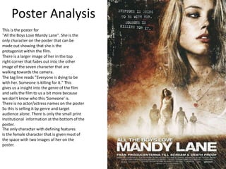
This is the poster for
"All the Boys Love Mandy Lane". She is the
only character on the poster that can be
made out showing that she is the
protagonist within the film.
There is a larger image of her in the top
right corner that fades out into the other
image of the seven character that are
walking towards the camera.
The tag line reads "Everyone is dying to be
with her. Someone is killing for it." This
gives us a insight into the genre of the film
and sells the film to us a bit more because
we don't know who this 'Someone' is.
There is no actor/actress names on the poster
So this is selling it by genre and target
audience alone. There is only the small print
Institutional information at the bottom of the
poster.
The only character with defining features
is the female character that is given most of
the space with two images of her on the
poster.
2. This is the only character that is recognizable on the poster.
This indicates to the viewer that she is the protagonist.
The genre of the film is indicated by the tag line and the
blood that is sprayed across the protagonist on the larger
image.
This tag line leaves the viewer curious as they don’t know
who this “Someone” is and makes the viewer subconsciously
want to watch it and find out.
3. Magazine Cover Analysis
This is the magazine cover of Little White
Lies’ edition for The Innkeepers. Since this
Magazine keeps each issue to one movie
There isn’t, if any, sell lines on the front
Cover, so the text to image ratio isn’t that
Big. The main image is almost always
A sketch but it does take up the entirety
Of the front cover with the title of the
Film and the logo a the top center of the
Front cover.
This front cover follows the rules of three,
They use only three colours on the front
Covers, in this case its white, black and a
Pale green.
4. “Little White Lies” being
The mast head of the
Magazine. “Midnight
Movies” and “Double bill”
Being the only other sell
Lines that are on the
Cover of the magazine apart
From the title.
This is probably a subscribers edition as there is no other sell lines and a low text to image
Ratio. I will try to avoid this as my magazine cover wont be a subscribers edition and there
Will be more marks to pick up if I incorporate sell lines, sky lines, a range of fonts.
“The Innkeepers” being
The title of the film that
Half of this issue if focused
On.
5. Poster Analysis Two.
This is the poster for the film “Apartment 143” which is
Also known as “Emergo”. There is only one character on
The poster for this film but we cannot see their face and
We cannot identify in and way with them.
There is a typical kind of supernatural font that is printed
For the title and the tag line that hooks the audience in
And makes the genre clear to the viewer.
All of the institutional information is at the bottom right
Hand side of the poster so this is selling due to its
Tag line and genre as there is no actor/actress’s names
Anywhere on the poster that is clear.
6. These are the three main features
That are on the poster. The only
Character on the front cover that
Is climbing on the wall, the tag line
“The First Real Ghost Story” that
Makes the viewer curious as to
What this means and what happens
Within the movie. And the film title
That is written in a typical
Supernatural horror font and the
Foreign title is written in a red
Font that can be signified as the
Identifier for the genre.
7. Magazine Analysis Two.
This is Empires cover for “The Dark Knight”.
The only image on the cover is of the main
Antagonist, “The Joker”, and they have
Changed the colour scheme to fit in the with
“The Joker VS. Batman” theme, normally the
Masthead is written in a red front but for this
Edition they have changed it to green, black
And white.
The text to image ratio is quite large, there
Are lots of sell lines, long with a skyline that
Tells the reader that there is “2 Covers to
Collect”.
They have composed the text around the face
Of the antagonist image that is on the front
Cover.
8. Sell lines that help sell the magazine to the audience and gives a little insight as
To what is inside the magazine.
The “Empire” masthead written in the typical
Font for this magazine. But the font colour has
Changed to fit the Batman/Joker theme.
This is the main image of the antagonist and it takes up
Most of the cover, and the masthead and sell lines are
Composed around it so the image remains clear the the
Reader.