![[object Object],This front cover gives out two types of messages, we can see the celebrity pointing at the reader in an intimidating way, so we get very strong vibes. The Masthead in a very bright pink, which is almost bringing out the feminine side of Akon. But the pink colours contradict that because they are soft colours and so we don't get that vibe from the colours, but we do from the main image. Also there are a wide range of different colours used to almost disorientate the attention of the reader, and gives us a different perceptions of them. In the mise-en-scene we can see the a chain with the word ‘Akon’ and ‘Konvict’ he has chosen to play with the words so they rhyme with his name. Also we are exposed to expensive jewellery Also the cover lines featured on the front cover are very tempting for the reader and show the reader a short snippet of what’s to come next but doesn't give too much away. This is the perfect way to lure the consumer into buying the magazine. Also the front cover is the first thing the buyer can see, so it has to be exceptionally attractive.](data:image/gif;base64,R0lGODlhAQABAIAAAAAAAP///yH5BAEAAAAALAAAAAABAAEAAAIBRAA7)
Recomendados
Más contenido relacionado
Destacado
Último
Último (20)
Industry front covers2
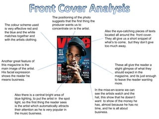
- 1. The colour scheme used is very effective red and the blue and the white matches together and with the artists clothing. Also there is a central bright area of blue lighting, to put the artist in the spot light, so the first thing the reader sees is the artist which automatically attracts their attention as he is very popular in the music business. Also the eye-catching pieces of texts located all around the front cover. They all give us a short snippet of what’s to come, but they don’t give too much away. These all give the reader a slight glimpse of what they should expect in the magazine, and its just enough to leave the reader wanting more. Another great feature of this magazine is the main image of the artist. His facial expression shows the reader he means business. In the mise-en-scene we can see the artists watch and the hat, this show that he doesn’t want to show of the money he has, almost because he has no time, and he is all about business. The positioning of the photo suggests that the first thing the producer wants us to concentrate on is the artist.
- 3. A midshot be being used to show all the artist clearly. the mise-en-scene there are three popular artist dressed in black and all looking directly in to the camera. The bright yellow contrasts with the black, this has intertwines with the song Whiz Kalifa is in ‘Black and Yellow’. The ideology is that these artist are serious about their music and also shows they are down to earth because they are not wearing the typical bulky jewellery to show off their money. The small names on top of the masthead show the artists featured in this magazine. Their body language shows intimidation towards the reader and also their is a sense of victory in this image. The word ‘Pop’ is in big bold yellow letters. This is because pop and music are very closely related. Also yellow represents idealism and optimism. These are a very stereotypical R&B artists because they are wearing from a black origin which is where the genre of music came from. Every time you look at the master head the reader then looks at the other pieces of text in yellow because the colour is leading the reader to the other pieces of text. Also the artist are not wearing much jeweller because they are not trying to show off their wealth. The are trying to send out the right message.