Recomendados

Recomendados
Más contenido relacionado
Similar a Colour chart
Similar a Colour chart (20)
Último
Último (20)
Colour chart
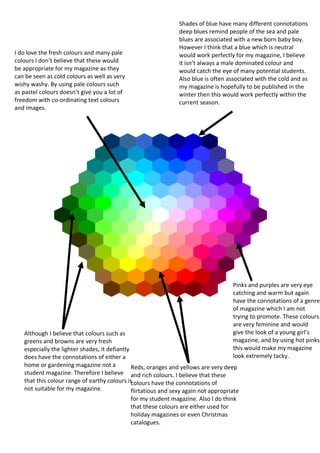
- 1. Shades of blue have many different connotations deep blues remind people of the sea and pale blues are associated with a new born baby boy. However I think that a blue which is neutral I do love the fresh colours and many pale would work perfectly for my magazine, I believe colours I don’t believe that these would it isn’t always a male dominated colour and be appropriate for my magazine as they would catch the eye of many potential students. can be seen as cold colours as well as very Also blue is often associated with the cold and as wishy washy. By using pale colours such my magazine is hopefully to be published in the as pastel colours doesn’t give you a lot of winter then this would work perfectly within the freedom with co-ordinating text colours current season. and images. Pinks and purples are very eye catching and warm but again have the connotations of a genre of magazine which I am not trying to promote. These colours are very feminine and would Although I believe that colours such as give the look of a young girl’s greens and browns are very fresh magazine, and by using hot pinks especially the lighter shades, it defiantly this would make my magazine does have the connotations of either a look extremely tacky. home or gardening magazine not a Reds, oranges and yellows are very deep student magazine. Therefore I believe and rich colours. I believe that these that this colour range of earthy colours is colours have the connotations of not suitable for my magazine. flirtatious and sexy again not appropriate for my student magazine. Also I do think that these colours are either used for holiday magazines or even Christmas catalogues.